
Table of Contents
- Introduction
- What Are Bitmap Graphics?
- What Are Vector Graphics?
- Key Differences Between Bitmap and Vector
- When to Use Bitmap Graphics
- When to Use Vector Graphics
- Common File Formats for Bitmap & Vector
- Why Designers Should Understand Both Types
- Best Fonts for Visual Mockups in Bitmap vs Vector Projects
- Conclusion
- References
1. Introduction
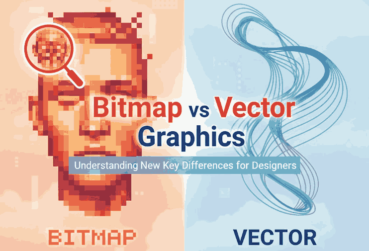
Bitmap vs Vector Graphics In the world of digital design, one of the most fundamental concepts designers must understand is the difference between bitmap and vector graphics. Whether you create illustrations, logos, UI assets, posters, or digital branding, knowing how each format works can dramatically improve your workflow and ensure better quality results.
This article breaks down Bitmap vs Vector Graphics in an easy, comprehensive way—perfect for beginners and professionals. You will also find font recommendations from CalligraphyFonts.net to help you create stunning visuals and mockups that match your design workflow.
2. What Are Bitmap vs Vector Graphics?
Bitmap graphics—also known as raster images—are made up of a grid of tiny squares called pixels. Each pixel contains color information, creating the final image.
Characteristics of Bitmap vs Vector Graphics
- Pixel-based
- Resolution-dependent
- Can become blurry when enlarged
- Ideal for complex images like photos
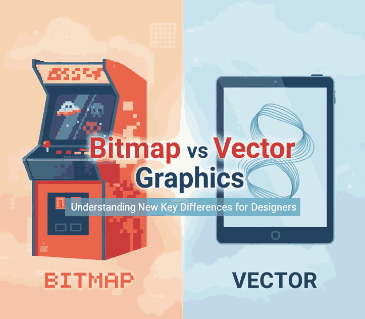
Common Uses
- Photography
- Digital painting
- Web graphics
- Texture-heavy visuals
3. What Are Bitmap vs Vector Graphics?
Vector graphics are made using mathematical paths rather than pixels. This means shapes are defined by formulas, allowing the image to scale without losing quality.
Characteristics of Bitmap vs Vector Graphics
- Formula/path-based
- Resolution-independent
- Scalable to any size
- Ideal for logos, icons, and illustrations
Common Uses
- Branding
- Print materials
- Icons & UI elements
- Technical illustrations
4. Key Differences Between Bitmap vs Vector Graphics
Understanding the differences helps you choose the right format for each project.
1. Scaling
- Bitmap: loses quality when enlarged
- Vector: scales infinitely with no loss
2. File Size
- Bitmap: typically larger
- Vector: often smaller unless highly complex
3. Detail & Realism
- Bitmap: great for detailed imagery
- Vector: best for simple, clean shapes
4. Editing
- Bitmap: edited pixel by pixel
- Vector: edited by adjusting paths & nodes
5. Compatibility
- Bitmap: universally supported
- Vector: requires specific design software
5. When to Use Bitmap vs Vector Graphics
Bitmap is the best choice when working with:
- Photographs
- Texture-rich digital art
- Realistic shading & gradients
- Photo manipulation
- Detailed backgrounds
Because bitmap graphics capture subtle color variations, they are ideal for visually rich projects.
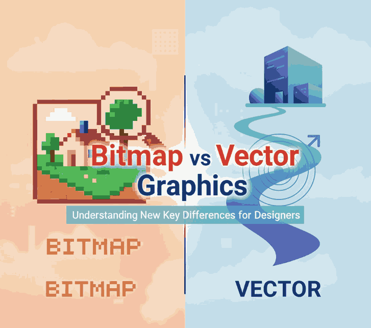
6. When to Use Bitmap vs Vector Graphics
Vector graphics are the top choice for:
- Logos & branding
- Icons & interface design
- Typography & lettering
- Posters, merchandise & print
- Scalable illustrations
Vectors ensure your designs look sharp at any size—from business cards to billboards.
7. Common File Formats for Bitmap vs Vector Graphics
Bitmap Formats
- JPG / JPEG – compressed, widely used
- PNG – supports transparency
- GIF – basic animation
- TIFF – high-quality images
Vector Formats
- SVG – web-friendly vector format
- AI – Adobe Illustrator
- EPS – print industry standard
- PDF – scalable vector-compatible format
8. Why Designers Should Understand Both Types
Mastering both bitmap and vector workflows allows designers to:
- Optimize images for print and digital platforms
- Choose the right format for maximum clarity
- Improve production efficiency
- Collaborate better with printers and developers
- Deliver professional-level results
Understanding these formats is essential in any creative industry—from UI/UX design to branding and illustration.
9. Best Fonts for Visual Mockups in Bitmap vs Vector Projects
To enhance the clarity and professionalism of your “Bitmap vs Vector” visuals or blog images, here are recommended fonts from CalligraphyFonts.net:
1. Faint Green Font
Perfect for clean layouts, diagrams, and explanatory visuals. The minimalist sans-serif style is ideal for comparing bitmap and vector formats.
2. Speed Attack Font
A bold, dynamic display font great for headers, titles, or infographic elements that require energy and modern appeal.
3. Pictorial Style Font
Ideal for labeling charts or creating eye-catching headings. Its stylish yet readable form works perfectly with technical design topics.
4. Monoscreen Modern Font
A futuristic and digital-feel font—excellent for tech-related mockups, UI/UX diagrams, and illustrations discussing digital formats.
Using these fonts in mockups or article graphics will help visually communicate the difference between bitmap and vector in a clean and engaging way.
10. Conclusion
Both bitmap and vector graphics play essential roles in modern design. Bitmaps are perfect for photos and detailed imagery, while vectors excel at scalability and clean, sharp shapes. Understanding these differences allows designers to choose formats wisely and deliver high-quality results for any project.
With the right fonts—like those from CalligraphyFonts.net—you can create striking visuals, infographics, and mockups that effectively reinforce the concepts behind each format.
11. References
- Wikipedia — Vector graphics
- This VS That — Bitmap Graphics vs. Vector Graphics
- DinStudio — Bitmap VS Vector; What’s the Difference?