Table of Contents
- Introduction
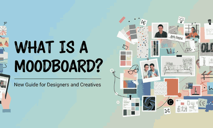
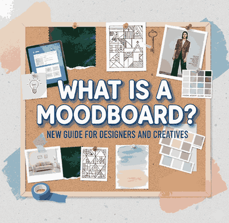
- What Is a Moodboard?
- Why Moodboards Matter in Creative Projects
- Types of Moodboards: Digital vs. Physical
- Key Elements of an Effective Moodboard
- How to Create a Moodboard Step-by-Step
- Best Fonts to Use in Moodboards (With Examples)
- Tips for Using Moodboards in Client Projects
- Final Thoughts
- References
1. Introduction What Is a Moodboard
What Is a Moodboard In the world of visual communication, clarity is everything. Designers, branding specialists, artists, and creative professionals often rely on moodboards to communicate ideas before moving to the execution stage. Whether you’re working on a logo, packaging, website, or social media identity, a moodboard helps transform abstract ideas into a clear visual direction.
This article will explain what a moodboard is, why it matters, how to create one effectively, and which fonts from CalligraphyFonts.net you can use to enhance your moodboard presentation.
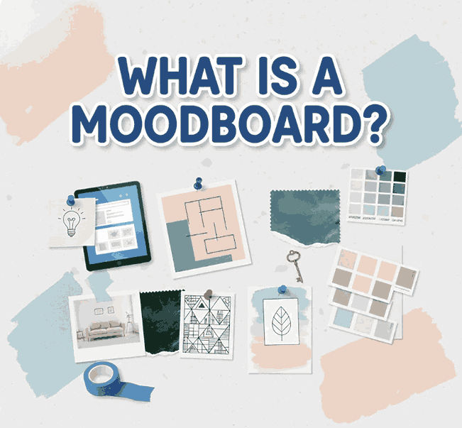
2. What Is a Moodboard?
A moodboard is a curated visual collage containing images, colors, typography, textures, patterns, and design inspiration that represent the desired style or concept of a project. It helps communicate the emotional tone (“mood”) and overall aesthetic direction you aim to achieve.
A moodboard acts as a visual brainstorming tool, making it easier to align ideas between designers and clients.
3. What Is a Moodboard Matter in Creative Projects
3.1. Clarifies Visual Direction
Instead of relying on verbal descriptions, moodboards visually express the atmosphere and style you’re aiming for. Clients understand better and faster.
3.2. Prevents Miscommunication
Design projects commonly fail due to misaligned expectations. A moodboard eliminates this risk by giving a shared point of reference.
3.3. Saves Time and Resources
With a clear visual direction upfront, the design process becomes more efficient, reducing revisions and increasing productivity.
3.4. Boosts Creativity
Moodboards provide inspiration and help spark new ideas that might not emerge through words alone.
4. Types of “What Is a Moodboard”: Digital vs. Physical
4.1. Digital What Is a Moodboard
Digital moodboards are created using software like Canva, Figma, Adobe Illustrator, or Pinterest. They’re flexible, easy to share, and ideal for remote collaboration.
4.2. Physical What Is a Moodboard
These are made using printed materials, magazine cut-outs, fabric samples, or hand-drawn sketches. They provide tactile texture that some designers prefer for fashion, interior, or craft-based projects.
Both types are effective—it all depends on your workflow and project needs.
5. Key Elements of an Effective What Is a Moodboard
✓ Color Palette
Your moodboard should include a consistent color theme that reflects the emotion of the project.
✓ Images/Photography
Photos help convey the style—minimalist, vibrant, vintage, playful, or futuristic.
✓ Typography
Fonts play a key role because they shape a brand’s personality. This is also where your chosen font mockups can shine (see Section 7).
✓ Textures and Patterns
Include fabrics, grids, gradients, geometric shapes, and other visual elements based on your creative direction.
✓ Keywords or Descriptive Notes
Words like “clean”, “elegant”, “retro”, or “bold” help reinforce your concept.
6. How to Create a Moodboard Step-by-Step
Step 1 – Define the Goal
Understand the purpose: branding, packaging, website design, logo creation, advertising, etc.
Step 2 – Research Inspiration
Use Pinterest, design blogs, Behance, or Instagram to gather visuals that express the desired mood.
Step 3 – Collect Visual Elements
Save images, textures, color palettes, icons, and typography samples.
Step 4 – Select Fonts
Choose fonts that express the style you’re going for. Minimalist fonts work for clean concepts; script fonts suit romantic or elegant themes.
Step 5 – Arrange the Layout
Organize your materials in a structured collage. Group similar elements for clarity.
Step 6 – Present to Your Client
Explain each visual choice and how it relates to the final design direction.
Step 7 – Revise if Needed
Refine based on client feedback to ensure alignment.
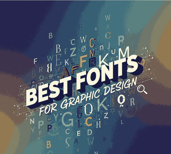
7. Best Fonts to Use in Moodboards (With Examples)
Typography is one of the most essential elements of any moodboard. To help you create a visually polished presentation, here are recommended fonts from CalligraphyFonts.net:
1. Overcame Font
A clean and modern sans-serif font perfect for bold headings and stylish minimalist concepts.
2. Kawaguchi Font
A geometric sans-serif font ideal for modern, futuristic, or grid-based moodboards. It gives a professional and structured impression.
3. Faint Green Font
A soft and elegant sans-serif with excellent readability. Great for clean branding, lifestyle concepts, and soft mood presentations.
Use these fonts to label sections in your moodboard, create headings, or show typography inspiration for branding projects.
8. Tips for Using What Is a Moodboard in Client Projects
Be Consistent What Is a Moodboard
Use a consistent color palette and type style to maintain coherence.
Avoid Overcrowding
Only include elements that truly capture the desired direction. Too many visuals make moodboards confusing.
Use High-Quality Images
Clients respond better to polished, high-resolution visuals.
Explain Your Choices
Don’t just show — tell why each element matters. This builds trust and credibility.
Integrate Your Fonts
Show how your own font collection can enhance the branding direction. This also subtly promotes your products.
9. Final Thoughts What Is a Moodboard
A moodboard is more than just a collage — it’s a powerful visual communication tool that helps designers clarify direction, express emotion, and align expectations. Whether you are building a brand identity, crafting packaging, or designing a website, moodboards help set a solid foundation for the creative process.
Using fonts from CalligraphyFonts.net can greatly enhance your moodboard’s professionalism and aesthetic appeal. Incorporate them thoughtfully to communicate style, personality, and design direction clearly.
10. References What Is a Moodboard
- Wikipedia – Mood board
- Din Studio – What Is a Moodboard
- Studio Binder – What is a Mood Board “Definition & Examples”