
Why Slab Serif Fonts Work for Logos
Table of Contents
- Introduction: Why Slab Serif Fonts Work for Logos
- What Are Slab Serif Fonts?
- The Psychology Behind Slab Serif Fonts in Branding
- Famous Brands That Use Slab Serif Fonts
- Step-by-Step Tutorial: Designing a Logo with Slab Serif Fonts
- Popular Slab Serif Font Styles You Can Try
- Recommended Fonts from CalligraphyFonts.net
- Frequently Asked Questions (FAQ)
- Expert Tips to Make Your Logo Stand Out
- Final Thoughts & Call to Action
1. Introduction: Why Slab Serif Fonts Work for Logos
Your logo is your brand’s first impression — and the font you choose is the voice behind that impression. Slab serif fonts for branding logo projects are a designer’s secret weapon: they’re bold, versatile, and stand out across digital and print media.
Brands that want to communicate strength and stability often rely on slab serif fonts. Whether you’re running a tech company, a coffee shop, or a creative agency, slab serif fonts give your logo a solid, professional foundation.
2. What Are Slab Serif Fonts?
Slab serif fonts are serif fonts with thick, block-like serifs. Unlike traditional serif fonts with delicate strokes, slab serifs are bold and geometric.
Key Characteristics:
- Bold serifs: The serifs are often as thick as the main strokes.
- Great readability: Excellent for logos, headlines, and large-format text.
- Versatile personality: Works for modern, vintage, and corporate looks.
3. The Psychology Behind Slab Serif Fonts in Branding
Fonts aren’t just decoration — they send a psychological message. Slab serif fonts are associated with:
- Strength & Stability – They look solid and dependable.
- Confidence – Their presence signals authority.
- Approachability – Softer slab serif styles make brands look friendly.
If you want a logo that communicates reliability and boldness, slab serif fonts are the perfect fit.
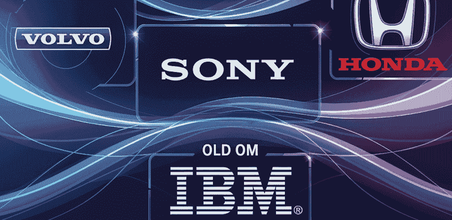
4. Famous Brands That Use Slab Serif Fonts
Here are some well-known examples to inspire you:
- Sony – Their serif-based logo communicates professionalism and authority.
- Volvo – The slab serif choice signals durability and trustworthiness.
- Honda – Their strong, thick letters give off a dependable vibe.
- IBM (early logos) – Before the striped design, IBM used slab serif fonts for a solid corporate identity.
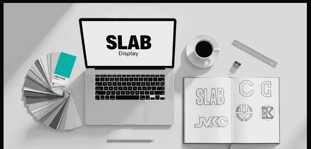
5. Step-by-Step Tutorial: Designing a Logo with Slab Serif Fonts
Step 1: Define Your Brand Personality
Think about your brand voice: Is it bold, fun, or sophisticated? Your slab serif choice should reflect that.
Step 2: Pick the Right Font
Choose a slab serif that is legible at all sizes but unique enough to make your brand recognizable.
Step 3: Adjust Letter Spacing and Weight
Kerning matters — adjust spacing so your logo feels balanced.
Step 4: Add Color and Symbol
Pair your typography with a simple symbol or icon. Stick to 1–2 colors to keep it professional.
Step 5: Test Across Platforms
View it on screens, print it out, and scale it down. Your logo must work everywhere.
6. Popular Slab Serif Font Styles You Can Try
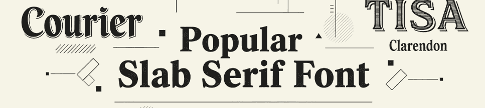
- Geometric Slab Serifs – Clean and modern, great for tech or startups.
- Humanist Slab Serifs – Slightly warmer and friendlier, perfect for lifestyle brands.
- Egyptian Slab Serifs – Classic and timeless, great for heritage or premium brands.
7. Recommended Fonts from CalligraphyFonts.net
We’ve handpicked three fonts from our catalog that are perfect for branding logos:
- Aeromove Font – A bold racing-inspired display font that symbolizes speed and movement, ideal for automotive or sports logos.
- Annandale Font – A sophisticated serif display font that conveys classy professionalism, perfect for law firms, consultants, and luxury brands.
- Avocado Diet Font – A fun, food-inspired sans serif display font that works beautifully for restaurants, cafés, and health-food brands.
8. Frequently Asked Questions (FAQ)
Q1: Are slab serif fonts too bold for minimalist logos?
No — when used with proper spacing and neutral colors, slab serif fonts can be very clean and minimalist.
Q2: Do slab serif fonts work well in digital media?
Yes, they remain clear and readable on screens, which makes them great for websites, apps, and social media branding.
Q3: Can I pair slab serif fonts with other font types?
Absolutely. Pair them with a clean sans serif for taglines or body text to create a balanced visual hierarchy.
9. Expert Tips to Make Your Logo Stand Out
- Use contrast: Pair a bold slab serif with a light tagline font.
- Keep your logo scalable: Avoid intricate details that disappear at small sizes.
- Limit your colors: Two or three brand colors are usually enough.
- Test across backgrounds: Your logo should look good on dark, light, and transparent backgrounds.