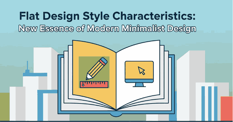
Posted on

Master UI/UX Design Systems: A Complete New Beginner’s Guide

UI/UX Design Systems Guide

Table of Contents

  1. Introduction: Why Design Systems Matter in UI/UX
  2. What Is a UI/UX Design System?
  3. Core Components of a Design System
  4. Benefits of Using a UI/UX Design System
  5. How to Build a UI/UX Design System Step by Step
  6. Typography in UI/UX Design Systems
  7. Best Fonts for UI/UX Projects (with Examples)
  8. Common Mistakes to Avoid
  9. Conclusion
  10. References

1. Introduction: Why Matter in UI/UX Design Systems Guide

UI/UX Design Systems Guide Consistency is key in user experience (UX) and user interface (UI) design. As products grow, maintaining design harmony across multiple pages, apps, or devices becomes challenging. That’s where a UI/UX Design System comes in—it ensures consistency, efficiency, and scalability.

Whether you’re designing for a startup or a global brand, understanding how to create and manage a design system helps your team maintain visual identity and improve the overall user experience.

UI/UX Design Systems Guide

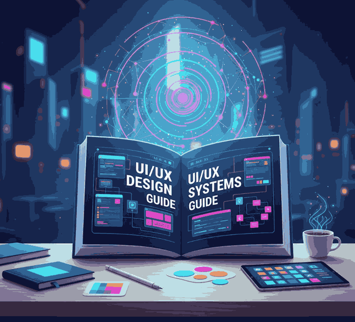
2. What Is aUI/UX Design Systems Guide?

A UI/UX design system is a structured collection of design rules, reusable components, patterns, and assets that define how an interface should look and behave. It’s like a “visual language” for your brand—covering everything from color schemes and typography to buttons and icons.

Famous examples include:

  • Google’s Material Design
  • Apple’s Human Interface Guidelines
  • Atlassian Design System

These frameworks ensure that every product built under the same brand feels cohesive and intuitive.

3. Core Components of a UI/UX Design Systems Guide

A well-built design system usually includes several key elements:

  • Design Principles: Core values that guide visual and UX decisions.
  • Color Palette: Defines the primary, secondary, and accent colors.
  • Typography: Sets the tone of the brand with consistent fonts and text hierarchy.
  • UI Components: Buttons, input fields, navigation bars, modals, etc.
  • Spacing and Grid System: Ensures visual balance and alignment.
  • Iconography and Imagery: Consistent visual symbols that support functionality.

Together, these elements form a living document that keeps all design and development work aligned.

4. Benefits of Using a UI/UX Design Systems Guide

Implementing a design system provides multiple long-term advantages:

  • Consistency: Every element across your platform looks and behaves the same.
  • Efficiency: Teams reuse existing assets instead of designing from scratch.
  • Scalability: New pages or apps can be developed faster and easier.
  • Collaboration: Designers and developers work more cohesively with shared resources.
  • Brand Recognition: A consistent aesthetic strengthens brand identity and trust.

In short, design systems make it easier to scale creativity without sacrificing usability.

5. How to Build a UI/UX Design Systems Guide Step by Step

Creating a design system might sound complex, but you can approach it in simple, structured steps:

  1. Audit Existing Designs: Review your current digital assets to find inconsistencies.
  2. Define Your Foundations: Set rules for color, typography, and grid layout.
  3. Create UI Components: Build reusable assets like buttons, modals, and icons.
  4. Document Everything: Use tools like Figma, Notion, or Zeroheight to document guidelines.
  5. Collaborate and Iterate: Involve developers and designers for feedback and continuous improvement.
  6. Maintain and Update: Treat your system as a living product that evolves over time.
UI/UX Design Systems Guide

6. Typography in UI/UX Design Systems Guide

Typography plays a vital role in any design system. The right font can establish hierarchy, readability, and emotional tone. Good UI fonts are:

  • Legible at all sizes (for both desktop and mobile),
  • Versatile (for headings, paragraphs, and buttons),
  • Aligned with your brand’s personality.

Sans-serif fonts are popular in UI design for their clean and modern appearance, while script or calligraphy fonts can be used for accent branding, logos, or special feature screens.

7. Best Fonts for UI/UX Projects (with Examples)

If you want to add personality to your design system, try experimenting with premium fonts that balance readability and style. Here are a few great examples from CalligraphyFonts.net:

  1. Rellative Font – A sleek handwritten signature font perfect for logos, landing pages, or digital branding accents.
  2. Signatory Font – Clean and modern with elegant strokes, ideal for hero sections or creative UI headlines.
  3. Catcalling Font – A stylish calligraphy typeface that adds sophistication and uniqueness to brand-driven UI elements.
  4. Fieldstone Font – A refined serif-style display font that’s perfect for titles and headers in web or mobile layouts.

These fonts demonstrate how typography can enhance digital aesthetics while maintaining usability. When paired with strong color palettes and intuitive components, they elevate your entire UI/UX design.

8. Common Mistakes to Avoid

Even experienced designers can make missteps when building a design system. Avoid these pitfalls:

  • Overcomplicating the system — Keep it simple and scalable.
  • Ignoring documentation — Every component should have usage guidelines.
  • Neglecting accessibility — Always test color contrast and font legibility.
  • Not updating regularly — A stagnant system becomes outdated quickly.

A design system should grow alongside your product and adapt to user needs and design trends.

9. Conclusion

A well-structured UI/UX Design System bridges creativity and consistency. It saves time, improves collaboration, and ensures every user interaction feels intentional and polished.
By integrating thoughtful color choices, readable typography, and reusable UI components, you can create digital experiences that feel both beautiful and functional.

To give your design system a unique touch, explore premium fonts like Rellative, Signatory, Catcalling, and Fieldstone — available now on CalligraphyFonts.net. The right font can transform not just your text, but your entire design identity.

10. References

Posted on

Flat Design Style Characteristics: New Essence of Modern Minimalist Design

Flat Design Style Characteristics

Table of Contents

  1. Introduction
  2. What Is Flat Design Style?
  3. The Origin of Flat Design
  4. Key Characteristics of Flat Design
    • 4.1 Minimalism and Simplicity
    • 4.2 Bold and Vibrant Colors
    • 4.3 Clean Typography
    • 4.4 Geometric Shapes and Icons
    • 4.5 Focus on Functionality
  5. Benefits of Using Flat Design
  6. Flat Design in Branding and Typography
  7. Recommended Fonts for Flat Design Projects
  8. Conclusion
  9. References

1. Introduction

In today’s world of digital design, Flat Design Style Characteristics has become one of the most popular and influential visual styles. Known for its clean, minimal, and modern look, flat design eliminates unnecessary textures, shadows, and gradients, focusing instead on clarity and usability.

This article explores the characteristics of flat design style, its evolution, and how designers can use it effectively in branding and typography. If you’re looking to elevate your visual identity or UI project, understanding flat design is essential.

Flat Design Style Characteristics

2. What Is Flat Design Style Characteristics?

Flat Design is a minimalist approach to user interface and graphic design that emphasizes functionality and simplicity.
Instead of imitating 3D effects or realistic textures (like in skeuomorphism), flat design uses solid colors, clean lines, and two-dimensional elements to convey information efficiently.

Flat Design became popular with tech giants such as Microsoft (Windows 8) and Apple (iOS 7), who adopted the style to create user-friendly, visually clear interfaces.

3. The Origin of Flat Design Style Characteristics

The concept of Flat Design can be traced back to Swiss Style or International Typographic Style from the 1950s, which focused on clarity, readability, and grid-based design.
When digital interfaces became mainstream, designers adapted these principles into a new digital form—resulting in Flat Design.

Its resurgence in the 2010s was a reaction against the heavily textured, skeuomorphic designs that dominated early smartphone interfaces. Designers began favoring cleaner, faster-loading visuals suitable for mobile and responsive environments.

4. Key Characteristics of Flat Design Style Characteristics

Let’s break down the defining Flat Design Style Characteristics that make it stand out.

4.1 Minimalism and Simplicity

Flat design embraces the “less is more” philosophy. Elements are stripped of unnecessary details, leaving only what’s essential. This creates a visually balanced layout that enhances readability and usability.

4.2 Bold and Vibrant Colors

Color plays a major role in flat design. Designers often use bright, contrasting palettes to draw attention and maintain visual interest. Common combinations include blues, oranges, purples, and greens that add energy without relying on gradients or depth.

4.3 Clean Typography

Typography in flat design is simple yet powerful. Sans-serif fonts are typically used for their readability and modern feel.
Fonts with clean lines, strong weight, and geometric proportions enhance the flat aesthetic by aligning with its functional and minimalist principles.

4.4 Geometric Shapes and Icons

Flat design relies heavily on geometric shapes, such as circles, rectangles, and triangles, to create icons and layouts. These elements contribute to a consistent visual system that users can understand instantly.

4.5 Focus on Functionality

Every element in flat design serves a purpose. Buttons, icons, and text are designed to communicate quickly and clearly, ensuring that usability remains at the core of the design.

5. Benefits of Using Flat Design Style Characteristics

Flat Design isn’t just aesthetically pleasing—it offers several practical benefits:

  • Faster loading times: Fewer textures and effects mean lighter graphics.
  • Improved user experience: Simple layouts help users navigate more intuitively.
  • Better scalability: Works well across different screen sizes and devices.
  • Timeless appeal: Minimalist designs age more gracefully than trend-heavy styles.

Because of these advantages, Flat Design remains a favorite among web designers, app developers, and branding experts.

6. Flat Design Style Characteristics in Branding and Typography

Flat Design extends beyond digital interfaces—it influences brand identity, logos, and typographic systems.
Modern brands use flat-style logos for clarity and adaptability. Think of brands like Spotify, Dropbox, and Google, which use minimal geometric forms and bold colors for maximum recognition.

Typography plays a crucial role in achieving harmony within flat design. Fonts must be readable, modern, and visually aligned with the overall design concept.

Here’s where custom or calligraphic fonts come in: adding a touch of human warmth to otherwise minimalist compositions.

7. Recommended Fonts for Flat Design Style Characteristics Projects

Here are some font recommendations from CalligraphyFonts.net that pair beautifully with Flat Design aesthetics:

  • Overcame Font – A strong and minimalist sans-serif perfect for bold titles or UI elements.
  • Faint Green Font – Elegant and modern, ideal for branding that requires clarity and a natural flow.
  • Creatoria Font – A clean and stylish display font, excellent for flat-style logos and posters.
  • Aesthetic Sunset Font – Adds a soft, artistic touch while maintaining simplicity—great for lifestyle or creative brands.

Using the right font enhances your flat design project’s visual balance and emotional tone, making your brand more memorable and consistent.

Flat Design Style Characteristics

8. Conclusion

The Flat Design Style Characteristics showcase the perfect balance between simplicity and function.
By focusing on minimalism, bold colors, and clean typography, designers can create visuals that are not only beautiful but also user-friendly and efficient.

Whether you’re working on a brand identity, mobile app, or website UI, flat design offers a timeless framework for visual communication.
To elevate your design projects, choose fonts that align with flat design’s clarity and purpose—explore more typefaces at CalligraphyFonts.net and bring simplicity to life.

9. References