
Table of Contents
- Introduction
- What Are Warm and Cool Colors?
- The Emotional Impact of Warm Colors
- The Calming Effect of Cool Colors
- Balancing Warm and Cool Tones in Design
- Applying Color Psychology in Branding
- Using Fonts and Colors Together
- Final Thoughts
- References
1. Introduction
In the Psychology of Warm world of graphic design, color is not just a visual choice — it’s a psychological tool. The Psychology of Warm and cool colors plays a key role in how audiences interpret a brand’s message, mood, and emotional tone. Whether it’s the fiery energy of red or the soothing calm of blue, every hue tells a story that connects deeply with viewers.
For example, pairing the right font design with a warm or cool palette can elevate your visual identity. Explore creative font options like Aeromove Font, Kidsway Font, or Glow Curly Font — each has its own emotional “temperature,” perfectly complementing color psychology in design.

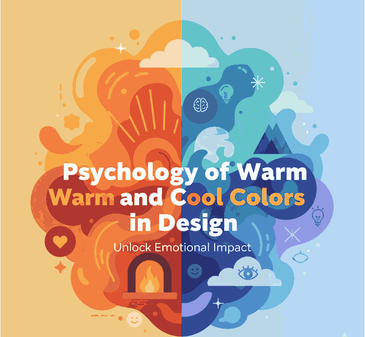
2. What Are Psychology of Warm and Cool Colors?
Warm colors include reds, oranges, and yellows, often linked to heat, sunlight, and passion. These hues grab attention and evoke excitement or comfort.
Cool colors — blues, greens, and purples — bring calm, relaxation, and professionalism. They are often used in healthcare, technology, and wellness industries for their soothing effects.
Designers often use a color temperature wheel to balance these tones effectively. Understanding how warm and cool colors interact helps ensure your visuals remain both emotionally resonant and visually balanced.
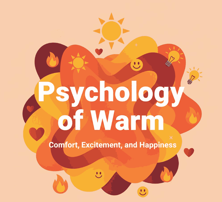
3. The Emotional Impact of Psychology of Warm Colors
Warm tones are stimulating and energetic. They can make designs feel cozy, passionate, and bold.
- Red symbolizes excitement, urgency, or love.
- Orange conveys creativity, enthusiasm, and friendliness.
- Yellow suggests optimism, clarity, and youthfulness.
These colors are ideal for calls-to-action (CTAs) or promotional visuals that need to grab attention instantly. However, overusing warm hues can lead to overstimulation — balance is key.
4. The Calming Effect of Cool Colors
Cool colors bring harmony, trust, and tranquility.
- Blue signifies dependability and calm — a favorite among corporate brands.
- Green represents growth, health, and balance.
- Purple conveys luxury, creativity, and mystery.
When used in digital design, cool palettes can make websites or brand visuals feel professional, peaceful, and trustworthy — especially when paired with minimalist font styles.
5. Balancing Psychology of Warm and Cool Tones in Design
A visually effective composition uses a strategic mix of warm and cool colors.
- Use warm tones for emotional highlights (buttons, accents).
- Use cool tones for stability (backgrounds, text areas).
- Maintain color contrast for visual hierarchy.
For instance, combining an inviting orange header with a calming blue background helps direct the viewer’s attention while maintaining harmony.
6. Applying Color Psychology of Warm in Branding
Brands consciously use color Psychology of Warm to influence customer behavior:
- Coca-Cola uses red for passion and energy.
- Facebook uses blue for trust and connection.
- Starbucks uses green for freshness and calm.
Your brand’s color scheme should align with its core values and emotional tone. A warm palette suits lifestyle or food brands, while cool colors work for tech, wellness, or finance.
7. Using Fonts and Colors Together
Typography amplifies color Psychology of Warm. Choosing the right font can reinforce or balance a color’s emotional message.
For instance:
- Warm-toned designs pair beautifully with bold, expressive typefaces like Aeromove Font.
- Cool color schemes can benefit from smooth, rounded fonts like Glow Curly Font.
- For playful designs, Kidsway Font adds a friendly and approachable touch.
By blending color temperature and typography psychology, you create cohesive and memorable visuals.
8. Final Thoughts Psychology of Warm
Mastering the Psychology of Warm and cool colors allows designers to craft visuals that don’t just look good — they feel right. Colors influence emotions, actions, and memories, making them a powerful branding asset.
Whether you’re designing logos, packaging, or web layouts, remember: every color has a voice. Use it wisely, pair it with the right font, and let your design speak directly to your audience’s emotions.