Posted on

Golden Ratio Definition & History: New Timeless Blueprint of Perfect Design

Golden Ratio Definition & History

Table of Contents

  1. Introduction
  2. What Is the Golden Ratio?
  3. The Mathematics Behind the Ratio
  4. A Brief History of the Golden Ratio
  5. Why the Golden Ratio Matters in Modern Design
  6. Golden Ratio in Logo Design
  7. Golden Ratio in Typography & Font Selection
  8. Recommended Fonts for Golden Ratio–Inspired Designs
  9. How to Apply the Golden Ratio in Your Creative Projects
  10. Final Thoughts
  11. References

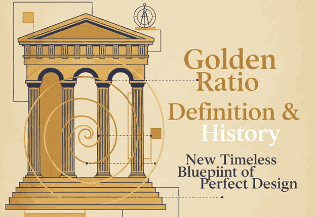
1. Introduction Golden Ratio Definition & History

Golden Ratio Definition & History Designers and artists have long sought a timeless formula that produces visual harmony. The Golden Ratio, often recognized as one of the most powerful composition tools in history, continues to influence architecture, art, branding, and typography today. Whether you’re designing a logo, a website, or a font-centered visual layout, understanding the Golden Ratio helps you create balance, beauty, and natural aesthetics.

This article explores the definition, history, and modern applications of the Golden Ratio—along with carefully selected font mockups from CalligraphyFonts.net to inspire your next design project.

Golden Ratio Definition & History

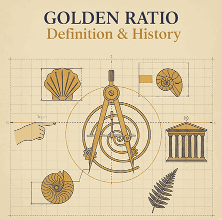
2. What Is the Golden Ratio Definition & History?

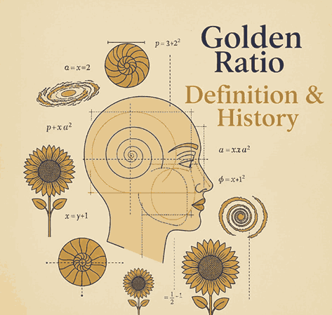
The Golden Ratio, also known as Phi (Φ) and valued approximately at 1.618, is a mathematical proportion found throughout nature, art, and design.

It describes the relationship between two quantities where:

(A + B) / A = A / B = 1.618

This natural proportional pattern is known for producing an ideal sense of harmony and visual balance. You’ll find it in:

  • Nautilus shells
  • Human anatomy
  • Flower petals
  • Galaxy spirals
  • Renaissance paintings
  • Modern brand logos

The universality of the Golden Ratio makes it a foundation of design excellence.

3. The Mathematics Behind the Golden Ratio Definition & History

The Golden Ratio originates from the Fibonacci Sequence, a series of numbers where each number is the sum of the two before it:

1, 1, 2, 3, 5, 8, 13, 21, …

As the sequence progresses, the ratio between successive numbers approaches 1.618, leading to the proportional beauty found in nature and geometry.

Golden rectangles, spirals, and triangles are all derived from this ratio, making it essential in layout design, architecture, and even typography spacing.

4. A Brief of Golden Ratio Definition & History

The Golden Ratio has been studied for thousands of years:

Ancient Greece

Greek mathematicians such as Euclid documented the ratio in “Elements,” linking it to geometry and aesthetics.

Renaissance

Artists including Leonardo da Vinci used the Golden Ratio in works like the Vitruvian Man and the Mona Lisa, elevating it as a standard of beauty.

Modern Times

Architects, graphic designers, and brand specialists continue to use Phi to create balanced compositions, logo grids, and typographic systems.

The Golden Ratio remains a symbol of perfection and artistic craftsmanship.

5. Why the Golden Ratio Definition & History Matters in Modern Design

Modern viewers are subconsciously drawn toward proportionally balanced visuals. Designs using the Golden Ratio tend to feel:

  • Naturally pleasing
  • More professional
  • Better structured
  • Easier to digest visually

It helps designers create layouts with optimal spacing, effective hierarchy, and aesthetically satisfying proportions in:

  • Logos
  • Web layouts
  • Posters
  • Packaging
  • Photography
  • Typography

6. Golden Ratio Definition & History in Logo Design

Many iconic brands incorporate Golden Ratio geometry in their logos, including:

  • Apple
  • Twitter
  • Pepsi
  • Toyota

Using Phi spirals and circular grids helps create logos that feel timeless, balanced, and instantly recognizable.

Designers often start with a Golden Rectangle or spiral, aligning elements—curves, icon shapes, or letterforms—to create cohesive branding.

Golden Ratio Definition & History

7. Golden Ratio Definition & History in Typography Font Selection

Typography plays a crucial role in achieving aesthetic harmony. Fonts that complement Golden Ratio compositions usually embody:

  • Balanced stroke proportions
  • Elegant curves
  • Consistent spacing
  • Strong readability

Choosing the right font amplifies the sense of order and sophistication in Golden Ratio-based layouts.

8. Recommended Fonts for Golden Ratio Definition & History–Inspired Designs

Here are carefully selected fonts from CalligraphyFonts.net that pair beautifully with Golden Ratio compositions:

1. Faint Green Font

A modern handwritten script with graceful curves. Ideal for branding, logos, and editorial layouts.

2. Golden Autumn Font

A luxurious handwritten font with soft strokes, perfect for elegant brand identities.

3. Pictorial Style Font

An artistic script font featuring refined visual rhythm—excellent for posters, book covers, and product packaging.

These fonts offer organic shapes and refined silhouettes that align beautifully with Golden Ratio compositions, helping designers achieve a visually harmonious aesthetic.

9. How to Apply the Golden Ratio Definition & History in Your Creative Projects

Here are practical ways designers integrate Phi into their work:

1. Layout Composition

Divide your canvas using the 1:1.618 proportion to create hierarchy and balance.

2. Typography Scaling

Set headline, subheadline, and body text sizes using Phi increments for harmonious typography.

3. Logo Structure

Use circles and rectangles based on the Golden Ratio to form shapes, curves, and letter marks.

4. Spacing & Margins

Apply the ratio to padding, margins, and leading (line spacing) for cleaner visual flow.

5. Photography & Cropping

Use the Golden Spiral to highlight focal points in images, improving storytelling and visual impact.

10. Final Thoughts

The Golden Ratio is more than a mathematical concept—it’s a universal design principle that inspires harmony, balance, and timeless beauty. From logo grids to typographic scaling, Phi remains an essential tool for designers seeking refinement and professional structure.

By combining Golden Ratio principles with elegant, expressive fonts from CalligraphyFonts.net, you can elevate your branding, layouts, and visual storytelling with powerful aesthetic precision.

11. References

Posted on

Minimalist Negative Space Logos: The Ultimate Guide for Modern Branding

Minimalist Negative Space Logos

Table of Contents

  1. What Are Minimalist Negative Space Logos?
  2. Why Negative Space Logos Are So Effective
  3. Key Principles Behind Minimalist Logo Design
  4. Techniques for Creating Negative Space Logos
  5. Common Mistakes to Avoid
  6. Best Font Recommendations from CalligraphyFonts.net
  7. Final Thoughts
  8. References

1. What Are Minimalist Negative Space Logos?

Minimalist Negative Space Logos is a logo design that uses the empty areas between or inside shapes to create a secondary meaning, symbol, or visual message. This design technique creates powerful, clever, and memorable branding while keeping the visual style extremely clean and simple.

Negative space logos gained significant popularity due to their ability to deliver double meaning, strong symbolism, and visual elegance without relying on complex illustrations or decorative elements.

Brands today gravitate toward minimalist logos because:

  • They look modern
  • They scale beautifully on digital and print media
  • They remain timeless and easy to recognize
  • They support simple, universal branding

Negative space design amplifies this minimalism by adding depth and visual intelligence to what seems like a simple logo at first glance.

Minimalist Negative Space Logos

2. Why Minimalist Negative Space Logos Are So Effective

A. They Improve Visual Memory & Brand Recall

The human brain loves solving visual puzzles. When people recognize the “hidden message” inside a negative space logo, it creates a moment of discovery that increases memorability.

According to the Interaction Design Foundation, humans process visuals 60,000x faster than text—making clever design more impactful.

B. They Deliver Simplicity With Depth

A minimalist negative space logo can communicate two ideas simultaneously, helping brands tell a fuller story with fewer graphic elements.

C. They Work Across All Mediums

From business cards to billboards, negative space logos remain sharp and recognizable because they do not rely on color or complex details.

D. They Communicate Professionalism

Minimalist design signals clarity, confidence, and modernity—key qualities for brands in 2025 and beyond.

3. Key Principles Behind Minimalist Negative Space Logos

Before creating a negative space logo, designers must understand the fundamentals of minimalism:

1. Simplicity Over Decoration

A minimalist logo removes anything unnecessary. Each line, shape, and curve must serve a purpose.

2. High Readability Minimalist Negative Space Logos

Even with hidden elements, the main form of the logo must be instantly recognizable.

3. Balanced Composition Minimalist Negative Space Logos

Spacing, alignment, and weight matter more in minimal logos because there are fewer visual cues to stabilize the design.

4. Optimal Use of White Minimalist Negative Space Logos

White space should not feel empty—it should feel intentional and meaningful.

5. Timelessness Minimalist Negative Space Logos

Minimalist logos aim to look relevant for 10–20 years, not just follow trends temporarily.

4. Techniques for Creating Minimalist Negative Space Logos

Below are the most effective methods for designing minimalist negative space logos:

1. Integrated Shapes

Merging two symbols by sharing borders or outlines—allowing one form to naturally create space for another.

2. Hidden Imagery

Placing symbolic shapes within the letters or icons using carved-out negative space.

Example:
An arrow inside the letter “E”, or an animal silhouette inside geometric shapes.

3. Overlapping Elements

Layering shapes in a way that creates subtle inner forms without adding clutter.

4. Letterform Manipulation

Adjusting strokes, spacing, or gaps within typography to reveal a secondary image.

5. Symmetry & Mirroring

Using symmetrical forms makes it easier to insert hidden shapes that feel natural.

6. Subtractive Design

Removing certain parts of a letter or shape to allow the surrounding empty area to become meaningful.

Minimalist Negative Space Logos

5. Common Mistakes to Avoid Minimalist Negative Space Logos

❌ Overcomplicating the Hidden Image

The biggest error is creating a hidden symbol that is too detailed or hard to recognize.

❌ Poor Typography Choices

Complex fonts make negative space logos difficult to read. Clean lines are essential.

❌ Weak Contrast

Negative space only works if the viewer can clearly distinguish the filled and empty areas.

❌ Forcing the Concept

Not every logo needs a hidden image. Only add negative space when it fits naturally.

❌ Ignoring Scalability

Logos must work at all sizes—especially at small resolutions on mobile screens.

6. Best Font Minimalist Negative Space Logos Recommendations from CalligraphyFonts.net

Typography is one of the most important components of negative space logo design. Minimalist logos rely on clarity and shape definition, and choosing the right font will elevate or weaken your entire design.

Below are top recommendations from CalligraphyFonts.net, perfect for minimalist and negative space branding:

1. Ballerinas Font

A clean, modern script with fluid strokes—perfect for elegant minimalist logo concepts that require a balanced flow.

2. Faint Green Font

A simple, readable, and modern sans-serif ideal for clean-cut minimalist logos and geometric compositions.

3. Healing Time Font

Smooth, gentle, and modern—ideal for minimalist logos in beauty, wellness, or lifestyle brands.

4. Pictorial Style Font

A contemporary and clean sans-serif display font perfect for tight spacing and negative space manipulation.

7. Final Thoughts Minimalist Negative Space Logos

Minimalist negative space logos remain one of the most intelligent and visually appealing trends in modern branding. Their ability to combine simplicity with symbolism allows brands to communicate depth while staying clean and timeless.

As designers continue to move toward scalable, digital-first branding, negative space techniques will only grow in demand.

With the right typography—such as curated fonts from CalligraphyFonts.net—you can craft logos that feel elegant, clever, and memorable.

Mastering this technique will elevate your work and help brands stand out with powerful visual storytelling.

8. References Minimalist Negative Space Logos

Posted on

Forbidden Color Combinations: The Essential Guide for Designers 2025

Forbidden Color Combinations

Table of Contents

  1. What Are Forbidden Color Combinations?
  2. Why Some Color Pairings Hurt Your Design
  3. The Most Common Forbidden Color Combinations
  4. How to Identify Bad Color Contrast
  5. How to Fix or Improve Poor Color Pairings
  6. Recommended Fonts for High-Contrast Designs
  7. Final Thoughts
  8. References

1. What Are Forbidden Color Combinations?

In the world of graphic design, color is one of the most powerful communication tools. However, not all colors work well together. “Forbidden color combinations” refer to color pairings that result in poor readability, visual discomfort, or design imbalance. These are combinations that distract the viewer, reduce clarity, or make the message difficult to understand.

The goal of a designer is not only to choose beautiful colors, but also to ensure harmony, contrast, and accessibility. When colors clash, the design suffers—whether it’s a logo, poster, website, or product label.

Forbidden Color Combinations

2. Why Some Forbidden Color Combinations Pairings Hurt Your Design

There are several reasons why certain colors become problematic when paired together:

A. Low Readability Forbidden Color Combinations

Text may blend into the background, making it hard to read.

B. High Visual Vibration

Some bright tones (such as neon pairs) create an unwanted glowing or vibrating effect.

C. Cultural or Emotional Mismatch

Colors may carry conflicting meanings, causing the design to feel confusing.

D. Poor Contrast Forbidden Color Combinations

Contrast affects accessibility and visual hierarchy. When contrast is too low or too extreme, the viewer’s eyes struggle.

E. Color Blindness Issues

Around 8% of men and 0.5% of women experience some form of color blindness (source: National Eye Institute). Certain combinations—such as red/green or green/brown—become impossible to differentiate for affected viewers.

3. The Most Common Forbidden Color Combinations

Here are the color pairings designers should avoid or handle with extreme care:

1. Red & Green

This pair is difficult for color-blind users and often causes blending, making elements look muddy and unclear.

2. Blue & Red

These two create an optical vibration effect, especially when both are bright. Often seen as a “dizzying” combination.

3. Neon Colors Together (Neon Yellow + Neon Green / Neon Pink + Neon Blue)

Neon-on-neon results in intense visual vibration that strains the eyes.

4. Dark Colors on Dark Backgrounds

Examples: navy on black, dark brown on burgundy.
Low contrast = poor readability.

5. Bright Yellow on White

Even though both are positive colors, they blend together and become nearly invisible.

6. Purple & Red

Both are saturated warm colors and create tension or a “messy” visual feel.

7. Green & Orange

Their similar mid-tone values often make them clash and appear unbalanced.

4. How to Identify Bad Forbidden Color Combinations Contrast

To avoid forbidden combinations, designers must evaluate color contrast effectively. Here are practical steps:

☑ Use Contrast-Checker Tools

Tools such as WebAIM Color Contrast Checker or Adobe Color Accessibility can help measure contrast ratios.

☑ Test Multiple Lighting Scenarios

Designs should remain readable in bright daylight, low light, and on various screen types.

☑ Review Your Design in Grayscale

This helps evaluate luminance contrast—the backbone of readability.

☑ Check With Color-Blind Simulations

Use simulators (e.g., Coblis) to ensure colors remain distinguishable.

☑ Follow WCAG 2.1 Guidelines

Text should meet a minimum contrast ratio of 4.5:1 for accessibility (source: W3C Web Content Accessibility Guidelines).

Forbidden Color Combinations

5. How to Fix or Improve Poor Forbidden Color Combinations Pairings

If you must use a risky combination, here’s how to refine it:

1. Adjust Brightness or Saturation

Darken or lighten one of the colors to create contrast.

2. Add Outlines or Shadows

A subtle outline (white or black) helps make text stand out.

3. Use a Neutral Divider

Black, white, gray, or beige can separate conflicting colors.

4. Modify Hue Slightly Forbidden Color Combinations

A small shift (e.g., from pure red to a deeper burgundy) can instantly fix the clash.

5. Simplify the Palette Forbidden Color Combinations

Sometimes less is more. Limiting to 2–3 main colors generally improves harmony.

6. Recommended Fonts for High-Contrast Designs

When dealing with tricky color combinations, typography plays a crucial role. A strong, legible font can compensate for visual limitations and help your message stand out.

Here are premium fonts from CalligraphyFonts.net that work beautifully even in high-contrast or challenging color settings:

1. Workday Font

A modern, bold, handwritten script with excellent clarity.
Perfect for packaging, branding, and product highlights.

2. Blossom Aura Font

Elegant, smooth, and beautifully balanced.
Ideal for labels, wedding branding, and soft color palettes.

3. Popcorn Chips Font

Fun, playful, and easy to read—great for bold color backgrounds.
Suitable for posters, children’s products, and casual branding.

These fonts help maintain visual clarity even when working with intense or difficult color combinations.

7. Final Thoughts Forbidden Color Combinations

Forbidden color combinations are not strict bans—but they are warnings. Understanding how colors interact helps designers produce cleaner, more effective designs while improving accessibility and user experience.

By avoiding problematic pairings—or adjusting them with contrast, saturation, or neutral tones—you can maintain visual harmony and strengthen your brand identity.

Pairing your designs with the right typography further enhances clarity, ensuring that your message remains readable and impactful, even in challenging color environments.

Whether you’re designing a product label, poster, or digital content, mastering color theory will elevate every project you create.

8. References

  • WebAIM – Color Contrast Analysis
  • Din Studio – Forbidden Color Combination
  • Adobe – Why is color accessibility important?
  • W3C / WCAG 2.1 – Color Contrast & Accessibility Guidelines
Posted on

What Is a Moodboard? New Guide for Designers and Creatives

What Is a Moodboard

Table of Contents

  1. Introduction
  2. What Is a Moodboard?
  3. Why Moodboards Matter in Creative Projects
  4. Types of Moodboards: Digital vs. Physical
  5. Key Elements of an Effective Moodboard
  6. How to Create a Moodboard Step-by-Step
  7. Best Fonts to Use in Moodboards (With Examples)
  8. Tips for Using Moodboards in Client Projects
  9. Final Thoughts
  10. References

1. Introduction What Is a Moodboard

What Is a Moodboard In the world of visual communication, clarity is everything. Designers, branding specialists, artists, and creative professionals often rely on moodboards to communicate ideas before moving to the execution stage. Whether you’re working on a logo, packaging, website, or social media identity, a moodboard helps transform abstract ideas into a clear visual direction.

This article will explain what a moodboard is, why it matters, how to create one effectively, and which fonts from CalligraphyFonts.net you can use to enhance your moodboard presentation.

2. What Is a Moodboard?

A moodboard is a curated visual collage containing images, colors, typography, textures, patterns, and design inspiration that represent the desired style or concept of a project. It helps communicate the emotional tone (“mood”) and overall aesthetic direction you aim to achieve.

A moodboard acts as a visual brainstorming tool, making it easier to align ideas between designers and clients.

What Is a Moodboard

3. What Is a Moodboard Matter in Creative Projects

3.1. Clarifies Visual Direction

Instead of relying on verbal descriptions, moodboards visually express the atmosphere and style you’re aiming for. Clients understand better and faster.

3.2. Prevents Miscommunication

Design projects commonly fail due to misaligned expectations. A moodboard eliminates this risk by giving a shared point of reference.

3.3. Saves Time and Resources

With a clear visual direction upfront, the design process becomes more efficient, reducing revisions and increasing productivity.

3.4. Boosts Creativity

Moodboards provide inspiration and help spark new ideas that might not emerge through words alone.

4. Types of “What Is a Moodboard”: Digital vs. Physical

4.1. Digital What Is a Moodboard

Digital moodboards are created using software like Canva, Figma, Adobe Illustrator, or Pinterest. They’re flexible, easy to share, and ideal for remote collaboration.

4.2. Physical What Is a Moodboard

These are made using printed materials, magazine cut-outs, fabric samples, or hand-drawn sketches. They provide tactile texture that some designers prefer for fashion, interior, or craft-based projects.

Both types are effective—it all depends on your workflow and project needs.

5. Key Elements of an Effective What Is a Moodboard

Color Palette

Your moodboard should include a consistent color theme that reflects the emotion of the project.

Images/Photography

Photos help convey the style—minimalist, vibrant, vintage, playful, or futuristic.

Typography

Fonts play a key role because they shape a brand’s personality. This is also where your chosen font mockups can shine (see Section 7).

Textures and Patterns

Include fabrics, grids, gradients, geometric shapes, and other visual elements based on your creative direction.

Keywords or Descriptive Notes

Words like “clean”, “elegant”, “retro”, or “bold” help reinforce your concept.

6. How to Create a Moodboard Step-by-Step

Step 1 – Define the Goal

Understand the purpose: branding, packaging, website design, logo creation, advertising, etc.

Step 2 – Research Inspiration

Use Pinterest, design blogs, Behance, or Instagram to gather visuals that express the desired mood.

Step 3 – Collect Visual Elements

Save images, textures, color palettes, icons, and typography samples.

Step 4 – Select Fonts

Choose fonts that express the style you’re going for. Minimalist fonts work for clean concepts; script fonts suit romantic or elegant themes.

Step 5 – Arrange the Layout

Organize your materials in a structured collage. Group similar elements for clarity.

Step 6 – Present to Your Client

Explain each visual choice and how it relates to the final design direction.

Step 7 – Revise if Needed

Refine based on client feedback to ensure alignment.

7. Best Fonts to Use in Moodboards (With Examples)

Typography is one of the most essential elements of any moodboard. To help you create a visually polished presentation, here are recommended fonts from CalligraphyFonts.net:

1. Overcame Font

A clean and modern sans-serif font perfect for bold headings and stylish minimalist concepts.

2. Kawaguchi Font

A geometric sans-serif font ideal for modern, futuristic, or grid-based moodboards. It gives a professional and structured impression.

3. Faint Green Font

A soft and elegant sans-serif with excellent readability. Great for clean branding, lifestyle concepts, and soft mood presentations.

Use these fonts to label sections in your moodboard, create headings, or show typography inspiration for branding projects.

What Is a Moodboard

8. Tips for Using What Is a Moodboard in Client Projects

Be Consistent What Is a Moodboard

Use a consistent color palette and type style to maintain coherence.

Avoid Overcrowding

Only include elements that truly capture the desired direction. Too many visuals make moodboards confusing.

Use High-Quality Images

Clients respond better to polished, high-resolution visuals.

Explain Your Choices

Don’t just show — tell why each element matters. This builds trust and credibility.

Integrate Your Fonts

Show how your own font collection can enhance the branding direction. This also subtly promotes your products.

9. Final Thoughts What Is a Moodboard

A moodboard is more than just a collage — it’s a powerful visual communication tool that helps designers clarify direction, express emotion, and align expectations. Whether you are building a brand identity, crafting packaging, or designing a website, moodboards help set a solid foundation for the creative process.

Using fonts from CalligraphyFonts.net can greatly enhance your moodboard’s professionalism and aesthetic appeal. Incorporate them thoughtfully to communicate style, personality, and design direction clearly.

10. References What Is a Moodboard

Posted on

Types of Designers Explained: New Guide for Modern Creatives

Types of Designers Explained

Table of Contents

  1. Introduction
  2. Why Understanding Designer Types Matters
    1. Graphic Designer
    1. UI Designer
    1. UX Designer
    1. Web Designer
    1. Motion Designer
    1. Product Designer
    1. Brand Identity Designer
  3. Best Fonts for Designer-Related Content (from CalligraphyFonts.net)
  4. Tips for Choosing the Right Designer for a Project
  5. Conclusion
  6. References

1. Introduction Types of Designers Explained

Types of Designers Explained The design industry is expanding rapidly, and with it comes a variety of specialized design roles. From visual communication to user experiences, different designers focus on different aspects of creativity and problem-solving. This article will break down the Types of Designers Explained, helping readers understand each role, their responsibilities, and where they fit in the modern creative ecosystem.

To make this guide even more effective, we also include carefully curated sans serif font recommendations from CalligraphyFonts.net to illustrate how typography influences designer-related content.

Types of Designers Explained

2. Why Understanding Types of Designers Explained Matters

Whether you are a business owner, creative director, or aspiring designer, knowing the differences between designer roles is crucial.

Here’s why:

  • You can hire the right professional for specific creative needs
  • You can delegate tasks more efficiently
  • You can understand how designers collaborate within a team
  • You can improve project outcomes by aligning skills with objectives
  • You can plan more strategic brand or product development

In the following sections, we describe the most common designer types in the industry today.

3. Graphic Types of Designers Explained

A Graphic Designer focuses on visual communication. They create visual assets that communicate messages through typography, color, composition, and imagery.

Core Responsibilities:

  • Branding & visual identity
  • Poster, flyer, and brochure design
  • Social media content
  • Packaging
  • Editorial layout

Skills Needed:

  • Strong typography sense
  • Mastery of design software (Adobe Illustrator, Photoshop)
  • Understanding color theory & layout

Graphic designers often work closely with marketing teams and brand strategists.

4. UI Types of Designers Explained

UI (User Interface) Designers create the visual layout of digital products, ensuring that digital interfaces look appealing and function smoothly.

Core Responsibilities:

  • Designing app & website interfaces
  • Creating component systems
  • Building style guides & design systems

Skills Needed:

  • Consistency in layout
  • Knowledge of grid systems
  • Familiarity with design tools like Figma or Sketch
  • Understanding of web behavior

UI Designers ensure users interact with intuitive and visually cohesive digital products.

5. UX Types of Designers Explained

UX (User Experience) Designers focus on how users feel while interacting with a product. Unlike UI designers who focus on appearance, UX designers emphasize structure, flow, and usability.

Core Responsibilities:

  • Conducting user research
  • Creating wireframes & prototypes
  • Improving user journeys
  • Testing usability

Skills Needed:

  • Analytical thinking
  • Knowledge of human behavior
  • UX methodologies

UX Designers ensure products are functional, intuitive, and user-friendly.

Types of Designers Explained

6. Web Types of Designers Explained

Web Designers work on websites, combining both visual design and basic coding.

Core Responsibilities:

  • Designing website layouts
  • Optimizing web visuals
  • Enhancing user flow
  • Sometimes handling front-end code

Skills Needed:

  • Knowledge of HTML/CSS
  • Responsive design understanding
  • Interface layout

Web designers bridge the gap between graphic design and front-end development.

7. Motion Types of Designers Explained

Motion Designers bring visuals to life using movement and animation.

Core Responsibilities:

  • Creating animated graphics
  • Video titles & transitions
  • Social media motion content
  • Digital advertisements

Skills Needed:

  • Animation sense
  • Video editing mastery
  • 2D/3D motion tools (After Effects, Blender)

Motion designers play a key role in modern marketing and digital storytelling.

8. Product Types of Designers Explained

A Product Designer works on digital platforms, combining UI, UX, design systems, and business logic.

Core Responsibilities:

  • Designing digital products end-to-end
  • Prototyping & design testing
  • Improving MVPs
  • Creating consistent design systems

Skills Needed:

  • Combination of UI + UX + strategy
  • System thinking
  • Collaboration with product teams

Product Designers are highly valued in the tech industry for their holistic perspective.

9. Brand Identity Types of Designers Explained

Brand Identity Designers focus on how a brand looks and feels. They ensure brand consistency across all touchpoints.

Core Responsibilities:

  • Logo design
  • Brand guidelines
  • Typography selection
  • Color palettes
  • Brand storytelling

Skills Needed:

  • Mastery of conceptual visual language
  • Strategic creative thinking
  • Strong typography & layout skills

They play a key role in shaping how people perceive a brand.

10. Best Fonts for Designer-Related Content (from CalligraphyFonts.net)

Typography plays a major role in design professionalism. Below are recommended fonts ideal for portfolio websites, design articles, and designer branding.

Pictorial Style Font

A sharp and modern sans serif with clean geometry. Perfect for headings and professional layouts.

Faint Green Font

Minimal and elegant, this font is ideal for body text, blog pages, and UI mockups.

Kawaguchi Font

A futuristic sans serif with strong geometric form — perfect for tech designers and digital creatives.

Overcame Font

Bold and modern, suitable for portfolio headers, case studies, and impactful design statements.

11. Tips for Choosing the Right Designer for a Project

Here are practical guidelines:

  • Identify your project goals clearly
  • Match the designer’s specialization with project needs
  • Review portfolios thoroughly
  • Check their experience level
  • Ensure communication style fits your workflow
  • Use typography (fonts) that strengthen the designer’s identity

Choosing the right designer leads to better creative outcomes and long-term success.

12. Conclusion Types of Designers Explained

Understanding the Types of Designers Explained is essential for anyone involved in creative, digital, or branding work. Each designer plays a unique role and contributes valuable expertise. Whether you’re a business owner or creative professional, this guide helps you navigate the design world more confidently.

Using the recommended fonts from CalligraphyFonts.net, you can elevate your visual presentations, portfolios, and design-related content with clean, modern, and professional typography.

13. References

  • Din Studio — “The 7 Common Types of Designers”
  • AIGA — Design Roles Overview
  • NNGroup — Research-based, practitioner-focused. Your source for UX guidance
Posted on

Bauhaus Typography Sans Serif: New Guide to Modern Geometric Lettering

Bauhaus Typography Sans Serif

Table of Contents

  1. Introduction
  2. What Is Bauhaus Typography?
  3. Key Characteristics of Bauhaus Sans Serif Fonts
  4. Why Bauhaus Typography Matters in Modern Design
  5. Best Uses for Bauhaus-Inspired Sans Serif Fonts
  6. Recommended Bauhaus-Style Fonts from CalligraphyFonts.net
  7. How to Use Bauhaus Typography Effectively
  8. Conclusion
  9. References

1. Introduction Bauhaus Typography Sans Serif

Bauhaus Typography Sans Serif has become a timeless design movement—one that continues to influence modern branding, advertising, posters, packaging, UI design, and more. Its minimalist, geometric, and functional style is widely used by designers who want to achieve a clean yet visually striking aesthetic.

In this guide, we will explore Bauhaus Typography Sans Serif, its essential design principles, and how you can apply this style to modern creative projects. Additionally, you’ll find curated font recommendations from CalligraphyFonts.net to help you bring Bauhaus-inspired visuals to life.

Bauhaus Typography Sans Serif

2. What Is Bauhaus Typography Sans Serif?

Bauhaus typography originated from the Bauhaus School of Design (1919–1933) in Germany. The movement emphasized simplicity, function, geometry, and modernism.

At its core, Bauhaus typography eliminates unnecessary decoration and focuses on pure form.

Major principles include:

  • Function over ornamentation
  • Geometric shapes (circles, squares, triangles)
  • Clear hierarchy and readability
  • Bold use of negative space
  • Sans serif letterforms that represent purity and modern thinking

This approach transformed typography across the world and became a foundation for modern graphic design.

3. Key Characteristics of Bauhaus Typography Sans Serif Fonts

Bauhaus sans serif fonts typically share these features:

Geometric Construction

Letters rely on basic shapes such as circles and straight lines. This leads to a clean and harmonious structure.

Minimalist Strokes

Bauhaus typography avoids excessive curves or decorative elements, opting for consistent stroke width.

High Legibility

Due to their simplicity and structural clarity, Bauhaus sans serif fonts remain readable even at small sizes.

Modern Appeal

Although created in the early 20th century, the style feels futuristic and contemporary—making it versatile for modern branding.

Bold and Confident

Many Bauhaus designs use thick, confident strokes to enhance visibility and create a strong visual identity.

4. Why Bauhaus Typography Sans Serif Matters in Modern Design

Even after 100 years, Bauhaus typography continues to dominate modern design trends. Here’s why:

A. Universality

Its clean geometric shapes make it suitable for various industries—technology, fashion, architecture, publishing, and more.

B. Timeless Aesthetic

Designers love Bauhaus fonts because they look modern regardless of era or medium.

C. Visual Balance

Its mathematical structure creates balanced compositions, ideal for logos, posters, and editorial layouts.

D. Versatility

Bauhaus sans serif fonts work across digital and print media, from websites to packaging design.

5. Best Uses for Inspired Bauhaus Typography Sans Serif Fonts

You can apply Bauhaus typography in many design projects, including:

  • Corporate branding and identity
  • Minimalist logo design
  • Posters & editorial design
  • Retro-modern artwork
  • Product packaging
  • Architectural and interior design presentations
  • Website & UI/UX layouts
  • Social media graphics
  • Tech-based marketing campaigns

The clean and geometric style helps create a strong, memorable, and modern impression.

Bauhaus Typography Sans Serif

6. Recommended Bauhaus Typography Sans Serif from CalligraphyFonts.net

To help you apply Bauhaus-style typography in your projects, here are curated fonts from CalligraphyFonts.net that align with Bauhaus principles:

1. Pictorial Style Font

A clean display sans serif with sharp lines and modern aesthetics—perfect for minimal posters, logos, and editorial layouts.

Why It Works for Bauhaus Typography Sans Serif Style:

  • Geometric foundations
  • Bold, modern appearance
  • Excellent for impactful headlines

2. Faint Green Font

A modern sans serif that balances simplicity and personality, ideal for branding, product packaging, and clean layout designs.

Why It Works for Bauhaus Typography Sans Serif Style:

  • Minimalist character structure
  • Smooth readability
  • Works well for body text & titles

3. Kawaguchi Font

A structured, futuristic sans serif font inspired by geometric shapes. Suitable for tech branding, architecture portfolios, and modern advertisements.

Why It Works for Bauhaus Typography Sans Serif Style:

  • Strong geometric influence
  • Futuristic yet functional look
  • Clear letterforms and balance

4. Overcame Font

Bold, straightforward, and minimal—Overcame is perfect for expressive modern layouts, poster designs, and identity systems.

Why It Works for Bauhaus Typography Sans Serif Style:

  • Clean lines
  • High visual impact
  • Ideal for headlines and large typography

7. How to Use Bauhaus Typography Sans Serif Effectively

A. Use Lots of White Space

Bauhaus design thrives on open composition. Give typography room to breathe.

B. Pair with Simple Shapes

Geometric shapes like circles or rectangles reinforce the Bauhaus spirit.

C. Avoid Too Many Fonts

Use 1–2 Bauhaus-style sans serif fonts to maintain consistency.

D. Maintain Alignment

Use grid systems for layout and text structure.

E. Combine with Bold Colors

Red, yellow, blue, and black are classic Bauhaus color palettes.

F. Keep It Functional

Every typographic choice should serve a purpose—clarity comes first.

8. Conclusion Bauhaus Typography Sans Serif

Bauhaus Typography Sans Serif remains one of the most influential styles in modern design. Its geometric beauty, functional nature, and minimalist elegance make it an excellent choice for branding, posters, websites, and creative layouts.

With the curated font recommendations from CalligraphyFonts.net, you can bring the timeless Bauhaus aesthetic into your projects while maintaining a strong, professional visual identity.

9. References Bauhaus Typography Sans Serif

Posted on

Take Away Packaging Design: New Guide & Best Fonts for Stunning Food Branding

Take Away Packaging Design

Table of Contents

  1. Introduction
  2. What Is Take Away Packaging Design?
  3. Why Take Away Packaging Matters
  4. Key Elements of Effective Take Away Packaging Design
    • 4.1 Visual Branding
    • 4.2 Typography
    • 4.3 Color Psychology
    • 4.4 Material Selection
    • 4.5 Functionality & User Experience
    • 4.6 Sustainability Trends
  5. How to Create a Winning Take Away Packaging Design
  6. Best Fonts for Food & Take Away Packaging (Font Mockups)
  7. Common Mistakes to Avoid
  8. Conclusion
  9. References

1. Introduction Take Away Packaging Design

In today’s competitive food industry, Take Away Packaging Design plays a powerful role in shaping customer experience and brand recognition. The packaging is not just a container—it’s a silent marketing tool that communicates your brand message, quality, values, and uniqueness.

From restaurants and cafés to bakeries and beverage shops, businesses are now investing in packaging that is visually appealing, functional, sustainable, and memorable. This article will guide you through everything you need to know about take away packaging design and how to elevate it using the right typography and branding elements.

Take Away Packaging Design

2. What Is Take Away Packaging Design?

Take away packaging design refers to the visual and structural design of food packaging intended for takeaway or delivery. This includes:

  • Boxes
  • Cups
  • Bags
  • Wrappers
  • Paper containers
  • Labels and stickers

A great design not only protects the product but also enhances the consumer’s perception of the food and the brand.

3. Why Take Away Packaging Design Matters

Your packaging influences customer decisions in several impactful ways:

  • Brand recognition – Unique packaging helps customers remember your brand.
  • Perceived quality – Stylish packaging makes products feel premium.
  • Customer loyalty – Positive unboxing experiences build emotional connection.
  • Social media shareability – Aesthetic packaging encourages customers to post online.
  • Differentiation – In a crowded market, packaging sets you apart.

Food packaging is no longer “just packaging”—it has become a key part of a brand’s identity.

4. Key Elements of Effective Take Away Packaging Design

4.1 Visual Branding

Your packaging should reflect your brand identity through:

  • Logo placement
  • Brand colors
  • Visual motifs
  • Layout style
  • Brand storytelling

Consistency builds recognition and trust.

4.2 Typography

Fonts set the tone of your brand. The right typography can instantly convey whether your product is:

  • Fun
  • Healthy
  • Luxurious
  • Homemade
  • Minimalist

Using display fonts or calligraphy fonts allows your packaging to stand out, especially in the food and beverage industry where emotions matter.

4.3 Color Psychology

Colors affect appetite and mood:

  • Red & Yellow → Stimulate hunger
  • Green → Represents freshness & health
  • Brown/Beige → Homemade, natural, warm
  • Black → Premium, elegant
  • Pastels → Friendly and sweet

Choose colors that align with your brand message.

4.4 Material Selection

Customers increasingly prefer eco-friendly materials:

  • Recyclable paper
  • Biodegradable cups
  • Compostable boxes
  • Reusable jars

The right materials elevate the eco-value of your brand.

4.5 Functionality & User Experience

Good packaging should be:

  • Easy to carry
  • Leak-proof
  • Heat-resistant
  • Stackable
  • Portion appropriate

It must protect the food while being convenient for customers.

4.6 Sustainability Trends

Sustainability is no longer optional. Modern consumers want environmentally responsible packaging.

Key trends include:

  • Minimalist packaging
  • Natural materials
  • Water-based inks
  • Recyclable designs
  • Zero-waste solutions
Take Away Packaging Design

5. How to Create a Winning Take Away Packaging Design

Here are essential steps to create impactful packaging:

1. Define your brand identity

Understand your values, personality, and target audience.

2. Choose the right typography

Fonts must represent your food category (playful, modern, organic, etc.).

3. Select colors intentionally

Use color psychology to influence customer behavior.

4. Prioritize functionality

The packaging should protect food and be easy to carry.

5. Make it Instagram-friendly

Customers love sharing beautiful packaging.

6. Include clear labeling

Add instructions, ingredients, or heating directions if needed.

7. Use eco-friendly materials

This increases brand trust and customer loyalty.

6. Best Fonts for Food & Take Away Packaging Design (Font Mockups)

Below are the best font recommendations from CalligraphyFonts.net, perfect for food branding, beverages, desserts, cafés, and take away packaging:

1. Gummy Candy Font – Playful & Fun

Perfect for candy stores, dessert shops, kids’ menus, sweet drinks, and fun food packaging.

2. Avocado Diet Font – Clean & Healthy Vibes

Ideal for salad bars, healthy food, organic beverages, vegan stores, and modern cafés.

3. Choco Brewing Font – Warm & Handcrafted

Perfect for bakeries, pastries, chocolate packaging, and cozy coffee shops.

4. Hazelnut Coffee Font – Artisanal & Café Style

Ideal for coffee cups, bakery bags, food labels, and premium café branding.

These fonts help bring emotion, personality, and memorability to your take away packaging design.

7. Common Mistakes to Avoid Take Away Packaging Design

Many brands fail because they overlook these issues:

  • Using fonts that are too hard to read
  • Ignoring brand consistency
  • Overcrowded layouts
  • Poor material choices
  • Lack of sustainability consideration
  • Weak color contrast
  • Generic, forgettable design

Avoiding these mistakes ensures that your packaging is functional, beautiful, and effective in communicating your brand.

8. Conclusion Take Away Packaging Design

Take away packaging design is a powerful branding tool that can elevate the food experience, strengthen customer loyalty, and boost brand visibility. By combining strong visual branding, thoughtful typography, and functional design, you can create packaging that stands out in today’s competitive food industry.

Using the right fonts—such as Gummy Candy, Avocado Diet, Choco Brewing, and Hazelnut Coffee—helps you craft a unique, memorable packaging identity that resonates with your target audience.

9. References

Posted on

Free Logo Design Brief Template: What to Include, How to Works & Best New Practices

Logo Design Brief Template

Table of Contents

  1. Introduction
  2. What Is a Logo Design Brief?
  3. Why You Need a Logo Design Brief Template
  4. Key Elements of an Effective Logo Design Brief
    • 4.1 Company Background
    • 4.2 Brand Personality
    • 4.3 Target Audience
    • 4.4 Competitor Insights
    • 4.5 Project Objectives
    • 4.6 Preferred Style & Visual Direction
    • 4.7 Color Palette & Typography
    • 4.8 Usage Requirements
    • 4.9 Budget & Timeline
  5. Sample Logo Design Brief Template (Ready to Copy)
  6. Best Fonts for Logo Design (Font Mockups Included)
  7. Tips for Designers & Clients
  8. Conclusion
  9. References

1. Introduction Logo Design Brief Template

Logo Design Brief Template Creating a great logo doesn’t start with sketching—it starts with clarity. A clear, well-structured Logo Design Brief Template helps designers understand a brand’s identity, mission, audience, and visual expectations before the creative process begins. Whether you are a designer or a business owner, using a strong brief ensures smooth communication, faster revisions, and a professional final result.

This article will guide you through everything you need to include in a powerful logo design brief, complete with a ready-to-use template and recommended fonts you can use for your branding projects.

Logo Design Brief Template

2. What Is a Logo Design Brief Template?

A logo design brief is a document that outlines essential information about a brand, design goals, project requirements, and visual preferences for creating a new logo. It acts as the foundation of the entire design process, ensuring both client and designer are aligned from the start.

Without a proper brief, the logo creation process becomes guesswork—and costly revisions are bound to happen.

3. Why You Need a Logo Design Brief Template

A professional Logo Design Brief Template helps you:

  • Gather essential brand information quickly
  • Communicate expectations clearly
  • Prevent misunderstandings
  • Reduce revision rounds
  • Speed up project delivery
  • Improve collaboration
  • Build brand consistency

Most importantly, a template ensures every detail is covered—no missing pieces that might slow down the project later.

4. Key Elements of an Effective Logo Design Brief Template

4.1 Company Background

Provide critical information such as:

  • Company name
  • Industry
  • Products or services offered
  • Unique selling points (USP)
  • Mission and vision

This helps designers understand what makes the brand special.

4.2 Brand Personality

Is the brand modern or traditional? Playful or corporate? Elegant or bold?

Defining personality helps create a visual identity that reflects the brand’s character.

4.3 Target Audience

Understanding audience demographics and behaviors allows designers to craft a logo that resonates with the right people.

Examples:

  • Age group
  • Interests
  • Location
  • Pain points
  • Purchase motivation

4.4 Competitor Insights

Analyzing competitors helps a brand:

  • Avoid similarity
  • Identify design gaps
  • Ensure uniqueness in the market

Clients should list 3–5 competitors with screenshots or logos for comparison.

4.5 Project Objectives

Define what the logo must achieve:

  • Increase brand recognition
  • Rebrand existing identity
  • Launch a new product line
  • Modernize outdated visuals

4.6 Preferred Style & Visual Direction

This section outlines the brand’s visual tastes:

  • Minimalist
  • Handwritten
  • Luxury
  • Vintage
  • Geometric
  • Playful
  • Serif / Sans serif

Providing sample inspirations helps designers eliminate guesswork.

4.7 Color Palette & Typography

State preferred (or avoided) colors and suggest potential typefaces. Clear direction prevents inconsistent branding.

4.8 Usage Requirements

Where will the logo be used?

  • Website
  • Social media
  • Packaging
  • Business cards
  • Apparel printing
  • Signage

Knowing these helps designers choose the right file formats and scalability.

4.9 Budget & Timeline

A brief should mention:

  • Budget range
  • Preferred timeline
  • Important milestones

This helps align expectations from day one.

Logo Design Brief Template

5. Sample Logo Design Brief Template (Copy & Paste)

Logo Design Brief Template

1. Company Information

  • Company Name:
  • Industry:
  • Products/Services:
  • Mission & Vision:

2. Brand Personality
(Select or describe)

  • Modern / Traditional
  • Playful / Formal
  • Luxurious / Minimal

3. Target Audience

  • Age:
  • Gender:
  • Interests:
  • Location:

4. Competitors
(List at least 3 and their websites/logos)

5. Project Goals

  • What problem should the logo solve?

6. Style Preferences

  • Preferred Style (Modern, handwritten, bold, etc.)
  • Example Inspirations:
  • Colors to Use/Avoid:

7. Typography Preferences

  • Script / Sans / Serif / Calligraphy
  • Optional: Provide font examples

8. Usage Requirements

  • Where will the logo appear?

9. Deliverables

  • File formats (PNG, SVG, AI, EPS)
  • Primary + Secondary versions

10. Budget & Deadline

  • Budget range:
  • Deadline:
  • Milestones:

6. Best Fonts for Logo Design Brief Template (Mockups Included)

Here are premium calligraphy fonts from CalligraphyFonts.net that work beautifully for logo design. Use them as mockup samples in your brief:

Jaycee Looks Font (Handwritten Signature)

Perfect for personal branding, fashion labels, or creative studios.

Joanna Fanny Font (Elegant Script)

Ideal for luxury branding, boutique logos, wedding businesses, and premium products.

Anthonyela Calligraphy Font (Bold & Stylish)

Great for beauty brands, lifestyle logos, upscale packaging, and signature logos.

These fonts bring emotional value, personality, and professionalism to any branding project.

7. Tips for Designers & Clients Logo Design Brief Template

✓ For Designers

  • Ask follow-up questions when the brief is unclear
  • Offer 2–3 design directions based on the brief
  • Use premium fonts to elevate professionalism
  • Provide a brand style guide with logo delivery

✓ For Clients

  • Be honest and specific about preferences
  • Provide real examples and inspirations
  • Avoid “I’ll know it when I see it” feedback
  • Trust the designer’s creative judgment

8. Conclusion Logo Design Brief Template

A strong Logo Design Brief Template is essential for producing meaningful, visually consistent, and brand-aligned logo designs. Whether you run a business or work as a designer, using a well-structured brief saves time, avoids confusion, and leads to stunning results.

With the template provided above—and the recommended fonts from CalligraphyFonts.net—you have everything you need to create a professional and effective logo design workflow.

9. References

Posted on

Branding Beyond Logo Explained: New Essential Elements Every Business Must Know

Branding Beyond Logo

Table of Contents

  1. Introduction
  2. What “Branding Beyond Logo” Really Means
  3. Why a Brand Is More Than Its Logo
  4. Key Elements of a Complete Brand Identity System
    • 4.1 Color Palette
    • 4.2 Typography
    • 4.3 Visual Style & Art Direction
    • 4.4 Brand Voice & Messaging
    • 4.5 Packaging & Product Presentation
    • 4.6 Photography Guidelines
    • 4.7 Layout System & Grid Usage
    • 4.8 Brand Applications
  5. How Typography Strengthens Brand Identity
  6. Recommended Fonts from CalligraphyFonts.net
  7. Conclusion
  8. References
  9. Yoast SEO Settings

1. Introduction

When people hear the word “Branding Beyond Logo,” most immediately think of a logo. While a logo is an important symbol, it only represents a small part of what branding truly is. A strong brand identity goes far beyond a single mark — it is a complete visual and emotional system that communicates the soul of a company.

This article explores the concept of Branding Beyond Logo, helping designers, creators, and business owners understand why branding is a holistic process. We will also share recommended fonts from CalligraphyFonts.net that can elevate your brand systems and visual consistency.

Branding Beyond Logo

2. What “Branding Beyond Logo” Really Means

Branding beyond the logo refers to all elements that shape how people perceive a brand. Instead of relying on one symbol, a brand builds recognition through a combination of visuals, tone, structure, and experience.

A brand is:

  • How your visuals make people feel
  • How your words speak to the audience
  • How consistent your identity appears across every platform

A logo is the signature, but the full identity system is what creates emotional connection.

3. Why Is More Than Its Branding Beyond Logo

A logo alone cannot communicate the brand story, values, tone, personality, or experience. Modern brands need more touchpoints—social media presence, packaging, typography systems, and digital interfaces.

A full Branding Beyond Logo system helps you:

  • Build trust and familiarity
  • Create consistent customer experiences
  • Strengthen emotional connection
  • Stand out in competitive markets

Brands like Apple, Nike, and Starbucks are recognized not just for their logos, but for their cohesive visual styles, tone of voice, and user experience.

4. Key Elements of a Complete Branding Beyond Logo Identity System

To build a brand beyond the logo, you need a system that includes visual, verbal, and experiential components.

4.1 Color Palette

Color influences emotions and shapes perception. A strategic color palette reinforces brand personality, from calm and minimalist to bold and energetic.

Examples:

  • Blue: trust, reliability
  • Yellow: optimism, friendliness
  • Black: luxury, sophistication

4.2 Typography

Typography is one of the strongest identity pillars. The fonts you choose affect clarity, emotion, and visual tone across every brand asset.

Consistent typography builds recognition even without the logo being present.

4.3 Visual Style & Art Direction

This includes illustration style, photography tone, shapes, textures, patterns, and graphic elements.

Art direction ensures:

  • Grid consistency
  • Image treatment
  • Composition rules
  • Aesthetic continuity

4.4 Branding Beyond Logo Voice & Messaging

A brand’s voice defines how it communicates. Is it playful? Corporate? Friendly? Luxurious?

Messaging includes:

  • Tagline
  • Brand story
  • Social media tone
  • Website copy

4.5 Packaging & Product Presentation

Packaging is a brand touchpoint that directly interacts with customers. The design must reflect the brand personality through:

  • Structure
  • Materials
  • Graphics
  • Label layout

4.6 Photography Guidelines

Photography direction includes:

  • Color tone
  • Lighting mood
  • Framing
  • Subject focus

Strong photography is essential for ecommerce and digital branding.

4.7 Layout System & Grid Usage

A layout system ensures visual consistency across:

  • Brochures
  • Social media templates
  • Posters
  • Website pages

4.8 Brand Applications

A brand becomes recognizable when the system is applied consistently across:

  • Website
  • Packaging
  • Social media
  • Stationery
  • Ads
  • Merchandise
  • Marketing materials

This is how the brand identity becomes alive.

Branding Beyond Logo

5. How Typography Strengthens Branding Beyond Logo Identity

Typography is more than choosing a beautiful font. It influences:

  • Brand recognition
  • Tone of communication
  • Hierarchy and structure
  • Emotional expression

For example:

  • A bold sans serif creates a modern and confident image
  • A rounded typeface feels friendly and playful
  • A futuristic font fits tech or gaming brands
  • A minimal font supports luxury and clean branding

Choosing the right font family helps unify the brand across all touchpoints.

6. Recommended Fonts from CalligraphyFonts.net

Here are curated fonts from your website that fit perfectly into a brand identity system:

1. Overcame Font

A bold and modern sans serif suitable for branding, headlines, and strong identity systems.

2. Snake Game Font

Unique, futuristic, and ideal for tech, gaming, or digital-focused branding.

3. Faint Green Font

Clean and elegant, ideal for editorial style, body text, and premium branding.

4. Pictorial Style Font

Creative and expressive, perfect for artistic branding, packaging, or illustration-heavy brands.

7. Conclusion Branding Beyond Logo

Branding is a complete experience—not just a logo. Businesses that invest in full identity systems see stronger customer loyalty, better recognition, and clearer communication.

Consistent typography, color palettes, visual elements, and messaging shape the emotional relationship between brand and audience.

Using the right fonts, such as those from CalligraphyFonts.net, supports the identity and elevates the brand’s visual presence across all platforms.

8. References

  1. Canva – Understanding Branding Basics
  2. Din Studio – Branding Is Not Just a Logo
  3. Inkbot Design – Beyond Logos: The Business Case for Branding
Posted on

Graphic Design Specializations: A Complete Guide for Modern Creatives

Graphic Design Specializations

Table of Contents

  1. Introduction
  2. What Are Graphic Design Specializations?
  3. Why Specialization Matters in Today’s Creative Industry
  4. 10 Most Common Graphic Design Specializations
    • 4.1 Branding & Visual Identity
    • 4.2 Logo Design
    • 4.3 UI/UX & Digital Product Design
    • 4.4 Web Design
    • 4.5 Illustration & Character Design
    • 4.6 Motion Graphics
    • 4.7 Advertising & Marketing Design
    • 4.8 Packaging Design
    • 4.9 Editorial & Publication Design
    • 4.10 Environmental & Spatial Design
  5. Recommended Fonts from CalligraphyFonts.net
  6. Final Thoughts
  7. References

1. Introduction Graphic Design Specializations

Graphic Design Specializations has evolved into a diverse and dynamic industry, offering countless opportunities for creatives with different skill sets. Whether you enjoy bold visual communication, digital interfaces, brand storytelling, or packaging aesthetics, there is a specialization tailored for your strengths.

In this article, we explore the most common graphic design, their roles, and how they shape modern design projects. If you want to choose a niche or strengthen your career direction, this guide will help you understand where your skills fit best.

Graphic Design Specializations

2. What Are Graphic Design Specializations?

Graphic design refer to specific categories or branches within the field of design. Each specialization focuses on a unique creative function—such as branding, illustration, UI/UX, or packaging—and requires a particular set of skills, tools, and visual approaches.

Specialization helps designers stand out, offer deeper expertise, and create more impactful work.

3. Why Graphic Design Specializations Matters in Today’s Creative Industry

Today’s digital landscape demands designers who are not only creative but also highly skilled in a specific area. Companies and clients look for specialists who understand niches deeply—whether it’s user interface design, brand identity creation, or motion graphics.

Key benefits of Specializations:

  • Higher expertise and credibility
  • Clearer portfolio direction
  • Better positioning for high-value projects
  • Easier personal branding as a designer
  • Efficient workflow through mastery of tools and methods

4. 10 Most Common Graphic Design Specializations

4.1 Branding & Visual Identity

This specialization focuses on shaping how a brand is perceived. Designers create visual systems including logos, typography, color palettes, and brand guidelines.

Key Responsibilities:

  • Brand identity creation
  • Visual consistency across platforms
  • Mood boards & concept development

4.2 Logo Graphic

Logo designers concentrate on symbols, marks, and icons that represent a brand. They understand shape psychology, simplicity, and timeless visual communication.

Skills Needed:

  • Typography mastery
  • Symbolism & visual meaning
  • Minimalist composition

4.3 UI/UX & Digital Product Graphic Design Specializations

This specialization improves digital experiences on apps, websites, dashboards, or software.

UI/UX designers focus on:

  • User-centered design
  • Interactive layouts
  • Digital prototypes
  • Information architecture

4.4 Web Graphic Design Specializations

Web designers create visually appealing and functional website layouts. They work with grids, responsive design, typography, and visual hierarchy.

Tasks Include:

  • Homepage layout
  • Landing page design
  • WordPress design
  • Visual mockups

4.5 Illustration & Character

Illustrators create custom artwork used in books, branding, packaging, social media, and motion design.

Applications:

  • Children’s books
  • Mascots
  • Brand illustrations
  • Animated characters

4.6 Motion Graphic Design Specializations

Motion designers create moving visuals for marketing videos, explainer animations, intros, and digital ads.

Key Tools: After Effects, Blender, Cinema4D.

4.7 Advertising & Marketing Graphic Design Specializations

Designers in this field create visuals that persuade or promote products and services.

Examples:

  • Posters
  • Billboards
  • Social media ads
  • Product campaigns

4.8 Packaging Design

Packaging designers combine layout, structure, branding, and consumer psychology to create physical product packaging.

Common Works:

  • Food packaging
  • Cosmetic boxes
  • Bottle labels
  • Retail products

4.9 Editorial & Publication

This specialization focuses on magazines, books, brochures, and layout-heavy documents.

Tools: Adobe InDesign, Affinity Publisher.

4.10 Environmental & Spatial

This field involves creating graphics for physical spaces.

Examples:

  • Wayfinding systems
  • Exhibition design
  • Storefront graphics
  • Wall murals
Graphic Design Specializations

5. Recommended Fonts from CalligraphyFonts.net

To enhance the visual examples in your article, here are curated fonts from your website that fit the topic:

1. Overcame Font

A modern sans serif ideal for branding, UI design, and visual identity samples.

2. Faint Green Font

Perfect for editorial and publication design due to its clean and readable structure.

3. Pictorial Style Font

A creative, expressive font suitable for illustration and artistic design samples.

4. Monoscreen Modern Font

A futuristic display font, great for UI/UX or tech-related graphics.

6. Final Thoughts Graphic Design Specializations

Graphic design is a vast field, and understanding its many specializations can help designers build a strong, focused career. Whether you prefer the strategic nature of branding, the precision of UI/UX, or the creativity of illustration, there is a niche that fits your passion.

By mastering one or two specializations—and using high-quality fonts such as those available on CalligraphyFonts.net—designers can elevate their portfolio and attract better clients.

7. References

  1. Interaction Design FoundationWhat is UI/UX Design?
  2. Din Studio – The 8 Most Common Types of Graphic Design
  3. Number Analytics Mastering Graphic Design Specializations