
Table of Contents
- Introduction
- What Is Bauhaus Typography?
- Key Characteristics of Bauhaus Sans Serif Fonts
- Why Bauhaus Typography Matters in Modern Design
- Best Uses for Bauhaus-Inspired Sans Serif Fonts
- Recommended Bauhaus-Style Fonts from CalligraphyFonts.net
- How to Use Bauhaus Typography Effectively
- Conclusion
- References
1. Introduction Bauhaus Typography Sans Serif
Bauhaus Typography Sans Serif has become a timeless design movement—one that continues to influence modern branding, advertising, posters, packaging, UI design, and more. Its minimalist, geometric, and functional style is widely used by designers who want to achieve a clean yet visually striking aesthetic.
In this guide, we will explore Bauhaus Typography Sans Serif, its essential design principles, and how you can apply this style to modern creative projects. Additionally, you’ll find curated font recommendations from CalligraphyFonts.net to help you bring Bauhaus-inspired visuals to life.
2. What Is Bauhaus Typography Sans Serif?
Bauhaus typography originated from the Bauhaus School of Design (1919–1933) in Germany. The movement emphasized simplicity, function, geometry, and modernism.
At its core, Bauhaus typography eliminates unnecessary decoration and focuses on pure form.
Major principles include:
- Function over ornamentation
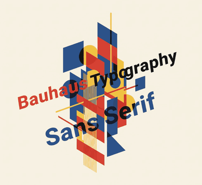
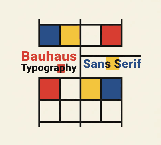
- Geometric shapes (circles, squares, triangles)
- Clear hierarchy and readability
- Bold use of negative space
- Sans serif letterforms that represent purity and modern thinking
This approach transformed typography across the world and became a foundation for modern graphic design.
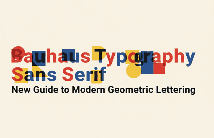
3. Key Characteristics of Bauhaus Typography Sans Serif Fonts
Bauhaus sans serif fonts typically share these features:
✔ Geometric Construction
Letters rely on basic shapes such as circles and straight lines. This leads to a clean and harmonious structure.
✔ Minimalist Strokes
Bauhaus typography avoids excessive curves or decorative elements, opting for consistent stroke width.
✔ High Legibility
Due to their simplicity and structural clarity, Bauhaus sans serif fonts remain readable even at small sizes.
✔ Modern Appeal
Although created in the early 20th century, the style feels futuristic and contemporary—making it versatile for modern branding.
✔ Bold and Confident
Many Bauhaus designs use thick, confident strokes to enhance visibility and create a strong visual identity.
4. Why Bauhaus Typography Sans Serif Matters in Modern Design
Even after 100 years, Bauhaus typography continues to dominate modern design trends. Here’s why:
A. Universality
Its clean geometric shapes make it suitable for various industries—technology, fashion, architecture, publishing, and more.
B. Timeless Aesthetic
Designers love Bauhaus fonts because they look modern regardless of era or medium.
C. Visual Balance
Its mathematical structure creates balanced compositions, ideal for logos, posters, and editorial layouts.
D. Versatility
Bauhaus sans serif fonts work across digital and print media, from websites to packaging design.
5. Best Uses for Inspired Bauhaus Typography Sans Serif Fonts
You can apply Bauhaus typography in many design projects, including:
- Corporate branding and identity
- Minimalist logo design
- Posters & editorial design
- Retro-modern artwork
- Product packaging
- Architectural and interior design presentations
- Website & UI/UX layouts
- Social media graphics
- Tech-based marketing campaigns
The clean and geometric style helps create a strong, memorable, and modern impression.
6. Recommended Bauhaus Typography Sans Serif from CalligraphyFonts.net
To help you apply Bauhaus-style typography in your projects, here are curated fonts from CalligraphyFonts.net that align with Bauhaus principles:
1. Pictorial Style Font
A clean display sans serif with sharp lines and modern aesthetics—perfect for minimal posters, logos, and editorial layouts.
Why It Works for Bauhaus Typography Sans Serif Style:
- Geometric foundations
- Bold, modern appearance
- Excellent for impactful headlines
2. Faint Green Font
A modern sans serif that balances simplicity and personality, ideal for branding, product packaging, and clean layout designs.
Why It Works for Bauhaus Typography Sans Serif Style:
- Minimalist character structure
- Smooth readability
- Works well for body text & titles
3. Kawaguchi Font
A structured, futuristic sans serif font inspired by geometric shapes. Suitable for tech branding, architecture portfolios, and modern advertisements.
Why It Works for Bauhaus Typography Sans Serif Style:
- Strong geometric influence
- Futuristic yet functional look
- Clear letterforms and balance
4. Overcame Font
Bold, straightforward, and minimal—Overcame is perfect for expressive modern layouts, poster designs, and identity systems.
Why It Works for Bauhaus Typography Sans Serif Style:
- Clean lines
- High visual impact
- Ideal for headlines and large typography
7. How to Use Bauhaus Typography Sans Serif Effectively
A. Use Lots of White Space
Bauhaus design thrives on open composition. Give typography room to breathe.
B. Pair with Simple Shapes
Geometric shapes like circles or rectangles reinforce the Bauhaus spirit.
C. Avoid Too Many Fonts
Use 1–2 Bauhaus-style sans serif fonts to maintain consistency.
D. Maintain Alignment
Use grid systems for layout and text structure.
E. Combine with Bold Colors
Red, yellow, blue, and black are classic Bauhaus color palettes.
F. Keep It Functional
Every typographic choice should serve a purpose—clarity comes first.
8. Conclusion Bauhaus Typography Sans Serif
Bauhaus Typography Sans Serif remains one of the most influential styles in modern design. Its geometric beauty, functional nature, and minimalist elegance make it an excellent choice for branding, posters, websites, and creative layouts.
With the curated font recommendations from CalligraphyFonts.net, you can bring the timeless Bauhaus aesthetic into your projects while maintaining a strong, professional visual identity.