Table of Contents
- Introduction
- Why Display Fonts for Logos Matter
- Key Traits of Effective Display Fonts for Logos
- Top Display Fonts for Logos
- Tips for Choosing the Right Display Fonts for Logos
- Conclusion
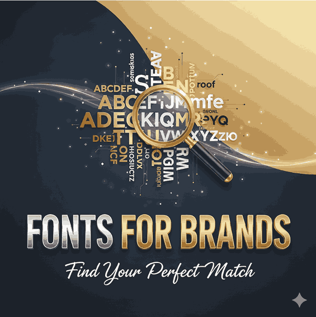
Introduction
Choosing the right display fonts for logos is one of the most important decisions in branding. Your logo is often the first impression customers have of your business, and the font you choose instantly communicates your brand’s personality, style, and values.
Using well-selected display fonts for logos ensures your brand stands out, is memorable, and clearly conveys your message. In this guide, we will explore why these fonts are essential, their characteristics, top recommendations, and tips to choose the perfect one for your logo.
Why Display Fonts for Logos Matter
Display fonts for logos are designed to grab attention and create a strong visual identity. Unlike standard text fonts, they are bold, distinctive, and often carry personality that aligns with your brand. Here’s why they matter:
- Immediate Recognition: Unique fonts help customers instantly recognize your brand.
- Personality & Style: Fonts communicate whether your brand is modern, playful, luxurious, or professional.
- Visual Impact: Display fonts naturally draw the eye, ensuring your logo stands out in any medium.
Reference: Smashing Magazine – Typography in Logo Design
Key Traits of Effective Display Fonts for Logos
When choosing display fonts for logos, look for these characteristics:
- Legibility: Ensure the font is readable at all sizes, from social media icons to billboard ads.
- Uniqueness: Your font should make your logo distinguishable from competitors.
- Brand Alignment: The style should match your brand’s tone, values, and target audience.
- Versatility: It should work across digital, print, and other media without losing impact.
A great display font balances creativity with clarity, ensuring your logo leaves a strong impression while remaining readable.
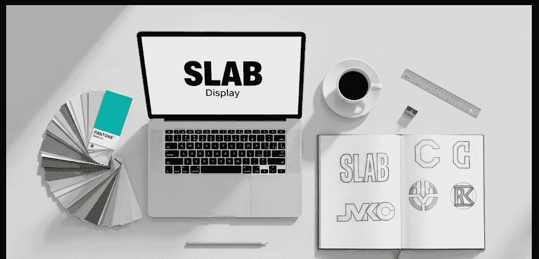
Top Display Fonts for Logos
Here are standout display fonts from CalligraphyFonts.net that can elevate your logo design:
1. Technophile Font
A futuristic, tech-inspired display font for logos. Perfect for digital brands and startups, Technophile brings a sleek, modern look that communicates innovation.
2. Denham Font
Denham blends classic elegance with modern style, making it ideal for professional brands that want to project sophistication and trustworthiness.
3. Neutrons Font
This geometric, minimalist font is perfect for logos that need clean lines and modern simplicity, conveying efficiency and clarity.
4. Kawaguchi Font
Kawaguchi brings a traditional Japanese aesthetic to logos, adding cultural depth and storytelling potential for brands that value heritage.
Reference: Creative Bloq – Fantastic Logo
Tips for Choosing the Right Display Fonts for Logos
- Know Your Audience: Choose fonts that appeal to your target demographic.
- Keep It Simple: Avoid overly complex fonts that reduce legibility.
- Test Across Media: Ensure the font looks great on websites, social media, and print.
- Consistency Matters: Match your display font with your brand’s overall visual identity.
- Experiment with Mockups: Use tools or examples like Technophile or Denham to visualize your logo.
Conclusion
Choosing the right display fonts for logos can transform your brand’s visual identity. By focusing on legibility, uniqueness, and brand alignment, you can create a logo that not only captures attention but also communicates your brand’s essence. Explore fonts like Neutrons and Kawaguchi to find the perfect fit for your brand.