
Table of Contents
- Introduction
- Why Photographers Need Photo Book Tools
- Core Features to Look for in Photo Book Publishing Tools
- Top Photo Book Publishing Tools for Photographers
- Integrating Typography & Branding in Photo Books
- Example Fonts to Elevate Your Photo Book Design
- Workflow Tips for Efficient Photo Book Publishing
- Common Pitfalls and How to Avoid Them
- Conclusion
- References
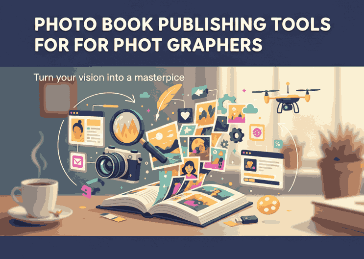
1. Introduction
In a world increasingly dominated by screens, physical photo books remain treasured keepsakes and powerful portfolio pieces for photographers. To produce a polished final product, you need the right photo book publishing tools for photographers—software that allows you to lay out images, add text, choose fonts, and output press-ready files without compromising design or quality.
This guide dives into what features matter, which tools are top-tier, and how to integrate branding and typography (including fonts) to make your photo books truly yours.
2. Why Photo Book Publishing Tools Matter for Photographers
Photographers often must wear many hats—shooter, editor, designer, and publisher. Good photo book tools help by:
- Automating layout and alignment
- Handling image color management and print settings
- Exporting in high-resolution, print-ready formats
- Enabling customization (captions, titles, typography)
Without dedicated tools, it’s easy to make layout errors, bleed issues, or misalignments that ruin the printed product.

3. Key Features of the Best Photo Book Publishing Tools
When evaluating tools, prioritize:
- Flexible layout and grid systems
- Image editing & color preview integrated
- Typographic controls (kerning, leading, font embedding)
- Export to print-ready PDF / TIFF with correct margins/bleeds
- Soft proofing & proofing modes
- Template libraries you can customize
- Support for high-resolution images & large file sizes
These features separate basic page-assemblers from professional publishing suites.
4. Top Photo Book Publishing Tools You Should Try
Here are some excellent tools that many photographers trust:
- Blurb BookWright — Offers layout flexibility, integration with printing services, and high-quality output.
- Adobe InDesign — The gold standard; full control over layout, typography, color, professional publishing.
- Affinity Publisher — A more affordable alternative to InDesign with nearly comparable layout and export features.
- Pixellu SmartAlbums — Focused on speed and simplicity, great for wedding and portrait shooters.
- Fundy Designer — Strong for album layout, multiple pages, and live design previews.
Each tool comes with pros and cons; choose one that matches your design needs and budget.
5. Integrating Typography & Branding in Photo Books
Your photo book is an extension of your brand. Consistent typography, logo placement, and styling matter. A few practices:
- Use a small set of brand fonts (title, subtitle, body)
- Embed your fonts so that layout doesn’t break when file moves between computers
- Maintain consistent margins, line spacing, and alignment
- Pre-proof how fonts look on print (sometimes what looks good on screen differs)
Fonts help your captions, credits, or chapter titles carry emotional weight without detracting from images.
6. Example Fonts to Elevate Your Photo Book Design
Here are some premium font styles from Calligraphy Fonts that work beautifully in photo book layouts:
- Lost in Smile Font — a graceful script that can elevate captions or title spreads.
- TrackWalker Classy Font — elegant serif or display option for section headings.
- Draw Sketch Font — hand-drawn aesthetic, suitable for creative or candid spreads.
- James Arthur Font — clean and modern font for body copy or commentary text.
These fonts help inject personality into your book while keeping readability and style in balance.
7. Workflow Tips for Efficient Photo Book Publishing
To stay efficient and reduce stress:

- Organize images by sequence before layout
- Use master pages/templates so you don’t recreate settings each spread
- Link text styles so caption formatting is consistent
- Proof early and often — order test prints
- Export with conservative downsampling for high-res output
- Back up your package (images + layouts + fonts) for safe keeping
A smooth workflow reduces errors and allows more creative focus.
8. Common Pitfalls and How to Avoid Them
| Pitfall | Solution |
|---|---|
| Poor bleed/margin settings | Always follow printer specs; preview with safety margins |
| Embedding font issues | Always embed fonts or convert to outlines when finalizing |
| Low image resolution | Use full-resolution originals; avoid upscaling |
| Overdecorative layouts | Let your photography shine — keep design subtle |
| Ignoring proof prints | Always order proofs; screen ≠ print color/contrast |
9. Conclusion
Choosing the right photo book publishing tools for photographers empowers you to transform your images into beautiful keepsakes or portfolio pieces without sacrificing design quality or brand identity. Pairing that with thoughtful typography (like the fonts listed above) and a smooth workflow leads to standout final products.
Your artistry deserves the best platform—use tools, techniques, and fonts that reflect your vision and professionalism.