

Table of Contents
- Introduction: Why Design Systems Matter in UI/UX
- What Is a UI/UX Design System?
- Core Components of a Design System
- Benefits of Using a UI/UX Design System
- How to Build a UI/UX Design System Step by Step
- Typography in UI/UX Design Systems
- Best Fonts for UI/UX Projects (with Examples)
- Common Mistakes to Avoid
- Conclusion
- References
1. Introduction: Why Matter in UI/UX Design Systems Guide
UI/UX Design Systems Guide Consistency is key in user experience (UX) and user interface (UI) design. As products grow, maintaining design harmony across multiple pages, apps, or devices becomes challenging. That’s where a UI/UX Design System comes in—it ensures consistency, efficiency, and scalability.
Whether you’re designing for a startup or a global brand, understanding how to create and manage a design system helps your team maintain visual identity and improve the overall user experience.

2. What Is aUI/UX Design Systems Guide?
A UI/UX design system is a structured collection of design rules, reusable components, patterns, and assets that define how an interface should look and behave. It’s like a “visual language” for your brand—covering everything from color schemes and typography to buttons and icons.
Famous examples include:
- Google’s Material Design
- Apple’s Human Interface Guidelines
- Atlassian Design System
These frameworks ensure that every product built under the same brand feels cohesive and intuitive.
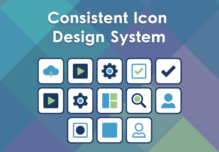
3. Core Components of a UI/UX Design Systems Guide
A well-built design system usually includes several key elements:
- Design Principles: Core values that guide visual and UX decisions.
- Color Palette: Defines the primary, secondary, and accent colors.
- Typography: Sets the tone of the brand with consistent fonts and text hierarchy.
- UI Components: Buttons, input fields, navigation bars, modals, etc.
- Spacing and Grid System: Ensures visual balance and alignment.
- Iconography and Imagery: Consistent visual symbols that support functionality.
Together, these elements form a living document that keeps all design and development work aligned.
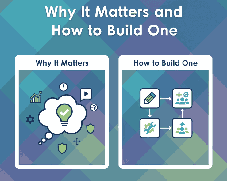
4. Benefits of Using a UI/UX Design Systems Guide
Implementing a design system provides multiple long-term advantages:
- Consistency: Every element across your platform looks and behaves the same.
- Efficiency: Teams reuse existing assets instead of designing from scratch.
- Scalability: New pages or apps can be developed faster and easier.
- Collaboration: Designers and developers work more cohesively with shared resources.
- Brand Recognition: A consistent aesthetic strengthens brand identity and trust.
In short, design systems make it easier to scale creativity without sacrificing usability.
5. How to Build a UI/UX Design Systems Guide Step by Step
Creating a design system might sound complex, but you can approach it in simple, structured steps:
- Audit Existing Designs: Review your current digital assets to find inconsistencies.
- Define Your Foundations: Set rules for color, typography, and grid layout.
- Create UI Components: Build reusable assets like buttons, modals, and icons.
- Document Everything: Use tools like Figma, Notion, or Zeroheight to document guidelines.
- Collaborate and Iterate: Involve developers and designers for feedback and continuous improvement.
- Maintain and Update: Treat your system as a living product that evolves over time.

6. Typography in UI/UX Design Systems Guide
Typography plays a vital role in any design system. The right font can establish hierarchy, readability, and emotional tone. Good UI fonts are:
- Legible at all sizes (for both desktop and mobile),
- Versatile (for headings, paragraphs, and buttons),
- Aligned with your brand’s personality.
Sans-serif fonts are popular in UI design for their clean and modern appearance, while script or calligraphy fonts can be used for accent branding, logos, or special feature screens.
7. Best Fonts for UI/UX Projects (with Examples)
If you want to add personality to your design system, try experimenting with premium fonts that balance readability and style. Here are a few great examples from CalligraphyFonts.net:
- Rellative Font – A sleek handwritten signature font perfect for logos, landing pages, or digital branding accents.
- Signatory Font – Clean and modern with elegant strokes, ideal for hero sections or creative UI headlines.
- Catcalling Font – A stylish calligraphy typeface that adds sophistication and uniqueness to brand-driven UI elements.
- Fieldstone Font – A refined serif-style display font that’s perfect for titles and headers in web or mobile layouts.
These fonts demonstrate how typography can enhance digital aesthetics while maintaining usability. When paired with strong color palettes and intuitive components, they elevate your entire UI/UX design.
8. Common Mistakes to Avoid
Even experienced designers can make missteps when building a design system. Avoid these pitfalls:
- Overcomplicating the system — Keep it simple and scalable.
- Ignoring documentation — Every component should have usage guidelines.
- Neglecting accessibility — Always test color contrast and font legibility.
- Not updating regularly — A stagnant system becomes outdated quickly.
A design system should grow alongside your product and adapt to user needs and design trends.
9. Conclusion
A well-structured UI/UX Design System bridges creativity and consistency. It saves time, improves collaboration, and ensures every user interaction feels intentional and polished.
By integrating thoughtful color choices, readable typography, and reusable UI components, you can create digital experiences that feel both beautiful and functional.
To give your design system a unique touch, explore premium fonts like Rellative, Signatory, Catcalling, and Fieldstone — available now on CalligraphyFonts.net. The right font can transform not just your text, but your entire design identity.
10. References
- Nielsen Norman Group — Design Systems 101
- Figma — The Ultimate Guide to Design Systems
- Din Studio — Everything About UI/UX Design Systems
- Atlassian Design System — Design with clarity Build with confidence