
Table of Contents
- Introduction
- The Origin of WPAP Art
- Who Is Wedha Abdul Rasyid?
- Defining the WPAP Art Style
- Key Characteristics of WPAP Art
- Why WPAP Matters in Indonesian Design
- WPAP Art and Typography: A Creative Connection
- Recommended Fonts for WPAP-Inspired Projects
- Conclusion
- References
1. Introduction
Indonesia has long been a hub for creativity, and one of its most iconic contributions to global design is WPAP Art Style Indonesia—short for Wedha’s Pop Art Portrait. The WPAP art style combines bold colors, sharp geometric shapes, and high-contrast portraits, creating a distinctive visual identity that celebrates individuality and national pride.
In this article, we’ll explore the origins, characteristics, and impact of the WPAP art style from Indonesia, as well as how typography and fonts can complement this dynamic aesthetic.
2. The Origin of WPAP Art Style Indonesia
WPAP (Wedha’s Pop Art Portrait) was pioneered by Wedha Abdul Rasyid, an Indonesian illustrator who first introduced the style in the 1990s.
At that time, digital tools were limited, and Wedha sought a new way to create portraits using color segmentation and geometric abstraction.
His experimental approach led to the birth of a new visual language—one that became a symbol of modern Indonesian creativity.
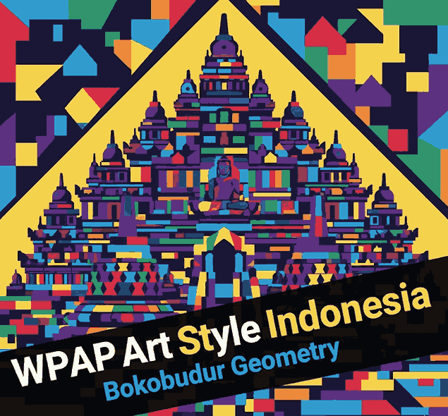
Today, WPAP art has evolved into a globally recognized style used in posters, murals, digital art, and brand design.
3. Who Is Wedha Abdul Rasyid?
Wedha Abdul Rasyid, born in 1951, is often referred to as the father of Indonesian Pop Art.
He began his artistic journey as a magazine illustrator before experimenting with simplifying portraits into flat, colorful planes.
His technique avoided natural shading or gradients—relying purely on geometry and contrast to define faces.
Wedha’s innovation turned into a movement of young digital artists, who adapted WPAP for contemporary mediums like NFTs, music covers, and advertising.
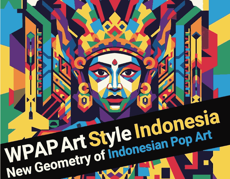
4. Defining the WPAP Art Style Indonesia
The WPAP art style is characterized by:
- Straight lines and geometric shapes: Every portrait is built using only straight edges—no curves.
- Vivid color blocks: Bright, contrasting colors replace traditional shading.
- Abstract yet recognizable portraits: Despite the abstraction, the subject’s identity remains clear.
- Pop culture influence: WPAP merges the energy of Pop Art with Indonesian creativity.
This combination makes WPAP instantly recognizable and visually striking—ideal for brands or artists wanting bold expression.
5. Key Characteristics of WPAP Art Style Indonesia
Let’s take a closer look at what defines WPAP’s unique visual DNA:
5.1 Geometric Abstraction
Every image is deconstructed into polygons, transforming organic shapes into angular patterns that maintain facial likeness through composition and color.
5.2 Vibrant Color Palette
WPAP thrives on strong, dynamic colors—purples, yellows, blues, and reds—to convey emotion and personality.
No blending or gradients are used—pure contrast drives depth and energy.
5.3 Flat Design Technique
WPAP completely avoids three-dimensional effects, creating a flat yet impactful visual effect that aligns well with modern design trends.
5.4 Cultural Identity
While inspired by Western pop art, WPAP’s spirit is distinctly Indonesian. It symbolizes diversity, vibrancy, and national identity through color and form.
6. Why Matters in WPAP Art Style Indonesia Design
WPAP is more than an art style—it’s a cultural phenomenon.
It represents Indonesia’s ability to innovate within global design languages.
Today, WPAP influences a wide range of creative fields:
- Advertising and Branding: Used for packaging, posters, and logo concepts.
- Digital Art and NFTs: Popular among modern illustrators and collectors.
- Education and Exhibitions: Taught in art schools as a homegrown design innovation.
The WPAP aesthetic continues to bridge traditional portraiture and modern digital design, inspiring new generations of artists.
7. WPAP Art Style Indonesia and Typography: A Creative Connection
Typography plays a vital role in balancing WPAP’s energetic visuals.
While the art focuses on geometry and color, the font choice should either:
- Complement the sharpness with bold sans-serif fonts, or
- Contrast it with smooth calligraphic fonts to soften the visual tension.
In branding or poster design, the right typeface enhances the impact and legibility of WPAP artwork.
This is where CalligraphyFonts.net comes in—offering fonts that merge artistic beauty with functional clarity.
8. Recommended Fonts for WPAP Art Style Indonesia-Inspired Projects
Here are four stunning fonts that perfectly complement WPAP-style visuals:
- Black Roll Font – A bold, confident font ideal for titles or logo designs that echo WPAP’s energy.
- Jungle Queen Font – Adds personality and flair to compositions with vibrant art backgrounds.
- Classicly Font – Elegant and timeless, perfect for pairing with geometric portraits.
- Overcame Font – Modern and versatile, great for posters or album covers inspired by pop art.
Each of these fonts embodies a sense of artistic freedom while maintaining readability—perfect for combining with WPAP visuals.
9. Conclusion
The WPAP Art Style Indonesia is a testament to how creativity can transcend boundaries.From Wedha Abdul Rasyid’s pioneering work to its presence in global digital design, WPAP has become a symbol of Indonesian modern art—bold, colorful, and full of character.
By combining WPAP’s geometric power with expressive typography from CalligraphyFonts.net, designers can craft visuals that tell stories, celebrate identity, and captivate audiences worldwide.
10. References
- CNN Indonesia – Wedha’s Journey with WPAP
- Din Studio – WPAP Art: An Indonesian Pop Art
- ArtStation – WPAP Gallery Inspiration