Posted on

International Typographic Style Principles: New Guide to Swiss Design

International Typographic Style Principles

Table of Contents

  1. What Is the International Typographic Style?
  2. Origins of Swiss Graphic Design
  3. Core Principles of International Typographic Style
  4. Typography Rules in Swiss Design
  5. Layout, Grid Systems, and White Space
  6. Font Mockup Examples Using Swiss Principles
  7. Why International Typographic Style Still Matters
  8. Final Thoughts

1. What Is the International Typographic Style Principles?

The International Typographic Style is a design movement that emerged in Switzerland in the 1940s and 1950s. Its primary goal is clear communication through objective, functional design.

Instead of decoration, Swiss designers focused on:

  • Readability
  • Structure
  • Visual hierarchy
  • Neutral typography

This approach influenced everything from posters and books to corporate branding, UI design, and editorial layouts.

International Typographic Style Principles

2. Origins of Swiss Graphic Design

Swiss Style was heavily influenced by:

  • Bauhaus principles
  • Constructivist art
  • Modernist architecture

Designers like Josef Müller-Brockmann and Max Miedinger emphasized grid systems, sans-serif typography, and asymmetrical layouts. Their work established rules that are still taught in design education today.

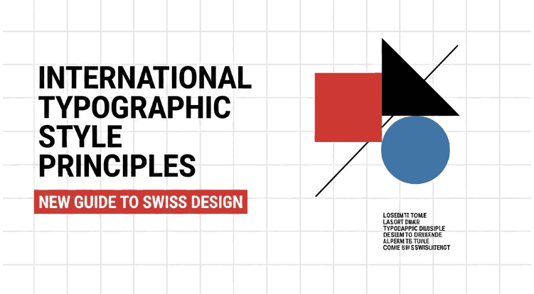
3. Core of International Typographic Style Principles

Understanding International Typographic Style principles starts with these fundamentals:

Clarity Above All

Design exists to communicate—not decorate. Every element must serve a purpose.

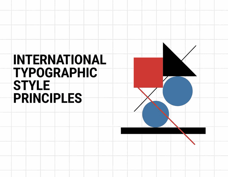
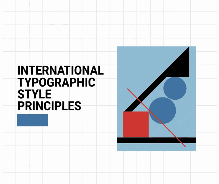
Asymmetrical Layouts

Instead of centered designs, Swiss Style favors dynamic, asymmetrical compositions guided by grids.

Limited Color Palettes

Designs often use black, white, and one accent color to maintain focus and consistency.

Objective Visual Language

The style avoids emotional excess, focusing instead on universal communication.

4. International Typographic Style Principles Rules in Swiss Design

Typography is the backbone of International Style design.

Key typographic characteristics include:

  • Sans serif fonts for neutrality
  • Consistent spacing and alignment
  • Strong hierarchy using size and weight
  • Minimal use of decorative typefaces

While classic Swiss typography relied on fonts like Helvetica or Univers, modern designers can apply the same principles using contemporary sans serif and clean display fonts.

5. Layout, Grid Systems, and White Space

The grid system is one of the most important Swiss design innovations. It helps designers:

  • Maintain consistency
  • Align text and visuals
  • Create visual rhythm

White space (or negative space) is equally important. Rather than filling every area, Swiss design allows layouts to breathe—improving readability and focus.

International Typographic Style Principles

6. Font Mockup Examples Using International Typographic Style Principles

Here are modern font examples from CalligraphyFonts.net that work well with International Typographic Style principles:

Ravenously Font

A modern sans serif font with strong structure and clarity—perfect for headlines and layouts that rely on grid systems.

Healing Time Font

Clean, functional, and highly readable, this font fits perfectly into Swiss-inspired editorial and UI layouts.

Dreamy Lanie Font

A minimal sans serif display font suitable for titles and large text blocks while maintaining Swiss design discipline.

Madame Grettha Font

An elegant, restrained font ideal for editorial layouts where clarity and refinement are essential.

These fonts show how modern typefaces can still respect Swiss principles while feeling contemporary.

7. Why International Typographic Style Principles Still Matters Today

Even decades later, International Typographic Style principles remain relevant because they:

  • Improve usability and readability
  • Work seamlessly in digital environments
  • Support responsive and UI design
  • Create timeless visual systems

Many modern design systems—especially in tech and corporate branding—are built on Swiss foundations.

International Typographic Style Principles

8. Final Thoughts International Typographic Style Principles

The International Typographic Style is more than a historical movement—it’s a design philosophy centered on clarity, structure, and purpose. By understanding and applying its principles, designers can create work that feels timeless, professional, and universally readable.

With modern fonts from CalligraphyFonts.net, you can apply Swiss design principles to contemporary projects without sacrificing personality or flexibility.

References

Posted on

Negative Space Design Examples: New Practices for Clean & Modern Design

Negative Space Design Examples

Table of Contents

  1. Introduction to Negative Space in Design
  2. What Is Negative Space Design?
  3. Why Negative Space Matters in Visual Communication
  4. Types of Negative Space in Design
  5. Negative Space Design Examples Across Creative Fields
  6. Typography and Fonts in Negative Space Design
  7. Font Mockup Examples for Negative Space Design
  8. Best Practices for Using Negative Space Effectively
  9. Common Mistakes to Avoid
  10. Final Thoughts

1. Introduction to Negative Space Design Examples

In modern visual communication, negative space design examples are often what separate average designs from truly memorable ones. Negative space—also known as white space—is the area around and between design elements. While it may seem “empty,” it plays a critical role in clarity, balance, and visual storytelling.

From logos and typography to packaging and web design, negative space allows viewers to focus on what truly matters. Designers who master this technique can create layouts that feel clean, premium, and professional.

Negative Space Design Examples

2. What Is Negative Space Design Examples?

Negative space design refers to the intentional use of empty or unused space to define, emphasize, or enhance visual elements. It is not about leaving areas blank, but about strategic spacing that improves readability and aesthetics.

In many famous negative space design examples, the space itself becomes part of the message—guiding the eye, creating hidden shapes, or improving focus.

3. Why Negative Space Design Examples Matters in Visual Communication

Negative space is essential because it:

  • Improves readability and comprehension
  • Creates visual hierarchy
  • Enhances focus on key elements
  • Makes designs feel more modern and professional
  • Reduces cognitive overload

Designs without enough negative space often feel cluttered and overwhelming, while well-spaced layouts feel intentional and elegant.

4. Types of Negative Space Design Examples

Understanding the types of negative space helps designers apply it more effectively:

Macro Negative Space

Large areas between major layout elements such as margins, sections, or blocks of content.

Micro Negative Space

Small spacing between letters, lines of text, icons, or buttons. This is especially important in typography.

Active Negative Space

Space deliberately used to guide attention or form visual meaning.

Passive Negative Space

Natural spacing that supports readability without drawing attention.

Successful negative space design examples usually combine multiple types of spacing harmoniously.

5. Negative Space Design Examples Across Creative Fields

Negative space is widely used across design disciplines:

  • Logo Design: Hidden symbols or shapes created by spacing
  • Typography: Letter spacing and line height for clarity
  • Packaging: Clean layouts that emphasize branding
  • Web Design: Improved UX and content scannability
  • Editorial Design: Balanced text and imagery

Many iconic brands rely on negative space to communicate sophistication and confidence.

6. Typography and Fonts in Negative Space Design Examples

Typography is one of the most powerful areas where negative space makes a difference. The right font, combined with thoughtful spacing, can transform a simple layout into a refined visual experience.

Fonts that work well for negative space design typically have:

  • Clear letterforms
  • Balanced stroke weight
  • Natural spacing
  • High readability

Premium fonts help ensure that negative space enhances the design instead of making it feel empty.

Negative Space Design Examples

7. Font Mockup Examples for Negative Space Design Examples

Below are professional font examples from CalligraphyFonts.net that work beautifully in negative space design mockups:

Curly Candy Font

A playful and expressive font that benefits from generous spacing, making it ideal for packaging, branding, and creative layouts where negative space highlights personality.

Blossom Aura Font

Elegant and flowing, this font shines when surrounded by white space, making it perfect for beauty, lifestyle, and premium product designs.

Sweet Crumble Font

A romantic calligraphy font that demonstrates how negative space can enhance readability and elegance in logos, invitations, and headlines.

Popcorn Chips Font

Bold and decorative, this font pairs well with strategic negative space to avoid visual overload while maintaining strong visual impact.

These fonts allow designers to clearly demonstrate how spacing and typography work together in effective negative space design examples.

8. Best Practices for Using Negative Space Design Examples Effectively

To master negative space in your designs:

  • Start with a clear visual hierarchy
  • Avoid filling every empty area
  • Use margins and padding intentionally
  • Test readability at different sizes
  • Let typography breathe

Negative space should feel natural, not forced.

9. Common Mistakes to Avoid

Even experienced designers can misuse negative space. Common mistakes include:

  • Treating negative space as wasted space
  • Overcrowding typography
  • Inconsistent spacing
  • Ignoring alignment
  • Using decorative fonts without enough breathing room

Avoiding these pitfalls ensures your designs remain clear and professional.

10. Final Thoughts

Negative space is one of the most powerful tools in a designer’s toolkit. The best negative space design examples show that what you leave out is just as important as what you include.

By combining thoughtful spacing with high-quality typography from CalligraphyFonts.net, you can create designs that feel balanced, elegant, and visually compelling—whether for branding, packaging, or digital media.

References

Posted on

Typography Games Kerning Online: The New Fun Way to Master Spacing

Typography Games Kerning Online

Table of Contents

  1. Introduction
  2. What Are Typography Games?
  3. Why Kerning Matters in Modern Design
  4. How Online Kerning Games Improve Your Skills
  5. Best Typography Games to Train Kerning
  6. Practical Ways to Apply Kerning Skills in Real Projects
  7. Recommended Fonts for Kerning Practice
  8. Final Thoughts
  9. References

1. Introduction Typography Games Kerning Online

Typography Games Kerning Online is more than choosing stylish fonts — it is about ensuring letterforms communicate clearly and beautifully. One of the most important yet often overlooked components of typography is kerning, the adjustment of spacing between individual letter pairs.

As design becomes more digital and competitive, understanding kerning becomes essential for graphic designers, typographers, brand creators, and UI/UX designers. Fortunately, learning kerning doesn’t have to feel like studying math — today, there are fun typography kerning games online that help sharpen your design instincts effortlessly.

This article explores these online games, why kerning is crucial, and how you can improve your spacing skills using interactive tools. We also include mockup font recommendations from CalligraphyFonts.net to inspire your projects.

Typography Games Kerning Online

2. What Are Typography Games Kerning Online?

Typography games are interactive digital games designed to teach visual design skills such as:

  • Kerning (adjusting letter spacing)
  • Tracking
  • Font pairing
  • Color matching
  • Grid alignment
  • Bézier curve manipulation

These games transform complex design principles into fun challenges that help train your visual sensitivity. They are especially helpful for:

  • Beginner designers
  • Students
  • Professional graphic designers wanting regular practice
  • Web/UI designers
  • Typography enthusiasts

The goal is simple: learn typography by playing, not memorizing.

3. Why Typography Games Kerning Online Matters in Modern Design

Kerning directly impacts how a brand or message is perceived. Poor kerning results in:

  • Awkward spacing
  • Misread words
  • Unprofessional visuals
  • Distracting text
  • Weak brand identity

Strong kerning, however, enhances:

  • Readability
  • Balance
  • Aesthetics
  • Brand signature look
  • Viewer trust

From logos to packaging to website headers, kerning determines whether text feels well-crafted or sloppy. This is why kerning games are extremely valuable — they train your eyes to spot spacing issues instantly.

4. How Typography Games Kerning Online Improve Your Skills

Kerning games offer instant skill development because they simulate real-world design challenges.

Benefits of Kerning Games

✔ Improve visual balance
✔ Sharpen spacing sensitivity
✔ Learn faster than reading theory
✔ Provide real-time corrections
✔ Strengthen typographic decision-making
✔ Help develop professional instinct

They also offer scoring systems so you can improve every time you play.

5. Best Typography Games Kerning Online to Train Kerning

Below are some of the top kerning games widely used in design education:

✔ KernType – The Kerning Game

A classic and highly popular kerning game where players adjust spacing between letters to match a typographer’s solution.

✔ ShapeType

Focuses on shaping letters using Bézier curves.

✔ Type War

A simple yet addictive game that sharpens your ability to identify fonts.

✔ Type Connection

A game about pairing fonts that work well together — great for designers doing branding work.

✔ Method of Action Bézier Game

Teaches how to manipulate curves precisely — essential for type designers.

These games make training enjoyable and give valuable muscle memory that improves your design workflow.

6. Practical Ways to Apply Typography Games Kerning Online Skills in Real Projects

Good kerning is essential across nearly all design categories:

Logo Design

Logo text must be perfectly spaced since it represents a brand permanently.

Brand Identity Design

Typography choices such as uppercase headings or handwritten scripts need balanced spacing to maintain consistency.

Web & UI Design

Proper kerning makes interfaces feel clean and professional.

Poster & Print Design

Large typography demands precise spacing to avoid visual imbalance.

Font Design / Custom Lettering

Kerning knowledge helps you understand how letters should interact harmoniously.

Typography Games Kerning Online

7. Recommended Fonts for Typography Games Kerning Online Practice (from CalligraphyFonts.net)

To enhance your typographic projects or create mockups, here are selected fonts from your website that are excellent for kerning exercises due to their clean shapes and consistent structure:

1. Overcame Font – Sans Serif

Perfect for learning kerning because of its bold, modern, and geometric letterforms.

2. Fieldstone Font – Modern Display

Ideal for stylish titles and kerning exploration, especially for uppercase spacing.

3. Faint Green Font – Clean Sans Serif

A minimalistic typeface that makes kerning practice easier and more precise.

4. Healing Time Font – Elegant Sans Serif

Suitable for practicing both subtle and wide kerning adjustments.

Using these fonts in mockups allows readers to visualize kerning improvements in real-world applications.

8. Final Thoughts Typography Games Kerning Online

Typography games are one of the most effective and enjoyable ways to sharpen your design intuition. Kerning might seem like a small detail, but it has a massive impact on branding, readability, and visual harmony.

By incorporating online typography games into your training routine — and practicing with well-designed fonts like Overcame, Fieldstone, Faint Green, and Healing Time — you can grow your design skills significantly faster.

Design is a journey, and kerning is a simple yet powerful step toward mastering it.

9. References

  • Avark — Type Terms
  • Din Studio — Games to Train Your Designing Skills
  • Font Pairings — Check typefaces and font pairings with this interactive tool
  • Method of Action — Method of Action creates tools, toys and games to help you learn design, for free.