Posted on

Analogous Colors Definition & How to Use Them in New Design

Analogous Colors Definition

Table of Contents

  1. Introduction
  2. What Is the Analogous Colors Definition?
  3. Why Analogous Schemes Create Visual Harmony
  4. Common Analogous Color Combinations & Examples
  5. Best Practices: Using Analogous Colors in Design
  6. Applying Analogous Palettes in Typography & Mockups
  7. Font Mockup Examples from Your Collection
  8. Tools & Tips to Create & Test Analogous Palettes
  9. Pitfalls to Avoid
  10. Conclusion & Next Steps
  11. References

1. Introduction

Color is one of the foundational building blocks of design. How you pick and combine hues determines mood, readability, cohesion, and emotional impact. Among the many color harmony techniques, Analogous Colors Definition schemes stand out for their subtle beauty and natural feel.

In this article, we’ll explore the Analogous Colors Definition, show you examples, and reveal how to use them effectively—especially in your font mockups, branding visuals, and creative assets.

2. What Is the Analogous Colors Definition?

The analogous colors definition refers to a set of colors that are adjacent to each other on the color wheel. In most applications, an analogous scheme consists of three hues: a base (dominant) color, and one or two supporting (neighbor) colors.

These neighboring hues share similar undertones, which gives analogous palettes a smooth, harmonious, and unified appearance—unlike complementary schemes, which emphasize high contrast.

For example:

  • Blue, blue-green, and green
  • Red, red-orange, and orange
  • Yellow, yellow-green, and green

In digital design, you can tweak saturation, brightness, or tone of these colors to achieve more depth and contrast.

Analogous Colors Definition

3. Why Analogous Schemes Create Visual Harmony

Analogous color schemes are praised for several reasons:

  • Low visual tension: Because the colors are similar in hue, they don’t “fight” each other. This makes them soothing to the eye.
  • Natural occurrences: You often see analogous schemes in nature (sunsets, foliage gradients), which makes them feel organic.
  • Cohesion & unity: They produce a unified look—great for backgrounds, branding, or layouts that shouldn’t feel busy.
  • Flexibility with contrast: Even though they are close in hue, you can achieve contrast by varying brightness, saturation, or applying neutrals (white, gray, black).

Because analogous schemes are more subtle than contrasting ones, they are often chosen when the goal is elegance, calmness, or aesthetic continuity.

4. Common Analogous Color Combinations & Examples

Here are typical triads of analogous hues you can experiment with:

  • Red → Red-Orange → Orange
  • Yellow → Yellow-Green → Green
  • Blue → Blue-Green → Green
  • Blue → Blue-Violet → Violet
  • Purple → Red-Violet → Red

Some designers extend schemes to 4 or 5 hues (neighboring spanning a small arc) as long as they remain adjacent without jumping across the wheel edges.

In interior design, for example, designers often use the 60 / 30 / 10 rule: 60% dominant color, 30% secondary analogous color, and 10% accent (which can be a more muted version).

5. Best Practices: Using Analogous Colors Definition in Design

To make analogous palettes work well, follow these tips:

  • Choose a dominant hue: Use one color for the bulk of your design (backgrounds, large shapes).
  • Support and accent: Use the neighboring colors more sparingly — for accents, buttons, borders, or decorative elements.
  • Vary lightness and saturation: Don’t use pure colors only — lighten or darken, desaturate to create depth.
  • Introduce neutral tones: Gray, off-white, black or very desaturated versions help give rest to the eyes and avoid monotony.
  • Mind contrast for usability: In UI or text design, make sure text is legible across these similar hues — sometimes you’ll need a complementary hue or neutral color to ensure readability.
  • Limit the range: Spread out too far along the wheel and you risk moving away from harmony. Keep the span narrow.

Analogous palettes are ideal when you want aesthetic smoothness rather than stark contrast.

6. Applying Analogous Colors Definition Palettes in Typography & Mockups

For a font/design business, applying analogous schemes can elevate mockups and branding visuals:

  • Use analogous hues for background → secondary shapes → highlight text layer.
  • For text overlays: Use one analogous color for fill, another (slightly darker or lighter) for subtle shadow or outline.
  • In UI or product previews: Use analogous tones in button states, hover effects, or navigation bars for consistency.
  • Combine analogous palettes with neutral typography (black, white) to maintain readability and grounding.

Because fonts and type are the focal point, using analogous color schemes gives them an elegant frame rather than overwhelming them.

Analogous Colors Definition

7. Font Mockup Examples from Your Collection

Here are fonts from your collection and some mockup ideas using analogous color schemes:

  • Classicly Font — Try a calm palette: soft blue, blue-green, and green. Use Classicly for headers and lighter variants for subtext.
  • Creatoria Font — Use warm analogous hues: peach, pink-peach, coral for creative branding visuals.
  • Ballerinas — Elegant pastel analogous colors such as lavender, violet, and blue-violet for feminine or graceful designs.
  • Overcame Font — Use bold analogous palette like orange, red-orange, and red to produce dramatic typographic compositions.

In each mockup, emphasize the dominant hue in backgrounds, the secondary in accents or decorative elements, and the third for smaller highlights. Show how the font remains legible but stylish within the analogous frame.

8. Tools & Tips to Create & Test Analogous Colors Definition Palettes

Here are useful tools and practices:

  • Adobe Color Wheel — switch to “Analogous” mode to generate triads.
  • Coolors.co — lock a hue and get adjacent ones.
  • Paletton — interactive color wheel with analogous scheme support.
  • Contrast checkers — ensure text vs background from your analogous palette remains legible.
  • Preview in context — test your palette on web pages or within your font mockups rather than in isolation.

Trial and iteration are key: you’ll often need to adjust brightness or saturation to make the palette work.

9. Pitfalls to Avoid

While analogous schemes are lovely, there are risks:

  • Too much monotony: All colors too similar can look flat.
  • Poor contrast: Text or UI elements may become unreadable if adjacent hues are too close.
  • Overusing full saturation: Pure colors next to each other can make your design look harsh or garish.
  • Ignoring neutral elements: Without blacks/whites/grays, the scheme may lack grounding.
  • Spanning too wide: If your analogous span covers too many hues, it starts to drift into other schemes and loses harmony.

By anticipating these challenges, you can better manage your palette choices.

10. Conclusion & Next Steps Analogous Colors Definition

The analogous colors definition is simple: hues next to each other on the color wheel, often used in sets of three. What makes them powerful is their ability to deliver harmony, subtlety, and visual cohesion.

For your font and design business, analogous palettes can enliven mockups, showcase your fonts in context, and provide mood without overwhelming contrast. Pair them with good typographic contrast and neutral grounding for the best results.

Next step: Pick a base hue from your branding or a font you want to spotlight. Use a tool to generate its adjacent analogous colors. Create a mockup with those three colors using one of your fonts and see how it feels. Iterate until it feels elegant and readable.

Kalau kamu mau, saya bisa bantu buat preset analogous color palettes (with hex values) khusus untuk font moods (elegant, bold, pastel) + file swatches yang bisa langsung kamu pakai. Mau saya kirim itu?

References

  • Pixflow — “What Is an Analogous Color Scheme? Definition, Examples & Uses”
  • Figma Dictionary — “Analogous Colors Definition & Examples”
  • Art in Context — “What Are Analogous Colors in Color Theory”
  • Creatopy — “What are analogous colors in graphic design”
Posted on

Triadic Color Combinations Examples: New Create Perfect Harmony in Design

Triadic Color Combinations Examples

Table of Contents

  1. Introduction: Why Color Harmony Matters
  2. What Are Triadic Color Combinations?
  3. The Psychology Behind Triadic Colors
  4. Best Triadic Color Combinations Examples
  5. How to Apply Triadic Colors in Graphic Design
  6. Triadic Colors in Branding and Typography
  7. Showcase: Fonts That Complement Triadic Palettes
  8. Useful Tools and Resources
  9. Conclusion

1. Introduction: Why Color Harmony Matters

Triadic Color Combinations Examples is one of the most powerful tools in design—it communicates emotions, defines brand identity, and influences perception. A well-balanced color palette can turn a simple design into a visually stunning masterpiece. Among the most reliable and creative methods for achieving balance is the Triadic Color Combinations Examples.

In this article, we’ll explore practical Triadic Color Combinations Examples, why they work, and how you can use them in your graphic design projects to achieve vibrant, eye-catching results.

2. What Are Triadic Color Combinations?

A triadic color combination consists of three colors that are evenly spaced around the color wheel. This means they are separated by 120 degrees, creating a perfect visual balance between contrast and harmony.

For example:

  • Red – Blue – Yellow
  • Orange – Green – Purple

Unlike complementary color schemes (which use opposite colors), triadic palettes provide a broader range of hues, making your designs more dynamic while maintaining visual coherence.

According to Canva’s Color Theory Guide, triadic schemes are especially effective in modern branding and web design because they are both bold and balanced.

Triadic Color Combinations Examples

3. The Psychology Behind Triadic Colors

Triadic combinations naturally create a sense of equilibrium. They allow each color to stand out without overwhelming the others. This makes them ideal for projects that need energy and vibrancy while still appearing professional.

  • Red evokes excitement and passion.
  • Blue symbolizes trust and calm.
  • Yellow conveys optimism and warmth.

When used together, these colors create visual interest and emotional harmony—perfect for marketing materials, websites, and social media visuals.

4. Best Triadic Color Combinations Examples

Here are some popular triadic color combinations you can use in your design projects:

1. Red – Blue – Yellow

A classic primary triad, perfect for playful, energetic designs like children’s brands or creative agencies.

2. Orange – Green – Purple

A bold and artistic palette, often used in lifestyle or entertainment branding.

3. Pink – Yellow – Cyan

A modern and youthful combination, great for tech startups or trendy product packaging.

4. Teal – Coral – Mustard

A warm yet sophisticated mix often seen in fashion or interior design visuals.

5. Navy – Gold – Crimson

A luxurious and elegant palette suitable for premium brands and editorial designs.

You can experiment with saturation and contrast levels to adjust the mood of your triadic scheme—keeping one color dominant and the others as accents often creates the best visual balance.

5. How to Apply Triadic Color Combinations Examples in Graphic Design

When using triadic palettes, the key is to maintain balance. Here are a few tips:

  • Pick a dominant color for your main elements.
  • Use the second color for highlights or secondary elements.
  • Reserve the third color for accents, buttons, or calls-to-action.

For web design, tools like Adobe Color Wheel or Coolors can help you generate and test triadic palettes effortlessly.

6. Triadic Color Combinations Examples in Branding and Typography

Triadic color harmony doesn’t only apply to images—it also enhances typography. Using fonts that complement your chosen palette can amplify the mood of your design.

For example:

  • Bold sans-serif fonts work well with vibrant, energetic color schemes.
  • Elegant script or calligraphy fonts pair beautifully with pastel triads.

To see how colors and typography combine beautifully, explore these font mockups from Calligraphy Fonts:

  • Rustte Font – Stylish and rustic, perfect for vintage palettes.
  • Classicly Font – Timeless serif that fits minimalist triadic designs.
  • Overcame Font – Modern and bold, ideal for vibrant color harmony.
  • Southlake Font – Natural and calm, perfect for earthy color triads.
Triadic Color Combinations Examples

7. Showcase: Fonts That Complement Triadic Color Combinations Examples

Typography plays a crucial role in color harmony. Pairing fonts with appropriate color combinations can completely transform a design’s tone.

For instance:

  • A triadic mix of navy, gold, and crimson with Classicly Font evokes sophistication.
  • A bright palette of pink, yellow, and cyan paired with Overcame Font creates a fun, tech-forward vibe.
  • A teal, coral, and mustard triad using Southlake Font offers an organic yet modern feel.

By combining these fonts with triadic color schemes, designers can achieve not just visual appeal but also emotional consistency.

8. Useful Tools and References

To help refine your understanding and create better triadic palettes, explore these useful resources:

9. Conclusion Triadic Color Combinations Examples

Triadic color combinations are a designer’s secret weapon for achieving balance, energy, and vibrancy. They give you flexibility to experiment while ensuring your compositions remain visually harmonious.

Whether you’re working on branding, digital graphics, or packaging, understanding how to use triadic color combinations can elevate your work to a new level of professionalism. Pair them with the right typography—like the beautiful selections available at CalligraphyFonts.net—and your designs will truly stand out.

Posted on

Unlock the Beauty of Double Complementary Color Palettes

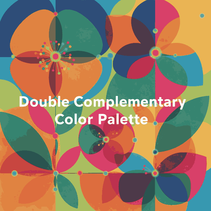
Double Complementary Color Palette

Table of Contents

  1. Introduction: Why Color Harmony Shapes Design
  2. What Is a Double Complementary Color Palette?
  3. The Power of Four: Advantages and Challenges
  4. How to Balance and Use Tetradic Colors
  5. Real Design Applications and Inspiration
  6. Applying Double Complementary Colors to Fonts
  7. Font Mockup Ideas for Designers
  8. Tools to Create Perfect Tetradic Palettes
  9. Final Thoughts and Pro Tips
  10. References

1. Introduction: Why Color Harmony Shapes Design

Colors are more than just decoration — they shape how people feel, perceive, and remember your brand. Whether you’re designing a logo, a web interface, or a font presentation, color harmony determines the impact of your work.

Among various color schemes, the Double Complementary Color Palette (also known as the Tetradic Color Scheme) stands out for its vibrancy and complexity. It offers endless creative possibilities — if you know how to control it.

For type designers and visual creators at CalligraphyFonts.net, mastering this palette helps you craft font mockups that look dynamic yet balanced, bold yet sophisticated.

Double Complementary Color Palette

2. What Is a Double Complementary Color Palette?

A Double Complementary Color Palette uses four colors arranged as two complementary pairs — for example:

  • Blue and orange
  • Green and red

These four colors form a rectangle on the color wheel, offering both contrast and variety.
This palette is also known as a Tetradic scheme because it uses four hues equally spaced around the color wheel.

Unlike monochromatic or analogous palettes, the double complementary setup gives you both warm and cool tones, creating an energetic and visually rich design.

3. The Power of Four: Advantages and Challenges

Advantages

  • Vibrant and versatile — You can express depth and personality in your design using four diverse hues.
  • Perfect for highlights — It allows creative use of accent colors for typography, icons, or buttons.
  • Balanced warm and cool contrast — This keeps visuals dynamic and emotionally balanced.

Challenges

  • Easily becomes overwhelming if all four colors are used equally.
  • Requires careful dominance — One color must take the lead, while others support it.
  • Color conflicts can occur if saturation or brightness levels clash.

To avoid chaos, pick one main color, use one as a secondary tone, and the other two only for highlights or accents.

4. How to Balance and Use Tetradic Colors

Balancing a four-color palette requires both artistic sense and technical planning. Here are practical tips:

  1. Choose a dominant hue.
    This color should cover around 60% of your design (like background or large shapes).
  2. Use secondary hues for support.
    Allocate around 30% for secondary visuals such as borders, icons, or graphic accents.
  3. Reserve the last pair for details.
    Keep them to 10% — perfect for typography effects or hover interactions.
  4. Desaturate or lighten secondary tones.
    This prevents harsh clashes and keeps harmony consistent.
  5. Add neutrals.
    White, gray, or beige spaces calm down the composition and improve readability.
Double Complementary Color Palette

5. Real Design Applications and Inspiration

Tetradic color harmony appears everywhere in digital and print design.
Here are a few ways professionals use it effectively:

  • Branding: A double complementary palette gives brands a dynamic and multidimensional look. For example, a combination of deep blue, orange, red, and green conveys energy and diversity.
  • UI Design: Designers use one color for primary buttons, its complement for hover states, and the second pair for accent borders or illustrations.
  • Poster Design: It’s common in modern poster layouts where one color dominates, and others appear in geometric or text details.

6. Applying Double Complementary Color Palette to Fonts

When it comes to typography and font mockups, this palette offers exciting visual potential — if handled with subtlety.

Try these design principles:

  • Use strong contrast: For example, orange text on a blue background looks bold and readable.
  • Highlight details: Apply the second complementary pair to emphasize swashes, ligatures, or shadows.
  • Add motion: Use color gradients or animated reveals that transition between complementary pairs.
  • Stay consistent: Don’t use all four colors in equal proportion — fonts must remain legible above all.

Combining color mastery with your custom fonts helps each design feel professional and intentionally artistic.

7. Font Mockup Ideas for Designers

Here are mockup ideas using your own fonts, designed to showcase how the double complementary palette enhances your font products:

  • Rostia Font — Use a deep blue base with orange lettering for a modern bold headline.
  • Jaycee Looks Font — Try muted red for text with soft green accents in background icons.
  • Creatoria Font — Combine warm and cool gradients for vibrant typographic posters.
  • Glitchy Font — Experiment with neon versions of double complementary hues for a futuristic vibe.

These examples demonstrate how color theory can elevate the value of your font designs and attract attention in marketing visuals or product previews.

8. Tools to Create Perfect Tetradic Double Complementary Color Palette

Designers don’t need to guess colors anymore — here are powerful free tools to experiment with your palette ideas:

  • Adobe Color Wheel – Generate tetradic palettes with precision.
  • Coolors.co – Save and test endless color combinations.
  • Paletton – Offers built-in “tetradic” mode for easy visualization.
  • Khroma AI – Uses AI to create harmonious palettes based on your preferences.
  • Viz Palette – Preview how your colors look on different backgrounds or charts.

Each of these tools helps refine your color combinations to achieve visual balance and emotional depth.

9. Final Thoughts and Pro Tips Double Complementary Color Palette

The Double Complementary Color Palette is a designer’s secret weapon — powerful, flexible, but demanding discipline.
Used wisely, it can create unforgettable branding, sleek typography, and visually rich layouts.

Pro Tips Recap:

  • Pick one dominant hue — let others support it.
  • Use neutral backgrounds for readability.
  • Reduce saturation when using all four hues together.
  • Apply the 60–30–10 balance rule.
  • Test color accessibility and contrast before finalizing your palette.

When paired with your signature fonts from CalligraphyFonts.net, these color strategies will help your designs stand out — bold, professional, and timeless.

10. References