Table of Contents
- Introduction
- Why Understand Font Categories?
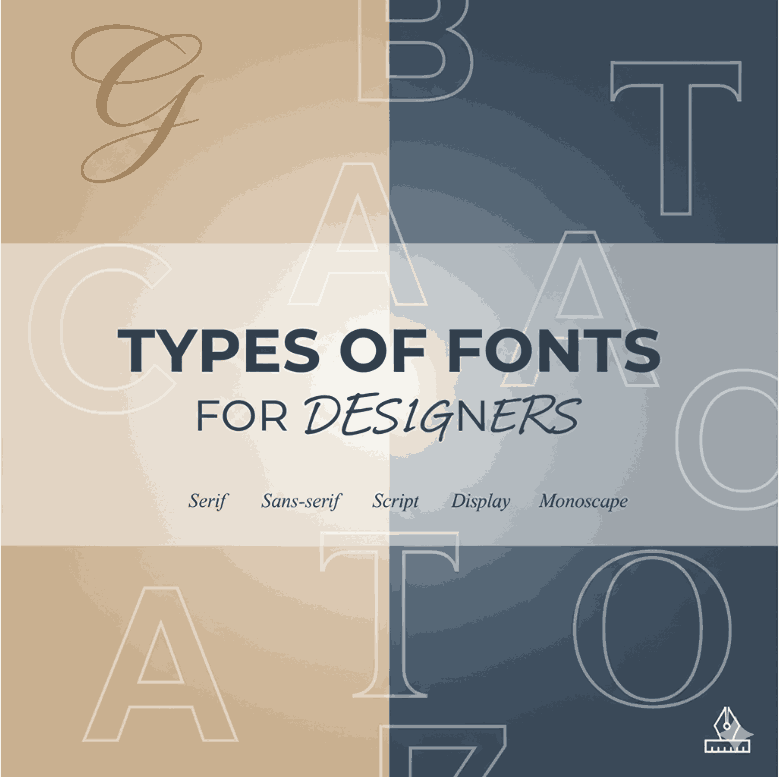
- Major Font Categories (and Their Traits)
3.1 Serif Fonts
3.2 Sans-Serif Fonts
3.3 Script Fonts
3.4 Display & Decorative Fonts
3.5 Monospaced & Handwritten Fonts - How to Choose Font Categories for Your Project
- Mixing Fonts: Do’s & Don’ts
- Fonts as Brand Assets: Mockup Examples
- Case Study & Best Practice Insights
- Conclusion
- References
1. Introduction
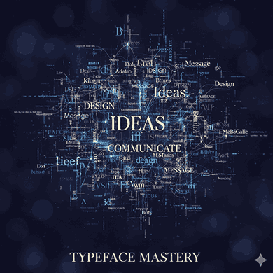
Every designer, typographer, or brand owner should know: font categories explained is not just academic—it’s foundational. Fonts do more than render text; they carry tone, voice, identity, and clarity. Understanding font categories is key to selecting the right typefaces for your project, enhancing readability, and reinforcing brand perception.
In this article, we’ll explain the main font categories, how to apply them in design, pitfalls to avoid, and how your own fonts (or mockups) can fit into this typographic taxonomy.
2. Why Understand Font categories explained?
Knowing font categories explained helps you:
- Communicate more effectively (match style with message)
- Improve readability and legibility
- Establish a consistent visual identity
- Avoid typographic clashes or confusion
Designers often misuse fonts because they fail to grasp their underlying classifications and behavioral characteristics.
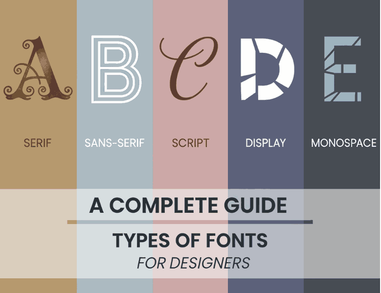
3. Major Font categories explained (and Their Traits)
3.1 Serif Fonts
Serif fonts have small decorative strokes (serifs) at their letter ends. These evoke tradition, formality, and elegance. Common sub-categories include old style, transitional, modern, and slab serif.
Use cases: books, magazines, editorial text, formal branding.
Pros: excellent readability in print and long text.
Cons: may appear heavy on screens at small sizes.
3.2 Sans-Serif Fonts
Sans-serif (“without serif”) fonts are cleaner and more modern. They have no extra strokes at ends, achieving a minimal, neutral, contemporary feel.
Use cases: digital interfaces, UI, headlines, modern brands.
Pros: high legibility on screens, scalable.
Cons: may lack personality if overused.
Sub-types: Grotesque, Neo-Grotesque, Geometric, Humanist.
3.3 Script Fonts
Script fonts mimic handwriting or calligraphy, featuring fluid, connected strokes. They convey elegance, personality, and emotion.
Use cases: logos, wedding cards, invitations, accents.
Pros: offers visual flair and unique identity.
Cons: can harm legibility if used for large bodies of text.
3.4 Display & Decorative Fonts
These fonts are designed to attract attention at large sizes. They often break conventional rules, have exaggerated forms, or elaborate styling.
Use cases: headlines, posters, branding, special effects.
Pros: high impact and memorability.
Cons: often unreadable at small sizes; overuse can distract.
3.5 Monospaced & Handwritten Fonts
- Monospaced: Each character occupies the same width (useful for code, tabular layouts).
- Handwritten: Mimics natural handwriting (looser than script). Useful in creative or expressive contexts.
Use cases: interfaces, code editors, casual designs.
Pros: clarity in context, character.
Cons: limited use in long paragraphs.
4. How to Choose Font categories explained for Your Project
When choosing after understanding font categories explained, consider:
- Tone & Mood: Serif = trust, tradition. Sans = modern, clarity. Script = elegance.
- Medium: Print vs digital: screen favors sans-serif or optimized serif.
- Legibility Needs: Avoid ornate or decorative fonts in body text.
- Brand Identity: Does the font reflect your core values?
- Pairing Compatibility: Choose categories that harmonize when paired.
5. Mixing Fonts: Do’s & Don’ts
- Do pair a serif with a sans-serif for contrast.
- Do limit font families: 2–3 is ideal.
- Do maintain hierarchy and visual rhythm.
- Don’t pair two fonts from the same class that are very similar (risk confusion).
- Don’t mix too many decorative or display types in one layout.
6. Fonts as Brand Assets: Mockup Examples
Your custom fonts can act as signature elements in brand systems. Here are some examples from your own catalog:
- Holdsmith – elegant script for signature wordmarks.
- Technophile – modern, technical sans-display font.
- Jaima Kaira – versatile modern serif/sans hybrid.
- Shailendra – classic serif style for editorial or branding.
Using these fonts consistently across projects—logos, packaging, web—reinforces brand identity and trust.
7. Case Study & Best Practice Insights
- Many design systems (e.g., Google’s Material, IBM Carbon) define their typographic hierarchy by category.
- Brands like Airbnb mix custom sans-serif with display accents — both categories but careful harmony.
- Always test fonts in real context: web, mobile, print. A decorative font that shines on poster may fail on mobile.
8. Conclusion
Understanding font categories explained empowers you to make better, more purposeful design choices. From readability to brand voice, each category has its role. By selecting the right font category for each use case, and using your own fonts as brand assets, your designs will be more coherent, meaningful, and effective.