Table of Contents
- Introduction: Why Color Theory Matters in Design
- The Basics of Color Theory
- The Color Wheel
- Primary, Secondary, and Tertiary Colors
- Understanding Color Harmony
- Complementary Colors
- Analogous Colors
- Triadic and Monochromatic Schemes
- The Psychology of Colors
- How to Choose the Right Color Palette
- Applying Color Theory in Graphic and Font Design
- Recommended Fonts for Color-Based Design Projects
- Conclusion
- References
1. Introduction: Why Color Theory Matters in Design
Color Theory for Beginners is one of the most powerful tools in design. It influences perception, evokes emotion, and helps convey brand identity. For beginners, understanding color theory is the first step to mastering visual communication. Whether you’re designing logos, websites, or typography art, color choices determine how your message resonates with the audience.

2. The Basics of Color Theory for Beginners
Color theory is a framework that explains how colors interact with one another. It combines artistic principles and scientific understanding to help designers create visually balanced and appealing compositions.
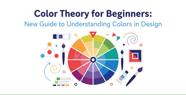
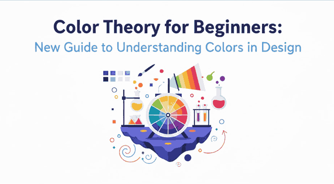
The Color Wheel
At the heart of color theory lies the color wheel, a circular chart that shows the relationships between colors. It includes primary, secondary, and tertiary colors.
- Primary colors: Red, Blue, and Yellow — cannot be created by mixing other colors.
- Secondary colors: Green, Orange, and Purple — formed by mixing two primary colors.
- Tertiary colors: Created by mixing a primary and a secondary color (e.g., Blue-Green, Red-Orange).
This wheel helps designers easily identify complementary or harmonious color combinations.
3. Understanding Color Theory for Beginners Harmony
Color harmony is the visual balance achieved when colors are combined effectively. It ensures your designs feel cohesive and pleasing to the eye.
Complementary Color Theory for Beginners
Colors that sit opposite each other on the color wheel (e.g., blue and orange). This combination creates strong contrast and high visual energy.
Analogous Color Theory for Beginners
These are colors that sit next to each other (e.g., yellow, yellow-green, and green). They produce a smooth and harmonious effect—perfect for calm and natural designs.
Triadic and Monochromatic Schemes
Triadic schemes use three colors equally spaced around the wheel, while monochromatic schemes use variations of one hue with different values and saturations. Triadic palettes add vibrancy, while monochromatic palettes provide simplicity and elegance.
4. The Psychology of Color Theory for Beginners
Every color carries emotional and psychological associations. Here’s a quick guide to help beginners understand the psychological impact of colors:
- Red: Passion, energy, and urgency.
- Blue: Calmness, trust, and professionalism.
- Yellow: Optimism and creativity.
- Green: Nature, balance, and growth.
- Purple: Luxury and sophistication.
- Black & White: Simplicity and contrast—used to create clarity and focus.
Knowing these meanings helps designers choose colors that align with their brand’s message or design goal.
5. How to Choose the Right Color Theory for Beginners
Choosing the perfect color palette can be challenging. Here are some quick tips for beginners:
- Start with your brand personality. Identify your brand’s tone—fun, elegant, minimalist, or bold.
- Use online tools. Platforms like Adobe Color or Coolors help generate color palettes easily.
- Maintain contrast for readability. When designing with fonts or text, ensure high contrast between text and background colors.
- Limit your palette. Three to five colors are usually enough for balanced design.
6. Applying Color Theory in Graphic and Font Design
Fonts and colors go hand in hand. The right combination can make your design stand out, while poor pairing can ruin even the best typography.
For example:
- Warm colors (reds, oranges, yellows) work well with handwritten or bold script fonts, creating energy and excitement.
- Cool colors (blues, greens) match perfectly with modern sans-serif fonts, giving a calm and professional vibe.
When using calligraphy fonts, balance is key — avoid overly bright combinations that can make the text hard to read.
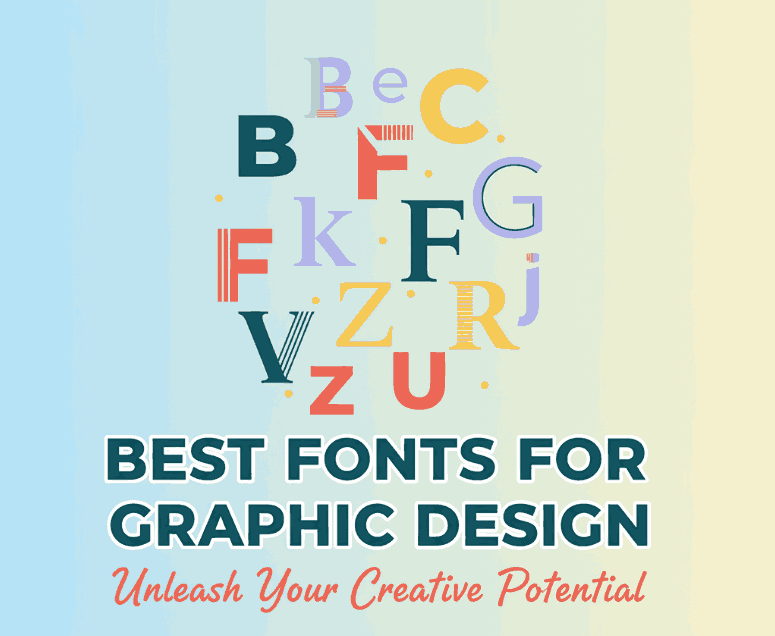
7. Recommended Fonts for Color-Based Design Projects
Here are some beautiful font recommendations from CalligraphyFonts.net that complement your color-based designs perfectly:
- Holters Font – A clean, modern sans-serif perfect for minimalist color palettes and branding.
- Rutinitas Font – A casual handwritten style ideal for creative projects and colorful logos.
- Leathering Font – Elegant and luxurious, perfect for premium product packaging with soft or neutral tones.
- Anthonyela Calligraphy Font – Beautifully flowing calligraphy font that shines in pastel and elegant color schemes.
Try experimenting with these fonts and various color harmonies to see how different tones can transform your typography and overall design aesthetic.
8. Conclusion
Mastering color theory for beginners is not just about memorizing a color wheel — it’s about understanding how color influences perception and emotion. By applying the right combinations, you can elevate your designs, highlight your message, and attract more attention.
Combine your newfound color knowledge with high-quality fonts from CalligraphyFonts.net, and your design projects will instantly feel more cohesive, professional, and visually stunning.