Table of Contents
- What Is Visual Hierarchy in Design?
- Why Visual Hierarchy Matters
- Key Principles of Visual Hierarchy
- Practical Tips to Improve Visual Hierarchy
- Using Fonts to Enhance Hierarchy
- Final Thoughts
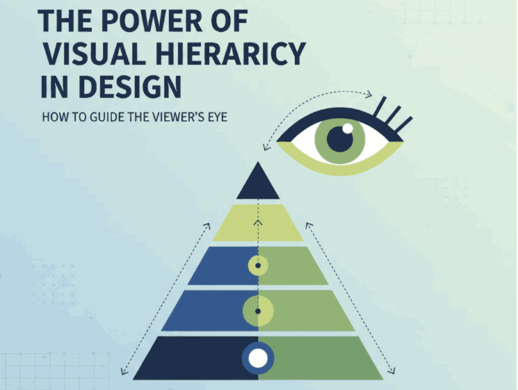
1. What Is Visual Hierarchy in Design?
Visual hierarchy in design refers to the strategic arrangement of elements in a way that clearly communicates their order of importance. In simpler terms, it’s how designers guide the viewer’s eye from the most important element to the least.
When used effectively, visual hierarchy helps audiences absorb information naturally and efficiently — whether on a website, poster, logo, or social media post. It’s the foundation that makes a design both aesthetically pleasing and functionally effective.
2. Why Visual Hierarchy in Design Matters
A well-crafted visual hierarchy is the secret to communicating your message clearly. When hierarchy is missing, your design can appear cluttered or confusing — leaving your audience unsure where to look first.
Here’s why it’s important:
- Enhances readability and comprehension. Clear hierarchy helps users process content effortlessly.
- Directs attention strategically. It emphasizes what’s most important — such as a headline, product name, or call-to-action.
- Creates emotional engagement. Proper balance and contrast create flow, making your design feel dynamic and professional.
When done right, visual hierarchy turns ordinary layouts into captivating compositions that tell a visual story.
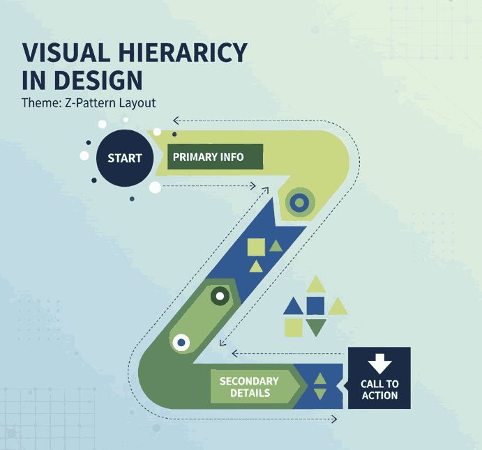
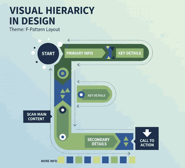
3. Key Principles of Visual Hierarchy in Design
There are several foundational principles every designer should understand when applying visual hierarchy:
a. Size and Scale
Larger elements naturally attract more attention. Headings, key images, or call-to-action buttons should be visually dominant compared to supporting text.
b. Color and Contrast
High-contrast colors help highlight important information, while muted tones guide attention elsewhere. Designers often use color psychology to evoke specific emotions.
c. Alignment and Balance
Proper alignment establishes harmony and order. Balanced compositions feel stable and trustworthy, while asymmetrical layouts can create energy and focus.
d. Typography
Font choice dramatically affects perception. Serif fonts convey elegance, sans-serif fonts show modernity, and script or calligraphy fonts express creativity and warmth.
e. White Space
Negative space isn’t “empty” — it’s a powerful tool to separate elements and improve focus. Well-used white space enhances sophistication and clarity.
4. Practical Tips to Improve Visual Hierarchy
To make your designs more visually structured and appealing, consider the following actionable tips:
- Establish a focal point: Always determine the element you want viewers to notice first.
- Use consistent typography styles: Keep heading, subheading, and paragraph fonts distinct but cohesive.
- Play with proximity: Group related items together to indicate relationships.
- Create rhythm with repetition: Repeating colors, shapes, or lines helps unify your composition.
- Experiment with grid systems: They help maintain consistent spacing and structure across multiple design formats.
5. Using Fonts to Enhance Hierarchy
Typography plays a central role in visual hierarchy. The right font choice can immediately set the tone of your design and help guide the viewer’s eye.
Here are some stunning examples from CalligraphyFonts.net that can elevate your design hierarchy:
- Holters Font – A sophisticated calligraphy typeface that’s perfect for headings and luxury branding.
- Salvations Font – A bold yet elegant script font that draws immediate attention, ideal for quotes and logo marks.
- Dinernighty Font – Retro-inspired with strong letterforms, perfect for highlighting focal text or signage.
- Banana Delight Font – A playful handwritten script that adds warmth and personality to any visual layout.
When combining fonts, maintain contrast and consistency:
- Use one typeface for titles and another for body text.
- Pair bold display fonts with simple sans-serif fonts to achieve visual balance.
- Avoid overusing decorative fonts — one accent typeface is usually enough to stand out.
Good typography hierarchy isn’t just about style; it’s about clarity, flow, and emotion.
6. Final Thoughts
Mastering visual hierarchy in design is one of the most valuable skills for any graphic designer, brand builder, or creative entrepreneur. It ensures your audience sees, feels, and understands your message exactly as intended.
Whether you’re crafting a brand identity, poster, or web layout, remember that hierarchy guides perception.
Experiment with size, color, alignment, contrast, and font choice until your design feels intuitive and balanced.
And if you’re searching for the perfect fonts to elevate your next creative project, explore more exclusive typefaces at
CalligraphyFonts.net — where design meets emotion.
References
- DinStudio – 5 Basic Principles of Layout in Graphic Design
- Canva Design School – What Is Visual Hierarchy in Design?
- Interaction Design Foundation – Visual Hierarchy and Its Role in UX Design