

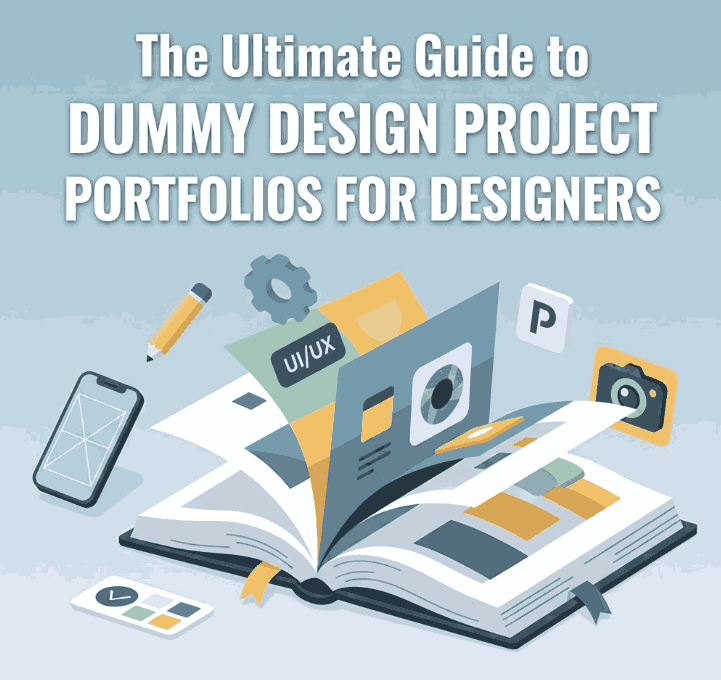
Table of Contents
- Introduction
- What Is a Dummy Design Project Portfolio?
- Why Dummy Projects Matter for Designers
- When You Should Use Dummy Projects
- How to Create Effective Dummy Design Projects
- Choose a Realistic Brand Concept
- Define the Project Scope
- Build a Complete Visual Direction
- Use High-Quality Typography
- Present the Final Mockups
- Best Fonts for Dummy Design Project Mockups
- Tips to Make Your Dummy Portfolio Look Professional
- Common Mistakes to Avoid
- Final Thoughts
- References
1. Introduction Dummy Design Project Portfolio
Dummy Design Project Portfolio is the backbone of a creative career—whether you are a graphic designer, branding specialist, illustrator, or font creator. But what if you are new to the industry or simply lack enough commercial projects to showcase? This is where the Dummy Design Project Portfolio comes in.
Dummy projects (also known as spec work, self-initiated projects, or conceptual projects) allow designers to demonstrate skills, creativity, style, and problem-solving ability—even without client work. In this article, we will explore how to create impactful dummy projects, which fonts work best for showcasing your mockups, and how they can dramatically elevate your portfolio’s visual appeal.
2. What Is a Dummy Design Project Portfolio?
A Dummy Design Project Portfolio is a curated collection of design works created without a real client. These projects are often conceptual, self-initiated, or crafted for practice and portfolio enhancement.
They can include:
- Fictional brand identities
- Mock product packaging
- Poster and advertisement designs
- Magazine or layout designs
- UI/UX redesigns
- Creative typography compositions
These projects aren’t commissioned—they are crafted to showcase your ability, style, and design thinking.
3. Why Matter Dummy Design Project Portfolio
Creating dummy projects is a powerful way to grow your career. Here’s why:
✔ Build Skills
They help you practice real-world workflows—from research to concept to execution.
✔ Showcase Your Style
Dummy projects reflect your personal aesthetic, not limited by client demands.
✔ Demonstrate Versatility
You can design for industries you want to work in: beauty, food, apparel, tech, lifestyle, etc.
✔ Build Client Trust
Professionally presented dummy projects can be as convincing as real commissions.
✔ Fill in Portfolio Gaps
Perfect for beginners or designers transitioning to a new niche.
According to Adobe Creative Cloud’s portfolio guidelines, conceptual work is acceptable as long as it clearly demonstrates expertise and storytelling. This makes dummy projects widely recognized and valued in the industry.
4. When You Should Use Dummy Design Project Portfolio
Dummy design projects are especially useful when:
- You have limited client work
- You want to enter a new design specialty
- You are building your brand identity as a designer
- You want to practice using new tools, fonts, or techniques
- You need high-quality content for Behance, Dribbble, or your portfolio website
These types of projects help you grow, experiment, and build a strong visual resume.
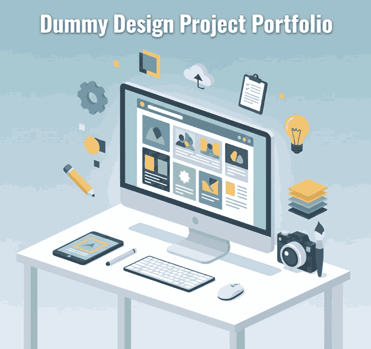
5. How to Create Effective Dummy Design Project Portfolio
1. Choose a Realistic Brand Concept
Start by selecting a fictional brand name, target audience, and industry.
For example:
- Organic skincare brand
- Coffee shop identity
- Luxury perfume packaging
- Festival poster design
The brand must feel believable and relatable.
2. Define the Project Scope
Determine what you will design:
- Logo
- Color palette
- Typeface selection
- Packaging
- Social media posts
- Website or UI screens
- Advertising poster
A clear scope helps maintain consistency.
3. Build a Complete Visual Direction
Design your visual identity as if for a real client:
- Moodboard
- Color theory
- Typography system
- Layout guides
- Graphic elements
This improves storytelling and strengthens your portfolio.
4. Use High-Quality Dummy Design Project Portfolio
Typography is one of the strongest tools in visual branding. Using premium fonts makes your dummy designs look polished and professional. Below, you’ll find curated font recommendations from CalligraphyFonts.net.
5. Present the Final Mockups
Great presentation increases perceived value.
Use:
- Product packaging mockups
- Poster mockups
- Branding mockups
- Social media layouts
- Stationery mockups
This transforms simple designs into professional visual assets.
6. Best Fonts for Dummy Design Project Portfolio Mockups (From CalligraphyFonts.net)
To make your dummy projects look premium and elegant, here are four recommended fonts—perfect for logos, packaging, and branding presentations:
1. Super Dreamer Font
Perfect for creating artistic and expressive branding concepts, especially for lifestyle and handmade product mockups.
2. Mellow Summer Font
Soft, relaxed, and natural—ideal for packaging, social media templates, and creative portfolios.
3. James Arthur Font
A signature-style font suitable for luxury branding, fashion labels, and personal logos.
4. Brothels Brush Font
A bold brush font with a strong artistic personality—great for posters, streetwear brands, and bold statement designs.
Each of these fonts adds character and visual impact to dummy project presentations.
7. Tips to Make Your Dummy Design Project Portfolio Look Professional
✔ Keep each project cohesive
Avoid mixing too many styles in one project.
✔ Add explanations
A short case-study format helps clients understand your thought process.
✔ Use realistic mockups
High-quality mockups make your designs feel more authentic.
✔ Focus on storytelling
Every brand identity should reflect a purpose and personality.
✔ Maintain consistent layout
Clean spacing, alignment, and color balance are essential for portfolio polish.
8. Common Mistakes to Avoid
- Using too many random styles
- Adding low-quality images
- Overusing free fonts with poor readability
- Not showing your design process
- Creating unrealistic brand concepts
- Lack of consistency in visual hierarchy
Avoiding these mistakes will significantly improve your dummy project presentation.
9. Final Thoughts Dummy Design Project Portfolio
A Dummy Design Project Portfolio is one of the most powerful tools for designers—especially beginners or creatives transitioning into new fields. By combining purposeful design thinking, high-quality typography, and professional mockups, you can build a stunning portfolio that attracts real clients.
Start creating your dummy projects today and elevate your visual identity using premium fonts from CalligraphyFonts.net.
10. References
- Adobe Creative Cloud – Portfolio Tips
- Din Studio – Tips for Preparing your Portfolio
- Nielsen Norman Group – Visual Design & Branding Guidelines


