Table of Contents
- Introduction
- Why Color Matters for Halloween Designs
- Trend Signals & Influences for 2024–2025
- Top 6 Modern Halloween Color Combinations
- 4.1 Deep Black + Neon Accents
- 4.2 Muted Neutrals + Subtle Spooky Highlight
- 4.3 Jewel Tones & Rich Hues
- 4.4 Pastel Horror (Pinkoween & Ghostly Shades)
- 4.5 Earthy & Organic Halloween Tones
- 4.6 Monochromatic with a Splash
- How to Use These Palettes in Your Font Mockups
- Tips for Balancing Readability & Atmosphere
- Case Study Mockup Examples
- Final Recommendations
- References
1. Introduction
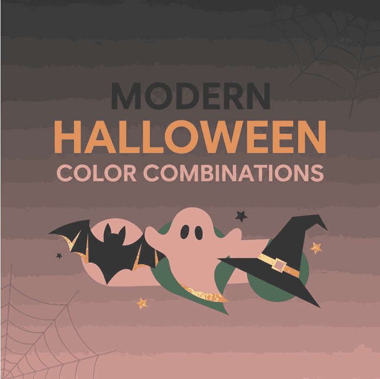
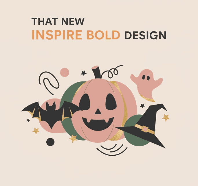
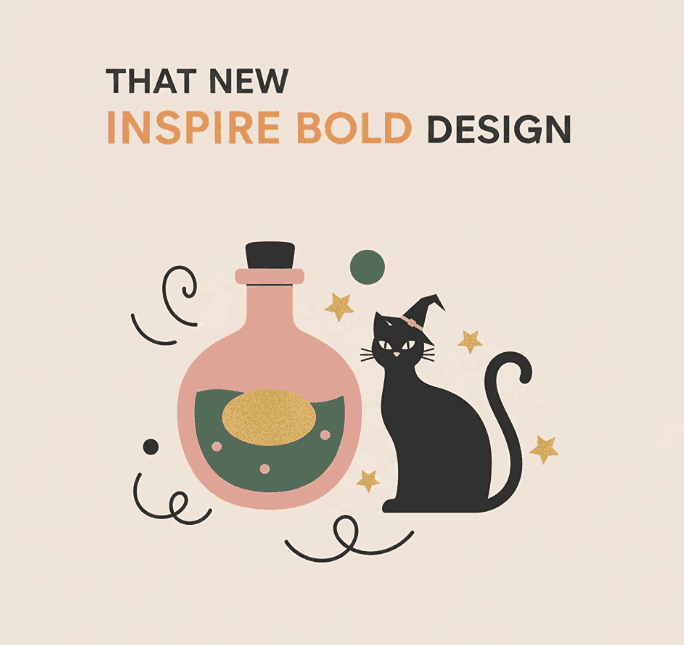
Halloween design has evolved. Gone are the days when only black and orange ruled every spooky poster or invitation. Today, designers are experimenting with Modern Halloween color combinations that bring sophistication, surprise, and a fresh twist to spooky aesthetics.
If you’re a font designer, marketer, or visual creator, the palette you choose can elevate font mockups, branding, and campaign visuals. This guide helps you explore trending color combos, apply them thoughtfully, and present your fonts in a way that fits the Halloween mood and stands out.
2. Why Color Matters for Modern Halloween Color Combinations
Color is fundamental in conveying mood, tone, and readability. For Halloween:
- Mood & Emotion: Dark hues, contrasts, and accent colors set spooky or ethereal atmospheres.
- Legibility: Fonts need proper contrast — too low contrast makes them unreadable, especially in promotional visuals.
- Branding & Uniqueness: Using unexpected color combos helps your designs stand out from the flood of “orange + black” visuals.
When your font mockups adopt a striking palette, potential buyers can better imagine how they’ll use your font in real seasonal designs.
3. Trend Signals & Influences for 2024–2025
Design trend reports and Halloween decor insights point to some shifting color directions:
- Dark + Neon accents: Platforms project that combining deep black with neon purples, greens, or orange creates a “mysterious yet modern” feel.
- “Spooky-Chic” aesthetics: According to Forbes, while orange and black still play a role, dark burgundy, charcoal gray, and upscale accent colors are on the rise in Halloween décor.
- Unusual / unexpected combinations: Din Studio’s article highlights how designers are now adding pastel, neon, or monochrome accents to classic Halloween palettes.
- Soft & neutral Halloween: Trends adopt muted or neutral tones like cream, taupe, dusty rose, or sage instead of prescriptive orange + black.
- “Pinkoween” & pastel horror: Some decorators are embracing blush, light purples, and metallics for a whimsical Halloween twist.
So, the stage is set: Halloween visuals that balance darkness and elegance, moodiness and surprise.
4. Top 6 Modern Halloween Color Combinations
4.1 Deep Black + Neon Accents
Palette idea: Jet black background + electric purple, neon green, or hot orange accents.
Why it works: The dark base gives a spooky canvas; neon adds energy and contrast without losing the Halloween feel.
Use case: Titles, flourishes, glowing outlines behind your script fonts.
4.2 Muted Neutrals + Subtle Spooky Highlight
Palette idea: Cream, soft gray, taupe + deep charcoal or muted purple.
Why it works: Elegant, wearable Halloween—fitting for designs that should carry beyond only one season.
Use case: Font name cards, website banners, classically styled posters with a whisper of spook.
4.3 Jewel Tones & Rich Hues
Palette idea: Burgundy, emerald, midnight blue, plum + black or dark accent.
Why it works: Luxurious mood with depth. It plays into “Gothic glamor” trends in decor.
Use case: Header visuals, merchandise mockups where font appears in a premium context.
4.4 Pastel Horror (Pinkoween & Ghostly Shades)
Palette idea: Blush pink, lavender, mint, white + soft gray or muted black accent.
Why it works: It surprises, softens the brutal edge, and aligns with emerging “Pinkoween” movements.
Use case: Feminine Halloween themes, invitations, or when you want contrast but gentle vibes.
4.5 Earthy & Organic Halloween Tones
Palette idea: Rust, terracotta, olive, muted gold + deep brown or charcoal.
Why it works: It feels grounded, seasonal, and connects to nature and harvest tones.
Use case: Autumn-themed layouts, wreath visuals, natural texture backgrounds.
4.6 Monochromatic with a Splash
Palette idea: Shades of a single color (e.g. grays or purples) + small highlight (like orange or lime).
Why it works: Minimal but intentional — you maintain harmony yet still draw the eye to accent details.
Use case: Lettering-focused mockups where the font is center stage, with just a flicker of accent to highlight.
5. How to Use These Palettes in Your Font Mockups Modern Halloween Color Combinations
To present your fonts powerfully with these color combos:
- Background & Foreground pairing: If your font is light (white, pale), use darker backgrounds; for darker fonts, use lighter or muted backings.
- Accent for emphasis: Use neon or hot accent colors on small decorative elements (borders, drop shadows, flourishes), not on body text.
- Text shadows & outline glows: Slight glows in accent color can boost readability when placed against darker areas.
- Gradient overlays: A subtle gradient from dark to accent can energize a flat layout.
- Texture & overlays: Use noise, scratch textures, or subtle grunge overlays in darker tones to enhance atmosphere without overwhelming.
By applying these combos thoughtfully, your font mockups become more than specimens — they become immersive design scenes.
6. Tips for Balancing Readability & Atmosphere
- Contrast is king: Always test readability. Even if a color is trendy, if text vanishes, it’s useless.
- Limit your palette: Stick to 3–4 primary tones. Too many competing colors dilute the effect.
- Use accent sparingly: Neon or bold colors should pop, not dominate.
- Fallback safe zones: Use solid color backgrounds behind text boxes, or semi-opaque overlays.
- Test across devices: Some colors shift in brightness on mobile or printed media — preview accordingly.
7. Case Study Mockup Examples Modern Halloween Color Combinations
Here are font examples you can integrate into your Halloween palette mockups:
Example mockup ideas:
- Use Killer Wings in white or pale lavender on deep black + neon violet backdrop.
- Show Rustte over a rust + olive gradient with textured overlay.
- Present Westerners in vintage cream + taupe + muted black combo, framed with subtle Halloween motifs.
- Use Justice Warrior in rich burgundy on a dark, moody background, with accent glints of metallic gold.
These mockups help customers visualize your fonts in real, usable Halloween designs.
8. Final Recommendations Modern Halloween Color Combinations
- Start with one of the six palette directions above.
- Always test contrast and readability before finalizing.
- Keep your mockups aligned: use consistent accent placements across visuals.
- Update your seasonal catalog early—designers and marketers begin Halloween planning well ahead.
- Track what color combos resonate (which mockups convert best) and iteratively adjust.
When you pair your calligraphy and script fonts with a modern, surprising palette, you offer both aesthetic novelty and functional usability. That’s the sweet spot that draws in designers, content creators, and buyers.
9. References
- Din Studio — 2024 Halloween Design Trends: A Fusion of Spooky and Stylish
- Attype Studio — Halloween Design Trends 2025: Fresh Inspiration
- Forbes — Halloween Decor Goes Upscale With ‘Spooky-Chic’ Trend
- Better Homes & Gardens — 6 Halloween Decor Trends That Will Be Huge in 2024
- The Spruce — Halloween Decor Doesn’t Have to Be Orange and Black (Pinkoween)