Table of Contents
- Introduction
- Why Fonts Matter in Design
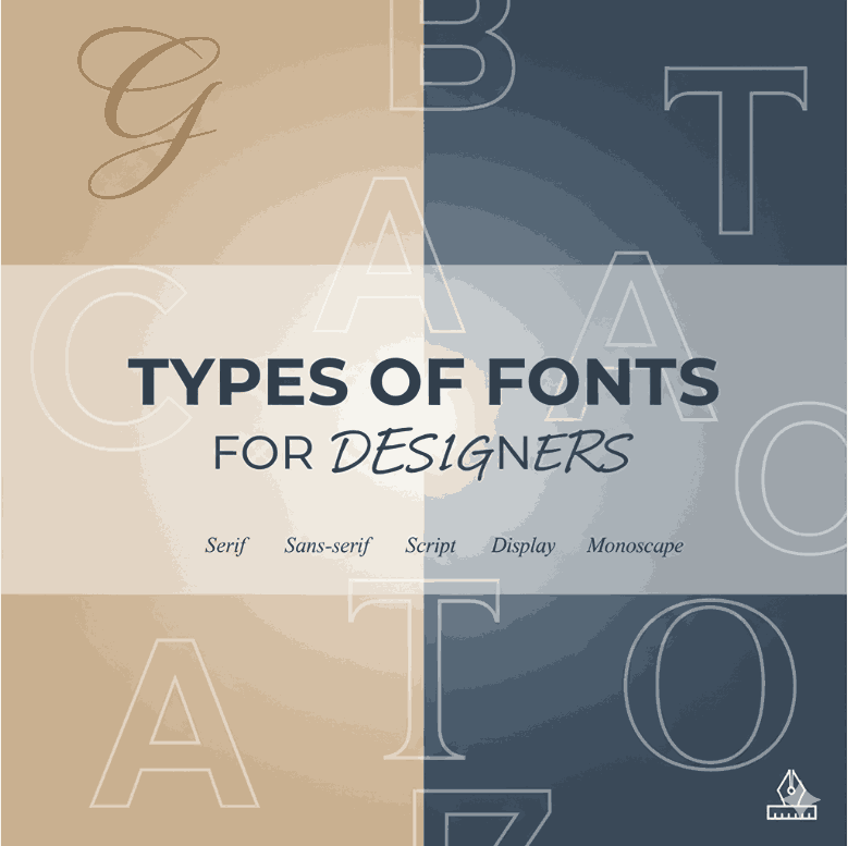
- The Main Types of Fonts for Designers
- Serif Fonts
- Sans Serif Fonts
- Script Fonts
- Display Fonts
- Monospaced Fonts
- How to Choose the Right Font for a Design Project
- Examples of Fonts You Can Use in Your Projects
- Tips for Pairing Different Font Types
- Common Mistakes Designers Make with Fonts
- Conclusion
- References
1. Introduction
Typography is one of the most important foundations of design. Choosing the right font can completely change how a brand, website, or poster feels. As a designer, knowing the types of fonts for designers is essential to build impactful and visually consistent work. This guide will walk you through the main font categories, practical examples, and tips on how to use them effectively.
2. Why Fonts Matter in Design
Fonts are more than just letters; they carry emotion, style, and tone. For instance:
- A serif font communicates tradition and professionalism.
- A bold display font adds drama and attention.
- A script font conveys elegance or playfulness.
Mastering different font types allows designers to craft messages that resonate with their target audiences.
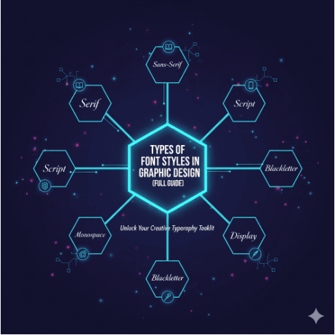
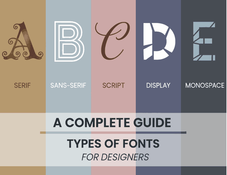
3. The Main Types of Fonts for Designers

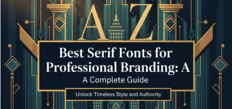
Serif Fonts
Serif fonts are characterized by small strokes or “feet” at the ends of letters. They are widely used in print media and projects requiring a classic or formal look. Think of newspapers, books, or prestigious brand identities.
Sans Serif Fonts
Sans serif fonts remove the decorative strokes, making them clean and modern. They are commonly used for digital interfaces, corporate branding, and minimalistic designs.
Script Fonts
Script fonts mimic handwriting and calligraphy. They are perfect for invitations, creative logos, or personal branding projects. For example, you can explore Classicly Font to create elegant lettering in your projects.
Display Fonts
Display fonts are highly stylized and designed for headlines, posters, and advertising. They grab attention and set a mood. Fonts like Westerners Font bring a strong character to any project.
Monospaced Fonts
Every character in a monospaced font has the same width. Historically used in coding, they are also popular for creating a retro, mechanical, or editorial aesthetic.
4. How Designers Choose the Right Types of Fonts
When choosing fonts, always consider:
- Audience – Is the target group professional, casual, or playful?
- Medium – Print and digital require different font legibility.
- Brand Voice – Fonts should match brand identity.
- Readability – Ensure text can be read easily at all sizes.
5. Examples of Fonts You Can Use in Your Projects
To make these ideas more practical, here are some font products you can explore:
- Classicly Font — an elegant script font.
- Come and Follow Font — perfect for bold branding and display.
- Westerners Font — adds a western vintage vibe to posters.
- Brafio Font — a versatile font great for modern branding.
These fonts demonstrate how versatile typefaces can elevate digital and print designs.
6. Tips for Pairing Types of Fonts for Designers
Good font pairing enhances design harmony. Try these combinations:
- Serif + Sans Serif — balance tradition and modernity.
- Script + Sans Serif — create contrast for logos or invitations.
- Display + Neutral Sans Serif — attention-grabbing headlines with easy-to-read body text.
7. Common Mistakes When Using Types of Fonts for Designers
- Using too many fonts in one project, leading to clutter.
- Ignoring hierarchy — headline, subheading, and body text should use different styles.
- Choosing trendy fonts only without considering long-term usability.
8. Conclusion
Understanding the types of fonts for designers is a must-have skill. Whether you’re working on branding, UI design, or creative projects, fonts shape how people perceive your message. By mastering serif, sans serif, script, display, and monospaced fonts, you’ll have the flexibility to create meaningful and memorable designs.