
Table of Contents
- Introduction: Why Visuals Matter in Advocacy
- Core Principles for Advocacy Campaign Design
- Choosing Fonts, Colors & Imagery That Resonate
- Storytelling & Visual Hierarchy in Campaigns
- Examples of Effective Visuals & Mockups
- Tips for Social Media, Print, and Digital Use
- Avoiding Common Design Pitfalls
- Measuring Visual Impact & Engagement
- Conclusion
- References
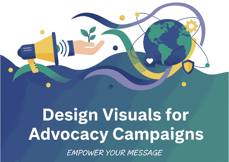
1. Introduction: Why Visuals Matter in Advocacy
In today’s digital world, advocacy campaign design plays a crucial role in delivering powerful messages. When your mission is to drive change—whether social, environmental, or political—the visuals you choose are more than decoration. They must communicate urgency, emotion, and clarity. Good visuals capture attention, help messages stick, and turn viewers into supporters. This guide will share how to design visuals for advocacy campaigns that truly move people.

2. Core Principles of Advocacy Campaign Design
- Clarity: Avoid clutter; make your message direct and unambiguous.
- Emotional resonance: Use visuals that evoke empathy, urgency, or hope.
- Brand consistency: Even advocacy campaigns need a coherent visual identity.
- Accessibility: Ensure designs are readable for all (contrast, font size, alt text).
3. Fonts & Colors for Advocacy Campaign Design
- Fonts: Select typefaces that reflect the tone of your campaign—strong and bold for activism, softer for healing themes.
- Colors: Use color psychology. Reds/oranges for urgency, greens for environment, blues for trust.
- Imagery: Use real photographs when possible; illustrations when symbolic. Make sure imagery is diverse and representative.
4. Storytelling in Advocacy Campaign Design
Every design should have a flow—what to see first, next, and last. Use size, contrast, and placement to guide eye movement. Start with a powerful headline, follow with a supporting image or statistic, then a clear call to action (CTA).
5. Examples of Effective Visuals & Mockups
To see how typography can enhance campaign visuals, consider these fonts from your collection:
- Pearl Fairy Font – whimsical, ideal for healing or community campaigns
- Hazelnut Candy Font – warm and friendly, works well for social themes
- Black Roll Font – bold and strong, perfect for action-oriented headings
- Jaima Kaira Font – elegant and readable, for supporting text
Use these fonts in mockups across social media, posters, banners, infographics to test how your message looks in real-world contexts.
6. Tips for Social Media, Print, and Digital Use
- Social media: square or vertical formats; use consistent brand elements.
- Digital (web / email): ensure responsive design and fast load times.
- Print: ensure high resolution, CMYK color settings, check readability from a distance.
7. Avoiding Common Design Pitfalls
- Overloading with text → people won’t read it.
- Low contrast → poor accessibility.
- Mixing too many fonts → visual chaos.
- Ignoring typography spacing (kerning, line height).
8. Measuring Visual Impact & Engagement
Track metrics:
- Social shares, likes, comments
- Click-through rates on visuals
- A/B test different visuals
- Use heatmaps to see what part of visual draws attention
These insights help refine future campaign design.
9. Conclusion
Designing for advocacy is a powerful responsibility. By designing visuals for advocacy campaigns that are clear, emotive, and accessible, you can turn passive viewers into active supporters. Use the mockup fonts above, always test your designs, and iterate based on real feedback. Your visual voice can inspire real change. By mastering advocacy campaign design, your visuals can inspire real social change.