Table of Contents
- Introduction
- What Is a Print Design Preparation Checklist?
- Why Print Preparation Is Crucial
- Print Design Preparation Checklist (Step-by-Step)
- Color Mode and Color Profile
- Document Size and Resolution
- Bleed, Margin, and Crop Marks
- Typography and Font Handling
- Images and Linked Files
- File Format and Export Settings
- Proofreading and Final Review
- Choosing the Right Fonts for Print Projects
- Font Mockup Examples for Print-Ready Designs
- Common Print Design Mistakes to Avoid
- Final Thoughts
- References
1. Introduction Print Design Preparation Checklist
Print Design Preparation Checklist is very different from designing for digital screens. Colors behave differently, resolution requirements are stricter, and small technical mistakes can lead to costly reprints. That’s why every designer—whether beginner or professional—needs a reliable Print Design Preparation Checklist.
This checklist helps ensure that your artwork is print-ready, accurate, and professional before it reaches the printer. In this article, we’ll walk through every essential step, explain why each detail matters, and show how using high-quality fonts can significantly improve your final printed results.

2. What Is a Print Design Preparation Checklist?
A Print Design Preparation Checklist is a systematic list of technical and visual checks performed before submitting a design file for printing. It ensures that:
- Colors print correctly
- Text remains sharp and readable
- Layouts are properly aligned
- No content gets cut off
- The printer receives the correct file format
Following a checklist minimizes errors and helps maintain consistency across all printed materials.
3. Why Print Design Preparation Checklist Is Crucial
Skipping print preparation can cause serious problems, such as:
- Incorrect colors
- Blurry images
- Missing fonts
- Cropped text or logos
- Wasted materials and budget
- Delays in production
Professional designers treat print preparation as a non-negotiable step. A well-prepared file saves time, money, and reputation.
4. Print Design Preparation Checklist (Step-by-Step)
1. Color Mode and Color Profile
Always convert your design to CMYK color mode, as printing uses ink—not light.
✔ Check:
- CMYK mode is applied
- ICC color profile matches printer requirements
- No RGB or spot colors remain unless required
2. Document Size and Resolution
Ensure your document size matches the final print size exactly.
✔ Check:
- Correct dimensions (A4, A5, poster size, packaging size, etc.)
- Resolution set to 300 DPI for high-quality print
- No low-resolution images
3. Bleed, Margin, and Crop Marks
Bleed prevents unwanted white edges after trimming.
✔ Check:
- Bleed set (usually 3 mm / 0.125 inch)
- Safe margins respected
- Crop marks included if required
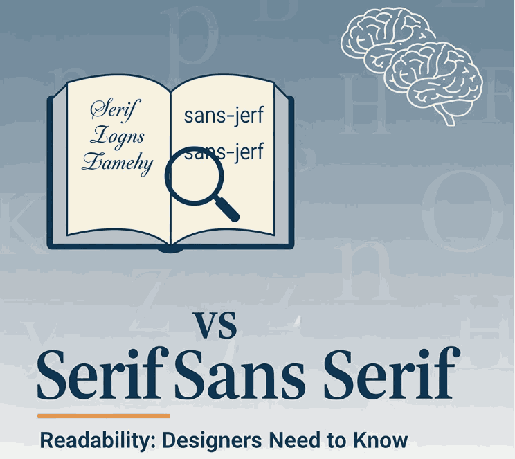
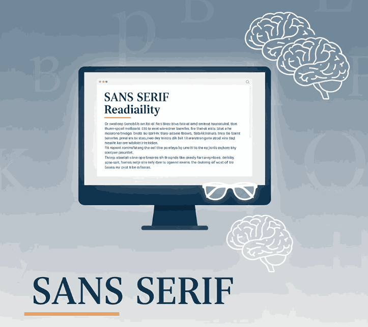
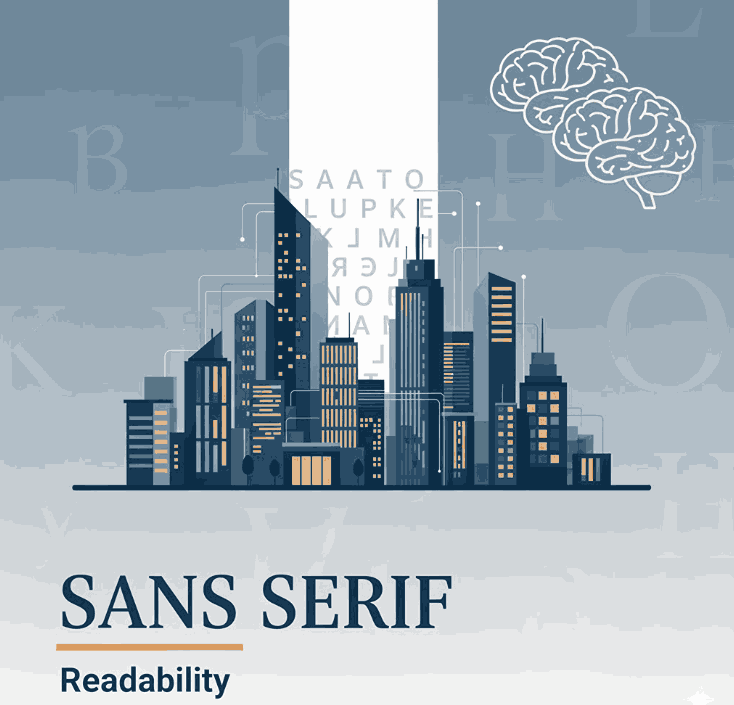
4. Typography and Font Handling
Typography is one of the most critical aspects of print design.
✔ Check:
- Fonts are legible at print size
- Font licenses allow print usage
- Text is converted to outlines (or fonts embedded)
- No missing or substituted fonts
High-quality fonts ensure sharp, professional results across all printed materials.
5. Images and Linked Files
Broken links can ruin a print job.
✔ Check:
- All images are embedded or properly linked
- No missing assets
- Image color mode matches CMYK
- No stretched or pixelated images
6. File Format and Export Settings
Exporting the correct file format is essential.
✔ Recommended formats:
- PDF/X-1a
- PDF/X-4
- High-resolution PDF
✔ Check:
- Transparency settings
- Compression settings
- Printer-specific requirements
7. Proofreading and Final Review
Never skip the final check.
✔ Review:
- Spelling and grammar
- Alignment and spacing
- Logo placement
- Contact information
- Consistency across pages
A printed typo is far more expensive than a digital one.
5. Choosing the Right Fonts for Print Design Preparation Checklist Projects
Not all fonts perform equally well in print. Print-friendly fonts should have:
- Clean outlines
- Balanced stroke weight
- Consistent spacing
- High readability
Premium fonts designed for professional use help prevent printing issues such as broken strokes or unclear letterforms.

6. Font Mockup Examples for Print Design Preparation Checklist
Here are print-safe font choices from CalligraphyFonts.net that work beautifully in real-world printing projects:
1. Belleriana Font
An elegant calligraphy font ideal for luxury print materials.
Best for:
- Invitations
- Branding
- Packaging
- Editorial print
2. Jungle Tribe Font
A bold display font designed for strong visual impact.
Best for:
- Posters
- Flyers
- Packaging headlines
- Merchandise
3. Super Dreamer Font
A creative brush script font with expressive texture.
Best for:
- Creative posters
- Cover designs
- Apparel printing
- Promotional print
These fonts maintain clarity and character when printed in CMYK and at various sizes.
7. Common Print Design Preparation Checklist Mistakes to Avoid
Even experienced designers can make mistakes. Avoid the following:
- Using RGB colors for print
- Forgetting bleed and margins
- Using low-resolution images
- Ignoring font licensing
- Not converting fonts to outlines
- Skipping proofing
- Exporting incorrect PDF settings
Following a checklist helps eliminate these errors before they happen.
8. Final Thoughts
A solid Print Design Preparation Checklist is essential for anyone working with printed materials. It ensures accuracy, professionalism, and consistent quality across all print projects.
By combining proper technical preparation with high-quality typography from CalligraphyFonts.net, designers can produce print designs that look exactly as intended—on paper, packaging, and promotional materials.
9. References
- Nielsen Norman Group – Visual Design Principles
- Wallacecarlson – Essential Prepress Checklist for Successful Printing
- Din Studio – Things You Should Consider Before Printing Your Design