Table of Contents
- Introduction
- What Is UI Design?
- What Is UX Design?
- The Key Difference Between UI and UX
- Why UI and UX Must Work Together
- The Importance of Fonts in UI/UX Design
- Font Recommendations for UI and UX Projects
- Conclusion
- References
1. Introduction
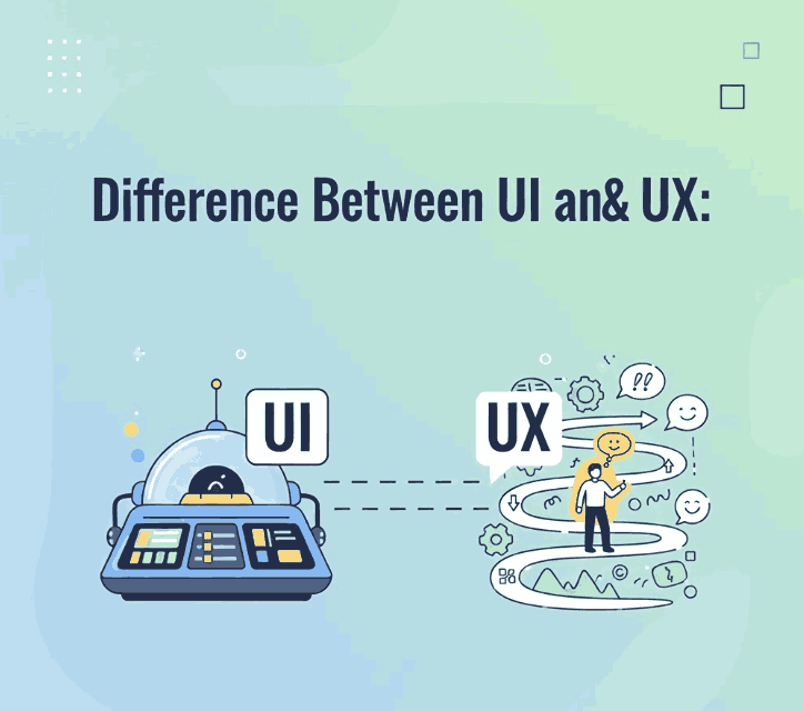
In the world of digital design, the terms UI (User Interface) and UX (User Experience) are often used interchangeably — yet they represent two distinct but interconnected disciplines. Understanding the Difference Between UI & UX is essential for anyone working in branding, web design, or digital product creation.
Whether you’re designing a mobile app, a website, or even promotional visuals for your font products on CalligraphyFonts.net, mastering UI and UX concepts can make your designs more user-friendly and visually appealing.
2. What Is UI Design?
UI design (User Interface Design) focuses on the look and feel of a digital product. It’s about crafting the interface — the screens, buttons, icons, typography, and color palettes that users interact with.
A UI designer ensures that every visual element aligns with the brand’s identity and supports user goals. They consider details like:
- Typography and font choice for clarity and personality
- Color harmony and accessibility
- Consistency in layout, icons, and spacing
- Interactive feedback, like hover effects or animations
In short, UI design is how the product looks.
Example: The clean buttons and elegant typography of an online store’s checkout page reflect good UI design — visually guiding users to complete their purchase.
3. What Is UX Design?
UX design (User Experience Design), on the other hand, is about how the product works and feels. It focuses on the user journey — ensuring that the interface is intuitive, efficient, and enjoyable.
A UX designer conducts research, builds wireframes, and tests prototypes to answer key questions:
- Is the navigation logical?
- Can users find what they need easily?
- Does the product solve their problem without friction?
UX design is the overall experience, not just the visuals. It’s how easy and satisfying it is for users to interact with your interface.
Example: If a website loads quickly, feels intuitive, and helps users find fonts effortlessly, that’s great UX design in action.
4. The Key Difference Between Difference Between UI & UX
Although UI and UX work closely together, the difference between UI and UX lies in their purpose and approach:
| Aspect | UI Design | UX Design |
|---|---|---|
| Focus | Visual appearance and style | User journey and functionality |
| Tools | Figma, Adobe XD, Sketch | Miro, Figma, UserTesting, Hotjar |
| Goal | To create attractive, interactive interfaces | To ensure usability and satisfaction |
| Output | Buttons, menus, color palettes, typography | User flows, wireframes, experience maps |
A simple analogy:
UI is the look and feel of a car; UX is how smoothly it drives.
Without good UX, even a visually stunning UI will fail to engage users. And without good UI, even a well-structured UX may appear unappealing.
5. Why Difference Between UI & UX Must Work Together
Great design happens when UI and UX are perfectly aligned. A product might have a beautiful interface, but if users struggle to navigate it, they’ll leave. Similarly, a functional app without visual appeal won’t keep users engaged.
The best design teams integrate both elements:
- UX ensures the logic, flow, and function are seamless.
- UI brings it to life with typography, color, and motion.
For font designers like you, this combination is equally important. When you showcase fonts in mockups or product pages, the UX defines how easily visitors can browse, and the UI defines how beautifully those fonts are presented.
6. The Importance of Fonts in Difference Between UI & UX
Typography plays a massive role in both UI and UX. The right font enhances readability, sets the mood, and strengthens brand identity. Poor font choice, however, can ruin even the best interface.
Here’s why fonts matter:
- Readability: Fonts should be legible across all screen sizes.
- Emotion: Different fonts evoke different emotions — serif fonts feel formal, sans-serifs modern, scripts artistic.
- Hierarchy: Using font weights and styles helps guide user attention.
- Consistency: A unified font style improves user trust and coherence.
A UI/UX designer should consider fonts not just for beauty, but also for usability and accessibility.

7. Font Recommendations for Difference Between UI & UX Projects
Here are some of your fonts from CalligraphyFonts.net that work beautifully in UI/UX contexts:
- Will Never Be Font – A bold, impactful script perfect for UI headings and creative branding screens.
- Holters Font – A clean sans-serif that maintains excellent legibility across digital devices.
- Glow Overload Font – Stylish and futuristic, ideal for landing pages or modern app interfaces.
- Quillbacks Font – Elegant and versatile, great for hero sections or promotional banners in design mockups.
You can use these fonts in mockups to illustrate how typography enhances both UI aesthetic and UX usability.
8. Conclusion
Understanding the Difference Between UI & UX empowers designers to create experiences that are both beautiful and functional.
- UI makes a product visually appealing.
- UX makes it usable, intuitive, and satisfying.
When combined thoughtfully — and paired with strong typography — they result in digital experiences that users love.
For you as a font designer, this knowledge helps you present your fonts more effectively online, improving engagement and conversions. Your fonts don’t just shape visuals — they shape the user experience itself.
9. References
- Nielsen Norman Group – The Definition of UX Design
- Material Design (Google) – Understanding typography
- Interaction Design Foundation – UX vs UI Design
- CareerFoundry – What’s the Difference Between UX and UI Design?