Table of Contents
- Introduction
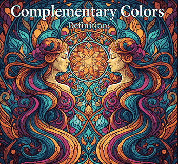
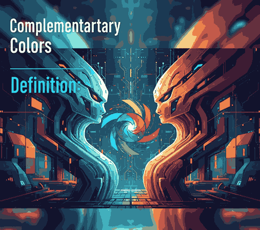
- What Is the Definition of Complementary Colors?
- Why Complementary Colors Work — Visual & Psychological Effects
- Common Complementary Color Pairs (Examples)
- How to Use Complementary Colors in Your Design
- Applying Complementary Pairs in Typography & Font Mockups
- Font Mockup Ideas with Your Fonts
- Tools & Tips to Test Complementary Palettes
- Pitfalls to Avoid
- Conclusion & Call to Action
- References
1. Introduction
Color is one of the most essential tools in Complementary Colors Definition. How you combine colors can make a design feel harmonious or jarring, boring or vibrant. One of the foundational strategies in color theory is complementary colors. Understanding the Complementary Colors Definition—and how to use them skillfully—can instantly elevate your visual designs, including font demonstrations, branding, and marketing visuals.
In this article, we’ll explore the definition of complementary colors, why they are so powerful, practical examples, and how you can apply them in typography mockups and your font portfolio.
2. What Is the Definition of Complementary Colors?
By definition, complementary colors are pairs of colors that sit directly opposite each other on the color wheel.
Because they are opposites, these pairs generate strong contrast when placed side by side. This contrast is key to what makes complementary combinations so visually compelling.
In traditional art (RYB model), some classic complementary pairs are:
- Red ↔ Green
- Blue ↔ Orange
- Yellow ↔ Purple
However, in digital and modern color models (RGB, CMYK), complementary pairs may shift—for example, red ↔ cyan, green ↔ magenta, blue ↔ yellow.
3. Why Complementary Colors Definition Work — Visual & Psychological Effects
Visual Contrast & Enhancement
When complementary colors are adjacent, they make each other appear more vivid through a phenomenon known as simultaneous contrast.
In essence, placing two opposite hues together intensifies their brightness and visual presence, which is very useful for highlighting focal elements in a design.
Emotional & Psychological Impact
Complementary colors often combine a warm hue (e.g. red, orange, yellow) with a cool hue (e.g. blue, green, purple). This warm-cool tension resonates with human perception, creating emotional interest.
Used thoughtfully, complementary schemes can convey energy, drama, or clarity—depending on the two hues and their intensities.
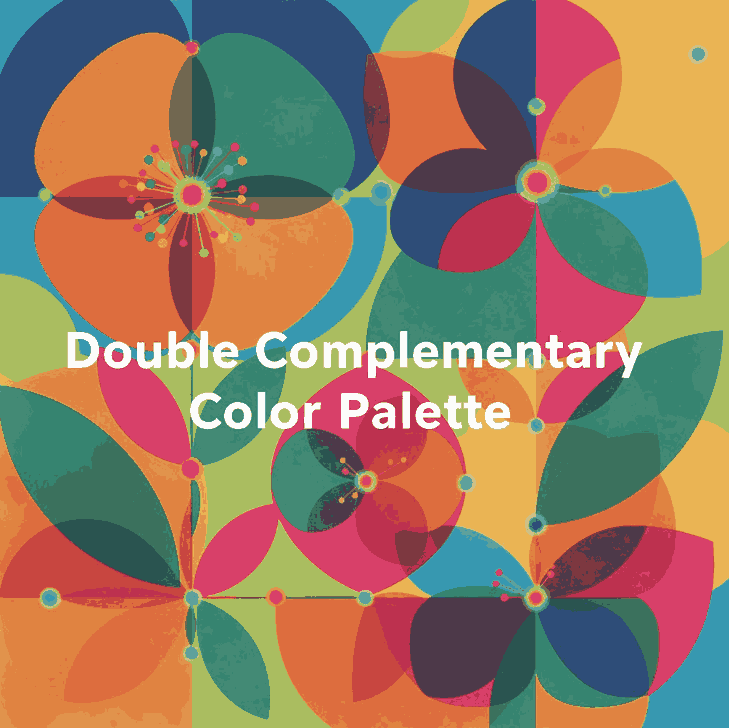
4. Common Complementary Color Pairs (Examples)
Here are some widely used complementary pairs that you’ll see across design, branding, art, and media:
- Red ↔ Green
- Blue ↔ Orange
- Yellow ↔ Purple
- Red-Orange ↔ Blue-Green
- Yellow-Orange ↔ Blue-Violet
- Yellow-Green ↔ Purple-Red
A very popular cinematic example is teal and orange—this pair is used in films and movie posters because it delivers strong contrast and skin tones often fall into the orange spectrum.
These pairs are foundational, but what truly matters is how you use tints, shades, and saturation to adapt them for your design.
5. How to Use Complementary Colors Definition in Your Design
Complementary colors are powerful, but they must be handled with care to prevent visual overload. Here are best practices:
1. Use One Dominant, One Accent
Designers often let one color dominate (e.g. 70%) and use the complementary color sparingly for accent or call-to-action elements.
2. Soften One Hue
If two pure complements are too harsh, consider desaturating or lightening one to reduce strain on the eyes.
3. Use Neutrals
Introduce whites, grays, or blacks to buffer the contrast. This helps maintain an overall balanced composition.
4. Apply Contrast for Legibility
Complementary pairs are excellent for readable typography when one color is used for background and the other for text, as long as contrast is sufficient.
5. Use Variations
Don’t stick to pure complements only—use adjacent shades or variations so the pair feels more natural and less rigid.
6. Applying Complementary Colors Definition Pairs in Typography & Font Mockups
When working with fonts, complementary color schemes can help your typeface stand out while looking polished. Here’s how:
- Headline & background pairing: e.g. use navy blue text on a soft orange background.
- Accent letterforms or ornaments: Use complementary color for swashes, flourishes, or decorative details.
- Interactive states: Use the complementary color for hover states, shadow layers, or outlines.
- Layered typography: Use a faint layer of complementary color behind text (offset shadow) to create a subtle glow or halo effect.
Because your fonts are the hero of your branding, combining them with complementary colors gives visual punch without swamping the type.
7. Font Mockup Ideas with Your Fonts
Here are specific fonts from your collection and ways you can apply complementary color schemes in mockups:
- Westerners Font — Use a burnt orange ↔ teal pair: Westerners in teal on burnt orange background, with accent details in modified orange tones.
- Senjalara Calligraphy Font — Pair soft lavender (purple) text with pale green backgrounds, use green for decorative elements.
- Ameralda Font — Use warm coral for Ameralda text and a muted turquoise as the complementary backdrop or shadows.
Such mockups show clients not just the font shape, but how it performs in real design context using foundational color theory.
8. Tools & Tips to Test Complementary Colors Definition Palettes
To experiment and validate color choices, these tools and tips help:
- Adobe Color Wheel — Generate complementary pairs instantly.
- Coolors.co — Lock one hue and see its complement variants.
- Paletton — Explore complementary harmony modes.
- Design software preview — Always preview your palette in situ (with text, images) before final use.
- Contrast checkers — Tools like WebAIM contrast checker ensure your text is legible when using complementary backgrounds.
These help you refine, test, and ensure your complementary color use is both bold and usable.
9. Pitfalls to Avoid Complementary Colors Definition
Complementary colors are strong, so avoid these common design missteps:
- Overusing both colors equally → results in visual tension.
- Using pure 100% saturation for both → may cause strain or look garish.
- Poor contrast in text → complementary doesn’t always mean readable.
- Ignoring color context → lighting, screen calibration, or nearby hues shift perception.
- Not testing on different mediums → print, web, or mobile may render colors differently.
By being mindful, you can harness the strength of complementarity without tipping into chaos.
10. Conclusion & Call to Action Complementary Colors Definition
The complementary colors definition is simple: hues opposite each other on the color wheel that enhance contrast and vibrancy. But in practice, using them well is an art.
When expertly applied, complementary color pairs offer designers a powerful tool to draw attention, convey emotions, and make typography sing. Pair your page elements and font mockups with complementary palettes to give them visual clarity and dynamic energy.
Call to Action: Jika Anda ingin, saya bisa bantu buat template mockup font + panduan warna complementary (preset palette) khusus untuk koleksi font-mu agar klien tinggal ganti teks dan warna. Mau saya kirim versi itu?
11. References
- StudioBinder — “What is a Complementary Color Scheme — Definition, Examples”
- Interaction Design Foundation — “What Are Complementary Colors?”
- The Spruce Crafts — “Definition of Complementary Colors”
- Park University — “Complementary – Color Theory in Graphic Design”