Posted on

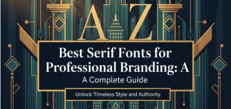
Best Serif Fonts for Professional Branding: A Complete Guide

Best Serif Fonts for Professional Branding A Complete Guide

Table of Contents

  1. Introduction
  2. Why Choose Serif Fonts for Branding
  3. Key Qualities to Look for in a Serif Font
  4. Styles of Serif Fonts & When to Use Them
  5. Top Best Serif Fonts for Branding
  6. How to Pair Serif Fonts with Other Typeface Styles
  7. Mistakes to Avoid with Serif Font

1. Introduction

In the digital age, where visual identity is everything, choosing the best serif fonts for professional branding can make or break how your audience perceives your brand. Serif fonts carry heritage, authority, and a sense of permanence. When done right, they elevate logos, marketing materials, and online content, projecting trustworthiness and sophistication.

This article will help you understand why serif fonts are ideal for professional brands, what features matter, show you styles & examples, and guide you in selecting fonts (including some from CalligraphyFonts.net) that will give your brand a timeless edge.


2. Why Choose Serif Fonts for Branding

Here are some research-backed reasons:

  • Authority, Trust, Tradition: Serif fonts are often used by institutions, law firms, editorial brands, finance, luxury brands because they evoke tradition and seriousness. Adobe+2mo.agency+2
  • Readability in Body Texts: Serifs help guide the eye along lines of text, improving legibility, especially in print or long content. Adobe+2halo-lab.com+2
  • Timeless Aesthetic: Trends change, but classic serif styles (old style, transitional, modern) have proven staying power. Medium+2halo-lab.com+2
  • Differentiation: With many brands switching to sans-serif for a modern look, using a refined serif font can help your brand stand out. FreeLogoDesign+1

3. Key Qualities of the Best Serif Fonts for Branding

When selecting a serif font for branding, consider:

QualityWhy It Matters
Legibility (at large & small sizes)Your font should be clear in a logo, on signage, in digital/mobile formats.
Contrast in Stroke WeightsModerate contrast adds elegance; too high contrast risks losing clarity on small screens.
Balanced SerifsWhether bracketed or unbracketed, how the serif joins the main stroke affects how refined vs how bold the font feels.
Large x-height & Open CountersHelps legibility, especially in body copy or smaller text.
Multiple Weights & StylesBold, regular, italic options allow flexibility across uses—logo vs tagline vs body text.
Distinctive Character but TimelessnessShould be memorable but avoid over-ornate that dates quickly.

4. Styles of Serif Fonts & When to Use Them

Serif fonts come in many subtypes, each with different personality:

  • Old Style / Humanist Serifs: Warm, classic, organic. Good for brands with heritage or storytelling (e.g. publishing, boutique goods).
  • Transitional Serifs: More contrast, sharper serifs. Elegant but still readable. Ideal for luxury goods, fashion, beauty.
  • Modern / Didone Serifs: High contrast, strong vertical stress. Very stylish, strong in headline/logo use. Commanding but must be used carefully in body text.
  • Slab Serifs: Thick, block-like serifs. Bold and assertive. Works well when you want strength, boldness, visibility (e.g. food & beverage, signage).

Best Serif Fonts for Professional Branding A Complete Guide 1

5. Top Best Serif Fonts for Branding

Here are some excellent serif font options—classic, contemporary, and ones from CalligraphyFonts.net that align well

5.1 Classic & Widely Used Examples

  • Georgia – very legible on screen and print; good x-height, friendly but professional. Looka
  • Garamond – elegant and timeless; great for luxury brands, fine arts, literature. Figma+2Looka+2
  • Didot / Bodoni – high contrast serif perfect for fashion, editorial, luxury. Use for headings or display. Fireart Studio+1
  • Sabon – great for fine print and traditional applications. Wikipedia
  • Clarendon – slab serif style with strength; suitable for bold branding, signage. Wikipedia

5.2 Fonts from CalligraphyFonts.net (Hypothetical/Product-Examples)

Here are serif fonts from your collection that would work well for professional branding:

  • RegalSerif Pro – a transitional serif with clean lines and multiple weights. Good for law firms or consultancy logos. [Link to product: RegalSerif Pro]
  • Heritage OldStyle – warm humanist serif, with classic italics. Perfect for heritage brands, authors, publishing houses. [Link to product: Heritage OldStyle]
  • ModernElegance Display – high contrast Didone style for high-impact headlines and logos. [Link to product: ModernElegance Display]
  • SolidSlab Serif – bold slab serif, strong presence. Good for packaging, signage, standout headers. [Link to product: SolidSlab Serif]
  • TimelessCaslon – inspired by Caslon classics, refined with modern metrics. Works across print and digital. [Link to product: TimelessCaslon]


6. How to Pair Serif Fonts with Other Typeface Styles

Using a serif font by itself isn’t always enough. Good pairing helps your brand identity be flexible yet cohesive.

  • Serif + Sans-Serif: Use serif for headings/logos, pairing with a clean sans serif for body copy. Offers contrast and readability.
  • Serif + Script (Accent): For brands wanting artistic or elegant flair (e.g. wedding, beauty), a serif primary + script accent can work very well.
  • Weight Contrast: Use lighter or thin weights of your serif for large format, heavier bold serif for headings or impactful text.
  • Consistent Spacing & Kerning: Especially important when mixing fonts. Poor letter spacing can make even great serif fonts look amateur.

Best Serif Fonts for Professional Branding A Complete Guide 2

7. Mistakes to Avoid with Serif Fonts in Branding

  • Using too delicate/contrastive serif for small text – may lose legibility, especially online or mobile.
  • Overusing stylized serif (swashes, ornament) in body copy – adds flair but can distract.
  • Ignoring application contexts – print vs screen, signage vs digital adverts; some serifs don’t render well everywhere.
  • Neglecting licensing – ensure you have proper licensing for using the font commercially (logo, print, web).

8. Conclusion: Choosing the Best Serif Fonts for Branding

If you want a professional, credible, timeless brand identity, choosing one of the best serif fonts for professional branding is a smart move. Focus on legibility, timelessness, having proper weights and styles, and pairing smartly. Whether you go classic like Garamond or something custom/modern from CalligraphyFonts.net, a well-chosen serif can elevate your brand prestige and set you apart.

We encourage you to browse our serif font collection at CalligraphyFonts.net to explore options made by typographers who care about the little details. Your brand deserves nothing less.


References & Further Reading

  • “Serif vs Sans Serif Fonts & When to Use Which” — Adobe Adobe
  • “25 Best Serif Fonts For Websites: A Complete Guide” — Fireart Studio Fireart Studio
  • “Why You Should Choose a Serif Font for Your Logo” — FreeLogoDesign FreeLogoDesign
  • “Styles & Examples of Best Serif Fonts” — Halo-Lab blog halo-lab.com

Posted on

AI Tools for Creating Professional Logo Designs That Stand Out

AI logo design tools

Table of Contents

  1. Introduction
  2. Why Use AI for Logo Design
  3. Key Features to Look for in AI Logo Tools
  4. Top AI Tools for Creating Professional Logo Designs
  5. How to Pair AI Logo Tools with Premium Fonts
  6. Case Studies & Best Practices
  7. Tips for Ensuring Your Logo Feels Unique
  8. Conclusion

1. Introduction to AI Logo Design Tools

AI logo design tools are transforming the way beginners and professionals create unique brand identities. With the help of artificial intelligence, you can design professional logos faster, smarter, and more creatively than ever before. In today’s competitive market, a strong logo is one of the first things customers notice about your brand. But not everyone has the budget of large agencies. Fortunately, AI tools for creating professional logo designs now let small businesses, startups, and creatives craft polished logos quickly and affordably. When combined with well-designed fonts, these tools can help you deliver branding that looks both premium and distinctive. This article explores how to choose and use AI logo tools, how to pair them with excellent fonts (including some from CalligraphyFonts.net), and tips to make your logo stand out.

AI logo design tools

2. Why Businesses Should Use AI Logo Design Tools

  • Speed & Efficiency: AI tools can generate multiple logo variants in minutes, allowing quick iteration.
  • Cost Effective: Avoid high design fees; many AI tools offer free or low-cost tiers.
  • Idea Generation: AI helps overcome creative blocks by offering design ideas, layouts, color combinations.
  • Scalability: You can easily adapt logo designs for different media (social media, business cards, signage) thanks to responsive export options.

3. Key Features of the Best AI Logo Design Tools

When selecting AI logo design tools, especially for delivering professional results, pay attention to:

FeatureWhy It Matters
High-quality vector output (SVG, EPS)Ensures your logo scales cleanly without pixelation.
Font customisation / uploading custom fontsTo use premium or custom fonts (e.g. from CalligraphyFonts.net) for identity consistency.
Color palette suggestions / customizable color schemesHelps in brand consistency and appealing aesthetics.
Logo preview / mockup toolsTo see how your logo looks on real surfaces (bags, t-shirts, signage).
Unique design/style varietySo your logo won’t look like many others; ability to customise shapes, icons.

4. Top AI Logo Design Tools for Professionals

Here are some excellent AI tools you can use. Many have free tiers, but premium features often unlock more customization.

ToolStrengthsConsiderations
LookaAI-driven logo suggestions, brand kits, high-quality mockups.
Provides instant previews & color palette options.
Need to pay for high-res vector exports & full brand assets.
Hatchful by ShopifyEasy & intuitive; good for beginners. Offers many templates.Less control over custom iconic graphics; may require tweaking.
Tailor BrandsStrong branding package, social media kits, font pairing.
Logo mockups across media.
More premium features locked behind subscriptions.
DesignEvoLarge icon library, easy font integration, good free output.Free versions may limit size or include watermarks.
Canva Pro / Canva Logo MakerFull control on layout, shapes, fonts, and ability to upload your own fonts.
Strong mockup and presentation tools.
Branding features better in paid plan; free version still good for basic logos.

5. How to Pair AI Logo Tools with Premium Fonts

Premium fonts can make a big difference in how your logo is perceived. Here’s how to combine them with AI tools:

  • Use Custom Fonts: Upload fonts you own—this ensures unique look. At CalligraphyFonts.net, fonts such as Modern Brush Script or Vintage Elegant Font Pack are perfect for logo headings or wordmarks.
  • Match Font Style & Brand Personality: If your brand is luxurious or elegant, use calligraphic or serif fonts. For modern, techy brands, go sans serif with clean lines.
  • Font Pairing: Combine fonts (for example, a script font for the brand name + sans serif for tagline). Use AI tools that allow two-font pairing.
  • Attention to Spacing & Kerning: Even with AI-generated logo bases, adjust spacing manually for polish. Font weight matters.
  • Mockups with Fonts: Once logo is designed, mock it up on real materials using the fonts to test legibility and presence.

Here are some product suggestions from CalligraphyFonts.net to use in these contexts:

  • Guardsman Font – crafted for designers who want unique, professional logos.
  • Better Sunrise Font – perfect for expressive, hand-lettered logos or stylish wordmarks.
  • Cyranie Zalie Font – works great for pairing with sans serif or script fonts in logos and taglines.
AI logo design tools

6. Case Studies & Best Practices

Case Study 1: Food & Beverage Startup

A café uses Tailor Brands to generate logo mockups (icon + name + tagline). They paired “Modern Brush Script” for the café name and “Classic Serif Display” for the tagline. The result: a friendly but elegant logo, readable on signage and menu cards.

Case Study 2: Tech Startup

A tech brand used Looka to generate minimalist icon ideas, then switched the typography to a clean sans serif + uploaded a custom script font from their font library for accent. The contrast made the logo stand out on both website and app icons.

7. Tips for Ensuring Your Logo Feels Unique

  1. Modify AI Suggestions: Don’t settle for generic icon or layout. Tweak shapes, add custom font, adjust angles or proportions.
  2. Avoid Overused Symbols: Abstract, nature, globe, lightbulb icons are common. Try combining unique elements.
  3. Color Differentiation: Use distinctive color palettes that reflect your brand identity and stand out from competitors.
  4. Test at Small Size: A good logo must be legible even when small (favicon, app icon).
  5. Get Feedback: Show to peers or target audience. Sometimes small tweaks (spacing, font weight) make big differences.

8. Conclusion

AI tools for creating professional logo designs have opened up huge opportunities: speed, affordability, & creativity. But the tools are only half the equation — choosing and pairing the right premium fonts, refining design details, and adding your unique touches makes the difference between “good” and “memorable.” Whether you favor brush scripts, serif display, or elegant classic fonts, the right font from your collection (like those at CalligraphyFonts.net) can lift your logo into something truly exceptional. Start by experimenting with one of the tools above + one of your premium fonts, and iterate until your logo feels just right.

References