Posted on

Food Packaging Color Ideas: How to Choose the Perfect Palette for Your Brand 2025

Food Packaging Color Ideas

Table of Contents

  1. Introduction
  2. Why Colors Matter in Food Packaging
  3. The Psychology of Colors in Food Branding
  4. Popular Color Palettes for Food Packaging
  5. How to Choose the Best Color Combination for Your Food Product
  6. Font Recommendations for Food Packaging Designs
  7. Practical Tips to Strengthen Your Packaging Identity
  8. Conclusion
  9. References

1. Introduction

Food Packaging Color Ideas In the competitive industry, packaging plays a critical role in attracting customers and communicating your brand message. Colors are one of the strongest visual elements that influence perception, emotions, and purchasing decisions. This is why exploring Food Packaging Color is essential for creating packaging that stands out on store shelves, e-commerce listings, and social media.

In this article, we will explore the psychology behind colors, the most effective palettes for different types of food products, and practical tips for selecting the right colors for your own brand. We will also recommend several font styles from CalligraphyFonts.net that complement various food packaging themes.

Food Packaging Color Ideas

2. Why Colors Matter in Food Packaging Color Ideas

Color does more than simply make packaging look attractive—it conveys meaning and helps customers make decisions quickly. Studies in consumer psychology show that customers can form a judgment about your product within only a few seconds, and color is one of the main contributors to this snap decision.

Colors help communicate:

  • Flavor expectations
  • Freshness and quality
  • Target audience (children, adults, health-conscious buyers)
  • Brand personality
  • Product category (organic, gourmet, snack, beverages)

When done correctly, colors increase recognition, trust, and customer engagement.

3. The Psychology of Food Packaging Color Ideas in Branding

Here are some commonly used colors and the emotions or messages they create in food packaging:

Red Food Packaging Color Ideas

Associated with energy and appetite stimulation. Often used for snacks or fast food products.

Yellow Food Packaging Color Ideas

Creates warmth, friendliness, and attention. Great for children’s snacks or cheerful food branding.

Green Food Packaging Color Ideas

Represents freshness, health, and organic ingredients. Works well for vegan, healthy, or natural products.

Brown Food Packaging Color Ideas

Communicates warmth, coffee, bakery, chocolate, and earthy flavors. Ideal for artisanal and handmade products.

Blue Food Packaging Color Ideas

Often used for beverages or refreshing products. Also conveys trust and reliability.

Orange Food Packaging Color Ideas

Energetic, fun, and appetizing. Common in juice, snacks, or fruity products.

Black & White Food Packaging Color Ideas

Clean, premium, and modern — widely used for gourmet or luxury food brands.

Understanding color psychology helps you select a palette that matches your product category and audience.

4. Popular Palettes for Food Packaging Color Ideas

1. Fresh & Healthy Palette

  • Light green, leaf green, beige
  • Perfect for organic products, salad bowls, plant-based foods

2. Sweet & Dessert Palette

  • Pink, cream, soft brown, chocolate
  • Works for bakery goods, dessert drinks, snacks

3. Kids’ Snack Palette

  • Bright yellow, orange, red, playful purple
  • Appeals to young audiences and conveys fun

4. Bold & Spicy Palette

  • Deep red, black, metallic gold
  • Ideal for spicy sauces or bold-flavored snacks

5. Minimalist Premium Palette

  • White, charcoal, gold accents
  • Suitable for gourmet foods, specialty products, and premium beverages

Your color palette should visually represent your product’s personality and flavor profile.

Food Packaging Color Ideas

5. How to Choose the Best Color Combination for Your Food Product

Here are practical steps to create the right color combination:

1. Identify Your Product’s Flavor or Category

Different flavors correlate with specific colors—green for mint or organic, red for spicy, brown for chocolate.

2. Analyze Your Target Audience

Children prefer bright colors; adults may prefer clean and modern palettes.

3. Research Market Competitors

Look for trends in your category and identify ways to differentiate while staying familiar.

4. Consider Psychological Impact

Choose colors that evoke the feelings you want customers to associate with the product.

5. Test Multiple Mockups

Visual testing ensures your packaging is both attractive and readable at various sizes and distances.

6. Font Recommendations for Food Packaging Color Ideas Designs

Typography is just as important as color. The right font enhances your brand’s personality and reinforces flavor cues.

Here are recommended fonts from CalligraphyFonts.net for this article:

1. Mango Bite Font

A playful and tasty-looking font that is perfect for juicy, fruity, or snack packaging.

2. Gummy Candy Font

Cute, rounded, and energetic — ideal for candy, kids’ snacks, or colorful food packaging.

3. Avocado Diet Font

Clean, healthy, and modern. Excellent for food products targeting wellness and organic markets.

4. Caramel Pizza Font

Warm, bold, and delicious. Perfect for bakery, pizza, dessert shops, and artisanal products.

These fonts help enhance the packaging identity and make the product more memorable.

7. Practical Tips to Strengthen Your Food Packaging Color Ideas Identity

✔ Use contrast to ensure readability
✔ Keep your palette limited to 2–4 main colors
✔ Maintain consistency across packaging variations
✔ Ensure the colors match digital and print versions
✔ Combine typography + color strategically
✔ Use mockups to test shelf visibility

8. Conclusion Food Packaging Color Ideas

Choosing the right Food Packaging Color Ideas helps elevate your product branding and influences how customers perceive taste, quality, and value. With the right color psychology, a thoughtful palette, and well-chosen typography, your packaging can stand out visually and emotionally.

By pairing strong color choices with carefully selected fonts, such as Mango Bite, Gummy Candy, Avocado Diet, and Caramel Pizza, your food packaging design can become more engaging and impactful.

9. References

  1. Canva – Choosing Colors for Branding
  2. 99Designs – Food Packaging Design Tips
  3. Packaging of the World – Food Packaging Inspiration
  4. Din Studio – Color Combination Ideas for your Food Business
Posted on

Master UI/UX Design Systems: A Complete New Beginner’s Guide

UI/UX Design Systems Guide

Table of Contents

  1. Introduction: Why Design Systems Matter in UI/UX
  2. What Is a UI/UX Design System?
  3. Core Components of a Design System
  4. Benefits of Using a UI/UX Design System
  5. How to Build a UI/UX Design System Step by Step
  6. Typography in UI/UX Design Systems
  7. Best Fonts for UI/UX Projects (with Examples)
  8. Common Mistakes to Avoid
  9. Conclusion
  10. References

1. Introduction: Why Matter in UI/UX Design Systems Guide

UI/UX Design Systems Guide Consistency is key in user experience (UX) and user interface (UI) design. As products grow, maintaining design harmony across multiple pages, apps, or devices becomes challenging. That’s where a UI/UX Design System comes in—it ensures consistency, efficiency, and scalability.

Whether you’re designing for a startup or a global brand, understanding how to create and manage a design system helps your team maintain visual identity and improve the overall user experience.

UI/UX Design Systems Guide

2. What Is aUI/UX Design Systems Guide?

A UI/UX design system is a structured collection of design rules, reusable components, patterns, and assets that define how an interface should look and behave. It’s like a “visual language” for your brand—covering everything from color schemes and typography to buttons and icons.

Famous examples include:

  • Google’s Material Design
  • Apple’s Human Interface Guidelines
  • Atlassian Design System

These frameworks ensure that every product built under the same brand feels cohesive and intuitive.

3. Core Components of a UI/UX Design Systems Guide

A well-built design system usually includes several key elements:

  • Design Principles: Core values that guide visual and UX decisions.
  • Color Palette: Defines the primary, secondary, and accent colors.
  • Typography: Sets the tone of the brand with consistent fonts and text hierarchy.
  • UI Components: Buttons, input fields, navigation bars, modals, etc.
  • Spacing and Grid System: Ensures visual balance and alignment.
  • Iconography and Imagery: Consistent visual symbols that support functionality.

Together, these elements form a living document that keeps all design and development work aligned.

4. Benefits of Using a UI/UX Design Systems Guide

Implementing a design system provides multiple long-term advantages:

  • Consistency: Every element across your platform looks and behaves the same.
  • Efficiency: Teams reuse existing assets instead of designing from scratch.
  • Scalability: New pages or apps can be developed faster and easier.
  • Collaboration: Designers and developers work more cohesively with shared resources.
  • Brand Recognition: A consistent aesthetic strengthens brand identity and trust.

In short, design systems make it easier to scale creativity without sacrificing usability.

5. How to Build a UI/UX Design Systems Guide Step by Step

Creating a design system might sound complex, but you can approach it in simple, structured steps:

  1. Audit Existing Designs: Review your current digital assets to find inconsistencies.
  2. Define Your Foundations: Set rules for color, typography, and grid layout.
  3. Create UI Components: Build reusable assets like buttons, modals, and icons.
  4. Document Everything: Use tools like Figma, Notion, or Zeroheight to document guidelines.
  5. Collaborate and Iterate: Involve developers and designers for feedback and continuous improvement.
  6. Maintain and Update: Treat your system as a living product that evolves over time.
UI/UX Design Systems Guide

6. Typography in UI/UX Design Systems Guide

Typography plays a vital role in any design system. The right font can establish hierarchy, readability, and emotional tone. Good UI fonts are:

  • Legible at all sizes (for both desktop and mobile),
  • Versatile (for headings, paragraphs, and buttons),
  • Aligned with your brand’s personality.

Sans-serif fonts are popular in UI design for their clean and modern appearance, while script or calligraphy fonts can be used for accent branding, logos, or special feature screens.

7. Best Fonts for UI/UX Projects (with Examples)

If you want to add personality to your design system, try experimenting with premium fonts that balance readability and style. Here are a few great examples from CalligraphyFonts.net:

  1. Rellative Font – A sleek handwritten signature font perfect for logos, landing pages, or digital branding accents.
  2. Signatory Font – Clean and modern with elegant strokes, ideal for hero sections or creative UI headlines.
  3. Catcalling Font – A stylish calligraphy typeface that adds sophistication and uniqueness to brand-driven UI elements.
  4. Fieldstone Font – A refined serif-style display font that’s perfect for titles and headers in web or mobile layouts.

These fonts demonstrate how typography can enhance digital aesthetics while maintaining usability. When paired with strong color palettes and intuitive components, they elevate your entire UI/UX design.

8. Common Mistakes to Avoid

Even experienced designers can make missteps when building a design system. Avoid these pitfalls:

  • Overcomplicating the system — Keep it simple and scalable.
  • Ignoring documentation — Every component should have usage guidelines.
  • Neglecting accessibility — Always test color contrast and font legibility.
  • Not updating regularly — A stagnant system becomes outdated quickly.

A design system should grow alongside your product and adapt to user needs and design trends.

9. Conclusion

A well-structured UI/UX Design System bridges creativity and consistency. It saves time, improves collaboration, and ensures every user interaction feels intentional and polished.
By integrating thoughtful color choices, readable typography, and reusable UI components, you can create digital experiences that feel both beautiful and functional.

To give your design system a unique touch, explore premium fonts like Rellative, Signatory, Catcalling, and Fieldstone — available now on CalligraphyFonts.net. The right font can transform not just your text, but your entire design identity.

10. References

Posted on

Color Theory for Beginners: New Guide to Understanding Colors in Design

Color Theory for Beginners

Table of Contents

  1. Introduction: Why Color Theory Matters in Design
  2. The Basics of Color Theory
    • The Color Wheel
    • Primary, Secondary, and Tertiary Colors
  3. Understanding Color Harmony
    • Complementary Colors
    • Analogous Colors
    • Triadic and Monochromatic Schemes
  4. The Psychology of Colors
  5. How to Choose the Right Color Palette
  6. Applying Color Theory in Graphic and Font Design
  7. Recommended Fonts for Color-Based Design Projects
  8. Conclusion
  9. References

1. Introduction: Why Color Theory Matters in Design

Color Theory for Beginners is one of the most powerful tools in design. It influences perception, evokes emotion, and helps convey brand identity. For beginners, understanding color theory is the first step to mastering visual communication. Whether you’re designing logos, websites, or typography art, color choices determine how your message resonates with the audience.

Color Theory for Beginners

2. The Basics of Color Theory for Beginners

Color theory is a framework that explains how colors interact with one another. It combines artistic principles and scientific understanding to help designers create visually balanced and appealing compositions.

The Color Wheel

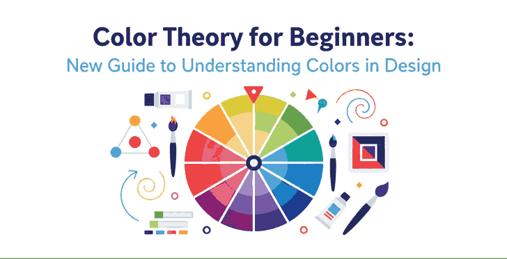
At the heart of color theory lies the color wheel, a circular chart that shows the relationships between colors. It includes primary, secondary, and tertiary colors.

  • Primary colors: Red, Blue, and Yellow — cannot be created by mixing other colors.
  • Secondary colors: Green, Orange, and Purple — formed by mixing two primary colors.
  • Tertiary colors: Created by mixing a primary and a secondary color (e.g., Blue-Green, Red-Orange).

This wheel helps designers easily identify complementary or harmonious color combinations.

3. Understanding Color Theory for Beginners Harmony

Color harmony is the visual balance achieved when colors are combined effectively. It ensures your designs feel cohesive and pleasing to the eye.

Complementary Color Theory for Beginners

Colors that sit opposite each other on the color wheel (e.g., blue and orange). This combination creates strong contrast and high visual energy.

Analogous Color Theory for Beginners

These are colors that sit next to each other (e.g., yellow, yellow-green, and green). They produce a smooth and harmonious effect—perfect for calm and natural designs.

Triadic and Monochromatic Schemes

Triadic schemes use three colors equally spaced around the wheel, while monochromatic schemes use variations of one hue with different values and saturations. Triadic palettes add vibrancy, while monochromatic palettes provide simplicity and elegance.

4. The Psychology of Color Theory for Beginners

Every color carries emotional and psychological associations. Here’s a quick guide to help beginners understand the psychological impact of colors:

  • Red: Passion, energy, and urgency.
  • Blue: Calmness, trust, and professionalism.
  • Yellow: Optimism and creativity.
  • Green: Nature, balance, and growth.
  • Purple: Luxury and sophistication.
  • Black & White: Simplicity and contrast—used to create clarity and focus.

Knowing these meanings helps designers choose colors that align with their brand’s message or design goal.

Color Theory for Beginners

5. How to Choose the Right Color Theory for Beginners

Choosing the perfect color palette can be challenging. Here are some quick tips for beginners:

  1. Start with your brand personality. Identify your brand’s tone—fun, elegant, minimalist, or bold.
  2. Use online tools. Platforms like Adobe Color or Coolors help generate color palettes easily.
  3. Maintain contrast for readability. When designing with fonts or text, ensure high contrast between text and background colors.
  4. Limit your palette. Three to five colors are usually enough for balanced design.

6. Applying Color Theory in Graphic and Font Design

Fonts and colors go hand in hand. The right combination can make your design stand out, while poor pairing can ruin even the best typography.
For example:

  • Warm colors (reds, oranges, yellows) work well with handwritten or bold script fonts, creating energy and excitement.
  • Cool colors (blues, greens) match perfectly with modern sans-serif fonts, giving a calm and professional vibe.

When using calligraphy fonts, balance is key — avoid overly bright combinations that can make the text hard to read.

7. Recommended Fonts for Color-Based Design Projects

Here are some beautiful font recommendations from CalligraphyFonts.net that complement your color-based designs perfectly:

  1. Holters Font – A clean, modern sans-serif perfect for minimalist color palettes and branding.
  2. Rutinitas Font – A casual handwritten style ideal for creative projects and colorful logos.
  3. Leathering Font – Elegant and luxurious, perfect for premium product packaging with soft or neutral tones.
  4. Anthonyela Calligraphy Font – Beautifully flowing calligraphy font that shines in pastel and elegant color schemes.

Try experimenting with these fonts and various color harmonies to see how different tones can transform your typography and overall design aesthetic.

8. Conclusion

Mastering color theory for beginners is not just about memorizing a color wheel — it’s about understanding how color influences perception and emotion. By applying the right combinations, you can elevate your designs, highlight your message, and attract more attention.
Combine your newfound color knowledge with high-quality fonts from CalligraphyFonts.net, and your design projects will instantly feel more cohesive, professional, and visually stunning.

9. References

Posted on

Earth Tones and Neon Color Trends: New Balancing Nature & Energy

Earth Tones & Neon Color

Table of Contents

  1. Introduction
  2. Why Earth Tones + Neon Are Trending
  3. Defining Earth Tones & Neon Shades
    • 3.1 What Are Earth Tones?
    • 3.2 What Are Neon / Bright Accent Colors?
  4. How These Trends Merge: Nature Meets Digital
  5. Design Applications: When & How to Use Earth + Neon
  6. Using These Trends with Typography & Font Branding
  7. Font Mockup Ideas from Your Collection
  8. Tools and Tips for Testing Earth & Neon Palettes
  9. Risks & Best Practices
  10. Conclusion & Call to Action
  11. References

1. Introduction

In 2024 and beyond, a compelling color balance is emerging: Earth Tones & Neon Color that feel grounding and warm, contrasted with neon accents that inject energy and modern sass. This pairing is reflective of a broader cultural tension—desire for calm rootedness + fascination with digital possibility.

For a font & design business, adopting earth tones and neon color trends offers a way to present your typefaces in contexts that feel both organic and dynamic, catering to brands that straddle analog and digital worlds.

2. Why Earth Tones + Neon Are Trending

Design trend forecasts for 2024 emphasize a fusion of nature and technology in palette choices. Din Studio’s color forecast describes how palettes will “combine nature and technology,” showcasing earthy greens, browns, sky blues, alongside neon blue, digital red, etc.

Other design sources list earthy natural tones + neon accents among the emerging 2024 color trends.

Fashion trend reports echo this shift: warm natural hues like terracotta, olive, clay, and browns are paired with pops of vivid brightness for contrast and visual surprise.

The appeal is clear: earth tones offer comfort and grounding in uncertain times, and neon accents provide vitality, energy, and a digital spark.

Earth Tones & Neon Color

3. Defining Earth Tones & Neon Shades

3.1 What Are Earth Tones?

Earth tones are colors that echo natural landscapes: soil, clay, rock, foliage, wood, moss, sand. Think muted browns, olive greens, beiges, warm taupes, rusts. In color theory, “earth tone” broadly refers to colors similar to natural materials and landscapes.

These colors evoke warmth, stability, calm, and organic authenticity—qualities many brands now want to communicate.

3.2 What Are Neon / Bright Accent Colors?

Neon shades are high-intensity, high-saturation colors like electric blue, hot pink, lime green, fluorescent yellow. They read as modern, energetic, almost digital in nature.

In the trend forecasts, these neon / digital colors are positioned as accents that infuse design with brightness and contrast, complementing the more subdued earth tones.

4. How These Trends Merge: Nature Meets Digital

The blending of earth tones and neons is about contrast in harmony. The idea is not to overshadow nature with neon, but to let neon highlights dance within an earthy base.

  • Earth tones anchor the design, offering base surfaces, backgrounds, textures, media framing.
  • Neon accents pop in focal elements — callouts, hover states, decorative flourishes, small overlays.
  • This contrast emphasizes hierarchy: the eye is drawn to neon, but finds rest in the earthy surrounding.
  • It reflects the real-world tension between analog (nature, grounding) and digital (tech, screens, brightness).

Designers are predicted to lean into such juxtapositions: “nature and technology” being a recurring motif in 2024 trend forecasts.

5. Design Applications: How to Use Earth Tones & Neon Color

Here are practical ways to apply this combined trend:

  • Backgrounds & Base Layers: use earth tones (terracotta, olive, tan) as large surfaces.
  • Accent Elements: apply neon (electric blue, lime, pink) to borders, highlights, interactive cues.
  • Typography Emphasis: neon for headlines or hover states; earth tones for body text or secondary text.
  • Gradients / Overlays: gentle gradients from earth to neon, or semi-transparent neon overlays on earth tones.
  • Texture + Neon Pop: use textured surfaces (wood grain, linen, clay patterns) overlaid with neon glyphs or lines.
  • Interactive / UI Effects: neon glow or neon border animation over muted earthy UI.

Because neon is intense, it works best in small doses against calming earth-tone backdrops.

Earth Tones & Neon Color

6. Using These Earth Tones & Neon Color Trends with Typography and Font Branding

For fonts and type specimens, the earth + neon trend can elevate the presentation:

  • Use earth tone backgrounds (light beige, muted olive, taupe) and place your font sample in neon contrast color (or vice versa) to emphasize the shape.
  • Combine fonts in earth-tone body text and neon headline overlays to show contrast.
  • Use neon outlines or shadows for fonts on earthy surfaces to add depth.
  • In branding previews, show a version in calm earth tones and a variant with neon highlights—this duality appeals to clients who want both elegance and edge.

This approach conveys that your font works in both organic and modern visual systems.

7. Font Mockup Ideas from Your Collection

Here are some fonts from your catalog and suggestions for mockup visuals using earth + neon palettes:

  • Aesthetic Sunset Font — place on muted terracotta or dusky peach base, with neon pink or coral highlights on parts of the text.
  • Leathering Font — simulate leather texture in earthy brown, then overlay neon accent lines or neon emboss effects.
  • Jungle Tribe Font — use deep olive, mossy greens as background, then neon lime or electric green for decorative elements or accent letters.

These mockups help clients envision your fonts in bold, contemporary color contexts—balancing calm and energy.

8. Tools and Tips for Testing Earth Tones & Neon Color Palettes

  • Use Adobe Color / color wheel: create a base earth tone and sample neon accents.
  • Use Coolors.co: generate palettes that mix muted/muted and high-saturation pairs.
  • Use Contrast checkers: ensure readability when a neon color is used over earth tones.
  • Create mood boards: mix textures (wood, clay, stone) with neon color swatches to feel out harmony.
  • Always preview in real mockup context (UI, print, web) to test how neon reads over earthy materials.

Testing in real use is key; neon often changes perception depending on surrounding hues.

9. Risks and Best Practices Earth Tones & Neon Color

  • Neon overuse: too much neon destroys calm; limit it to accent levels.
  • Poor contrast: some neon + earth combos may cause low readability; always test.
  • Clashing temperature: ensure the neon accent doesn’t clash (warm neon vs cool earth).
  • Saturation overload: desaturate neon or earth colors if the mix feels too garish.
  • Maintain brand cohesion: don’t sacrifice brand palette entirely—introduce neon accents thoughtfully.

By balancing restraint and creativity, this trend can feel fresh without overwhelming.

10. Conclusion and Call to Action Earth Tones & Neon Color

The trend pairing of Earth Tones & Neon Color trends allows designs to feel grounded while sparking energy. For font and design businesses, this combination is powerful: you can present your typefaces in contexts that speak both to tactile warmth and digital vivacity.

Call to Action: Pick one font from your catalog. Build a mockup using an earthy base and neon accent as described above. Share it in your portfolio or Instagram and gauge audience reaction. If you like, saya bisa bantu kirimkan 3 preset palette (hex codes) earth + neon yang cocok untuk font usage agar kamu tinggal pakai. Mau saya kirim versi itu?

References

  • Din Studio — “Color Trend Forecast 2024: Embracing Nature and Technology”
  • Pixemix — “Unveiling the Top 2024/2025 Color Trends: Grounding Earth & Bold Neon”
  • BlackSoc — “7 Colour Design Trends for 2024: Earthy + Neon Among Them”
  • Wikipedia — “Earth Tone (Definition & Common shades)”
Posted on

Triadic Color Combinations Examples: New Create Perfect Harmony in Design

Triadic Color Combinations Examples

Table of Contents

  1. Introduction: Why Color Harmony Matters
  2. What Are Triadic Color Combinations?
  3. The Psychology Behind Triadic Colors
  4. Best Triadic Color Combinations Examples
  5. How to Apply Triadic Colors in Graphic Design
  6. Triadic Colors in Branding and Typography
  7. Showcase: Fonts That Complement Triadic Palettes
  8. Useful Tools and Resources
  9. Conclusion

1. Introduction: Why Color Harmony Matters

Triadic Color Combinations Examples is one of the most powerful tools in design—it communicates emotions, defines brand identity, and influences perception. A well-balanced color palette can turn a simple design into a visually stunning masterpiece. Among the most reliable and creative methods for achieving balance is the Triadic Color Combinations Examples.

In this article, we’ll explore practical Triadic Color Combinations Examples, why they work, and how you can use them in your graphic design projects to achieve vibrant, eye-catching results.

2. What Are Triadic Color Combinations?

A triadic color combination consists of three colors that are evenly spaced around the color wheel. This means they are separated by 120 degrees, creating a perfect visual balance between contrast and harmony.

For example:

  • Red – Blue – Yellow
  • Orange – Green – Purple

Unlike complementary color schemes (which use opposite colors), triadic palettes provide a broader range of hues, making your designs more dynamic while maintaining visual coherence.

According to Canva’s Color Theory Guide, triadic schemes are especially effective in modern branding and web design because they are both bold and balanced.

Triadic Color Combinations Examples

3. The Psychology Behind Triadic Colors

Triadic combinations naturally create a sense of equilibrium. They allow each color to stand out without overwhelming the others. This makes them ideal for projects that need energy and vibrancy while still appearing professional.

  • Red evokes excitement and passion.
  • Blue symbolizes trust and calm.
  • Yellow conveys optimism and warmth.

When used together, these colors create visual interest and emotional harmony—perfect for marketing materials, websites, and social media visuals.

4. Best Triadic Color Combinations Examples

Here are some popular triadic color combinations you can use in your design projects:

1. Red – Blue – Yellow

A classic primary triad, perfect for playful, energetic designs like children’s brands or creative agencies.

2. Orange – Green – Purple

A bold and artistic palette, often used in lifestyle or entertainment branding.

3. Pink – Yellow – Cyan

A modern and youthful combination, great for tech startups or trendy product packaging.

4. Teal – Coral – Mustard

A warm yet sophisticated mix often seen in fashion or interior design visuals.

5. Navy – Gold – Crimson

A luxurious and elegant palette suitable for premium brands and editorial designs.

You can experiment with saturation and contrast levels to adjust the mood of your triadic scheme—keeping one color dominant and the others as accents often creates the best visual balance.

5. How to Apply Triadic Color Combinations Examples in Graphic Design

When using triadic palettes, the key is to maintain balance. Here are a few tips:

  • Pick a dominant color for your main elements.
  • Use the second color for highlights or secondary elements.
  • Reserve the third color for accents, buttons, or calls-to-action.

For web design, tools like Adobe Color Wheel or Coolors can help you generate and test triadic palettes effortlessly.

6. Triadic Color Combinations Examples in Branding and Typography

Triadic color harmony doesn’t only apply to images—it also enhances typography. Using fonts that complement your chosen palette can amplify the mood of your design.

For example:

  • Bold sans-serif fonts work well with vibrant, energetic color schemes.
  • Elegant script or calligraphy fonts pair beautifully with pastel triads.

To see how colors and typography combine beautifully, explore these font mockups from Calligraphy Fonts:

  • Rustte Font – Stylish and rustic, perfect for vintage palettes.
  • Classicly Font – Timeless serif that fits minimalist triadic designs.
  • Overcame Font – Modern and bold, ideal for vibrant color harmony.
  • Southlake Font – Natural and calm, perfect for earthy color triads.
Triadic Color Combinations Examples

7. Showcase: Fonts That Complement Triadic Color Combinations Examples

Typography plays a crucial role in color harmony. Pairing fonts with appropriate color combinations can completely transform a design’s tone.

For instance:

  • A triadic mix of navy, gold, and crimson with Classicly Font evokes sophistication.
  • A bright palette of pink, yellow, and cyan paired with Overcame Font creates a fun, tech-forward vibe.
  • A teal, coral, and mustard triad using Southlake Font offers an organic yet modern feel.

By combining these fonts with triadic color schemes, designers can achieve not just visual appeal but also emotional consistency.

8. Useful Tools and References

To help refine your understanding and create better triadic palettes, explore these useful resources:

9. Conclusion Triadic Color Combinations Examples

Triadic color combinations are a designer’s secret weapon for achieving balance, energy, and vibrancy. They give you flexibility to experiment while ensuring your compositions remain visually harmonious.

Whether you’re working on branding, digital graphics, or packaging, understanding how to use triadic color combinations can elevate your work to a new level of professionalism. Pair them with the right typography—like the beautiful selections available at CalligraphyFonts.net—and your designs will truly stand out.

Posted on

Unlock the Beauty of Double Complementary Color Palettes

Double Complementary Color Palette

Table of Contents

  1. Introduction: Why Color Harmony Shapes Design
  2. What Is a Double Complementary Color Palette?
  3. The Power of Four: Advantages and Challenges
  4. How to Balance and Use Tetradic Colors
  5. Real Design Applications and Inspiration
  6. Applying Double Complementary Colors to Fonts
  7. Font Mockup Ideas for Designers
  8. Tools to Create Perfect Tetradic Palettes
  9. Final Thoughts and Pro Tips
  10. References

1. Introduction: Why Color Harmony Shapes Design

Colors are more than just decoration — they shape how people feel, perceive, and remember your brand. Whether you’re designing a logo, a web interface, or a font presentation, color harmony determines the impact of your work.

Among various color schemes, the Double Complementary Color Palette (also known as the Tetradic Color Scheme) stands out for its vibrancy and complexity. It offers endless creative possibilities — if you know how to control it.

For type designers and visual creators at CalligraphyFonts.net, mastering this palette helps you craft font mockups that look dynamic yet balanced, bold yet sophisticated.

Double Complementary Color Palette

2. What Is a Double Complementary Color Palette?

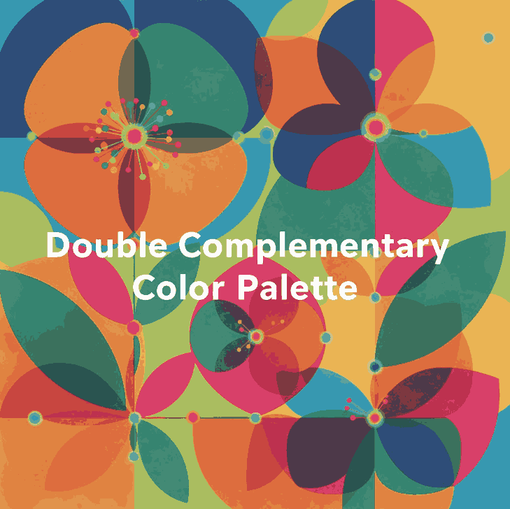
A Double Complementary Color Palette uses four colors arranged as two complementary pairs — for example:

  • Blue and orange
  • Green and red

These four colors form a rectangle on the color wheel, offering both contrast and variety.
This palette is also known as a Tetradic scheme because it uses four hues equally spaced around the color wheel.

Unlike monochromatic or analogous palettes, the double complementary setup gives you both warm and cool tones, creating an energetic and visually rich design.

3. The Power of Four: Advantages and Challenges

Advantages

  • Vibrant and versatile — You can express depth and personality in your design using four diverse hues.
  • Perfect for highlights — It allows creative use of accent colors for typography, icons, or buttons.
  • Balanced warm and cool contrast — This keeps visuals dynamic and emotionally balanced.

Challenges

  • Easily becomes overwhelming if all four colors are used equally.
  • Requires careful dominance — One color must take the lead, while others support it.
  • Color conflicts can occur if saturation or brightness levels clash.

To avoid chaos, pick one main color, use one as a secondary tone, and the other two only for highlights or accents.

4. How to Balance and Use Tetradic Colors

Balancing a four-color palette requires both artistic sense and technical planning. Here are practical tips:

  1. Choose a dominant hue.
    This color should cover around 60% of your design (like background or large shapes).
  2. Use secondary hues for support.
    Allocate around 30% for secondary visuals such as borders, icons, or graphic accents.
  3. Reserve the last pair for details.
    Keep them to 10% — perfect for typography effects or hover interactions.
  4. Desaturate or lighten secondary tones.
    This prevents harsh clashes and keeps harmony consistent.
  5. Add neutrals.
    White, gray, or beige spaces calm down the composition and improve readability.
Double Complementary Color Palette

5. Real Design Applications and Inspiration

Tetradic color harmony appears everywhere in digital and print design.
Here are a few ways professionals use it effectively:

  • Branding: A double complementary palette gives brands a dynamic and multidimensional look. For example, a combination of deep blue, orange, red, and green conveys energy and diversity.
  • UI Design: Designers use one color for primary buttons, its complement for hover states, and the second pair for accent borders or illustrations.
  • Poster Design: It’s common in modern poster layouts where one color dominates, and others appear in geometric or text details.

6. Applying Double Complementary Color Palette to Fonts

When it comes to typography and font mockups, this palette offers exciting visual potential — if handled with subtlety.

Try these design principles:

  • Use strong contrast: For example, orange text on a blue background looks bold and readable.
  • Highlight details: Apply the second complementary pair to emphasize swashes, ligatures, or shadows.
  • Add motion: Use color gradients or animated reveals that transition between complementary pairs.
  • Stay consistent: Don’t use all four colors in equal proportion — fonts must remain legible above all.

Combining color mastery with your custom fonts helps each design feel professional and intentionally artistic.

7. Font Mockup Ideas for Designers

Here are mockup ideas using your own fonts, designed to showcase how the double complementary palette enhances your font products:

  • Rostia Font — Use a deep blue base with orange lettering for a modern bold headline.
  • Jaycee Looks Font — Try muted red for text with soft green accents in background icons.
  • Creatoria Font — Combine warm and cool gradients for vibrant typographic posters.
  • Glitchy Font — Experiment with neon versions of double complementary hues for a futuristic vibe.

These examples demonstrate how color theory can elevate the value of your font designs and attract attention in marketing visuals or product previews.

8. Tools to Create Perfect Tetradic Double Complementary Color Palette

Designers don’t need to guess colors anymore — here are powerful free tools to experiment with your palette ideas:

  • Adobe Color Wheel – Generate tetradic palettes with precision.
  • Coolors.co – Save and test endless color combinations.
  • Paletton – Offers built-in “tetradic” mode for easy visualization.
  • Khroma AI – Uses AI to create harmonious palettes based on your preferences.
  • Viz Palette – Preview how your colors look on different backgrounds or charts.

Each of these tools helps refine your color combinations to achieve visual balance and emotional depth.

9. Final Thoughts and Pro Tips Double Complementary Color Palette

The Double Complementary Color Palette is a designer’s secret weapon — powerful, flexible, but demanding discipline.
Used wisely, it can create unforgettable branding, sleek typography, and visually rich layouts.

Pro Tips Recap:

  • Pick one dominant hue — let others support it.
  • Use neutral backgrounds for readability.
  • Reduce saturation when using all four hues together.
  • Apply the 60–30–10 balance rule.
  • Test color accessibility and contrast before finalizing your palette.

When paired with your signature fonts from CalligraphyFonts.net, these color strategies will help your designs stand out — bold, professional, and timeless.

10. References