Table of Contents
- Introduction: Why Color Harmony Matters
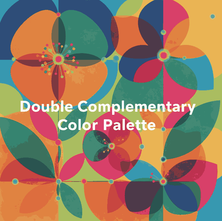
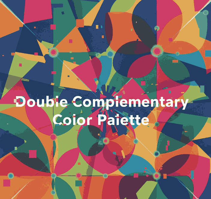
- What Are Triadic Color Combinations?
- The Psychology Behind Triadic Colors
- Best Triadic Color Combinations Examples
- How to Apply Triadic Colors in Graphic Design
- Triadic Colors in Branding and Typography
- Showcase: Fonts That Complement Triadic Palettes
- Useful Tools and Resources
- Conclusion
1. Introduction: Why Color Harmony Matters
Triadic Color Combinations Examples is one of the most powerful tools in design—it communicates emotions, defines brand identity, and influences perception. A well-balanced color palette can turn a simple design into a visually stunning masterpiece. Among the most reliable and creative methods for achieving balance is the Triadic Color Combinations Examples.
In this article, we’ll explore practical Triadic Color Combinations Examples, why they work, and how you can use them in your graphic design projects to achieve vibrant, eye-catching results.
2. What Are Triadic Color Combinations?
A triadic color combination consists of three colors that are evenly spaced around the color wheel. This means they are separated by 120 degrees, creating a perfect visual balance between contrast and harmony.
For example:
- Red – Blue – Yellow
- Orange – Green – Purple
Unlike complementary color schemes (which use opposite colors), triadic palettes provide a broader range of hues, making your designs more dynamic while maintaining visual coherence.
According to Canva’s Color Theory Guide, triadic schemes are especially effective in modern branding and web design because they are both bold and balanced.

3. The Psychology Behind Triadic Colors
Triadic combinations naturally create a sense of equilibrium. They allow each color to stand out without overwhelming the others. This makes them ideal for projects that need energy and vibrancy while still appearing professional.
- Red evokes excitement and passion.
- Blue symbolizes trust and calm.
- Yellow conveys optimism and warmth.
When used together, these colors create visual interest and emotional harmony—perfect for marketing materials, websites, and social media visuals.
4. Best Triadic Color Combinations Examples
Here are some popular triadic color combinations you can use in your design projects:
1. Red – Blue – Yellow
A classic primary triad, perfect for playful, energetic designs like children’s brands or creative agencies.
2. Orange – Green – Purple
A bold and artistic palette, often used in lifestyle or entertainment branding.
3. Pink – Yellow – Cyan
A modern and youthful combination, great for tech startups or trendy product packaging.
4. Teal – Coral – Mustard
A warm yet sophisticated mix often seen in fashion or interior design visuals.
5. Navy – Gold – Crimson
A luxurious and elegant palette suitable for premium brands and editorial designs.
You can experiment with saturation and contrast levels to adjust the mood of your triadic scheme—keeping one color dominant and the others as accents often creates the best visual balance.
5. How to Apply Triadic Color Combinations Examples in Graphic Design
When using triadic palettes, the key is to maintain balance. Here are a few tips:
- Pick a dominant color for your main elements.
- Use the second color for highlights or secondary elements.
- Reserve the third color for accents, buttons, or calls-to-action.
For web design, tools like Adobe Color Wheel or Coolors can help you generate and test triadic palettes effortlessly.
6. Triadic Color Combinations Examples in Branding and Typography
Triadic color harmony doesn’t only apply to images—it also enhances typography. Using fonts that complement your chosen palette can amplify the mood of your design.
For example:
- Bold sans-serif fonts work well with vibrant, energetic color schemes.
- Elegant script or calligraphy fonts pair beautifully with pastel triads.
To see how colors and typography combine beautifully, explore these font mockups from Calligraphy Fonts:
- Rustte Font – Stylish and rustic, perfect for vintage palettes.
- Classicly Font – Timeless serif that fits minimalist triadic designs.
- Overcame Font – Modern and bold, ideal for vibrant color harmony.
- Southlake Font – Natural and calm, perfect for earthy color triads.
7. Showcase: Fonts That Complement Triadic Color Combinations Examples
Typography plays a crucial role in color harmony. Pairing fonts with appropriate color combinations can completely transform a design’s tone.
For instance:
- A triadic mix of navy, gold, and crimson with Classicly Font evokes sophistication.
- A bright palette of pink, yellow, and cyan paired with Overcame Font creates a fun, tech-forward vibe.
- A teal, coral, and mustard triad using Southlake Font offers an organic yet modern feel.
By combining these fonts with triadic color schemes, designers can achieve not just visual appeal but also emotional consistency.
8. Useful Tools and References
To help refine your understanding and create better triadic palettes, explore these useful resources:
- Adobe Color Wheel – Generate triadic palettes instantly.
- Canva Color Wheel – Visualize color relationships.
- Color Hunt – Browse community-curated triadic color schemes.
- Din studio – Unlocking the Potential of Triadic Colors in Graphic Design
9. Conclusion Triadic Color Combinations Examples
Triadic color combinations are a designer’s secret weapon for achieving balance, energy, and vibrancy. They give you flexibility to experiment while ensuring your compositions remain visually harmonious.
Whether you’re working on branding, digital graphics, or packaging, understanding how to use triadic color combinations can elevate your work to a new level of professionalism. Pair them with the right typography—like the beautiful selections available at CalligraphyFonts.net—and your designs will truly stand out.