Table of Contents
- Introduction: Why Understanding Logo Types Matters
- What Is a Logo and Its Role in Branding
- Main Logo Types Every Designer Should Know
- Wordmark Logos (Logotype)
- Lettermark & Monogram Logos
- Symbol & Abstract Logos
- Combination Mark Logos
- Emblem Logos
- Logo Typography and Font Selection
- Font Mockup Examples from CalligraphyFonts.net
- How to Choose the Right Logo Type
- Final Thoughts
- References
1. Introduction: Why Understanding Logo Types with Examples Matters
A logo is often the first visual element people notice about a brand. It communicates personality, credibility, and values in a single glance. Understanding logo types with examples helps designers and business owners make informed decisions when creating brand identities that are clear, memorable, and scalable.
Each logo type serves a different purpose depending on brand goals, audience, and industry. Choosing the right one can significantly impact brand recognition and long-term success.
2. What Is a Logo Types with Examples and Its Role in Branding
A logo is a visual symbol or typographic mark that represents a brand. It appears across websites, packaging, advertising, social media, and products, making consistency and clarity essential.
A well-designed logo should:
- be easily recognizable
- reflect brand personality
- work across multiple sizes and platforms
- remain timeless and versatile
Understanding different logo types helps achieve these goals more effectively.
3. Main Logo Types with Examples Every Designer Should Know
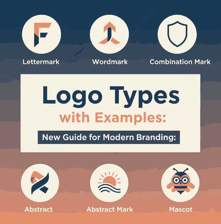
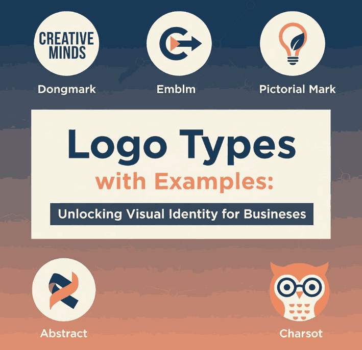
There are several widely recognized logo categories used in modern branding. The most common include:
- Wordmark logos
- Lettermark (monogram) logos
- Symbol or pictorial logos
- Abstract logos
- Combination mark logos
- Emblem logos
Each type has strengths and limitations, which we’ll explore with practical examples.
4. Wordmark Logo Types with Examples (Logotype)
Wordmark logos focus entirely on typography. The brand name itself becomes the logo without icons or symbols.
Best for: brands with unique names or strong typography
Advantages: simplicity, clarity, strong brand recall
Examples: Google, Coca-Cola, FedEx
Typography plays a critical role here—custom or display fonts often define the brand’s entire visual identity.
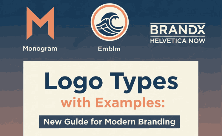
5. Lettermark & Monogram Logos
Lettermark logos use initials instead of full brand names. They are especially effective for brands with long or complex names.
Best for: corporations, luxury brands, professional services
Advantages: compact, elegant, versatile
Examples: IBM, HBO, LV
Monograms often rely on refined typography and spacing to convey sophistication and trust.
6. Symbol & Abstract Logos
Symbol logos use recognizable imagery, while abstract logos use geometric or conceptual shapes that don’t directly depict real-world objects.
Best for: global brands, scalable branding systems
Advantages: highly memorable, language-independent
Examples:
- Symbol: Apple, Twitter
- Abstract: Nike, Pepsi
These logos often require time and consistent marketing to build strong brand associations.
7. Combination Mark Logos
Combination logos merge text with symbols or icons, offering flexibility and clarity.
Best for: new brands, growing businesses
Advantages: versatile, easy brand recognition
Examples: Adidas, Burger King, Lacoste
Brands can later separate the icon or wordmark once recognition grows.
8. Emblem Logos
Emblem logos feature text enclosed within a shape or badge. They often feel classic, authoritative, or traditional.
Best for: institutions, heritage brands, automotive, food & beverage
Advantages: strong visual presence, traditional appeal
Examples: Starbucks, Harley-Davidson
Because of their complexity, emblem logos may require careful scaling for digital use.
9. Logo Typography and Font Selection
Typography is one of the most powerful elements in logo design. Fonts influence how a brand feels—modern, aggressive, playful, elegant, or nostalgic.
When selecting fonts for logos:
- prioritize readability
- consider scalability
- ensure uniqueness
- match typography style with brand values
Display fonts are often used for logos because they deliver strong visual impact.
10. Font Mockup Examples from CalligraphyFonts.net
Below are premium font examples from CalligraphyFonts.net that work well for various logo types and branding styles:
Secret Come Font
An elegant serif display font ideal for luxury, fashion, and premium branding. Perfect for wordmark, emblem, or monogram logos.
Speed Attack Font
A bold, dynamic display font designed for energetic and modern brands. Works exceptionally well for sports, tech, and mascot-style logos.
Good Memories Font
A decorative display font with a warm, nostalgic feel. Ideal for vintage, retro, or creative lifestyle logos.
Using the right typography not only strengthens logo design but also improves brand memorability across all marketing channels.
11. How to Choose the Right Logo Types with Examples
When deciding which logo type to use, consider the following factors:
✔ Brand personality – modern, playful, serious, elegant
✔ Target audience – age, culture, industry
✔ Brand name length – short names suit wordmarks; long names suit lettermarks
✔ Usage context – digital-first or print-heavy branding
✔ Scalability needs – icons, favicons, social media
There is no “one-size-fits-all” solution. The best logo type is the one that aligns with your brand’s strategy and long-term goals.
12. Final Thoughts
Understanding logo types with examples empowers designers and brand owners to make smarter creative decisions. From minimalist wordmarks to expressive emblem logos, each type serves a specific branding purpose.
By pairing the right logo structure with high-quality typography—such as premium fonts from CalligraphyFonts.net—you can create logos that are distinctive, versatile, and visually compelling across all platforms.
13. References
- Interaction Design — Logo Design
- Din Studio — Logo Types Crucial to Know
- Vista Print — The 7 types of logos (and how to use them)
- Logo Design — Typography in Logo Design: Choosing the Right Font

