Posted on

Art Nouveau Style Characteristics: New Elegance of Nature in Design

Art Nouveau Style Characteristics

Table of Contents

  1. Introduction
  2. What Is Art Nouveau?
  3. Key Art Nouveau Style Characteristics
    • Organic & Curvilinear Lines
    • Nature-Inspired Motifs
    • Decorative Typography
    • Asymmetry and Dynamic Movement
    • Handcrafted Aesthetics
    • Use of Soft, Natural Color Palettes
  4. Art Nouveau in Modern Design
  5. Recommended Calligraphy Fonts for Art Nouveau-Inspired Projects
  6. Final Thoughts
  7. References

1. Introduction

Art Nouveau Style Characteristics remains one of the most iconic design movements in history. Known for its fluid lines, botanical elements, and ornamental aesthetics, this artistic era continues to inspire designers across industries—from branding to architecture and digital illustration.

In this article, we will break down the Art Nouveau Style Characteristics, explore why the movement remains timeless, and provide recommended calligraphy fonts from CalligraphyFonts.net that perfectly complement Art Nouveau-themed design works.

Art Nouveau Style Characteristics

2. What Is Art Nouveau Style Characteristics?

Art Nouveau, which translates to “New Art”, emerged in Europe around the late 19th and early 20th centuries. It stood as a rebellion against industrial mass production by bringing back handcrafted artistic expression.

The movement deeply influenced:

  • Architecture
  • Graphic design
  • Posters
  • Typography
  • Interior design
  • Crafts & ornamental arts

Its philosophy emphasized nature, beauty, craftsmanship, and organic forms, making it one of the most recognizable design movements of all time.

3. Key Art Nouveau Style Characteristics

a. Organic & Curvilinear Lines

Perhaps the most defining characteristic of Art Nouveau is its use of curving, flowing lines often described as “whiplash curves.”
These forms evoke:

  • vines
  • stems
  • hair
  • smoke
  • flowing water

Designers use these lines to create a sense of movement, making artworks feel alive and dynamic.

b. Nature-Inspired Motifs

Art Nouveau heavily incorporates elements from the natural world, such as:

  • Flowers (iris, lily, poppy)
  • Leaves & vines
  • Birds
  • Insects (especially butterflies & dragonflies)

These motifs create a visually poetic and harmonious design that feels organic and romantic.

c. Decorative Typography Art Nouveau Style Characteristics

Typography during this era moved away from rigid serif structures and embraced ornamental lettering with fluid strokes and artistic embellishments.

Art Nouveau fonts often feature:

  • extended curves
  • decorative swashes
  • uneven baseline movement
  • handcrafted letterforms

This makes them especially attractive for modern branding, logotypes, packaging, and posters.

d. Asymmetry and Dynamic Movement

Unlike the classical styles that valued symmetry, Art Nouveau embraced asymmetry to emphasize originality and creativity.
This approach created a more natural and spontaneous composition.

e. Handcrafted Aesthetics

Art Nouveau emerged partly as a reaction against machine-made products. Artists and designers prioritized craftsmanship, giving every detail a hand-drawn, artistic feel.

This handcrafted atmosphere can still be seen today in calligraphy and custom lettering styles.

f. Soft, Natural Color Palettes

Typical Art Nouveau colors include:

  • Olive green
  • Dusty blue
  • Gold
  • Beige
  • Terracotta
  • Soft purple

These gentle palettes reflect the movement’s devotion to nature and organic beauty.

4. Art Nouveau Style Characteristics in Modern Design

While Art Nouveau peaked more than a century ago, its influence continues in many modern design fields, such as:

  • branding
  • editorial design
  • illustration
  • luxury packaging
  • wedding invitations
  • interior decor

Designers adapt Art Nouveau’s organic lines and natural themes to create artworks that feel both nostalgic and contemporary.

Art Nouveau Style Characteristics

5. Recommended Calligraphy Fonts for Art Nouveau Style Characteristics-Inspired Projects

To help designers achieve an authentic Art Nouveau aesthetic, here are four carefully selected fonts from CalligraphyFonts.net that embody the movement’s beauty:

1. Creamine Calligraphy Font

A highly decorative calligraphy style with elegant curves and classic ornamentation. Perfect for Art Nouveau poster designs, invitations, and decorative branding.

2. Originale Brush Font

This brush-style font gives a handcrafted, vintage texture reminiscent of early 20th-century artistic posters. Ideal for organic, flowing compositions.

3. Antique Collection Font

A vintage handwriting typeface with historical charm, evoking early European artistic movements. Great for retro packaging and antique-style illustrations.

4. Loveliness Calligraphy Font

A soft, elegant monoline script that captures graceful curves—one of the strongest characteristics of Art Nouveau handwriting styles.

These fonts help bring the spirit of Art Nouveau into modern projects with authenticity and elegance.

6. Final Thoughts Art Nouveau Style Characteristics

The Art Nouveau style stands as one of the most enchanting and influential movements in design history. Its graceful lines, organic motifs, and handcrafted beauty continue to inspire modern designers seeking elegance and visual harmony.

Whether you are working on branding, posters, packaging, or visual storytelling, understanding the Art Nouveau Style Characteristics will give you a powerful foundation for creating sophisticated and expressive artworks.

And with the recommended fonts from CalligraphyFonts.net, you can easily incorporate Art Nouveau’s timeless aesthetics into your next creative project.

7. References

Posted on

Flat Design Style Characteristics: New Essence of Modern Minimalist Design

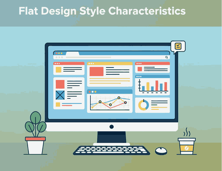
Flat Design Style Characteristics

Table of Contents

  1. Introduction
  2. What Is Flat Design Style?
  3. The Origin of Flat Design
  4. Key Characteristics of Flat Design
    • 4.1 Minimalism and Simplicity
    • 4.2 Bold and Vibrant Colors
    • 4.3 Clean Typography
    • 4.4 Geometric Shapes and Icons
    • 4.5 Focus on Functionality
  5. Benefits of Using Flat Design
  6. Flat Design in Branding and Typography
  7. Recommended Fonts for Flat Design Projects
  8. Conclusion
  9. References

1. Introduction

In today’s world of digital design, Flat Design Style Characteristics has become one of the most popular and influential visual styles. Known for its clean, minimal, and modern look, flat design eliminates unnecessary textures, shadows, and gradients, focusing instead on clarity and usability.

This article explores the characteristics of flat design style, its evolution, and how designers can use it effectively in branding and typography. If you’re looking to elevate your visual identity or UI project, understanding flat design is essential.

Flat Design Style Characteristics

2. What Is Flat Design Style Characteristics?

Flat Design is a minimalist approach to user interface and graphic design that emphasizes functionality and simplicity.
Instead of imitating 3D effects or realistic textures (like in skeuomorphism), flat design uses solid colors, clean lines, and two-dimensional elements to convey information efficiently.

Flat Design became popular with tech giants such as Microsoft (Windows 8) and Apple (iOS 7), who adopted the style to create user-friendly, visually clear interfaces.

3. The Origin of Flat Design Style Characteristics

The concept of Flat Design can be traced back to Swiss Style or International Typographic Style from the 1950s, which focused on clarity, readability, and grid-based design.
When digital interfaces became mainstream, designers adapted these principles into a new digital form—resulting in Flat Design.

Its resurgence in the 2010s was a reaction against the heavily textured, skeuomorphic designs that dominated early smartphone interfaces. Designers began favoring cleaner, faster-loading visuals suitable for mobile and responsive environments.

4. Key Characteristics of Flat Design Style Characteristics

Let’s break down the defining Flat Design Style Characteristics that make it stand out.

4.1 Minimalism and Simplicity

Flat design embraces the “less is more” philosophy. Elements are stripped of unnecessary details, leaving only what’s essential. This creates a visually balanced layout that enhances readability and usability.

4.2 Bold and Vibrant Colors

Color plays a major role in flat design. Designers often use bright, contrasting palettes to draw attention and maintain visual interest. Common combinations include blues, oranges, purples, and greens that add energy without relying on gradients or depth.

4.3 Clean Typography

Typography in flat design is simple yet powerful. Sans-serif fonts are typically used for their readability and modern feel.
Fonts with clean lines, strong weight, and geometric proportions enhance the flat aesthetic by aligning with its functional and minimalist principles.

4.4 Geometric Shapes and Icons

Flat design relies heavily on geometric shapes, such as circles, rectangles, and triangles, to create icons and layouts. These elements contribute to a consistent visual system that users can understand instantly.

4.5 Focus on Functionality

Every element in flat design serves a purpose. Buttons, icons, and text are designed to communicate quickly and clearly, ensuring that usability remains at the core of the design.

5. Benefits of Using Flat Design Style Characteristics

Flat Design isn’t just aesthetically pleasing—it offers several practical benefits:

  • Faster loading times: Fewer textures and effects mean lighter graphics.
  • Improved user experience: Simple layouts help users navigate more intuitively.
  • Better scalability: Works well across different screen sizes and devices.
  • Timeless appeal: Minimalist designs age more gracefully than trend-heavy styles.

Because of these advantages, Flat Design remains a favorite among web designers, app developers, and branding experts.

6. Flat Design Style Characteristics in Branding and Typography

Flat Design extends beyond digital interfaces—it influences brand identity, logos, and typographic systems.
Modern brands use flat-style logos for clarity and adaptability. Think of brands like Spotify, Dropbox, and Google, which use minimal geometric forms and bold colors for maximum recognition.

Typography plays a crucial role in achieving harmony within flat design. Fonts must be readable, modern, and visually aligned with the overall design concept.

Here’s where custom or calligraphic fonts come in: adding a touch of human warmth to otherwise minimalist compositions.

7. Recommended Fonts for Flat Design Style Characteristics Projects

Here are some font recommendations from CalligraphyFonts.net that pair beautifully with Flat Design aesthetics:

  • Overcame Font – A strong and minimalist sans-serif perfect for bold titles or UI elements.
  • Faint Green Font – Elegant and modern, ideal for branding that requires clarity and a natural flow.
  • Creatoria Font – A clean and stylish display font, excellent for flat-style logos and posters.
  • Aesthetic Sunset Font – Adds a soft, artistic touch while maintaining simplicity—great for lifestyle or creative brands.

Using the right font enhances your flat design project’s visual balance and emotional tone, making your brand more memorable and consistent.

Flat Design Style Characteristics

8. Conclusion

The Flat Design Style Characteristics showcase the perfect balance between simplicity and function.
By focusing on minimalism, bold colors, and clean typography, designers can create visuals that are not only beautiful but also user-friendly and efficient.

Whether you’re working on a brand identity, mobile app, or website UI, flat design offers a timeless framework for visual communication.
To elevate your design projects, choose fonts that align with flat design’s clarity and purpose—explore more typefaces at CalligraphyFonts.net and bring simplicity to life.

9. References

Posted on

Graphic Design Trend Forecast 2024: What Will Define New Visual Creativity This Year

Graphic Design Trend Forecast

Table of Contents

  1. Introduction
  2. Why Graphic Design Trends Matter
  3. The Biggest Graphic Design Trends of 2024
     3.1 Minimalism with a Modern Twist
     3.2 Retro Revival and Nostalgia
     3.3 Bold Typography and Experimental Fonts
     3.4 3D and Motion Design Integration
     3.5 Sustainable and Eco-Friendly Visuals
     3.6 AI-Driven Design Tools
  4. How Designers Can Adapt to These Trends
  5. Recommended Fonts to Match 2024’s Visual Style
  6. Final Thoughts
  7. References

1. Introduction

As we step into 2024, the world of graphic design continues to evolve at lightning speed. Technology, culture, and social change all influence how we communicate visually. The Graphic Design Trend Forecast for 2024 reveals a fascinating mix of nostalgia and innovation—where timeless design principles meet futuristic tools and aesthetics.

Whether you’re a brand designer, creative director, or font creator, understanding these upcoming Graphic Design Trend Forecast helps you stay relevant and produce work that resonates with your audience.

Graphic Design Trend Forecast

2. Why Graphic Design Trend Forecast Matter

Graphic design trends are not just fleeting visual fads; they represent how human behavior and technology merge to shape visual culture. For professionals, following these trends means:

  • Staying aligned with audience expectations
  • Keeping designs visually fresh and competitive
  • Improving brand recognition through modern aesthetics

At CalligraphyFonts.net, where creativity meets craftsmanship, following visual trends also helps you design fonts that fit into the ever-changing digital landscape.

3. The Biggest Graphic Design Trend Forecast of 2024

Here’s a look at the dominant creative directions predicted to shape the industry this year.

3.1 Minimalism with a Modern Twist

Minimalism isn’t going anywhere—but 2024’s version comes with personality. Expect to see clean layouts with subtle gradients, dynamic asymmetry, and bold negative space. The goal? To create elegant simplicity that still feels expressive.

Designers are moving toward “warm minimalism”—using soft color palettes, human-centered imagery, and balanced typography to maintain sophistication without feeling sterile.

3.2 Retro Revival and Nostalgia

The return of the Y2K and ’80s–’90s retro aesthetics continues to dominate. From chrome effects and holographic textures to grainy filters and hand-drawn fonts, nostalgia remains a strong emotional trigger.

This blend of old and new creates familiarity while remaining visually exciting—perfect for social media campaigns, music posters, and brand visuals.

3.3 Bold Typography and Experimental Fonts

Typography takes center stage in 2024. Designers are using custom typefaces, layered textures, and variable fonts to express brand personality.
If you want to incorporate trend-aligned typography, explore these examples:

  • Classicly Font — a timeless serif that fits minimalist and editorial aesthetics.
  • Jaycee Looks Font — perfect for vibrant, modern-retro compositions.
  • Rellative Font — ideal for bold, headline-driven layouts.
  • Vineland Font — stylish and sophisticated, great for brand logos or packaging.

These fonts capture the essence of 2024’s design movement: a balance between clarity, expression, and innovation.

3.4 3D and Motion Design Integration

Motion graphics and 3D design continue to merge into mainstream brand identity. Animated typography, immersive visuals, and subtle motion in UI design are becoming essential.
With the rise of AR/VR, designers are exploring interactive storytelling, where static visuals come to life. Tools like Blender and After Effects are now standard for many designers who want to add dimension to their work.

3.5 Sustainable and Eco-Friendly Visuals

As sustainability becomes central to global consciousness, design is reflecting this shift. 2024 brings more earth-inspired tones, natural textures, and organic shapes.
Brands are emphasizing authenticity and ethical design—moving away from over-production toward timeless, minimalist visual systems. Fonts that feel handcrafted or organic fit perfectly into this movement.

3.6 AI-Driven Design Tools

Artificial intelligence has revolutionized how designers brainstorm, create mockups, and explore new visual ideas. AI tools like Adobe Firefly, Midjourney, and ChatGPT are not replacing creativity—they’re amplifying it.
Designers who understand how to collaborate with AI can increase productivity while maintaining artistic integrity. Expect AI-generated art, smart layouts, and predictive color harmonies to play major roles in 2024’s workflows.

4. How Can Adapt to These Graphic Design Trend Forecast

To stay ahead in 2024:

  • Stay curious — follow design blogs, attend webinars, and observe top agencies.
  • Experiment often — create mockups using the latest design software or new font combinations.
  • Refine your typography — test modern fonts and variable weights for flexibility.
  • Collaborate with AI tools — use them for idea generation, but always apply your human creativity.
  • Build a timeless portfolio — integrate trendy design ideas while preserving your personal style.

By balancing trends with originality, you’ll maintain both relevance and authenticity.

Graphic Design Trend Forecast

5. Recommended Fonts to Match 2024’s Visual Style

Typography is a major driver of 2024’s aesthetic direction. Here are curated fonts from your collection that complement this year’s design mood:

  • Classicly Font – clean and classy, ideal for minimalist branding.
  • Jaycee Looks Font – bold and futuristic, great for trend-forward logos.
  • Rellative Font – contemporary yet timeless for editorial projects.
  • Vineland Font – elegant curves and humanist design perfect for creative campaigns.

These typefaces not only align with the graphic design trend forecast 2024 but also demonstrate the craftsmanship that defines CalligraphyFonts.net.

6. Final Thoughts Graphic Design Trend Forecast

The Graphic Design Trend Forecast for 2024 paints a picture of creativity that merges technology, emotion, and timeless beauty. From AI-powered design tools to nostalgic fonts, this year encourages experimentation and authenticity.
For font creators and graphic designers alike, embracing these shifts means staying not just current—but visionary.

Explore these trends, try new fonts, and let your work inspire the next generation of design innovation.

7. References

Posted on

Modern Halloween Color Combinations That New Inspire Bold Design

Modern Halloween Color Combinations

Table of Contents

  1. Introduction
  2. Why Color Matters for Halloween Designs
  3. Trend Signals & Influences for 2024–2025
  4. Top 6 Modern Halloween Color Combinations
    • 4.1 Deep Black + Neon Accents
    • 4.2 Muted Neutrals + Subtle Spooky Highlight
    • 4.3 Jewel Tones & Rich Hues
    • 4.4 Pastel Horror (Pinkoween & Ghostly Shades)
    • 4.5 Earthy & Organic Halloween Tones
    • 4.6 Monochromatic with a Splash
  5. How to Use These Palettes in Your Font Mockups
  6. Tips for Balancing Readability & Atmosphere
  7. Case Study Mockup Examples
  8. Final Recommendations
  9. References

1. Introduction

Halloween design has evolved. Gone are the days when only black and orange ruled every spooky poster or invitation. Today, designers are experimenting with Modern Halloween color combinations that bring sophistication, surprise, and a fresh twist to spooky aesthetics.

If you’re a font designer, marketer, or visual creator, the palette you choose can elevate font mockups, branding, and campaign visuals. This guide helps you explore trending color combos, apply them thoughtfully, and present your fonts in a way that fits the Halloween mood and stands out.

Modern Halloween Color Combinations

2. Why Color Matters for Modern Halloween Color Combinations

Color is fundamental in conveying mood, tone, and readability. For Halloween:

  • Mood & Emotion: Dark hues, contrasts, and accent colors set spooky or ethereal atmospheres.
  • Legibility: Fonts need proper contrast — too low contrast makes them unreadable, especially in promotional visuals.
  • Branding & Uniqueness: Using unexpected color combos helps your designs stand out from the flood of “orange + black” visuals.

When your font mockups adopt a striking palette, potential buyers can better imagine how they’ll use your font in real seasonal designs.

3. Trend Signals & Influences for 2024–2025

Design trend reports and Halloween decor insights point to some shifting color directions:

  • Dark + Neon accents: Platforms project that combining deep black with neon purples, greens, or orange creates a “mysterious yet modern” feel.
  • “Spooky-Chic” aesthetics: According to Forbes, while orange and black still play a role, dark burgundy, charcoal gray, and upscale accent colors are on the rise in Halloween décor.
  • Unusual / unexpected combinations: Din Studio’s article highlights how designers are now adding pastel, neon, or monochrome accents to classic Halloween palettes.
  • Soft & neutral Halloween: Trends adopt muted or neutral tones like cream, taupe, dusty rose, or sage instead of prescriptive orange + black.
  • “Pinkoween” & pastel horror: Some decorators are embracing blush, light purples, and metallics for a whimsical Halloween twist.

So, the stage is set: Halloween visuals that balance darkness and elegance, moodiness and surprise.

4. Top 6 Modern Halloween Color Combinations

4.1 Deep Black + Neon Accents

Palette idea: Jet black background + electric purple, neon green, or hot orange accents.
Why it works: The dark base gives a spooky canvas; neon adds energy and contrast without losing the Halloween feel.
Use case: Titles, flourishes, glowing outlines behind your script fonts.

4.2 Muted Neutrals + Subtle Spooky Highlight

Palette idea: Cream, soft gray, taupe + deep charcoal or muted purple.
Why it works: Elegant, wearable Halloween—fitting for designs that should carry beyond only one season.
Use case: Font name cards, website banners, classically styled posters with a whisper of spook.

4.3 Jewel Tones & Rich Hues

Palette idea: Burgundy, emerald, midnight blue, plum + black or dark accent.
Why it works: Luxurious mood with depth. It plays into “Gothic glamor” trends in decor.
Use case: Header visuals, merchandise mockups where font appears in a premium context.

4.4 Pastel Horror (Pinkoween & Ghostly Shades)

Palette idea: Blush pink, lavender, mint, white + soft gray or muted black accent.
Why it works: It surprises, softens the brutal edge, and aligns with emerging “Pinkoween” movements.
Use case: Feminine Halloween themes, invitations, or when you want contrast but gentle vibes.

4.5 Earthy & Organic Halloween Tones

Palette idea: Rust, terracotta, olive, muted gold + deep brown or charcoal.
Why it works: It feels grounded, seasonal, and connects to nature and harvest tones.
Use case: Autumn-themed layouts, wreath visuals, natural texture backgrounds.

4.6 Monochromatic with a Splash

Palette idea: Shades of a single color (e.g. grays or purples) + small highlight (like orange or lime).
Why it works: Minimal but intentional — you maintain harmony yet still draw the eye to accent details.
Use case: Lettering-focused mockups where the font is center stage, with just a flicker of accent to highlight.

Modern Halloween Color Combinations

5. How to Use These Palettes in Your Font Mockups Modern Halloween Color Combinations

To present your fonts powerfully with these color combos:

  • Background & Foreground pairing: If your font is light (white, pale), use darker backgrounds; for darker fonts, use lighter or muted backings.
  • Accent for emphasis: Use neon or hot accent colors on small decorative elements (borders, drop shadows, flourishes), not on body text.
  • Text shadows & outline glows: Slight glows in accent color can boost readability when placed against darker areas.
  • Gradient overlays: A subtle gradient from dark to accent can energize a flat layout.
  • Texture & overlays: Use noise, scratch textures, or subtle grunge overlays in darker tones to enhance atmosphere without overwhelming.

By applying these combos thoughtfully, your font mockups become more than specimens — they become immersive design scenes.

6. Tips for Balancing Readability & Atmosphere

  • Contrast is king: Always test readability. Even if a color is trendy, if text vanishes, it’s useless.
  • Limit your palette: Stick to 3–4 primary tones. Too many competing colors dilute the effect.
  • Use accent sparingly: Neon or bold colors should pop, not dominate.
  • Fallback safe zones: Use solid color backgrounds behind text boxes, or semi-opaque overlays.
  • Test across devices: Some colors shift in brightness on mobile or printed media — preview accordingly.

7. Case Study Mockup Examples Modern Halloween Color Combinations

Here are font examples you can integrate into your Halloween palette mockups:

Example mockup ideas:

  • Use Killer Wings in white or pale lavender on deep black + neon violet backdrop.
  • Show Rustte over a rust + olive gradient with textured overlay.
  • Present Westerners in vintage cream + taupe + muted black combo, framed with subtle Halloween motifs.
  • Use Justice Warrior in rich burgundy on a dark, moody background, with accent glints of metallic gold.

These mockups help customers visualize your fonts in real, usable Halloween designs.

8. Final Recommendations Modern Halloween Color Combinations

  • Start with one of the six palette directions above.
  • Always test contrast and readability before finalizing.
  • Keep your mockups aligned: use consistent accent placements across visuals.
  • Update your seasonal catalog early—designers and marketers begin Halloween planning well ahead.
  • Track what color combos resonate (which mockups convert best) and iteratively adjust.

When you pair your calligraphy and script fonts with a modern, surprising palette, you offer both aesthetic novelty and functional usability. That’s the sweet spot that draws in designers, content creators, and buyers.

9. References

  1. Din Studio2024 Halloween Design Trends: A Fusion of Spooky and Stylish
  2. Attype StudioHalloween Design Trends 2025: Fresh Inspiration
  3. Forbes Halloween Decor Goes Upscale With ‘Spooky-Chic’ Trend
  4. Better Homes & Gardens6 Halloween Decor Trends That Will Be Huge in 2024
  5. The SpruceHalloween Decor Doesn’t Have to Be Orange and Black (Pinkoween)