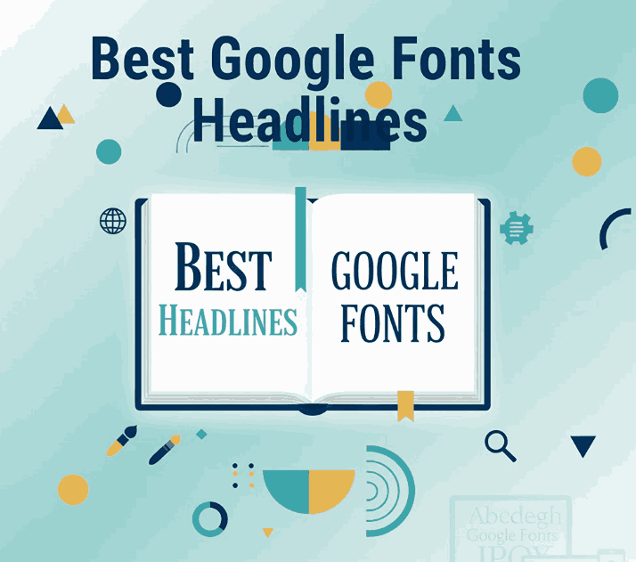
Table of Contents
- Introduction: Why Headlines Need the Right Font
- What Makes a Google Font Great for Headlines
- Best Google Fonts for Headlines (Top Picks + Design Tips)
- How to Pair Headline Fonts with Body Text
- Tips to Improve Readability & Visual Hierarchy
- Google Font Alternatives for High-Impact Headlines
- Font Mockup Examples from CalligraphyFonts.net
- Conclusion
1. Introduction: Why Best Google Fonts Headlines Need the Right Font
Your headline is the first element visitors see—online or in print. Choosing the right headline font can dramatically influence how content is perceived: modern, elegant, bold, playful, or serious.
Google Fonts has become one of the most accessible resources for designers thanks to:
- free licensing,
- responsive font support,
- extensive multilingual character sets.
In this article, we break down the best Google Fonts for eye-catching headlines, plus practical examples for web designers, brand creators, and editorial layouts.
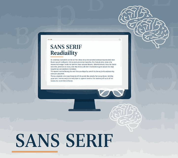
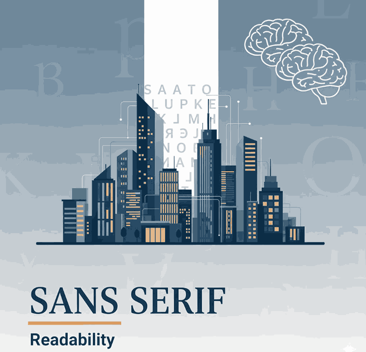
2. What Makes a Best Google Fonts Headlines?
Not every Google font is suited for headlines.
A strong headline font should be:
✔ bold and readable
✔ scalable across resolutions
✔ emotionally expressive
✔ able to stand alone without shrinking readability
When evaluating headline fonts, consider:
- stroke contrast
- spacing and kerning
- overall shape personality
- legibility at mobile sizes
A good headline font is not only visually attractive—it makes the reader want to continue scanning the page.
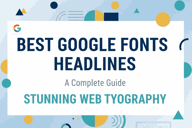
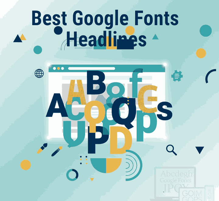
3. Best Google Fonts Headlines (Top Picks + Design Tips)
Below are some of the most widely used and award-winning headline fonts on Google Fonts for modern design.
1. Playfair Display
A high-contrast serif typeface. Great for luxury, beauty, fashion, and editorial.
Design tips:
- Use in large sizes for dramatic elegance
- Pair with light sans serif body text
2. Montserrat
Clean, professional, geometric. Popular in landing pages, apps, and modern websites.
Design tips:
- Bold weight for headlines
- Works well in uppercase
3. Oswald
Neutral but strong condensed font. Ideal for bold campaign messages.
Design tips:
- Works well with tight tracking
- Great for event posters or hero banners
4. Lora
Elegant serif with organic curves. Useful for emotional or narrative-driven content.
Design tips:
- Perfect for storytelling layouts
- Works beautifully with serif body copy
5. Bebas Neue
Known as the uppercase headline king. Popular for magazine covers and bold product ads.
Design tips:
- Avoid long text blocks
- Pair with light sans serif paragraph font
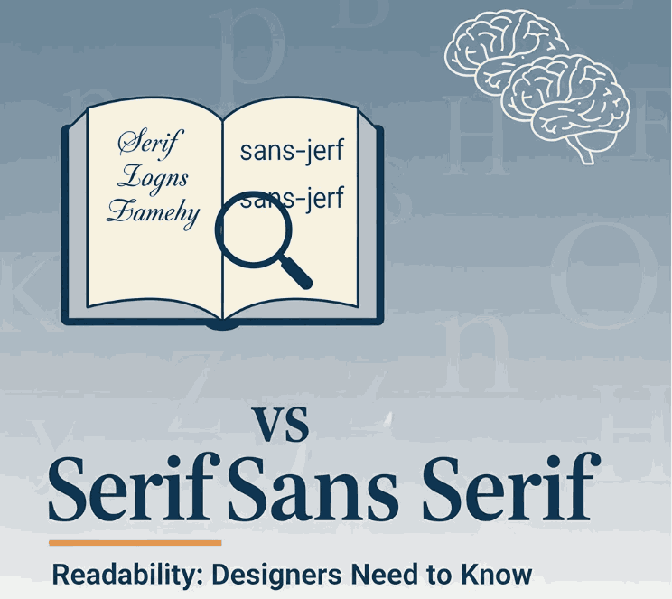
4. How to Pair Best Google Fonts Headlines with Body Text
Good typography pairing improves readability and hierarchy.
Recommended pairings:
| Headline Font | Suggested Body Text |
|---|---|
| Montserrat Bold | Roboto Regular |
| Playfair Display Black | Open Sans Regular |
| Oswald Bold | Lato Light |
| Lora Bold | Raleway Regular |
| Bebas Neue | Inter Regular |
Key pairing principles:
- contrast serif + sans serif
- avoid using two decorative styles
- check legibility at small and large sizes
5. Tips to Improve Readability & Visual Hierarchy
To make headlines stand out naturally:
- use bold weight for emphasis
- apply consistent spacing
- use color contrast against background
- apply responsive sizing
- keep sentence length crisp (<12 words recommended)
6. Google Font Alternatives for High-Impact Headlines
If you want headline fonts that look exclusive, consider premium fonts outside Google Fonts. Designers often combine Google fonts for body copy and premium fonts for headlines.
You can explore premium headline-worthy fonts here:
These fonts provide unique ligatures, stylistic alternates, and distinct personality compared to common web-standard fonts.
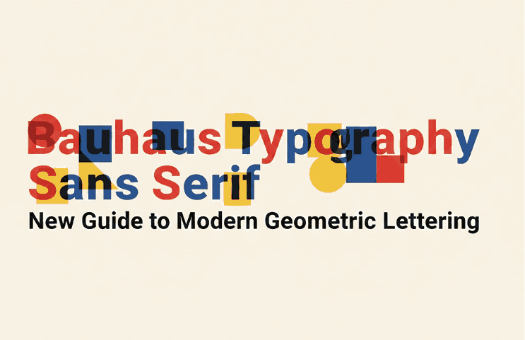
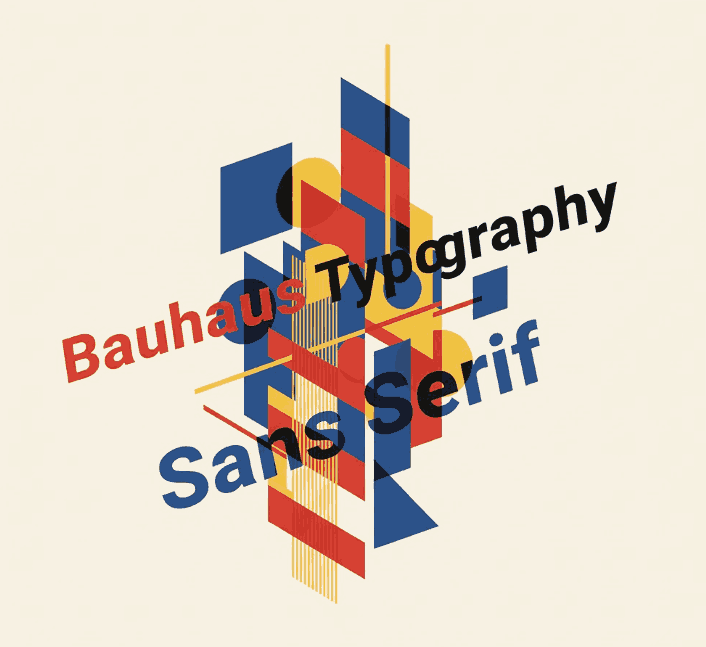
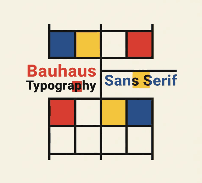
7. Best Google Fonts Headlines Font Mockup Examples(from CalligraphyFonts.net)
To inspire your next headline-focused project, explore these premium headline-ready fonts:
These fonts work beautifully for:
- social media ads
- poster headlines
- branding wordmarks
- editorial titles
8. Conclusion Best Google Fonts Headlines
Choosing the best Google Fonts for headlines requires balancing personality and readability. Whether you want bold modern typography or elegant editorial style, Google Fonts provides versatile, responsive and scalable type choices.
To elevate typography further, pairing Google Fonts with premium headline fonts can make your brand feel more unique and professional.
Reference
- GoogleFonts — Browse Fonts
- MaterialDesign — The type system
- DinStudio — Beautiful Display Typeface on Google Font
- Typewolf — The 40 Best Free Fonts Available on Google Fonts