Table of Contents
- Introduction
- What Is the Golden Ratio?
- The Mathematics Behind the Ratio
- A Brief History of the Golden Ratio
- Why the Golden Ratio Matters in Modern Design
- Golden Ratio in Logo Design
- Golden Ratio in Typography & Font Selection
- Recommended Fonts for Golden Ratio–Inspired Designs
- How to Apply the Golden Ratio in Your Creative Projects
- Final Thoughts
- References
1. Introduction Golden Ratio Definition & History
Golden Ratio Definition & History Designers and artists have long sought a timeless formula that produces visual harmony. The Golden Ratio, often recognized as one of the most powerful composition tools in history, continues to influence architecture, art, branding, and typography today. Whether you’re designing a logo, a website, or a font-centered visual layout, understanding the Golden Ratio helps you create balance, beauty, and natural aesthetics.
This article explores the definition, history, and modern applications of the Golden Ratio—along with carefully selected font mockups from CalligraphyFonts.net to inspire your next design project.
2. What Is the Golden Ratio Definition & History?
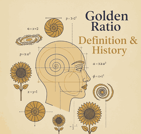
The Golden Ratio, also known as Phi (Φ) and valued approximately at 1.618, is a mathematical proportion found throughout nature, art, and design.
It describes the relationship between two quantities where:
(A + B) / A = A / B = 1.618
This natural proportional pattern is known for producing an ideal sense of harmony and visual balance. You’ll find it in:
- Nautilus shells
- Human anatomy
- Flower petals
- Galaxy spirals
- Renaissance paintings
- Modern brand logos
The universality of the Golden Ratio makes it a foundation of design excellence.
3. The Mathematics Behind the Golden Ratio Definition & History
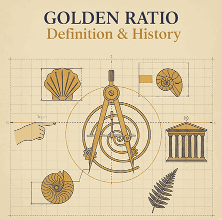
The Golden Ratio originates from the Fibonacci Sequence, a series of numbers where each number is the sum of the two before it:
1, 1, 2, 3, 5, 8, 13, 21, …
As the sequence progresses, the ratio between successive numbers approaches 1.618, leading to the proportional beauty found in nature and geometry.
Golden rectangles, spirals, and triangles are all derived from this ratio, making it essential in layout design, architecture, and even typography spacing.
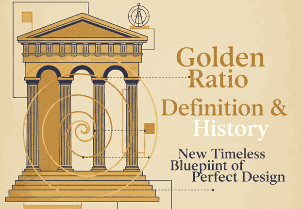
4. A Brief of Golden Ratio Definition & History
The Golden Ratio has been studied for thousands of years:
Ancient Greece
Greek mathematicians such as Euclid documented the ratio in “Elements,” linking it to geometry and aesthetics.
Renaissance
Artists including Leonardo da Vinci used the Golden Ratio in works like the Vitruvian Man and the Mona Lisa, elevating it as a standard of beauty.
Modern Times
Architects, graphic designers, and brand specialists continue to use Phi to create balanced compositions, logo grids, and typographic systems.
The Golden Ratio remains a symbol of perfection and artistic craftsmanship.
5. Why the Golden Ratio Definition & History Matters in Modern Design
Modern viewers are subconsciously drawn toward proportionally balanced visuals. Designs using the Golden Ratio tend to feel:
- Naturally pleasing
- More professional
- Better structured
- Easier to digest visually
It helps designers create layouts with optimal spacing, effective hierarchy, and aesthetically satisfying proportions in:
- Logos
- Web layouts
- Posters
- Packaging
- Photography
- Typography
6. Golden Ratio Definition & History in Logo Design
Many iconic brands incorporate Golden Ratio geometry in their logos, including:
- Apple
- Pepsi
- Toyota
Using Phi spirals and circular grids helps create logos that feel timeless, balanced, and instantly recognizable.
Designers often start with a Golden Rectangle or spiral, aligning elements—curves, icon shapes, or letterforms—to create cohesive branding.
7. Golden Ratio Definition & History in Typography Font Selection
Typography plays a crucial role in achieving aesthetic harmony. Fonts that complement Golden Ratio compositions usually embody:
- Balanced stroke proportions
- Elegant curves
- Consistent spacing
- Strong readability
Choosing the right font amplifies the sense of order and sophistication in Golden Ratio-based layouts.
8. Recommended Fonts for Golden Ratio Definition & History–Inspired Designs
Here are carefully selected fonts from CalligraphyFonts.net that pair beautifully with Golden Ratio compositions:
1. Faint Green Font
A modern handwritten script with graceful curves. Ideal for branding, logos, and editorial layouts.
2. Golden Autumn Font
A luxurious handwritten font with soft strokes, perfect for elegant brand identities.
3. Pictorial Style Font
An artistic script font featuring refined visual rhythm—excellent for posters, book covers, and product packaging.
These fonts offer organic shapes and refined silhouettes that align beautifully with Golden Ratio compositions, helping designers achieve a visually harmonious aesthetic.
9. How to Apply the Golden Ratio Definition & History in Your Creative Projects
Here are practical ways designers integrate Phi into their work:
1. Layout Composition
Divide your canvas using the 1:1.618 proportion to create hierarchy and balance.
2. Typography Scaling
Set headline, subheadline, and body text sizes using Phi increments for harmonious typography.
3. Logo Structure
Use circles and rectangles based on the Golden Ratio to form shapes, curves, and letter marks.
4. Spacing & Margins
Apply the ratio to padding, margins, and leading (line spacing) for cleaner visual flow.
5. Photography & Cropping
Use the Golden Spiral to highlight focal points in images, improving storytelling and visual impact.
10. Final Thoughts
The Golden Ratio is more than a mathematical concept—it’s a universal design principle that inspires harmony, balance, and timeless beauty. From logo grids to typographic scaling, Phi remains an essential tool for designers seeking refinement and professional structure.
By combining Golden Ratio principles with elegant, expressive fonts from CalligraphyFonts.net, you can elevate your branding, layouts, and visual storytelling with powerful aesthetic precision.
11. References
- Britannica — Golden ratio
- Cambridge — Visual Neuroscience
- Din Studio — What is the Golden Ratio?