Table of Contents
- What Is a Debranding Strategy in Branding?
- Why Big Brands Are Choosing Debranding
- Key Characteristics of a Successful Debranding Strategy
- The Role of Typography in Debranding
- Font Mockup Examples for Debranding Branding
- When Debranding Works — and When It Doesn’t
- How Designers Can Apply Debranding Principles
- Final Thoughts
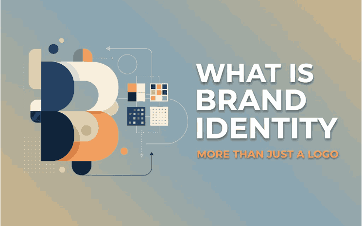
1. What Is a Debranding Strategy In Branding?
A debranding strategy in branding is the process of simplifying a brand’s visual identity by removing unnecessary details. This can include:
- Simplifying logos
- Reducing color palettes
- Using cleaner typography
- Removing icons or symbols entirely
The goal is not to weaken the brand, but to make it more recognizable, flexible, and timeless. In many cases, debranding helps brands communicate confidence—because strong brands don’t need excessive decoration to be recognized.

2. Why Big Choosing Debranding Strategy In Branding
There are several reasons why debranding has become so popular:
Digital-First Branding
Brands today must look good on websites, apps, social media icons, and small mobile screens. Complex logos don’t scale well, while simplified branding performs better across digital platforms.
Faster Recognition
Minimal branding allows audiences to recognize a brand instantly without visual noise. Clean typography and simple marks are easier to remember.
Timeless Design
Trends change quickly, but simplicity lasts. Debranding helps brands avoid frequent redesigns and stay relevant longer.
Global Consistency
Simpler logos and typography are easier to adapt across cultures, languages, and markets.
3. Key Characteristics of a Successful Debranding Strategy In Branding
A strong debranding strategy usually includes:
- Minimal visual elements
- Strong, readable typography
- Neutral or limited color usage
- Clear brand voice and tone
- Consistency across platforms
Typography often becomes the main visual identity once logos and symbols are reduced—making font selection more important than ever.
4. The Role of Typography in Debranding Strategy In Branding
When brands remove icons and complex visuals, typography takes center stage. Fonts communicate personality, trust, and emotion without needing extra decoration.
In debranded identities:
- Serif and script fonts can add human warmth
- Clean display fonts create confidence and clarity
- Well-designed letterforms replace symbols as brand signatures
This is why choosing the right font is critical for modern branding strategies.

5. Font Mockup Examples for Debranding Strategy In Branding
Here are font examples from CalligraphyFonts.net that work exceptionally well for branding and debranding concepts:
Suffragist Font
A natural and confident script font that brings a human touch to minimalist branding. Ideal for lifestyle, fashion, and boutique brands.
Dinernighty Font
A clean yet expressive font suitable for logo text and brand headlines, especially when icons are removed.
Jungle Queen Font
A bold script font that maintains personality even in simplified branding systems. Works well as a standalone logo text.
Charima Sharene Font
Elegant and refined, this font is perfect for premium branding that relies on typography instead of visual symbols.
These fonts demonstrate how strong typography can replace complex logos while maintaining brand character.
6. When Debranding Works — and When It Doesn’t
Debranding Works Best When:
- The brand already has strong recognition
- Typography is carefully chosen
- The brand message is clear and consistent
Debranding Can Fail If:
- The brand lacks identity clarity
- Typography is generic or poorly designed
- Simplicity removes too much personality
Debranding is not about being boring—it’s about being intentional.
7. How Designers Can Apply Debranding Strategy In Branding Principles
Designers working on modern branding projects can apply debranding strategies by:
- Starting with typography-first logo concepts
- Reducing color usage to essentials
- Testing logos at small sizes early
- Focusing on readability and spacing
- Letting fonts carry the brand personality
Fonts from curated libraries like CalligraphyFonts.net make it easier to build strong identities without visual clutter.
8. Final Thoughts
A debranding strategy in branding is not about removing value—it’s about removing distraction. In a crowded digital world, clarity wins. Brands that embrace simplicity, supported by strong typography, often appear more confident, modern, and trustworthy.
By combining debranding principles with expressive, high-quality fonts, designers can create brand identities that are both minimal and memorable.
References
- Canva — Branding tips and tricks
- Interaction Design — The world’s biggest collection of design knowledge
- Din Studio — What Makes Big Companies Change Their Logos to Simpler Ones?