
Table of Contents
- Introduction to High Resolution Image Design
- What Is High Resolution Image Design?
- Why High Resolution Matters in Modern Design
- Common Causes of Blurry or Low-Quality Images
- DPI, PPI, and Pixel Dimensions Explained
- Best File Formats for High Resolution Image Design
- Typography and Fonts in High Resolution Design
- How to Prepare Images for Print and Digital Use
- Professional Font Mockup Examples for High Resolution Design
- Final Thoughts
1. Introduction to High Resolution Image Design
In today’s visually driven digital world, high resolution image design is no longer optional—it’s essential. Whether you’re creating branding assets, website visuals, social media graphics, or print materials, image clarity directly affects how professional and trustworthy your brand appears.
Designers often invest time in color theory and layout but overlook resolution, leading to blurry visuals that reduce impact. This guide will help you understand how to create crisp, clean, and professional designs that look sharp on every screen and print medium.
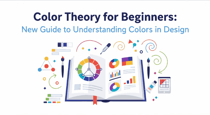
2. What Is High Resolution Image Design?
High resolution image design refers to creating visuals with sufficient pixel density, clarity, and sharpness so they appear detailed and clean at their intended size.
A high resolution image typically includes:
- Proper pixel dimensions
- Correct DPI/PPI settings
- Non-compressed or minimally compressed formats
- Sharp typography and vector-based elements
When done correctly, high resolution designs maintain clarity whether viewed on retina displays, large monitors, or printed materials.

3. Why High Resolution Image Design Matters
High resolution image design is critical because it:
- Enhances brand credibility
- Improves user experience
- Ensures print accuracy
- Prevents pixelation on high-density screens
- Makes typography appear sharp and professional
Low-quality visuals can instantly damage trust, especially for creative brands, digital products, and typography showcases.
4. Common Causes of Blurry or Low-Quality Images
Even experienced designers sometimes struggle with image clarity. Common mistakes include:
- Using images smaller than required
- Stretching raster images beyond their original size
- Exporting with low DPI for print
- Excessive compression
- Using low-quality fonts or rasterized text
Avoiding these mistakes is the foundation of effective high resolution image design.
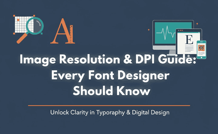
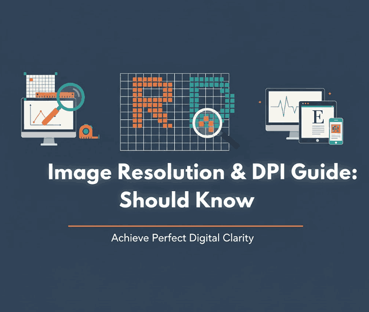
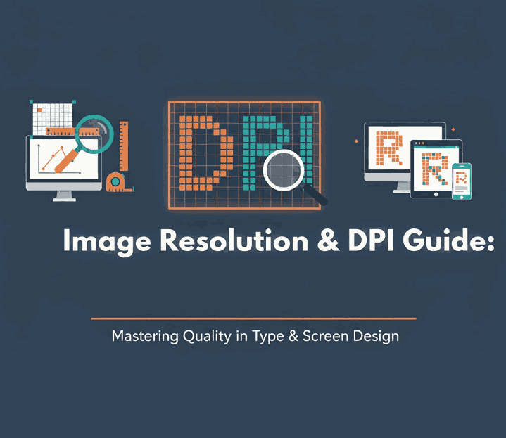
5. DPI, PPI, and Pixel Dimensions Explained
Understanding these three concepts is essential:
- Pixel Dimensions: The actual width and height of an image in pixels
- PPI (Pixels Per Inch): Used for digital screens (72–144 PPI typical)
- DPI (Dots Per Inch): Used for printing (300 DPI standard)
For print design, always use 300 DPI with large pixel dimensions. For digital designs, prioritize pixel size over DPI.
6. Best File Formats for High Resolution Image Design
Choosing the right format ensures your designs stay sharp:
- PNG – Best for web, transparency, and sharp typography
- JPEG – Smaller file size, but avoid excessive compression
- SVG – Ideal for logos and vector typography
- PDF – Best for print-ready designs
- TIFF – High-quality print production
For typography-focused visuals, PNG and SVG are often the best choices.
7. Typography and Fonts in High Resolution Image Design
Typography plays a major role in perceived image quality. Poor font choices can ruin even the best layout.
High-quality fonts:
- Render cleanly at large sizes
- Maintain detail when exported
- Look sharp on high-resolution displays
Premium fonts are especially important for:
- Branding
- Logo design
- Posters
- Product mockups
- Website headers

8. How to Prepare High Resolution Image Design for Print and Digital Use
For Digital Use:
- Export at 2× or 3× resolution
- Use PNG or SVG
- Avoid over-compression
- Preview on high-density screens
For Print Use:
- Set canvas to final print size
- Use 300 DPI
- Export as PDF or TIFF
- Use CMYK color mode
These steps ensure your high resolution image design remains consistent across platforms.
9. Professional Font Mockup Examples for High Resolution Design
Using premium fonts significantly enhances visual clarity and professionalism. Below are excellent font examples from CalligraphyFonts.net that work beautifully in high resolution designs:
- Shotflick Font – A bold display font perfect for sharp headlines and modern branding
- Holdsmith Font – Elegant signature style ideal for premium mockups and luxury designs
- Ameralda Font – Artistic and expressive, great for creative high-resolution typography
- Shailendra Font – Classic calligraphy style that remains crisp even at large sizes
These fonts are ideal for showcasing high resolution image design in both digital and print mockups.
10. Final Thoughts
Mastering high resolution image design is about more than just large images—it’s about precision, preparation, and quality assets. From understanding DPI to choosing premium fonts, every detail matters.
By combining proper resolution settings with professional typography from CalligraphyFonts.net, your designs will look sharper, more polished, and more impactful across all platforms.
Authority References
- Dribbble — High Resolution
- Freepik — High resolution Images
- Adobe Stock — High-Resolution Design Images
- Din Studio — Pro Tips: How to Make a High Definition, Not Blurry Design