Table of Contents
- Introduction
- What Is a Monochrome Color Palette?
- Monochrome vs Black and White: Key Differences
- Why Designers Love Monochrome Color Palettes
- Popular Monochrome Color Palette Examples
- Typography’s Role in Monochrome Design
- Font Mockup Examples for Monochrome Designs
- Tips for Creating Effective Monochrome Designs
- Common Mistakes to Avoid
- Final Thoughts
- References
1. Introduction Monochrome Color Palette Examples
Monochrome Color Palette Examples plays a crucial role in visual communication, but sometimes less truly is more. One of the most powerful and timeless approaches in design is the monochrome color palette. Designers across branding, typography, packaging, and digital media rely on monochrome palettes to create visuals that feel clean, intentional, and emotionally focused.
In this article, we explore Monochrome Color Palette Examples, explain how they work, and show how the right typography—especially high-quality fonts—can elevate monochrome designs to a professional level.
2. What Is a Monochrome Color Palette Examples?
A monochrome (or monochromatic) color palette is created using one base color and expanding it through:
- Tints (color + white)
- Shades (color + black)
- Tones (color + gray)
This results in a palette that maintains visual consistency while still offering depth and contrast.
For example:
- A blue monochrome palette may include navy, royal blue, sky blue, and pale blue
- A green monochrome palette may include forest green, olive, sage, and mint
3. Monochrome vs Black and White: Key Differences
Many people mistakenly think monochrome means only black and white. In reality:
- Black and white is just one type of monochrome palette
- Monochrome can be built from any color
This flexibility makes monochrome palettes ideal for modern branding, editorial layouts, and typography-focused designs.
4. Why Designers Love Monochrome Color Palette Examples
Monochrome palettes remain popular because they offer multiple advantages:
✔ Visual Harmony
Using one color ensures consistency across all design elements.
✔ Strong Brand Identity
Brands using monochrome colors often appear more confident and memorable.
✔ Focus on Form and Typography
Without multiple colors competing for attention, typography and layout shine.
✔ Timeless Aesthetic
Monochrome designs age well and adapt easily across mediums.
✔ Easier Color Decisions
Designers can focus more on concept, spacing, and hierarchy.
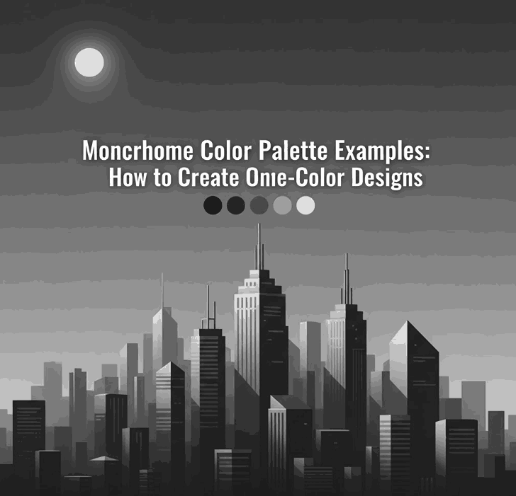
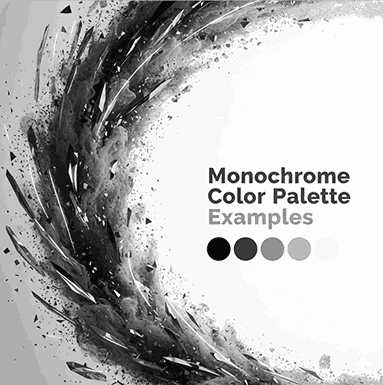
5. Popular Monochrome Color Palette Examples
Here are some widely used monochrome palettes in modern design:
Monochrome Black & Gray
- Editorial layouts
- Luxury branding
- Minimalist websites
Monochrome Blue
- Technology and SaaS brands
- Corporate identity
- UI and web design
Monochrome Green
- Eco-friendly brands
- Organic products
- Wellness and lifestyle designs
Monochrome Beige / Brown
- Craft, handmade, and vintage branding
- Packaging and labels
Monochrome Red
- Bold posters
- Entertainment branding
- Promotional visuals
Each palette works best when combined with strong typography and thoughtful contrast.
6. Typography’s Role in Monochrome Color Palette Examples Design
In monochrome design, typography becomes the primary visual element. The font’s:
- Stroke weight
- Curves
- Contrast
- Texture
…all determine how engaging the design feels.
High-quality fonts help:
- Create hierarchy without extra colors
- Add emotion and personality
- Improve readability
- Strengthen brand perception
This is why premium fonts are essential for monochrome layouts.
7. Font Mockup for Monochrome Color Palette Examples Designs
Below are carefully selected fonts from CalligraphyFonts.net that work exceptionally well in monochrome color palette examples.
1. Belleriana Font
Elegant calligraphy font perfect for monochrome luxury branding, editorial headlines, and premium packaging.
Best for:
- Monochrome black, navy, emerald palettes
- Fashion, beauty, and wedding branding
2. Jungle Tribe Font
A bold display font with strong personality that stands out even with a single color.
Best for:
- Monochrome earthy tones
- Posters, packaging, and merchandise
3. Monoscreen Modern Display Font
A futuristic display font ideal for clean, modern monochrome digital designs.
Best for:
- Monochrome gray or blue palettes
- Tech branding, UI, and web headers
4. Anthonyela Calligraphy Font
A flowing handwritten font that brings elegance and softness to monochrome compositions.
Best for:
- Monochrome pastel palettes
- Beauty brands, personal logos, and packaging
8. Tips for Creating Effective Monochrome Color Palette Examples Designs
To get the most out of monochrome color palettes:
- Use contrast through light and dark tones
- Combine bold and thin typography
- Apply spacing and hierarchy carefully
- Experiment with texture and opacity
- Avoid flat designs by adding subtle gradients
- Test readability across screen and print
Typography and composition are the keys to success.
9. Common Mistakes to Avoid Monochrome Color Palette Examples
Even simple palettes can fail if used incorrectly. Avoid these mistakes:
- Using too little contrast
- Choosing weak or poorly designed fonts
- Relying on color alone without hierarchy
- Ignoring accessibility and readability
- Overusing decorative fonts
A strong monochrome design is intentional, not accidental.
10. Final Thoughts Monochrome Color Palette Examples
Exploring Monochrome Color Palette Examples is an excellent way to refine your design skills and strengthen visual storytelling. By focusing on one color and pairing it with high-quality typography, designers can create layouts that are elegant, modern, and impactful.
For professional monochrome typography and branding, premium fonts from CalligraphyFonts.net provide the perfect foundation for stunning design results.
11. References
- Nielsen Norman Group – Visual Design Principles
- Interaction Design Foundation – Color Theory
- Smashing Magazine – Color in Design