Posted on

Serif vs Sans Serif Readability: New Designers Need to Know

Sans Serif Readability

Table of Contents

  1. Introduction
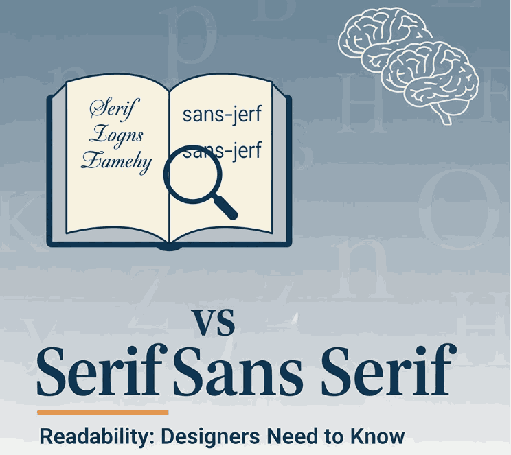
  2. What Are Serif and Sans-Serif Fonts?
  3. The Readability Debate: Serif vs Sans Serif
  4. Key Factors That Influence Readability
  5. How This Applies to Your Font Design & Mockups
  6. Font Examples for Mockups & Practice
  7. Conclusion
  8. References

1. Introduction

When choosing typefaces for branding, web design, print or packaging, one of the most common questions is: “Should I use a serif or Sans Serif Readability” The short answer: it depends. In this article we’ll explore the nuance of serif vs sans serif readability, examine scientific research, highlight key influencing factors, and show how you can apply this knowledge to your font-design business at CalligraphyFonts.net.

2. What Are Serif and Sans Serif Readability Fonts?

A serif font features small decorative strokes or “feet” at the ends of letterforms. The term “serif” comes from the Dutch word schreef meaning a line or stroke.
A sans-serif font (from French sans meaning “without”) lacks those extra strokes, giving a cleaner and more modern appearance.
From a designer’s perspective:

  • Serif fonts often convey tradition, formality, readability in print.
  • Sans-serif fonts often convey modernity, clarity, minimalism—especially in digital contexts.
Sans Serif Readability

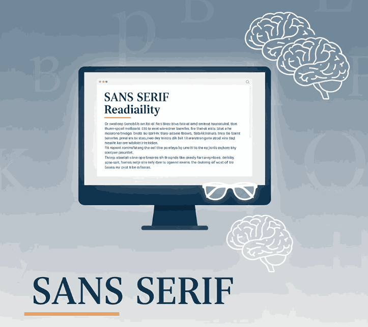
3. The Readability Debate: Serif vs Sans-Serif

For decades, designers and typographers assumed serifs help guide the eye along lines of text (especially in print) and thus improve readability. But what does the research say?

Research Highlights

  • A study published by PMC found that participants read slightly faster and more accurately from sans‐serif typefaces in some digital contexts.
  • Another review notes: “There is no evidence that serif or sans‐serif significantly impacts readability.”
  • A 2023 article in Readable states that the “sans‐serif is easiest” assumption isn’t always true, and that reading speed/comprehension depends on many factors beyond serif presence.
  • A font-readability blog notes: “Serif fonts were slightly more legible for printed text with no anti-aliasing; sans-serif performed best on screen with anti-aliasing.”

What It Means

In practical terms:

  • In print contexts or very small type sizes, serif fonts may offer a slight advantage (though not huge).
  • On digital screens, high resolution and anti-aliasing have reduced the advantage of serifs; many sans-serif fonts perform equally well or better.
  • Ultimately readability depends more on font design quality, x-height, letter spacing, contrast, line length, line spacing, and audience context.

4. Key Factors That Influence Sans Serif Readability

When thinking about serif vs sans-serif readability, keep these factors in mind—they often matter more than the presence or absence of serifs:

  • x-Height & letter proportions: A larger x-height tends to improve legibility.
  • Stroke contrast: High contrast (thin/thick strokes) may reduce readability, especially at small sizes or screen resolution.
  • Spacing (kerning/leading/tracking): Tight spacing can hinder readability; generous spacing helps.
  • Line length & layout: Very long lines of text reduce readability regardless of font style.
  • Medium & resolution: On low-resolution screens, serifs may blur; on print or high-dpi displays, this is less an issue.
  • Audience & context: Readers with visual impairment or dyslexia may respond differently; some studies suggest sans‐serif may have slight advantages for certain groups.

5. How This Applies to Your Font Design & Mockups

As a font-design business (CalligraphyFonts.net) you’re not just choosing fonts—you’re creating them and selling to other designers. Here’s how you can apply the readability insight:

  • Design for context: If a font is intended for body text (print or long reading), then consider serif or well-designed sans with strong x-height and spacing.
  • Mockup your fonts in both display and text usage so customers see readability in context.
  • Use your fonts in relevant digital or print scenarios:
    • For example, a font designed with strong x-height and simplified forms will work well on screen as a sans-serif choice even if it has subtle serifs.
  • Educate your customers: In your product descriptions mention readability context—“ideal for screen use”, “optimized for print body copy”, etc.
  • Pair fonts thoughtfully: When using display fonts (for headlines) vs text fonts (body), the readability requirements differ—display can be more stylised, text needs clarity.
    By aligning font style with readability research (rather than simply relying on “serif for print, sans for web”), you’ll build trust and credibility with your customers.
Sans Serif Readability

6. Font Examples for Mockups & Practice

Here are four fonts from your collection that you can use for readability-focused mockups and display them in contexts (print vs screen) to showcase versatility:

  • Faint Green Font – Try this in body text print mock-up to illustrate serif readability in print context.
  • Clangorous Font – Use in bold headings or web hero to show how sans-serif or hybrid forms perform on screen.
  • Barley Round Font – A friendly rounded sans-serif ideal for digital reading and lifestyle brand usage.
  • Patriotics Font – Vintage-inspired serif display font – good for print use or headings where tone and readability matter.

Show your audience how each font performs in both screen and print contexts, and you’ll not only sell fonts—you’ll educate your market and position your brand as expert.

7. Conclusion Sans Serif Readability

The serif vs Sans Serif Readability discussion doesn’t have a one-size-fits-all answer—but the takeaway is clear: context matters more than dogma. Good font design, appropriate spacing, layout and medium matter more than whether a font has serifs. For your font-design business, that means being deliberate about readability in every mockup, controlling context, and educating your customers. By doing so, you set your fonts apart as thoughtful, usable, and high-quality assets — not just pretty typefaces.

8. References

Posted on

Modern Art Trends Shaping the New Future of Interior Design

Modern Art Trends Interior Design

Table of Contents

  1. Introduction
  2. Why Modern Art Influences Interior Design
  3. Key Modern Art Trends Shaping Interiors
    • 3.1 Bold & Unexpected Color Palettes
    • 3.2 Abstract Shapes & Geometric Forms
    • 3.3 Mixed Media & Texture Play
    • 3.4 Digital Art, Projections & Interactive Elements
    • 3.5 Large-Scale Murals & Statement Walls
    • 3.6 Minimalism & Negative Space
    • 3.7 Sustainability & Recycled Materials
  4. Translating Art Trends into Interior Strategy
  5. Applying Art-Driven Aesthetics in Font & Branding Spaces
  6. Font Mockup Ideas Aligned with Art Trends
  7. Tips & Cautions When Integrating Modern Art in Interiors
  8. Conclusion & Call to Action
  9. References

1. Introduction Modern Art Trends Interior Design

Modern Art Trends Interior Design are converging more than ever. Interiors are no longer neutral canvases but expressive spaces where art trends directly shape color, form, texture, and interactive experience. The article “How Modern Art Trends Are Influencing Interior Design” discusses this shift: contemporary art’s striking palettes, textures, and shapes now inspire spatial design.

In this article, we’ll explore the major art trends infiltrating interior design and show you how you (as a font and design business) can reflect these trends in your mockups, branding, and visual storytelling.

Modern Art Trends Interior Design

2. Why Influences Modern Art Trends Interior Design

Art has always been a mirror of culture, innovation, and visual experiment. As interior design becomes more expressive and personal, designers borrow from modern art to:

  • Bring identity into spaces
  • Create emotional resonance (color, form, texture)
  • Blur boundaries between gallery and home
  • Introduce interactive, media-rich elements

Art offers a vocabulary of visual tension and harmony, which interiors can leverage to make spaces feel alive.

3. Key Modern Art Trends Interior Design Shaping

3.1 Bold & Unexpected Color Palettes

Modern art often experiments with contrast, saturated pigments, unexpected combinations, and accent pops. Interiors reflecting this trend may use avant-garde palettes—neon accents over muted bases or unconventional color pairings.

3.2 Abstract Shapes & Geometric Forms

From fluid organic abstract to strict geometry, modern interiors embrace abstract shapes: sculptural furniture, geometry in wall patterns, asymmetric layouts, and fragmented partitions.

3.3 Mixed Media & Texture Play

Art trends often fuse materials—canvas, metal, resin, textiles. Interiors adopt this via textured walls (plaster, terrazzo), layered materials, and juxtaposed finishes to evoke depth.

3.4 Digital Art, Projections & Interactive Elements

Digital art—projection maps, interactive walls, LED art—adds kinetic dimension to interiors. With screens more integrated, interiors may include motion, evolving visuals, or responsive surfaces.

3.5 Large-Scale Murals & Statement Walls

Instead of small artworks, walls themselves become canvases. Oversized murals, abstract compositions, or bold wall graphics anchor the room visually. Designers use these as focal statements.

3.6 Minimalism & Negative Space

In contrast to boldness, modern art also influences pared-down interiors—emphasizing negative space, selective color, simplicity as expressive. Clean lines, minimal objects, and curated voids are tools of modern interiors.

3.7 Sustainability & Recycled Materials

Modern art increasingly highlights ecological concerns. Interiors borrow by repurposing materials, using recycled art installations, or elevating found objects as sculptural elements.

4. Translating Modern Art Trends Interior Design Strategy

To use these art trends in real spaces:

  • Choose a dominant art element (mural, sculpture, digital panel) and let other design choices echo it.
  • Build layers of texture—floor, wall, ceiling—to complement artistic features.
  • Use accent lighting & focal illumination to showcase art elements.
  • Keep furniture, fixtures neutral or simple so the art becomes the hero.
  • Balance bold zones with calm zones to avoid overstimulation.

Interior trend forecasts for 2025 also highlight earth neutrals, warm metallics, and bold accent scales as trending.

Modern Art Trends Interior Design

5. Applying Art-Driven Aesthetics in Font & Branding Spaces

For your font business and brand visuals:

  • Use color palettes inspired by art trends (unexpected duos, muted + pop) in your font specimen pages.
  • Mock your fonts on “statement walls” visuals or alongside digital panels/abstract backgrounds.
  • Use geometric or abstract overlays in your branding to echo interior art forms.
  • In your office or studio space, display your own font posters as art panels in interior décor.

By aligning your visual brand with interior-art trends, you bridge the world of fonts with spatial design sensibility.

6. Font Mockup Ideas Aligned with Modern Art Trends Interior Design

Here are fonts from your catalog and mockup ideas that mirror modern interior art trends:

  • Black Roll Font — place it over an abstract expressionist background or layered texture wall.
  • Aesthetic Sunset Font — use gradient abstract sunset mural behind text, reflect on color interplay.
  • Madame Grettha Font — elegant script paired with minimal negative space and bold statement wall behind.
  • Overcame Font — use strong color-blocked or geometric geometry behind the type sample.

Try creating mockups where fonts appear as if part of modern interiors: floating on walls, integrated with art panels, or interacting with projected animations.

7. Tips & Cautions When Integrating Modern Art Trends Interior Design

  • Don’t let art overwhelm function—spaces still need flow and comfort.
  • Ensure the art focal point complements architecture, not fights it.
  • Test lighting and contrast: some art colors fade or read poorly under regular lighting.
  • Be mindful of scale—art elements too large or small lose impact.
  • For digital art: consider maintenance, updates, and how it ages.

Balance creativity with usability.

8. Conclusion & Call to Action

Modern art trends are reshaping interiors into expressive, dynamic environments. For designers and font creators, these trends provide rich visual language—color, shape, texture, digital interplay—you can mirror in your branding and mockup worlds.

References

  • Din Studio — How Modern Art Trends Are Influencing Interior Design
  • Decorilla 20 Interior Design Trends 2025
  • Prazzle ArtsIntegration of Traditional Art in Contemporary Interior Design
  • Singulart Top 10 Art Trends in 2025

Posted on

Best Color Palette Generator: New Tools & Tips for Designers

Best Color Palette Generator

Table of Contents

  1. Introduction: Why a Good Color Generator Matters
  2. What Makes a Color Palette Generator “Best”?
  3. Top Best Color Palette Generator Tools in 2025
    • 3.1 Coolors
    • 3.2 Adobe Color
    • 3.3 Paletton
    • 3.4 Colormind
    • 3.5 Khroma
    • 3.6 ColorSpace / MyColor.Space
    • 3.7 ColorMagic / AI generators
  4. How to Choose the Right Generator for Your Workflow
  5. Applying Generated Palettes to Fonts & Branding
  6. Font Mockup Examples from Your Collection
  7. Tips & Best Practices When Working with Generated Palettes
  8. Common Pitfalls to Avoid
  9. Conclusion & Action Steps
  10. References

1. Introduction: Why a Good Color Generator Matters

Choosing a Best Color Palette Generator can be one of the most challenging and yet foundational steps in any design project. A strong color palette sets tone, mood, and visual harmony. For font designers and sellers, the palette behind your mockups and branding visuals matters: it influences perception and lets your typefaces shine.

This is where a best color palette generator becomes invaluable. It helps you experiment with harmony, contrast, and visual coherence quickly and reliably. In this article, we’ll explore top tools, how to pick one that suits your workflow, and how to apply those palettes to font mockups and branding.

Best Color Palette Generator

2. What Makes a Best Color Palette Generator?

Not all color tools are created equal. Here are criteria to judge whether a generator is worth your time:

  • Ease of use / UI / UX — simple interface, clear controls
  • Color harmony modes — support for analogous, complementary, triadic, tetradic, etc.
  • Image upload or extraction — ability to extract palettes from photos or inspirations
  • AI / smart suggestions — help with palette variation, learning your preferences
  • Export / integration formats — HEX, RGB, CSS, ASE, plugins for design tools
  • Preview / context — show palettes in mockups or UI / layout previews
  • Performance & reliability — fast, responsive, no heavy lag

A generator that ticks many of these boxes becomes a go-to tool in your design arsenal.

3. Top Best Color Palette Generator Tools in 2025

Here are some of the leading, widely recognized tools used by designers today:

3.1 Coolors

Coolors is praised for speed, simplicity, and versatility. You can lock certain colors and shuffle others, browse trending palettes, and export in many formats.

3.2 Adobe Color

Adobe Color offers multiple harmony rules (analogous, monochrome, triad, etc.) and integrates with Adobe Creative Cloud. You can also upload images and extract color themes.

3.3 Paletton

Paletton is ideal for more experimental palette exploration. It shows previews, scheme variations, and interactive wheel adjustments.

3.4 Colormind

Colormind uses deep learning to suggest palettes based on existing design styles, photos, and popular palettes.

3.5 Khroma

Khroma applies AI to learn your preferred colors and continuously generate palettes aligned with your taste.

3.6 ColorSpace / MyColor.Space

These tools offer palette generation and gradient exploration based on user input or random generation.

3.7 ColorMagic / AI Generators

ColorMagic allows generating palettes from text, images, brand names—with AI backing.

Each of these tools has strengths—some are faster and simpler, others more advanced or AI-powered. You may use multiple depending on your project type.

4. How to Choose the Right Best Color Palette Generator for Your Workflow

Here are guiding questions to help you select the best generator for you:

  • Do you prefer creativity or control? (Some tools give you full control, others guide you.)
  • Do you need to extract palettes from images / brand assets?
  • Do you often work inside Adobe / Figma / design tools and need plugin integration?
  • Do you want AI assistance or more manual adjustment?
  • Which export formats do you need (CSS, image, ASE, etc.)?
  • Do you need preview context (UI mockups, layout previews)?

Choose a generator that fits your typical design flow—whether quick mockups or fine-tuned branding work.

5. Applying Best Color Palette Generator to Fonts & Branding

Once you have a palette, here’s how to apply it in your font business:

  • Mockup backgrounds: Use primary or secondary palette colors behind your font samples.
  • Accent layers: Use secondary or highlight palette colors on swashes, alternates, curves, ligatures.
  • Font pairing visuals: Use different colors in your palette for heading, subheading, body text in your examples.
  • Hover / UI states: If you display font previews in a UI or webpage, use accent palette colors for hover overlay or border.
  • Brand consistency: Match your brand’s color vocabulary in your marketing, packaging, and interface visuals.

Your palette becomes an extension of brand identity, guiding how fonts are perceived in context.

6. Font Mockup Examples from Your Collection

Here are fonts from your catalog and mockup ideas using generated palettes:

  • Holdsmith — place it on a muted, complementary palette background; use a contrasting accent color for decorative strokes or shadows.
  • Ameralda Font — present in elegant tones with gentle accent hues to make the script pop.
  • Shailendra Font — use bold accent for the name, background in subdued palette tones to let details shine.
  • Leathering Font — try textured mockups with color palette-derived earthy tones + one bright accent to highlight edges or texture.

Test multiple generated palettes on the same font mockup to see which palette gives the desired mood or style.

Best Color Palette Generator

7. Tips & Best Practices When Working with Best Color Palette Generator

  • Don’t accept palette blindly—adjust saturation, brightness, contrast as needed.
  • Use the 60-30-10 rule: dominant, secondary, and accent colors proportions.
  • Always check text contrast – ensure legibility.
  • Combine with neutral grays or whites to buffer strong colors.
  • Lock colors you like and regenerate the rest to find variations.
  • Save your favorite palettes in a swatch library.
  • Use palette previews (UI, layout, mockups) before committing.
  • Test across devices/screens to avoid color surprises.

8. Common Pitfalls to Avoid

  • Accepting a palette without testing it in real use (mockups).
  • Ignoring contrast and readability.
  • Relying entirely on bright colors or extremes—balance with neutrals.
  • Using too many accent colors from generated palettes.
  • Forgetting to match your font style / brand tone with the palette mood.

9. Conclusion & Action Steps Best Color Palette Generator

A best color palette generator is not just a tool — it’s a creative partner that helps you explore harmony, contrast, and visual identity. For your font business, using strong, intentional palettes makes your typefaces look more professional, compelling, and cohesive in context.

Action Steps:

  1. Pick 2–3 generator tools above (e.g. Coolors, Adobe Color, Colormind).
  2. Generate 5–10 palettes and apply to one of your fonts in mockup visuals.
  3. Choose the palette(s) that reflect your brand mood, test readability.
  4. Save hex codes and build a swatch library.
  5. Use your palette consistently across branding, marketing, mockups.

References

  • Paletton — “The Color Scheme Designer”
  • Color Designer — “Color Palette Builder & Mixer”
  • Wixel — “8 Best Free Color Palette Generator Tools”
  • School of Motion — “10 Tools to Help You Design a Color Palette”

Posted on

Brand Color Personality: How Colors Shape Your New Brand Identity

Brand Color Personality

Table of Contents

  1. Introduction: Why Color Isn’t Just Decoration
  2. What Is Brand Color Personality?
  3. How Colors Influence Consumer Perception
  4. Key Color–Personality Associations
  5. Choosing a Color Personality for Your Brand
  6. Applying Brand Color Personality in Typography & Fonts
  7. Font Mockup Examples from Your Collection
  8. Pitfalls & Cultural Considerations
  9. Tips to Test & Validate Your Brand Color Personality
  10. Conclusion & Call to Action
  11. References

1. Introduction: Why Color Isn’t Just Decoration

You’ve probably heard that “colors speak louder than words.” In branding, that’s more than a cliché—it’s a strategic truth. The colors you choose for your brand become a nonverbal language, signaling who you are and what you stand for to your audience. This is at the heart of brand color personality.

For a font business like yours, where visual identity is core, aligning your brand’s personality with color helps your fonts “feel right” in context, attract the right customers, and create stronger brand recall.

2. What Is Brand Color Personality?

Brand color personality refers to the emotional, psychological, and associative traits that a brand’s color palette communicates to the audience. It’s how colors express the “character” of a brand—whether it feels energetic, trustworthy, youthful, sophisticated, earthy, or whimsical.

It is grounded in color psychology, which studies how color influences human emotion, behavior, and perception. In branding, color is a powerful cue—studies show that up to 90% of first impressions can be formed based on color alone.

So choosing colors isn’t just aesthetic; it’s a strategic decision in aligning visual identity with brand values and messaging.

Brand Color Personality

3. How Colors Influence Consumer Perception

Colors influence perception in several interlocking ways:

  • Emotional associations: People often unconsciously connect colors with feelings (e.g. blue = calm/trust, red = energy/passion).
  • Cultural & contextual meaning: Interpretations of colors differ across cultures, industries, and usage context.
  • Recognition & recall: A consistent color palette builds memory linkage—customers start to associate that hue set with your brand.
  • Decision-making & behavior: Colors can influence what people pay attention to or how they perceive brand attributes like trust, sophistication, energy, or friendliness.

In short: your color choices help shape how your brand is felt and judged at a glance.

4. Key Color–Personality Associations

While these associations are not universal, here are commonly recognized linkages in branding:

  • Blue → Trust, stability, professionalism
  • Green → Nature, growth, harmony
  • Red → Excitement, urgency, passion
  • Yellow / Gold → Optimism, warmth
  • Orange → Creativity, friendliness
  • Purple → Luxury, imagination, spirituality
  • Black / Dark Neutrals → Elegance, sophistication
  • White / Light Neutrals → Simplicity, purity

Brands often pair a primary color with neutrals or accent colors to modulate their personality. (E.g. a tech brand might pair blue + gray + neon accent.)

A useful note: color psychology is nuanced and mediated by context, culture, and individual experience. No color guarantees one emotion.

5. Choosing a Your Brand Color Personality

Here’s a framework you can follow:

  1. Define your brand values, tone, and target audience
    What do you want people to feel when they see your brand? Bold? Warm? Premium? Creative?
  2. Map traits to colors
    Pick color(s) that best echo those traits. If your brand is “creative + grounded,” you might lean earthy greens + warm neutrals + one accent.
  3. Test harmony & contrast
    Ensure your palette is usable—text legibility, contrast, color combinations must work in practical use.
  4. Consider accent colors
    Use accent hues to introduce nuance, highlight, or signal interactive states.
  5. Stay consistent
    Apply your color personality across all brand assets—logo, website, social media, mockups, packaging.
  6. Be flexible to context
    Use variations or secondary palettes when needed, but keep primary identity stable.

By anchoring your color decisions in personality and consistency, you build stronger visual identity.

Brand Color Personality

6. Applying Brand Color Personality in Typography & Fonts

As a font designer/seller, your color personality should reflect (or harmonize with) your font style. Here’s how:

  • Font sample previews: Display your fonts on backgrounds that reflect your brand’s personality. Use your primary hue in a way that makes the font pop.
  • Mockup contexts: If your brand is rugged or bold, use earthy, textured palettes. If elegant or luxury, use dark neutrals or muted tones with accent highlights.
  • Font pairing examples: Show how two fonts work together with your brand palette—one in primary color, one in secondary.
  • Highlighting special glyphs or alternates: Use accent colors to draw attention to ligatures, alternates, or stylistic sets in demo visuals.

Your font visuals become not just product previews, but expressions of your brand’s color personality.

7. Font Mockup Examples from Your Collection

Here are some fonts in your catalog and how you might incorporate brand color personality in their mockups:

  • Rustte Font — Use warm rust, burnt orange, deep brown or olive tones to emphasize the rugged, expressive character of the font.
  • Holdsmith — Pair dark neutral or charcoal backgrounds with a bold accent (e.g. muted gold) to present a dignified and timeless personality.
  • Jungle Tribe Font — Use natural greens, earthy browns, and subtle accent colors (like warm ochre) to evoke jungle or organic brand themes.
  • Charima Sharene Font — Elegant, script‐style font might be showcased over soft pastels or muted jewel tones with metallic accents for a more premium aesthetic.

Make sure your mockups align visually with the personality your brand wants to communicate—don’t just randomly use colors.

8. Pitfalls & Cultural Considerations

  • Overgeneralizing color meaning: Color associations differ across cultures and individuals. What is soothing in one region may feel dull in another.
  • Ignoring contrast & legibility: Even the best palette fails if text is unreadable.
  • Trend chasing: Don’t change color personality too often just to follow trends; consistency builds recognition.
  • Clashing personalities: Be careful with secondary or accent hues—they shouldn’t muddy your core identity.
  • Assuming universal responses: Personal and cultural differences mediate how color is perceived.

Always test your color choices with your target audience.

9. Tips to Test & Validate Your Brand Color Personality

  • A/B testing: Present variations of mockups to small audience and see which palette gets better response.
  • Surveys / Feedback: Ask people what emotions or traits they perceive from your color choices.
  • Brand persona tests: Show your brand visuals (with colors) and ask participants to pick adjectives (e.g. “trusted,” “creative,” “bold”).
  • Contrast & accessibility tools: Use contrast checkers to ensure color combinations comply with readability standards.
  • Longitudinal consistency: Evaluate if the palette still feels appropriate as your brand grows or evolves across media.

Validation is key—color personality isn’t just what you like; it’s how your audience receives it.

10. Conclusion & Call to Action

Your brand color personality is a powerful tool: it communicates unspoken values, shapes emotional perception, and gives your brand a visual voice. For a font business, strong alignment between the style of your typefaces and your brand’s color persona is a competitive edge.

Next step: Choose one or two adjectives (e.g. “bold & grounded,” “elegant & creative”) and build a minimal palette (primary + accent + neutrals). Apply that palette across one font mockup and test audience reaction.

References

  • HubSpot — “Color Psychology: How To Use it in Marketing and Branding”
  • HelpScout — “Color Psychology in Marketing & Branding: Will It Always Work?”
  • BrandVM — “Brand Color Psychology: How Hues Influence Emotions and Behavior”
  • Insights in Marketing — “The Power of Color in Branding and Marketing”
Posted on

Earth Tones and Neon Color Trends: New Balancing Nature & Energy

Earth Tones & Neon Color

Table of Contents

  1. Introduction
  2. Why Earth Tones + Neon Are Trending
  3. Defining Earth Tones & Neon Shades
    • 3.1 What Are Earth Tones?
    • 3.2 What Are Neon / Bright Accent Colors?
  4. How These Trends Merge: Nature Meets Digital
  5. Design Applications: When & How to Use Earth + Neon
  6. Using These Trends with Typography & Font Branding
  7. Font Mockup Ideas from Your Collection
  8. Tools and Tips for Testing Earth & Neon Palettes
  9. Risks & Best Practices
  10. Conclusion & Call to Action
  11. References

1. Introduction

In 2024 and beyond, a compelling color balance is emerging: Earth Tones & Neon Color that feel grounding and warm, contrasted with neon accents that inject energy and modern sass. This pairing is reflective of a broader cultural tension—desire for calm rootedness + fascination with digital possibility.

For a font & design business, adopting earth tones and neon color trends offers a way to present your typefaces in contexts that feel both organic and dynamic, catering to brands that straddle analog and digital worlds.

2. Why Earth Tones + Neon Are Trending

Design trend forecasts for 2024 emphasize a fusion of nature and technology in palette choices. Din Studio’s color forecast describes how palettes will “combine nature and technology,” showcasing earthy greens, browns, sky blues, alongside neon blue, digital red, etc.

Other design sources list earthy natural tones + neon accents among the emerging 2024 color trends.

Fashion trend reports echo this shift: warm natural hues like terracotta, olive, clay, and browns are paired with pops of vivid brightness for contrast and visual surprise.

The appeal is clear: earth tones offer comfort and grounding in uncertain times, and neon accents provide vitality, energy, and a digital spark.

Earth Tones & Neon Color

3. Defining Earth Tones & Neon Shades

3.1 What Are Earth Tones?

Earth tones are colors that echo natural landscapes: soil, clay, rock, foliage, wood, moss, sand. Think muted browns, olive greens, beiges, warm taupes, rusts. In color theory, “earth tone” broadly refers to colors similar to natural materials and landscapes.

These colors evoke warmth, stability, calm, and organic authenticity—qualities many brands now want to communicate.

3.2 What Are Neon / Bright Accent Colors?

Neon shades are high-intensity, high-saturation colors like electric blue, hot pink, lime green, fluorescent yellow. They read as modern, energetic, almost digital in nature.

In the trend forecasts, these neon / digital colors are positioned as accents that infuse design with brightness and contrast, complementing the more subdued earth tones.

4. How These Trends Merge: Nature Meets Digital

The blending of earth tones and neons is about contrast in harmony. The idea is not to overshadow nature with neon, but to let neon highlights dance within an earthy base.

  • Earth tones anchor the design, offering base surfaces, backgrounds, textures, media framing.
  • Neon accents pop in focal elements — callouts, hover states, decorative flourishes, small overlays.
  • This contrast emphasizes hierarchy: the eye is drawn to neon, but finds rest in the earthy surrounding.
  • It reflects the real-world tension between analog (nature, grounding) and digital (tech, screens, brightness).

Designers are predicted to lean into such juxtapositions: “nature and technology” being a recurring motif in 2024 trend forecasts.

5. Design Applications: How to Use Earth Tones & Neon Color

Here are practical ways to apply this combined trend:

  • Backgrounds & Base Layers: use earth tones (terracotta, olive, tan) as large surfaces.
  • Accent Elements: apply neon (electric blue, lime, pink) to borders, highlights, interactive cues.
  • Typography Emphasis: neon for headlines or hover states; earth tones for body text or secondary text.
  • Gradients / Overlays: gentle gradients from earth to neon, or semi-transparent neon overlays on earth tones.
  • Texture + Neon Pop: use textured surfaces (wood grain, linen, clay patterns) overlaid with neon glyphs or lines.
  • Interactive / UI Effects: neon glow or neon border animation over muted earthy UI.

Because neon is intense, it works best in small doses against calming earth-tone backdrops.

Earth Tones & Neon Color

6. Using These Earth Tones & Neon Color Trends with Typography and Font Branding

For fonts and type specimens, the earth + neon trend can elevate the presentation:

  • Use earth tone backgrounds (light beige, muted olive, taupe) and place your font sample in neon contrast color (or vice versa) to emphasize the shape.
  • Combine fonts in earth-tone body text and neon headline overlays to show contrast.
  • Use neon outlines or shadows for fonts on earthy surfaces to add depth.
  • In branding previews, show a version in calm earth tones and a variant with neon highlights—this duality appeals to clients who want both elegance and edge.

This approach conveys that your font works in both organic and modern visual systems.

7. Font Mockup Ideas from Your Collection

Here are some fonts from your catalog and suggestions for mockup visuals using earth + neon palettes:

  • Aesthetic Sunset Font — place on muted terracotta or dusky peach base, with neon pink or coral highlights on parts of the text.
  • Leathering Font — simulate leather texture in earthy brown, then overlay neon accent lines or neon emboss effects.
  • Jungle Tribe Font — use deep olive, mossy greens as background, then neon lime or electric green for decorative elements or accent letters.

These mockups help clients envision your fonts in bold, contemporary color contexts—balancing calm and energy.

8. Tools and Tips for Testing Earth Tones & Neon Color Palettes

  • Use Adobe Color / color wheel: create a base earth tone and sample neon accents.
  • Use Coolors.co: generate palettes that mix muted/muted and high-saturation pairs.
  • Use Contrast checkers: ensure readability when a neon color is used over earth tones.
  • Create mood boards: mix textures (wood, clay, stone) with neon color swatches to feel out harmony.
  • Always preview in real mockup context (UI, print, web) to test how neon reads over earthy materials.

Testing in real use is key; neon often changes perception depending on surrounding hues.

9. Risks and Best Practices Earth Tones & Neon Color

  • Neon overuse: too much neon destroys calm; limit it to accent levels.
  • Poor contrast: some neon + earth combos may cause low readability; always test.
  • Clashing temperature: ensure the neon accent doesn’t clash (warm neon vs cool earth).
  • Saturation overload: desaturate neon or earth colors if the mix feels too garish.
  • Maintain brand cohesion: don’t sacrifice brand palette entirely—introduce neon accents thoughtfully.

By balancing restraint and creativity, this trend can feel fresh without overwhelming.

10. Conclusion and Call to Action Earth Tones & Neon Color

The trend pairing of Earth Tones & Neon Color trends allows designs to feel grounded while sparking energy. For font and design businesses, this combination is powerful: you can present your typefaces in contexts that speak both to tactile warmth and digital vivacity.

Call to Action: Pick one font from your catalog. Build a mockup using an earthy base and neon accent as described above. Share it in your portfolio or Instagram and gauge audience reaction. If you like, saya bisa bantu kirimkan 3 preset palette (hex codes) earth + neon yang cocok untuk font usage agar kamu tinggal pakai. Mau saya kirim versi itu?

References

  • Din Studio — “Color Trend Forecast 2024: Embracing Nature and Technology”
  • Pixemix — “Unveiling the Top 2024/2025 Color Trends: Grounding Earth & Bold Neon”
  • BlackSoc — “7 Colour Design Trends for 2024: Earthy + Neon Among Them”
  • Wikipedia — “Earth Tone (Definition & Common shades)”
Posted on

Analogous Colors Definition & How to Use Them in New Design

Analogous Colors Definition

Table of Contents

  1. Introduction
  2. What Is the Analogous Colors Definition?
  3. Why Analogous Schemes Create Visual Harmony
  4. Common Analogous Color Combinations & Examples
  5. Best Practices: Using Analogous Colors in Design
  6. Applying Analogous Palettes in Typography & Mockups
  7. Font Mockup Examples from Your Collection
  8. Tools & Tips to Create & Test Analogous Palettes
  9. Pitfalls to Avoid
  10. Conclusion & Next Steps
  11. References

1. Introduction

Color is one of the foundational building blocks of design. How you pick and combine hues determines mood, readability, cohesion, and emotional impact. Among the many color harmony techniques, Analogous Colors Definition schemes stand out for their subtle beauty and natural feel.

In this article, we’ll explore the Analogous Colors Definition, show you examples, and reveal how to use them effectively—especially in your font mockups, branding visuals, and creative assets.

2. What Is the Analogous Colors Definition?

The analogous colors definition refers to a set of colors that are adjacent to each other on the color wheel. In most applications, an analogous scheme consists of three hues: a base (dominant) color, and one or two supporting (neighbor) colors.

These neighboring hues share similar undertones, which gives analogous palettes a smooth, harmonious, and unified appearance—unlike complementary schemes, which emphasize high contrast.

For example:

  • Blue, blue-green, and green
  • Red, red-orange, and orange
  • Yellow, yellow-green, and green

In digital design, you can tweak saturation, brightness, or tone of these colors to achieve more depth and contrast.

Analogous Colors Definition

3. Why Analogous Schemes Create Visual Harmony

Analogous color schemes are praised for several reasons:

  • Low visual tension: Because the colors are similar in hue, they don’t “fight” each other. This makes them soothing to the eye.
  • Natural occurrences: You often see analogous schemes in nature (sunsets, foliage gradients), which makes them feel organic.
  • Cohesion & unity: They produce a unified look—great for backgrounds, branding, or layouts that shouldn’t feel busy.
  • Flexibility with contrast: Even though they are close in hue, you can achieve contrast by varying brightness, saturation, or applying neutrals (white, gray, black).

Because analogous schemes are more subtle than contrasting ones, they are often chosen when the goal is elegance, calmness, or aesthetic continuity.

4. Common Analogous Color Combinations & Examples

Here are typical triads of analogous hues you can experiment with:

  • Red → Red-Orange → Orange
  • Yellow → Yellow-Green → Green
  • Blue → Blue-Green → Green
  • Blue → Blue-Violet → Violet
  • Purple → Red-Violet → Red

Some designers extend schemes to 4 or 5 hues (neighboring spanning a small arc) as long as they remain adjacent without jumping across the wheel edges.

In interior design, for example, designers often use the 60 / 30 / 10 rule: 60% dominant color, 30% secondary analogous color, and 10% accent (which can be a more muted version).

5. Best Practices: Using Analogous Colors Definition in Design

To make analogous palettes work well, follow these tips:

  • Choose a dominant hue: Use one color for the bulk of your design (backgrounds, large shapes).
  • Support and accent: Use the neighboring colors more sparingly — for accents, buttons, borders, or decorative elements.
  • Vary lightness and saturation: Don’t use pure colors only — lighten or darken, desaturate to create depth.
  • Introduce neutral tones: Gray, off-white, black or very desaturated versions help give rest to the eyes and avoid monotony.
  • Mind contrast for usability: In UI or text design, make sure text is legible across these similar hues — sometimes you’ll need a complementary hue or neutral color to ensure readability.
  • Limit the range: Spread out too far along the wheel and you risk moving away from harmony. Keep the span narrow.

Analogous palettes are ideal when you want aesthetic smoothness rather than stark contrast.

6. Applying Analogous Colors Definition Palettes in Typography & Mockups

For a font/design business, applying analogous schemes can elevate mockups and branding visuals:

  • Use analogous hues for background → secondary shapes → highlight text layer.
  • For text overlays: Use one analogous color for fill, another (slightly darker or lighter) for subtle shadow or outline.
  • In UI or product previews: Use analogous tones in button states, hover effects, or navigation bars for consistency.
  • Combine analogous palettes with neutral typography (black, white) to maintain readability and grounding.

Because fonts and type are the focal point, using analogous color schemes gives them an elegant frame rather than overwhelming them.

Analogous Colors Definition

7. Font Mockup Examples from Your Collection

Here are fonts from your collection and some mockup ideas using analogous color schemes:

  • Classicly Font — Try a calm palette: soft blue, blue-green, and green. Use Classicly for headers and lighter variants for subtext.
  • Creatoria Font — Use warm analogous hues: peach, pink-peach, coral for creative branding visuals.
  • Ballerinas — Elegant pastel analogous colors such as lavender, violet, and blue-violet for feminine or graceful designs.
  • Overcame Font — Use bold analogous palette like orange, red-orange, and red to produce dramatic typographic compositions.

In each mockup, emphasize the dominant hue in backgrounds, the secondary in accents or decorative elements, and the third for smaller highlights. Show how the font remains legible but stylish within the analogous frame.

8. Tools & Tips to Create & Test Analogous Colors Definition Palettes

Here are useful tools and practices:

  • Adobe Color Wheel — switch to “Analogous” mode to generate triads.
  • Coolors.co — lock a hue and get adjacent ones.
  • Paletton — interactive color wheel with analogous scheme support.
  • Contrast checkers — ensure text vs background from your analogous palette remains legible.
  • Preview in context — test your palette on web pages or within your font mockups rather than in isolation.

Trial and iteration are key: you’ll often need to adjust brightness or saturation to make the palette work.

9. Pitfalls to Avoid

While analogous schemes are lovely, there are risks:

  • Too much monotony: All colors too similar can look flat.
  • Poor contrast: Text or UI elements may become unreadable if adjacent hues are too close.
  • Overusing full saturation: Pure colors next to each other can make your design look harsh or garish.
  • Ignoring neutral elements: Without blacks/whites/grays, the scheme may lack grounding.
  • Spanning too wide: If your analogous span covers too many hues, it starts to drift into other schemes and loses harmony.

By anticipating these challenges, you can better manage your palette choices.

10. Conclusion & Next Steps Analogous Colors Definition

The analogous colors definition is simple: hues next to each other on the color wheel, often used in sets of three. What makes them powerful is their ability to deliver harmony, subtlety, and visual cohesion.

For your font and design business, analogous palettes can enliven mockups, showcase your fonts in context, and provide mood without overwhelming contrast. Pair them with good typographic contrast and neutral grounding for the best results.

Next step: Pick a base hue from your branding or a font you want to spotlight. Use a tool to generate its adjacent analogous colors. Create a mockup with those three colors using one of your fonts and see how it feels. Iterate until it feels elegant and readable.

Kalau kamu mau, saya bisa bantu buat preset analogous color palettes (with hex values) khusus untuk font moods (elegant, bold, pastel) + file swatches yang bisa langsung kamu pakai. Mau saya kirim itu?

References

  • Pixflow — “What Is an Analogous Color Scheme? Definition, Examples & Uses”
  • Figma Dictionary — “Analogous Colors Definition & Examples”
  • Art in Context — “What Are Analogous Colors in Color Theory”
  • Creatopy — “What are analogous colors in graphic design”
Posted on

Complementary Colors Definition: New Contrast & Harmony in Design for 2025

Complementary Colors Definition

Table of Contents

  1. Introduction
  2. What Is the Definition of Complementary Colors?
  3. Why Complementary Colors Work — Visual & Psychological Effects
  4. Common Complementary Color Pairs (Examples)
  5. How to Use Complementary Colors in Your Design
  6. Applying Complementary Pairs in Typography & Font Mockups
  7. Font Mockup Ideas with Your Fonts
  8. Tools & Tips to Test Complementary Palettes
  9. Pitfalls to Avoid
  10. Conclusion & Call to Action
  11. References

1. Introduction

Color is one of the most essential tools in Complementary Colors Definition. How you combine colors can make a design feel harmonious or jarring, boring or vibrant. One of the foundational strategies in color theory is complementary colors. Understanding the Complementary Colors Definition—and how to use them skillfully—can instantly elevate your visual designs, including font demonstrations, branding, and marketing visuals.

In this article, we’ll explore the definition of complementary colors, why they are so powerful, practical examples, and how you can apply them in typography mockups and your font portfolio.

2. What Is the Definition of Complementary Colors?

By definition, complementary colors are pairs of colors that sit directly opposite each other on the color wheel.

Because they are opposites, these pairs generate strong contrast when placed side by side. This contrast is key to what makes complementary combinations so visually compelling.

In traditional art (RYB model), some classic complementary pairs are:

  • Red ↔ Green
  • Blue ↔ Orange
  • Yellow ↔ Purple

However, in digital and modern color models (RGB, CMYK), complementary pairs may shift—for example, red ↔ cyan, green ↔ magenta, blue ↔ yellow.

Complementary Colors Definition

3. Why Complementary Colors Definition Work — Visual & Psychological Effects

Visual Contrast & Enhancement

When complementary colors are adjacent, they make each other appear more vivid through a phenomenon known as simultaneous contrast.

In essence, placing two opposite hues together intensifies their brightness and visual presence, which is very useful for highlighting focal elements in a design.

Emotional & Psychological Impact

Complementary colors often combine a warm hue (e.g. red, orange, yellow) with a cool hue (e.g. blue, green, purple). This warm-cool tension resonates with human perception, creating emotional interest.

Used thoughtfully, complementary schemes can convey energy, drama, or clarity—depending on the two hues and their intensities.

4. Common Complementary Color Pairs (Examples)

Here are some widely used complementary pairs that you’ll see across design, branding, art, and media:

  • Red ↔ Green
  • Blue ↔ Orange
  • Yellow ↔ Purple
  • Red-Orange ↔ Blue-Green
  • Yellow-Orange ↔ Blue-Violet
  • Yellow-Green ↔ Purple-Red

A very popular cinematic example is teal and orange—this pair is used in films and movie posters because it delivers strong contrast and skin tones often fall into the orange spectrum.

These pairs are foundational, but what truly matters is how you use tints, shades, and saturation to adapt them for your design.

5. How to Use Complementary Colors Definition in Your Design

Complementary colors are powerful, but they must be handled with care to prevent visual overload. Here are best practices:

1. Use One Dominant, One Accent

Designers often let one color dominate (e.g. 70%) and use the complementary color sparingly for accent or call-to-action elements.

2. Soften One Hue

If two pure complements are too harsh, consider desaturating or lightening one to reduce strain on the eyes.

3. Use Neutrals

Introduce whites, grays, or blacks to buffer the contrast. This helps maintain an overall balanced composition.

4. Apply Contrast for Legibility

Complementary pairs are excellent for readable typography when one color is used for background and the other for text, as long as contrast is sufficient.

5. Use Variations

Don’t stick to pure complements only—use adjacent shades or variations so the pair feels more natural and less rigid.

6. Applying Complementary Colors Definition Pairs in Typography & Font Mockups

When working with fonts, complementary color schemes can help your typeface stand out while looking polished. Here’s how:

  • Headline & background pairing: e.g. use navy blue text on a soft orange background.
  • Accent letterforms or ornaments: Use complementary color for swashes, flourishes, or decorative details.
  • Interactive states: Use the complementary color for hover states, shadow layers, or outlines.
  • Layered typography: Use a faint layer of complementary color behind text (offset shadow) to create a subtle glow or halo effect.

Because your fonts are the hero of your branding, combining them with complementary colors gives visual punch without swamping the type.

7. Font Mockup Ideas with Your Fonts

Here are specific fonts from your collection and ways you can apply complementary color schemes in mockups:

  • Westerners Font — Use a burnt orange ↔ teal pair: Westerners in teal on burnt orange background, with accent details in modified orange tones.
  • Senjalara Calligraphy Font — Pair soft lavender (purple) text with pale green backgrounds, use green for decorative elements.
  • Ameralda Font — Use warm coral for Ameralda text and a muted turquoise as the complementary backdrop or shadows.

Such mockups show clients not just the font shape, but how it performs in real design context using foundational color theory.

8. Tools & Tips to Test Complementary Colors Definition Palettes

To experiment and validate color choices, these tools and tips help:

  • Adobe Color Wheel — Generate complementary pairs instantly.
  • Coolors.co — Lock one hue and see its complement variants.
  • Paletton — Explore complementary harmony modes.
  • Design software preview — Always preview your palette in situ (with text, images) before final use.
  • Contrast checkers — Tools like WebAIM contrast checker ensure your text is legible when using complementary backgrounds.
Complementary Colors Definition

These help you refine, test, and ensure your complementary color use is both bold and usable.

9. Pitfalls to Avoid Complementary Colors Definition

Complementary colors are strong, so avoid these common design missteps:

  • Overusing both colors equally → results in visual tension.
  • Using pure 100% saturation for both → may cause strain or look garish.
  • Poor contrast in text → complementary doesn’t always mean readable.
  • Ignoring color context → lighting, screen calibration, or nearby hues shift perception.
  • Not testing on different mediums → print, web, or mobile may render colors differently.

By being mindful, you can harness the strength of complementarity without tipping into chaos.

10. Conclusion & Call to Action Complementary Colors Definition

The complementary colors definition is simple: hues opposite each other on the color wheel that enhance contrast and vibrancy. But in practice, using them well is an art.

When expertly applied, complementary color pairs offer designers a powerful tool to draw attention, convey emotions, and make typography sing. Pair your page elements and font mockups with complementary palettes to give them visual clarity and dynamic energy.

Call to Action: Jika Anda ingin, saya bisa bantu buat template mockup font + panduan warna complementary (preset palette) khusus untuk koleksi font-mu agar klien tinggal ganti teks dan warna. Mau saya kirim versi itu?

11. References

Posted on

Unlock the Beauty of Double Complementary Color Palettes

Double Complementary Color Palette

Table of Contents

  1. Introduction: Why Color Harmony Shapes Design
  2. What Is a Double Complementary Color Palette?
  3. The Power of Four: Advantages and Challenges
  4. How to Balance and Use Tetradic Colors
  5. Real Design Applications and Inspiration
  6. Applying Double Complementary Colors to Fonts
  7. Font Mockup Ideas for Designers
  8. Tools to Create Perfect Tetradic Palettes
  9. Final Thoughts and Pro Tips
  10. References

1. Introduction: Why Color Harmony Shapes Design

Colors are more than just decoration — they shape how people feel, perceive, and remember your brand. Whether you’re designing a logo, a web interface, or a font presentation, color harmony determines the impact of your work.

Among various color schemes, the Double Complementary Color Palette (also known as the Tetradic Color Scheme) stands out for its vibrancy and complexity. It offers endless creative possibilities — if you know how to control it.

For type designers and visual creators at CalligraphyFonts.net, mastering this palette helps you craft font mockups that look dynamic yet balanced, bold yet sophisticated.

Double Complementary Color Palette

2. What Is a Double Complementary Color Palette?

A Double Complementary Color Palette uses four colors arranged as two complementary pairs — for example:

  • Blue and orange
  • Green and red

These four colors form a rectangle on the color wheel, offering both contrast and variety.
This palette is also known as a Tetradic scheme because it uses four hues equally spaced around the color wheel.

Unlike monochromatic or analogous palettes, the double complementary setup gives you both warm and cool tones, creating an energetic and visually rich design.

3. The Power of Four: Advantages and Challenges

Advantages

  • Vibrant and versatile — You can express depth and personality in your design using four diverse hues.
  • Perfect for highlights — It allows creative use of accent colors for typography, icons, or buttons.
  • Balanced warm and cool contrast — This keeps visuals dynamic and emotionally balanced.

Challenges

  • Easily becomes overwhelming if all four colors are used equally.
  • Requires careful dominance — One color must take the lead, while others support it.
  • Color conflicts can occur if saturation or brightness levels clash.

To avoid chaos, pick one main color, use one as a secondary tone, and the other two only for highlights or accents.

4. How to Balance and Use Tetradic Colors

Balancing a four-color palette requires both artistic sense and technical planning. Here are practical tips:

  1. Choose a dominant hue.
    This color should cover around 60% of your design (like background or large shapes).
  2. Use secondary hues for support.
    Allocate around 30% for secondary visuals such as borders, icons, or graphic accents.
  3. Reserve the last pair for details.
    Keep them to 10% — perfect for typography effects or hover interactions.
  4. Desaturate or lighten secondary tones.
    This prevents harsh clashes and keeps harmony consistent.
  5. Add neutrals.
    White, gray, or beige spaces calm down the composition and improve readability.
Double Complementary Color Palette

5. Real Design Applications and Inspiration

Tetradic color harmony appears everywhere in digital and print design.
Here are a few ways professionals use it effectively:

  • Branding: A double complementary palette gives brands a dynamic and multidimensional look. For example, a combination of deep blue, orange, red, and green conveys energy and diversity.
  • UI Design: Designers use one color for primary buttons, its complement for hover states, and the second pair for accent borders or illustrations.
  • Poster Design: It’s common in modern poster layouts where one color dominates, and others appear in geometric or text details.

6. Applying Double Complementary Color Palette to Fonts

When it comes to typography and font mockups, this palette offers exciting visual potential — if handled with subtlety.

Try these design principles:

  • Use strong contrast: For example, orange text on a blue background looks bold and readable.
  • Highlight details: Apply the second complementary pair to emphasize swashes, ligatures, or shadows.
  • Add motion: Use color gradients or animated reveals that transition between complementary pairs.
  • Stay consistent: Don’t use all four colors in equal proportion — fonts must remain legible above all.

Combining color mastery with your custom fonts helps each design feel professional and intentionally artistic.

7. Font Mockup Ideas for Designers

Here are mockup ideas using your own fonts, designed to showcase how the double complementary palette enhances your font products:

  • Rostia Font — Use a deep blue base with orange lettering for a modern bold headline.
  • Jaycee Looks Font — Try muted red for text with soft green accents in background icons.
  • Creatoria Font — Combine warm and cool gradients for vibrant typographic posters.
  • Glitchy Font — Experiment with neon versions of double complementary hues for a futuristic vibe.

These examples demonstrate how color theory can elevate the value of your font designs and attract attention in marketing visuals or product previews.

8. Tools to Create Perfect Tetradic Double Complementary Color Palette

Designers don’t need to guess colors anymore — here are powerful free tools to experiment with your palette ideas:

  • Adobe Color Wheel – Generate tetradic palettes with precision.
  • Coolors.co – Save and test endless color combinations.
  • Paletton – Offers built-in “tetradic” mode for easy visualization.
  • Khroma AI – Uses AI to create harmonious palettes based on your preferences.
  • Viz Palette – Preview how your colors look on different backgrounds or charts.

Each of these tools helps refine your color combinations to achieve visual balance and emotional depth.

9. Final Thoughts and Pro Tips Double Complementary Color Palette

The Double Complementary Color Palette is a designer’s secret weapon — powerful, flexible, but demanding discipline.
Used wisely, it can create unforgettable branding, sleek typography, and visually rich layouts.

Pro Tips Recap:

  • Pick one dominant hue — let others support it.
  • Use neutral backgrounds for readability.
  • Reduce saturation when using all four hues together.
  • Apply the 60–30–10 balance rule.
  • Test color accessibility and contrast before finalizing your palette.

When paired with your signature fonts from CalligraphyFonts.net, these color strategies will help your designs stand out — bold, professional, and timeless.

10. References

Posted on

Boost New Creativity in 2025 with Adobe Illustrator Productivity Plugins

Adobe Illustrator Productivity Plugins

Table of Contents

  1. Introduction
  2. Why Productivity Plugins Matter for Font Designers
  3. Top Illustrator Plugins to Boost Workflow
    • 3.1 Astute Graphics Suite (VectorScribe, VectorFirstAid, etc.)
    • 3.2 Fontself Maker
    • 3.3 Select Menu
    • 3.4 SymmetryWorks
    • 3.5 Magic Exporter & Other Export Helpers
    • 3.6 Bonus: Cleanup / Nudge / Concatenate / ToolShed
  4. How to Use These Plugins in Font Mockups
  5. Tips for Choosing & Managing Plugins
  6. Case Study: Mockups with CalligraphyFonts
  7. Conclusion & Call to Action
  8. References

1. Introduction

In the world of vector design and type design, time is precious. Every minute saved on repetitive or tedious tasks can be reinvested into creativity, refinement, or exploring new ideas. That’s where Adobe Illustrator Productivity Plugins shine.

For font designers, these Adobe Illustrator Productivity Plugins aren’t just nice-to-have—they can streamline glyph cleanup, path editing, batch exports, symmetry generation, and more. In this article, we’ll explore the best productivity plugins for Illustrator, how they help in a font-oriented workflow, and how you can integrate them into your mockups and design process.

2. Why Productivity Plugins Matter for Font Designers

Even though Illustrator is powerful by itself, certain tasks remain friction points—like cleaning up messy vector artwork, splitting paths, aligning anchors, exporting multiple formats, or generating symmetric ornamentation. Plugins extend Illustrator’s native capabilities, allowing you to:

  • Automate repetitive tasks
  • Increase precision in path manipulation
  • Speed up export workflows (especially for marketing / font previews)
  • Add specialty tools not built into Illustrator
  • Reduce manual errors

Din Studio’s article on essential Illustrator plugins highlights how these extensions “improve productivity by providing significantly more efficient tools for some common tasks.”
Also, Ziflow’s list of “19 best Illustrator plugins” includes many productivity and collaboration tools that embed directly into the Illustrator workflow.

Adobe Illustrator Productivity Plugins

3. Top Adobe Illustrator Productivity Plugins to Boost Workflow

Berikut beberapa plugin unggulan yang sering disebut dalam ulasan desain sebagai pengubah produktivitas:

3.1 Astute Graphics Suite (VectorScribe, VectorFirstAid, etc.)

Astute Graphics adalah salah satu pemain besar dalam plugin Illustrator.
Beberapa modul penting:

  • VectorScribe: Smart removal of unnecessary points, dynamic corner tools, path extension, precise measurements.
  • VectorFirstAid: Membersihkan vektor (fix stray anchors, broken paths, text to outlines) yang sering muncul ketika impor desain kompleks.
  • Phantasm: Mengatur warna, efek vektor seperti halftone dan koreksi warna langsung dalam Illustrator.
  • ColliderScribe, ToolShed, Cleanup Tools, Concatenate, Nudge Panel: Beragam utilitas kecil tapi sangat menghemat waktu.

Banyak desainer menyatakan bahwa Astute plugins “shaved time off my workflow and opened new geometric doors.”
Di komunitas Adobe, plugin seperti VectorScribe, InkScribe, dan Reform disebut sebagai “sangat membantu dalam pengeditan path & spline.”

3.2 Fontself Maker

Fontself Maker memungkinkan kamu membuat font (OTF / SVG) langsung dari bentuk vector / lettering di Illustrator.
Fitur utamanya:

  • Drag & drop bentuk glyph
  • Ligatures & alternates
  • Font dengan warna (OpenType-SVG)

Bagi pembuat font, ini menghilangkan kebutuhan berpindah aplikasi (Illustrator → Font software).

3.3 Select Menu

Select Menu memperluas menu Select > Object dengan 18 fungsi tambahan — seperti memilih closed paths, open paths, compound paths, dll.
Plugin ini sederhana, gratis, dan sangat membantu ketika bekerja dengan dokumen kompleks yang berisi ribuan objek.

3.4 SymmetryWorks

Plugin ini membantu membuat pola simetris (mirror, repeat) secara otomatis. Di artikel Din Studio, disebut sebagai plugin yang cocok untuk wallpaper atau desain repeating pattern.
Sangat berguna untuk membuat dekorasi, borders, motif hias dalam tampilan font mockup.

3.5 Magic Exporter & Other Export Helpers

Plugin seperti Magic Exporter memungkinkan kamu memilih objek atau layer tertentu lalu langsung diekspor ke beberapa format (PNG, SVG) dengan otomatis.
Plugin semacam ini sangat berguna ketika kamu memiliki mockups font dalam berbagai variasi ukuran dan format.

3.6 Bonus: Cleanup / Nudge / Concatenate / ToolShed

Plugin-plugin utilitas kecil sering terlupakan tapi sangat berguna:

  • Concatenate: Gabungkan path terpisah secara otomatis jika endpoints dekat.
  • Cleanup Tools: Memperbaiki segment, menyederhanakan anchor, menjaga transisi halus.
  • Nudge Panel: Menggeser objek, dash, pattern fills dengan kontrol lebih halus.
  • ToolShed: Koleksi utilitas seperti offset open paths, duplicate removal, note panel, dan lainnya.

Bersama plugin-plugin utama di atas, kamu bisa sangat mengurangi kerja manual.

4. How to Use These Adobe Illustrator Productivity Plugins in Font Mockups

Untuk font designers, penggunaan plugin bukan hanya di fase perancangan glyph, tetapi juga dalam membuat mockup visual. Berikut beberapa contoh pemakaian:

  • SymmetryWorks → buat border dekoratif ulang tanpa menggambar manual
  • VectorScribe / Cleanup → setelah impor vektor motif atau background, bersihkan path agar lebih ringan
  • Magic Exporter → ekspor mockup font dalam berbagai ukuran (web preview, social media, pp) sekaligus
  • Select Menu → pilih objek tertentu (mis. hanya strokes tanpa fills) untuk di-layering
  • Fontself → jika kamu juga ingin menyajikan font test langsung sebagai glyph dalam mockup

Kamu bisa mencoba memadukan contoh font dari katalogmu:

Dengan plugin di atas, kamu bisa membuat mockup font dalam latar tematik Halloween, vintage, modern, atau motif custom dengan lebih efisien.

Adobe Illustrator Productivity Plugins

5. Tips for Choosing & Managing Adobe Illustrator Productivity Plugins

  • Mulai dari kebutuhan nyata: Identifikasi bagian mana dari workflow yang paling memakan waktu, lalu cari plugin untuk itu.
  • Kompatibilitas & pembaruan: Pastikan plugin kompatibel dengan versi Illustrator kamu. Plugin dari Astute Graphics misalnya rutin update.
  • Gunakan trial dulu: Banyak plugin premium menawarkan uji coba. Coba dulu sebelum beli.
  • Jangan terlalu banyak: Plugin berlebihan bisa membebani memori atau memperlambat startup Illustrator.
  • Organisasi & backup: Simpan plugin eksternal di folder khusus dan backup pengaturan / preset agar tidak hilang saat reinstall.
  • Pantau performa: Jika file jadi lambat, disable plugin tertentu untuk melihat pengaruhnya.

6. Case Study: Mockups with Adobe Illustrator Productivity Plugins CalligraphyFonts

Misalnya kamu ingin membuat mockup font Annandale untuk kampanye Halloween:

  1. Gunakan SymmetryWorks untuk membuat border ornament horor yang berulang.
  2. Impor motif vector eksternal, lalu jalankan VectorFirstAid / Cleanup agar path rapi.
  3. Atur komposisi, lalu ekspor menggunakan Magic Exporter dalam format PNG & SVG sekaligus.
  4. Bila kamu ingin sertakan preview glyph, gunakan Fontself Maker untuk mengubah contoh huruf langsung menjadi font (uji coba).
  5. Gunakan Select Menu untuk memilih elemen dekoratif tertentu dan memodifikasinya secara cepat dalam mockup.

Dengan alur ini, kamu hemat waktu dan hasil mockup tampil profesional serta konsisten.

7. Conclusion & Call to Action Adobe Illustrator Productivity Plugins

Adobe Illustrator Productivity Plugins bukan hanya alat tambahan — mereka menjadi bagian vital dari workflow desain modern, khususnya bagi pembuat font dan mockup visual. Dengan plugin-plugin seperti Astute Graphics suite, Fontself Maker, Select Menu, SymmetryWorks, dan alat ekspor produktif, kamu bisa mempercepat proses, menjaga kualitas, dan menghasilkan mockup yang menarik lebih cepat.

Kalau kamu tertarik, cobalah dulu satu atau dua plugin dalam daftar di atas, lihat seberapa banyak waktu yang bisa kamu hemat. Lalu, langkah berikutnya: integrasikan ke dalam template mockup fontmu, dan pantau konversi dari visual yang lebih halus.

Call to Action: Kalau kamu ingin saya bantu susun template mockup khusus plugin + tema (misalnya Halloween, luxury, vintage) untuk katalog fontmu, tinggal bilang ya — saya siap bantu!

References

  1. Din Studio — “7 Essential Adobe Illustrator Plugins Every Designer Needs”
  2. Ziflow — “19 best Adobe Illustrator plugins for designers and agencies”
  3. 99designs — “5 Best Productivity Plugins for Adobe Illustrator”
  4. Astute Graphics official site — “Astute Graphics plugin suite”
Posted on

Modern Halloween Color Combinations That New Inspire Bold Design

Modern Halloween Color Combinations

Table of Contents

  1. Introduction
  2. Why Color Matters for Halloween Designs
  3. Trend Signals & Influences for 2024–2025
  4. Top 6 Modern Halloween Color Combinations
    • 4.1 Deep Black + Neon Accents
    • 4.2 Muted Neutrals + Subtle Spooky Highlight
    • 4.3 Jewel Tones & Rich Hues
    • 4.4 Pastel Horror (Pinkoween & Ghostly Shades)
    • 4.5 Earthy & Organic Halloween Tones
    • 4.6 Monochromatic with a Splash
  5. How to Use These Palettes in Your Font Mockups
  6. Tips for Balancing Readability & Atmosphere
  7. Case Study Mockup Examples
  8. Final Recommendations
  9. References

1. Introduction

Halloween design has evolved. Gone are the days when only black and orange ruled every spooky poster or invitation. Today, designers are experimenting with Modern Halloween color combinations that bring sophistication, surprise, and a fresh twist to spooky aesthetics.

If you’re a font designer, marketer, or visual creator, the palette you choose can elevate font mockups, branding, and campaign visuals. This guide helps you explore trending color combos, apply them thoughtfully, and present your fonts in a way that fits the Halloween mood and stands out.

Modern Halloween Color Combinations

2. Why Color Matters for Modern Halloween Color Combinations

Color is fundamental in conveying mood, tone, and readability. For Halloween:

  • Mood & Emotion: Dark hues, contrasts, and accent colors set spooky or ethereal atmospheres.
  • Legibility: Fonts need proper contrast — too low contrast makes them unreadable, especially in promotional visuals.
  • Branding & Uniqueness: Using unexpected color combos helps your designs stand out from the flood of “orange + black” visuals.

When your font mockups adopt a striking palette, potential buyers can better imagine how they’ll use your font in real seasonal designs.

3. Trend Signals & Influences for 2024–2025

Design trend reports and Halloween decor insights point to some shifting color directions:

  • Dark + Neon accents: Platforms project that combining deep black with neon purples, greens, or orange creates a “mysterious yet modern” feel.
  • “Spooky-Chic” aesthetics: According to Forbes, while orange and black still play a role, dark burgundy, charcoal gray, and upscale accent colors are on the rise in Halloween décor.
  • Unusual / unexpected combinations: Din Studio’s article highlights how designers are now adding pastel, neon, or monochrome accents to classic Halloween palettes.
  • Soft & neutral Halloween: Trends adopt muted or neutral tones like cream, taupe, dusty rose, or sage instead of prescriptive orange + black.
  • “Pinkoween” & pastel horror: Some decorators are embracing blush, light purples, and metallics for a whimsical Halloween twist.

So, the stage is set: Halloween visuals that balance darkness and elegance, moodiness and surprise.

4. Top 6 Modern Halloween Color Combinations

4.1 Deep Black + Neon Accents

Palette idea: Jet black background + electric purple, neon green, or hot orange accents.
Why it works: The dark base gives a spooky canvas; neon adds energy and contrast without losing the Halloween feel.
Use case: Titles, flourishes, glowing outlines behind your script fonts.

4.2 Muted Neutrals + Subtle Spooky Highlight

Palette idea: Cream, soft gray, taupe + deep charcoal or muted purple.
Why it works: Elegant, wearable Halloween—fitting for designs that should carry beyond only one season.
Use case: Font name cards, website banners, classically styled posters with a whisper of spook.

4.3 Jewel Tones & Rich Hues

Palette idea: Burgundy, emerald, midnight blue, plum + black or dark accent.
Why it works: Luxurious mood with depth. It plays into “Gothic glamor” trends in decor.
Use case: Header visuals, merchandise mockups where font appears in a premium context.

4.4 Pastel Horror (Pinkoween & Ghostly Shades)

Palette idea: Blush pink, lavender, mint, white + soft gray or muted black accent.
Why it works: It surprises, softens the brutal edge, and aligns with emerging “Pinkoween” movements.
Use case: Feminine Halloween themes, invitations, or when you want contrast but gentle vibes.

4.5 Earthy & Organic Halloween Tones

Palette idea: Rust, terracotta, olive, muted gold + deep brown or charcoal.
Why it works: It feels grounded, seasonal, and connects to nature and harvest tones.
Use case: Autumn-themed layouts, wreath visuals, natural texture backgrounds.

4.6 Monochromatic with a Splash

Palette idea: Shades of a single color (e.g. grays or purples) + small highlight (like orange or lime).
Why it works: Minimal but intentional — you maintain harmony yet still draw the eye to accent details.
Use case: Lettering-focused mockups where the font is center stage, with just a flicker of accent to highlight.

Modern Halloween Color Combinations

5. How to Use These Palettes in Your Font Mockups Modern Halloween Color Combinations

To present your fonts powerfully with these color combos:

  • Background & Foreground pairing: If your font is light (white, pale), use darker backgrounds; for darker fonts, use lighter or muted backings.
  • Accent for emphasis: Use neon or hot accent colors on small decorative elements (borders, drop shadows, flourishes), not on body text.
  • Text shadows & outline glows: Slight glows in accent color can boost readability when placed against darker areas.
  • Gradient overlays: A subtle gradient from dark to accent can energize a flat layout.
  • Texture & overlays: Use noise, scratch textures, or subtle grunge overlays in darker tones to enhance atmosphere without overwhelming.

By applying these combos thoughtfully, your font mockups become more than specimens — they become immersive design scenes.

6. Tips for Balancing Readability & Atmosphere

  • Contrast is king: Always test readability. Even if a color is trendy, if text vanishes, it’s useless.
  • Limit your palette: Stick to 3–4 primary tones. Too many competing colors dilute the effect.
  • Use accent sparingly: Neon or bold colors should pop, not dominate.
  • Fallback safe zones: Use solid color backgrounds behind text boxes, or semi-opaque overlays.
  • Test across devices: Some colors shift in brightness on mobile or printed media — preview accordingly.

7. Case Study Mockup Examples Modern Halloween Color Combinations

Here are font examples you can integrate into your Halloween palette mockups:

Example mockup ideas:

  • Use Killer Wings in white or pale lavender on deep black + neon violet backdrop.
  • Show Rustte over a rust + olive gradient with textured overlay.
  • Present Westerners in vintage cream + taupe + muted black combo, framed with subtle Halloween motifs.
  • Use Justice Warrior in rich burgundy on a dark, moody background, with accent glints of metallic gold.

These mockups help customers visualize your fonts in real, usable Halloween designs.

8. Final Recommendations Modern Halloween Color Combinations

  • Start with one of the six palette directions above.
  • Always test contrast and readability before finalizing.
  • Keep your mockups aligned: use consistent accent placements across visuals.
  • Update your seasonal catalog early—designers and marketers begin Halloween planning well ahead.
  • Track what color combos resonate (which mockups convert best) and iteratively adjust.

When you pair your calligraphy and script fonts with a modern, surprising palette, you offer both aesthetic novelty and functional usability. That’s the sweet spot that draws in designers, content creators, and buyers.

9. References

  1. Din Studio2024 Halloween Design Trends: A Fusion of Spooky and Stylish
  2. Attype StudioHalloween Design Trends 2025: Fresh Inspiration
  3. Forbes Halloween Decor Goes Upscale With ‘Spooky-Chic’ Trend
  4. Better Homes & Gardens6 Halloween Decor Trends That Will Be Huge in 2024
  5. The SpruceHalloween Decor Doesn’t Have to Be Orange and Black (Pinkoween)