Table of Contents
- Introduction
- What Defines a Minimalist Logo?
- Why Minimalist Logo Trends Are Dominating Now
- Top Minimalist Logo Trends to Watch
- How Typography & Fonts Play into Minimalist Logos
- Applying Minimalist Logo Trends as a Font & Design Brand
- Conclusion
- References
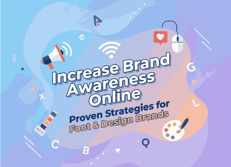
1. Introduction
In a world filled with visual clutter, the power of simplicity has never been greater. For brands looking to stand out while remaining timeless, minimalism is making a strong comeback. The latest Minimalist Logo Trends reflect a design shift: less is more, clarity is king. If you’re a designer or font-creator (like at CalligraphyFonts.net), understanding and leveraging these trends can help you craft smarter logos, better visuals, and stronger brand identities. In this article, we’ll dive deep into what minimalist logo design means today, why it’s important, explore key trends, and show how typography/fonts tie into it all.
2. What Defines a Minimalist Logo Trends?
A minimalist logo does more with less. According to the design firm Clay Global, minimal-logo design emphasizes “simplicity, clarity, and timelessness — focusing on essential shapes, clean typography, and limited color palettes to communicate a brand’s identity effectively.”
Core characteristics include:
- Few or no decorative elements
- Clean, simple shapes and lines
- Limited colour palette (often one or two colours)
- Clear typography
- Use of negative/white space for clarity and impact.
The result? A logo that is easily recognised, scalable across media, and capable of standing the test of time.
3. Why Minimalist Logo Trends Are Dominating Now
There are several reasons why minimalist logos are thriving in 2024-25:
- Clarity in a noisy world: With so many brands, visuals and touch-points, simplicity helps cut through the noise.
- Scalability & versatility: Minimalist logos work across formats — from tiny mobile icons to large billboards — without losing legibility.
- Digital-first design: Brands that launch online or rely on social media favour clean, bold identities that translate well on screens.
- Timeless appeal: By reducing super-trendy ornamentation, minimalist logos are less likely to date quickly and thus offer longer lifespan.
Given these advantages, for a font-design brand like yours, adopting and showcasing minimalist logo styles can reinforce your modern and professional position.
4. Top Minimalist Logo Trends to Watch
Here are some specific trends within the minimalist logo space that are especially relevant in 2024-25:
Trend 1: Bold Minimalism with a Twist
While maintaining simplicity, designers are adding subtle details — like a unique cut in the logotype, a split-line, a hidden negative-space form — to keep minimalistic designs distinctive.
Trend 2: Negative Space & Clever Shapes
Using the space around and between elements to form secondary shapes or letters is a hallmark of modern minimalist logos. It adds depth without clutter.
Trend 3: Monochrome or Limited Colours
Minimalist logos often use a single colour (black, white, a muted tone) or a very restricted palette to emphasise form and typography rather than flashy colour.
Trend 4: Typography-led Logos
Logotypes (text-only) or minimal icons with strong typography are dominant. Fonts become central to brand identity rather than being an afterthought.
Trend 5: Geometric & Grid-based Structures
Clean geometry, symmetry, and grid systems underpin minimalist logos — giving them structure and harmony.
By combining these trends smartly, you get minimalist logos that are clean yet characterful, blank-canvas ready yet brand-specific.
5. How Typography & Fonts Play into Minimalist Logo Trends
For your brand – designing, making and selling fonts – this part is particularly relevant: typography isn’t just a support tool; it is part of the identity. Here’s how fonts tie into minimalist logo trends:
- When the logo is minimalist, the font choice becomes more critical. A slight variation in letter-spacing, a unique cut in a serif, or a customised stroke can differentiate your brand.
- Using your own fonts in branding helps create uniqueness. For example:
- Overcame Font — script or expressive, yet can be pared-down to clean usage for minimalist logos that still have flair.
- Jalousie — a strong display font which you could use in a minimalist word-mark.
- DarkLoose Font — a font with character, that when used simply (one colour, no effects) aligns with minimalist trend.
- Daylighted — soft, modern style which can fit well in minimalist identity systems.
- When showcasing your fonts, present them in minimalist mock-ups (white background, monochrome logo, subtle negative space) to underline how they work in modern branding.
- Highlight how the font can scale, reproduce clearly at small sizes, and maintain legibility — key for minimalist logos that span formats.
In short: your font-library becomes a toolkit for other brands wanting minimalist logo identities — positioning you as both font creator and design trend enabler.
6. Applying Minimalist Logo Trends as a Font & Design Brand
Here’s how you can apply these insights directly to your design business and font-shop:
Step 1: Audit Your Current Brand Visuals
Look at your logo, product pages, website, social media. Are they aligned with minimalist aesthetics? Are your fonts clearly legible? Do colours and spacing reflect simplicity?
Step 2: Develop Minimalist Logo Concepts
If you haven’t already, create a version of your brand logo or product-logo that uses one colour, simple form, and clean typography. Use one of your fonts as the wordmark to test how strong it feels.
Step 3: Create Mock-ups for Your Fonts in Minimalist Logo Trends Contexts
For each featured font (Overcame, Jalousie, DarkLoose, Daylighted), design logo mock-ups showing how the font works in a minimalist identity: one-colour, no gradients, generous white space, negative space. These become proof-points for your audience.
Step 4: Content & Social Media Strategy
Write blog posts (like this one), share case-studies of minimalist logos, offer free resources (e.g., “How to Build a Minimalist Logo with Our Fonts”). Post visuals showcasing minimalist logo usage. Let your fonts shine as tools for the trend.
Step 5: Educate Your Audience
Create tutorials: “Choosing the right font for a minimalist logo”, “How spacing and negative space make or break minimalist design”. Position your brand not just as font-seller, but design-adviser.
Step 6: Maintain Consistency
Ensure your own brand identity (website, packaging, product visuals) aligns with minimalist design principles: consistent typography, limited palette, clean layout. Your audience will trust you more if you live the aesthetic you preach.
7. Conclusion Minimalist Logo Trends
Minimalist logo trends are not merely about removing decoration—they’re about focusing on what matters: typography, clarity, meaning, scalability. For brands and designers today, embracing simplicity means better recognition, adaptability, and longevity. As a font-design brand, you’re ideally placed to ride this wave—because the right font is often the heart of a minimalist logo. Use your fonts, mock-ups and content strategy to help brands craft identities that are both simple and powerful. The result? Designs that stand out not by excess—but by precision.
8. References
- Clay Global – “Minimalist Logo Design: Streamlining Your Brand’s Visual Identity”
- GraphicDesignJunction – “50+ Minimalist Logos That Master Negative Space”
- 48hourslogo – “Top Trends in Logo Design for 2024”
- Logobean – “Top 5 Logo Design Trends in 2024”