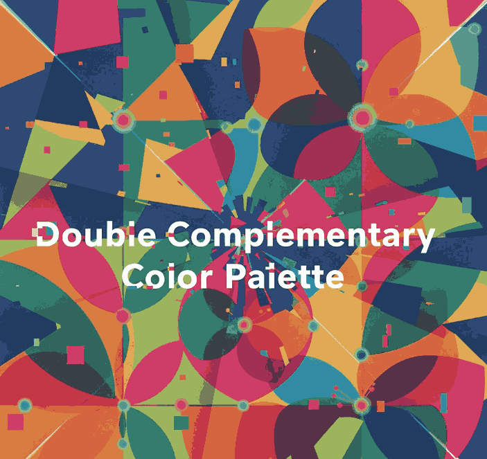
Posted on

Earth Tones and Neon Color Trends: New Balancing Nature & Energy

Earth Tones & Neon Color

Table of Contents

  1. Introduction
  2. Why Earth Tones + Neon Are Trending
  3. Defining Earth Tones & Neon Shades
    • 3.1 What Are Earth Tones?
    • 3.2 What Are Neon / Bright Accent Colors?
  4. How These Trends Merge: Nature Meets Digital
  5. Design Applications: When & How to Use Earth + Neon
  6. Using These Trends with Typography & Font Branding
  7. Font Mockup Ideas from Your Collection
  8. Tools and Tips for Testing Earth & Neon Palettes
  9. Risks & Best Practices
  10. Conclusion & Call to Action
  11. References

1. Introduction

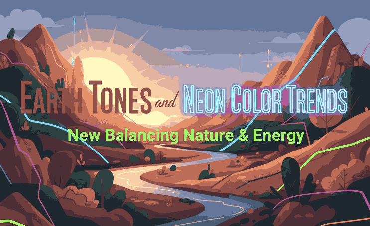
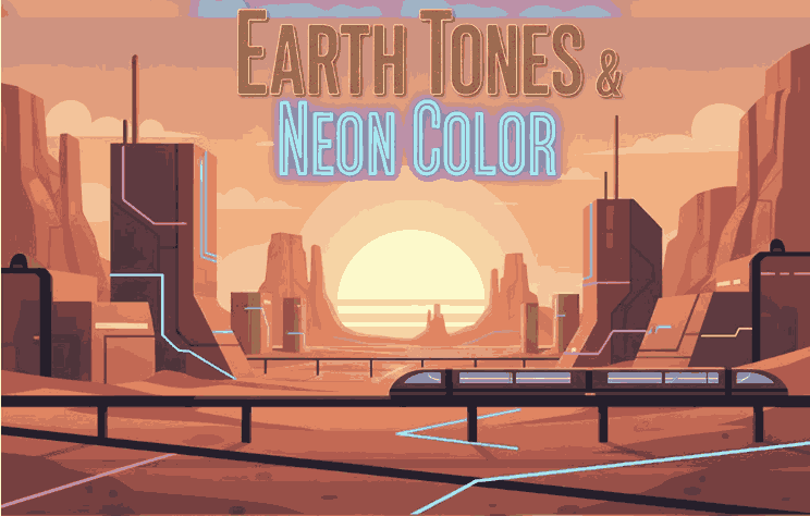
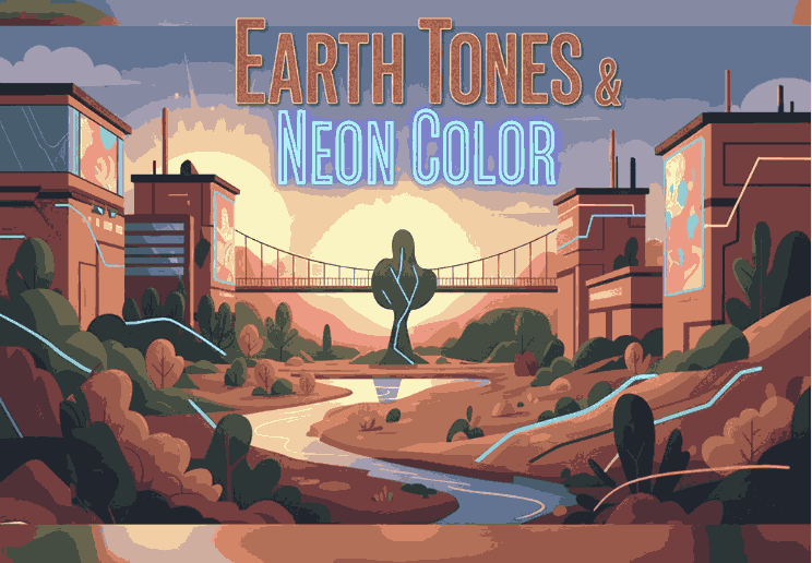
In 2024 and beyond, a compelling color balance is emerging: Earth Tones & Neon Color that feel grounding and warm, contrasted with neon accents that inject energy and modern sass. This pairing is reflective of a broader cultural tension—desire for calm rootedness + fascination with digital possibility.

For a font & design business, adopting earth tones and neon color trends offers a way to present your typefaces in contexts that feel both organic and dynamic, catering to brands that straddle analog and digital worlds.

2. Why Earth Tones + Neon Are Trending

Design trend forecasts for 2024 emphasize a fusion of nature and technology in palette choices. Din Studio’s color forecast describes how palettes will “combine nature and technology,” showcasing earthy greens, browns, sky blues, alongside neon blue, digital red, etc.

Other design sources list earthy natural tones + neon accents among the emerging 2024 color trends.

Fashion trend reports echo this shift: warm natural hues like terracotta, olive, clay, and browns are paired with pops of vivid brightness for contrast and visual surprise.

The appeal is clear: earth tones offer comfort and grounding in uncertain times, and neon accents provide vitality, energy, and a digital spark.

Earth Tones & Neon Color

3. Defining Earth Tones & Neon Shades

3.1 What Are Earth Tones?

Earth tones are colors that echo natural landscapes: soil, clay, rock, foliage, wood, moss, sand. Think muted browns, olive greens, beiges, warm taupes, rusts. In color theory, “earth tone” broadly refers to colors similar to natural materials and landscapes.

These colors evoke warmth, stability, calm, and organic authenticity—qualities many brands now want to communicate.

3.2 What Are Neon / Bright Accent Colors?

Neon shades are high-intensity, high-saturation colors like electric blue, hot pink, lime green, fluorescent yellow. They read as modern, energetic, almost digital in nature.

In the trend forecasts, these neon / digital colors are positioned as accents that infuse design with brightness and contrast, complementing the more subdued earth tones.

4. How These Trends Merge: Nature Meets Digital

The blending of earth tones and neons is about contrast in harmony. The idea is not to overshadow nature with neon, but to let neon highlights dance within an earthy base.

  • Earth tones anchor the design, offering base surfaces, backgrounds, textures, media framing.
  • Neon accents pop in focal elements — callouts, hover states, decorative flourishes, small overlays.
  • This contrast emphasizes hierarchy: the eye is drawn to neon, but finds rest in the earthy surrounding.
  • It reflects the real-world tension between analog (nature, grounding) and digital (tech, screens, brightness).

Designers are predicted to lean into such juxtapositions: “nature and technology” being a recurring motif in 2024 trend forecasts.

5. Design Applications: How to Use Earth Tones & Neon Color

Here are practical ways to apply this combined trend:

  • Backgrounds & Base Layers: use earth tones (terracotta, olive, tan) as large surfaces.
  • Accent Elements: apply neon (electric blue, lime, pink) to borders, highlights, interactive cues.
  • Typography Emphasis: neon for headlines or hover states; earth tones for body text or secondary text.
  • Gradients / Overlays: gentle gradients from earth to neon, or semi-transparent neon overlays on earth tones.
  • Texture + Neon Pop: use textured surfaces (wood grain, linen, clay patterns) overlaid with neon glyphs or lines.
  • Interactive / UI Effects: neon glow or neon border animation over muted earthy UI.

Because neon is intense, it works best in small doses against calming earth-tone backdrops.

Earth Tones & Neon Color

6. Using These Earth Tones & Neon Color Trends with Typography and Font Branding

For fonts and type specimens, the earth + neon trend can elevate the presentation:

  • Use earth tone backgrounds (light beige, muted olive, taupe) and place your font sample in neon contrast color (or vice versa) to emphasize the shape.
  • Combine fonts in earth-tone body text and neon headline overlays to show contrast.
  • Use neon outlines or shadows for fonts on earthy surfaces to add depth.
  • In branding previews, show a version in calm earth tones and a variant with neon highlights—this duality appeals to clients who want both elegance and edge.

This approach conveys that your font works in both organic and modern visual systems.

7. Font Mockup Ideas from Your Collection

Here are some fonts from your catalog and suggestions for mockup visuals using earth + neon palettes:

  • Aesthetic Sunset Font — place on muted terracotta or dusky peach base, with neon pink or coral highlights on parts of the text.
  • Leathering Font — simulate leather texture in earthy brown, then overlay neon accent lines or neon emboss effects.
  • Jungle Tribe Font — use deep olive, mossy greens as background, then neon lime or electric green for decorative elements or accent letters.

These mockups help clients envision your fonts in bold, contemporary color contexts—balancing calm and energy.

8. Tools and Tips for Testing Earth Tones & Neon Color Palettes

  • Use Adobe Color / color wheel: create a base earth tone and sample neon accents.
  • Use Coolors.co: generate palettes that mix muted/muted and high-saturation pairs.
  • Use Contrast checkers: ensure readability when a neon color is used over earth tones.
  • Create mood boards: mix textures (wood, clay, stone) with neon color swatches to feel out harmony.
  • Always preview in real mockup context (UI, print, web) to test how neon reads over earthy materials.

Testing in real use is key; neon often changes perception depending on surrounding hues.

9. Risks and Best Practices Earth Tones & Neon Color

  • Neon overuse: too much neon destroys calm; limit it to accent levels.
  • Poor contrast: some neon + earth combos may cause low readability; always test.
  • Clashing temperature: ensure the neon accent doesn’t clash (warm neon vs cool earth).
  • Saturation overload: desaturate neon or earth colors if the mix feels too garish.
  • Maintain brand cohesion: don’t sacrifice brand palette entirely—introduce neon accents thoughtfully.

By balancing restraint and creativity, this trend can feel fresh without overwhelming.

10. Conclusion and Call to Action Earth Tones & Neon Color

The trend pairing of Earth Tones & Neon Color trends allows designs to feel grounded while sparking energy. For font and design businesses, this combination is powerful: you can present your typefaces in contexts that speak both to tactile warmth and digital vivacity.

Call to Action: Pick one font from your catalog. Build a mockup using an earthy base and neon accent as described above. Share it in your portfolio or Instagram and gauge audience reaction. If you like, saya bisa bantu kirimkan 3 preset palette (hex codes) earth + neon yang cocok untuk font usage agar kamu tinggal pakai. Mau saya kirim versi itu?

References

  • Din Studio — “Color Trend Forecast 2024: Embracing Nature and Technology”
  • Pixemix — “Unveiling the Top 2024/2025 Color Trends: Grounding Earth & Bold Neon”
  • BlackSoc — “7 Colour Design Trends for 2024: Earthy + Neon Among Them”
  • Wikipedia — “Earth Tone (Definition & Common shades)”
Posted on

Analogous Colors Definition & How to Use Them in New Design

Analogous Colors Definition

Table of Contents

  1. Introduction
  2. What Is the Analogous Colors Definition?
  3. Why Analogous Schemes Create Visual Harmony
  4. Common Analogous Color Combinations & Examples
  5. Best Practices: Using Analogous Colors in Design
  6. Applying Analogous Palettes in Typography & Mockups
  7. Font Mockup Examples from Your Collection
  8. Tools & Tips to Create & Test Analogous Palettes
  9. Pitfalls to Avoid
  10. Conclusion & Next Steps
  11. References

1. Introduction

Color is one of the foundational building blocks of design. How you pick and combine hues determines mood, readability, cohesion, and emotional impact. Among the many color harmony techniques, Analogous Colors Definition schemes stand out for their subtle beauty and natural feel.

In this article, we’ll explore the Analogous Colors Definition, show you examples, and reveal how to use them effectively—especially in your font mockups, branding visuals, and creative assets.

2. What Is the Analogous Colors Definition?

The analogous colors definition refers to a set of colors that are adjacent to each other on the color wheel. In most applications, an analogous scheme consists of three hues: a base (dominant) color, and one or two supporting (neighbor) colors.

These neighboring hues share similar undertones, which gives analogous palettes a smooth, harmonious, and unified appearance—unlike complementary schemes, which emphasize high contrast.

For example:

  • Blue, blue-green, and green
  • Red, red-orange, and orange
  • Yellow, yellow-green, and green

In digital design, you can tweak saturation, brightness, or tone of these colors to achieve more depth and contrast.

Analogous Colors Definition

3. Why Analogous Schemes Create Visual Harmony

Analogous color schemes are praised for several reasons:

  • Low visual tension: Because the colors are similar in hue, they don’t “fight” each other. This makes them soothing to the eye.
  • Natural occurrences: You often see analogous schemes in nature (sunsets, foliage gradients), which makes them feel organic.
  • Cohesion & unity: They produce a unified look—great for backgrounds, branding, or layouts that shouldn’t feel busy.
  • Flexibility with contrast: Even though they are close in hue, you can achieve contrast by varying brightness, saturation, or applying neutrals (white, gray, black).

Because analogous schemes are more subtle than contrasting ones, they are often chosen when the goal is elegance, calmness, or aesthetic continuity.

4. Common Analogous Color Combinations & Examples

Here are typical triads of analogous hues you can experiment with:

  • Red → Red-Orange → Orange
  • Yellow → Yellow-Green → Green
  • Blue → Blue-Green → Green
  • Blue → Blue-Violet → Violet
  • Purple → Red-Violet → Red

Some designers extend schemes to 4 or 5 hues (neighboring spanning a small arc) as long as they remain adjacent without jumping across the wheel edges.

In interior design, for example, designers often use the 60 / 30 / 10 rule: 60% dominant color, 30% secondary analogous color, and 10% accent (which can be a more muted version).

5. Best Practices: Using Analogous Colors Definition in Design

To make analogous palettes work well, follow these tips:

  • Choose a dominant hue: Use one color for the bulk of your design (backgrounds, large shapes).
  • Support and accent: Use the neighboring colors more sparingly — for accents, buttons, borders, or decorative elements.
  • Vary lightness and saturation: Don’t use pure colors only — lighten or darken, desaturate to create depth.
  • Introduce neutral tones: Gray, off-white, black or very desaturated versions help give rest to the eyes and avoid monotony.
  • Mind contrast for usability: In UI or text design, make sure text is legible across these similar hues — sometimes you’ll need a complementary hue or neutral color to ensure readability.
  • Limit the range: Spread out too far along the wheel and you risk moving away from harmony. Keep the span narrow.

Analogous palettes are ideal when you want aesthetic smoothness rather than stark contrast.

6. Applying Analogous Colors Definition Palettes in Typography & Mockups

For a font/design business, applying analogous schemes can elevate mockups and branding visuals:

  • Use analogous hues for background → secondary shapes → highlight text layer.
  • For text overlays: Use one analogous color for fill, another (slightly darker or lighter) for subtle shadow or outline.
  • In UI or product previews: Use analogous tones in button states, hover effects, or navigation bars for consistency.
  • Combine analogous palettes with neutral typography (black, white) to maintain readability and grounding.

Because fonts and type are the focal point, using analogous color schemes gives them an elegant frame rather than overwhelming them.

Analogous Colors Definition

7. Font Mockup Examples from Your Collection

Here are fonts from your collection and some mockup ideas using analogous color schemes:

  • Classicly Font — Try a calm palette: soft blue, blue-green, and green. Use Classicly for headers and lighter variants for subtext.
  • Creatoria Font — Use warm analogous hues: peach, pink-peach, coral for creative branding visuals.
  • Ballerinas — Elegant pastel analogous colors such as lavender, violet, and blue-violet for feminine or graceful designs.
  • Overcame Font — Use bold analogous palette like orange, red-orange, and red to produce dramatic typographic compositions.

In each mockup, emphasize the dominant hue in backgrounds, the secondary in accents or decorative elements, and the third for smaller highlights. Show how the font remains legible but stylish within the analogous frame.

8. Tools & Tips to Create & Test Analogous Colors Definition Palettes

Here are useful tools and practices:

  • Adobe Color Wheel — switch to “Analogous” mode to generate triads.
  • Coolors.co — lock a hue and get adjacent ones.
  • Paletton — interactive color wheel with analogous scheme support.
  • Contrast checkers — ensure text vs background from your analogous palette remains legible.
  • Preview in context — test your palette on web pages or within your font mockups rather than in isolation.

Trial and iteration are key: you’ll often need to adjust brightness or saturation to make the palette work.

9. Pitfalls to Avoid

While analogous schemes are lovely, there are risks:

  • Too much monotony: All colors too similar can look flat.
  • Poor contrast: Text or UI elements may become unreadable if adjacent hues are too close.
  • Overusing full saturation: Pure colors next to each other can make your design look harsh or garish.
  • Ignoring neutral elements: Without blacks/whites/grays, the scheme may lack grounding.
  • Spanning too wide: If your analogous span covers too many hues, it starts to drift into other schemes and loses harmony.

By anticipating these challenges, you can better manage your palette choices.

10. Conclusion & Next Steps Analogous Colors Definition

The analogous colors definition is simple: hues next to each other on the color wheel, often used in sets of three. What makes them powerful is their ability to deliver harmony, subtlety, and visual cohesion.

For your font and design business, analogous palettes can enliven mockups, showcase your fonts in context, and provide mood without overwhelming contrast. Pair them with good typographic contrast and neutral grounding for the best results.

Next step: Pick a base hue from your branding or a font you want to spotlight. Use a tool to generate its adjacent analogous colors. Create a mockup with those three colors using one of your fonts and see how it feels. Iterate until it feels elegant and readable.

Kalau kamu mau, saya bisa bantu buat preset analogous color palettes (with hex values) khusus untuk font moods (elegant, bold, pastel) + file swatches yang bisa langsung kamu pakai. Mau saya kirim itu?

References

  • Pixflow — “What Is an Analogous Color Scheme? Definition, Examples & Uses”
  • Figma Dictionary — “Analogous Colors Definition & Examples”
  • Art in Context — “What Are Analogous Colors in Color Theory”
  • Creatopy — “What are analogous colors in graphic design”
Posted on

Content Creator Categories Examples & How New They Differ

Content Creator Categories Examples

Table of Contents

  1. Introduction
  2. Why Knowing Creator Categories Matters
  3. Core Content Creator Categories & Examples
    • 3.1 Video / Visual Creators
    • 3.2 Writers / Bloggers / Text Creators
    • 3.3 Podcasters & Audio Creators
    • 3.4 Educators / Course Creators
    • 3.5 Influencers & Brand Ambassadors
    • 3.6 UGC / Community Creators
    • 3.7 Designers, Digital Artists & Visual Specialists
  4. Blended & Hybrid Creator Types
  5. How Font & Design Businesses Fit In
  6. Font Mockup Examples to Showcase in Diverse Creator Niches
  7. How to Choose or Express Your Own Creator Category
  8. Conclusion & Action Guide
  9. References

1. Introduction Content Creator Categories Examples

In the vast creator economy, not all content creators do the same work or speak with the same voice. Understanding content creator categories examples helps you clarify your niche, collaborate smartly, and communicate your value clearly.

For a business centered on fonts and design, recognizing these creator types helps you align your products (fonts, mockups, templates) with the right audiences and creative partnerships.

2. Why Knowing Content Creator Categories Examples
Matters

  • Better alignment: You can tailor your products or offerings to the needs of each category.
  • Effective partnerships: You know which creators to approach for collaborations (e.g. a video creator vs a blogger).
  • Stronger branding: When you know your type (or your clients’ types), you can position your visual identity more deliberately.
  • Diverse revenue paths: Each category often monetizes differently.

Refer to Shopify’s “7 types of digital creators” for archetypes and how they work: Performer, Maker, Technophile, etc.

Content Creator Categories Examples

3. Core Content Creator Categories Examples

Here are several major categories of content creators, together with real-world examples of how they operate and how fonts/design interplay with them:

3.1 Video / Visual Creators

These creators primarily produce video content, motion graphics, visual storytelling, or photo-based content. Think YouTubers, TikTokers, cinematographers, visual storytellers.

  • Their content demands strong visuals, typography, and motion design.
  • Font needs: dynamic, legible on video, expressive overlays.

3.2 Writers / Bloggers / Text Creators

These creators focus on producing textual content: articles, essays, blog posts, long-form narratives.

  • They may use imagery and typographic elements to enhance readability.
  • They often rely on well-paired fonts for headers, body text, callouts.

3.3 Podcasters & Audio Creators

Audio-first creators produce spoken-word content, interviews, storytelling, and often repurpose into video. Their written assets (episode titles, social promos) benefit from strong visual design.

3.4 Educators / Course Creators

These creators package their knowledge into classes, workshops, tutorial videos, written guides, and courses. They often need slide decks, resource materials, PDF workbooks, and branding.

3.5 Influencers & Brand Ambassadors

Influencers use a personal brand to share opinions, reviews, lifestyle or niche content—often collaborating with brands. They produce multi-format content (video, posts, stories).

  • Their content tends to emphasize strong visual branding and fonts that reflect their persona.

3.6 UGC / Community Creators

User-generated content (UGC) creators produce content around everyday experiences, testimonials, or small-scale creative repurposing. Brands often engage them for authentic content.
They often remix visuals, overlays, and typography.

3.7 Designers, Digital Artists & Visual Specialists

These creators are often skilled in visual arts — illustration, graphic design, UI/UX, motion design. They create visual assets, templates, mockups, design experiments.

  • A font business aligns naturally with this group. They demand premium fonts, variable fonts, unique styles, type pairing guidance.

Teleprompter.com lists designers and visual creators as a major category.
Also, Hurrdat marketing mentions bloggers, photographers, graphic designers among content creator types.

4. Blended & Hybrid Content Creator Categories Examples
Types

Many creators don’t fit a single category. They blend:

  • A podcaster + video creator
  • A designer + educator who sells courses about design
  • An influencer + UGC creator who makes everyday content along with brand collaborations

These hybrid creators benefit from cross-format fluency and can reach multiple audiences.

5. How Font & Design Businesses Fit In

As a font shop and design asset provider, you can serve many creator categories:

  • Video creators: provide fonts optimized for video subtitles, motion designs, title overlays.
  • Educators / course creators: supply fonts for slides, workbooks, handouts.
  • Influencers / UGC creators: offer branded fonts or type kits they can integrate in social visuals.
  • Designers / visual creators: collaborate on font development, license custom versions, co-create templates.

Understanding creator categories helps you package your fonts with appropriate mockups, bundles, and usage examples.

6. Font Mockup Examples to Showcase in Diverse Content Creator Categories Examples Niches

Here are some fonts from your collection and mockup ideas suited to different creator types:

  • Aeromove Font — use in video title overlays or motion typography demos for video creators.
  • Aulion Font Duo — pair for header/body combos in blog posts or course slides.
  • Salvations Font — dramatic and expressive, good for influencer branding graphics.
  • Daylighted — sleek modern style for UI mockups, visual designers, or minimalist layouts.

In each mockup, you can show how the font works in the context of a creator’s output: video thumbnail, slide deck, social post, or design portfolio.

Content Creator Categories Examples

7. How to Choose or Express Your Own Content Creator Categories Examples

  • Identify your primary medium: video, writing, audio, design?
  • Recognize your strength: storytelling, visuals, education, personality.
  • Lean into what you enjoy: hybrid creators often burn out — better to focus where your passion and skill lie.
  • Adapt and evolve: many creators shift categories as their audience or monetization changes.
  • Communicate clearly: state your creator type in your brand messaging, so clients/audience know what you do best.

8. Conclusion & Action Guide Content Creator Categories Examples

Understanding content creator categories examples empowers you to:

  • Tailor your offerings (fonts, templates) to different creator types
  • Position yourself for collaborations
  • Clarify your niche and brand identity

Action Steps:

  1. Pick one or two creator types that align with your strengths.
  2. Create mockups and resources tailored to those categories.
  3. Showcase those mockups in your marketing (blog, social, portfolio).
  4. Reach out to creators in those categories for partnership or feedback.

With clarity and purpose, your font business can better engage creators, serve their needs, and grow together.

References

  • Kit Blog — “Types of Content Creators”
  • Hurrdat Marketing — “11 Common Types of Content Creators in 2024”
  • Shopify — “7 Types of Digital Creators Who Power the Creator Economy”
  • ClickUp — “Different Types of Content Creators on Social Media Platforms”
Posted on

New Challenges Content Creators Face: How to Overcome Them

Challenges Content Creators Face

Table of Contents

  1. Introduction
  2. Why Creators Face So Many Obstacles
  3. Top Challenges Content Creators Face
    • 3.1 Growing an Audience & Reach
    • 3.2 Content Ideas & Creative Burnout
    • 3.3 Consistency & Time Management
    • 3.4 Monetization & Revenue Generation
    • 3.5 Differentiation in a Saturated Market
    • 3.6 Content Theft, IP & Attribution
    • 3.7 Platform Algorithm & Demands
  4. Strategies to Overcome These Challenges
  5. Applying These in a Font / Design Business
  6. Font Mockup Examples You Can Use
  7. Conclusion & Next Steps
  8. References

1. Introduction Challenges Content Creators Face

Being a Challenges Content Creators Face seems glamorous from the outside: followers, likes, sponsored posts. But behind the scenes lies a set of formidable challenges. Many creators struggle with growth plateaus, creative fatigue, monetization issues, algorithm changes, and more.

If you run a font/design business (like CalligraphyFonts), knowing these challenges content creators face and how to navigate them gives you a strategic advantage. In this article, we’ll explore the key obstacles, practical strategies, and how you can adapt them to your font-design world.

Challenges Content Creators Face

2. Why Challenges Content Creators Face So Many Obstacles

The creator economy is booming, but that also means competition, platform complexity, and high expectations. According to Spiralytics, 64% of creators say growing an audience is their greatest challenge.

In earlier creator surveys (Podia), the top three challenges were: growing audience, finding time for everything, and monetizing content.

So these problems are widespread — not limited to any niche.

3. Top Challenges Content Creators Face

Here are the biggest hurdles many creators (including designers, font sellers, visual artists) encounter:

3.1 Growing an Audience & Reach

No matter how great your content is, if it doesn’t reach people, it doesn’t matter. Many creators struggle with discoverability, especially early on.

You must navigate algorithms, SEO, social media virality, and networking to expand your audience.

3.2 Content Ideas & Creative Burnout

Producing fresh, interesting content week after week is exhausting. It’s one of the most cited struggles.

Additionally, maintaining novelty without repeating yourself is a constant tension.

3.3 Consistency & Time Management

Many creators wear many hats—content production, marketing, customer support, admin. Balancing all that consistently is a major problem.

When life or mental energy interferes, consistency is usually what slips.

3.4 Monetization & Revenue Generation

Turning views and likes into a sustainable income is a big leap. Many struggle to figure out monetization models that work long term.

Options like ads, sponsorships, selling products (like your fonts), or memberships all come with challenges.

3.5 Differentiation in a Saturated Market

As more creators flood every niche, standing out becomes harder. Content can feel recycled, less distinct.

Your brand voice, aesthetic, and unique value proposition must be sharper than ever.

3.6 Content Theft, IP & Attribution

Creators often find their work copied or reposted without credit or payment. This drains value and discourages innovation.

Protecting your designs and fonts from misuse is a nontrivial legal and practical issue.

3.7 Platform Algorithm & Demands

Algorithms change frequently; what worked yesterday may underperform today. Platforms often reward new formats or penalize older ones.

Creators must adapt, experiment, and stay current.

4. Strategies to Overcome These Challenges Content Creators Face

Below are actionable steps you can take:

  • Audience Growth: Collaborate, guest post, cross-promote with other creators. Tap into niche communities.
  • Content Ideas / Burnout: Batch-produce content, maintain an idea bank, rotate content themes, take creative rest.
  • Consistency & Time: Use scheduling tools, outsource tasks, block time for content work, set boundaries.
  • Monetization: Diversify revenue streams—sell fonts, digital products, affiliate, sponsorships, workshops.
  • Differentiation: Define your brand voice, visual identity, niche focus. Lean into your unique strengths.
  • IP Protection: Use licensing, watermark mockups, register your designs, enforce TOS on misuse.
  • Adapt Algorithmically: Stay updated with platform changes, test varied content formats, analyze metrics, pivot fast.

5. Applying These in a Font / Design Business

As font creators and designers, you face the same challenges — but you can use your design strengths to mitigate them:

  • Grow audience by offering free samples, font freebies, or design resources to attract interest.
  • Create content about your font design process—these become evergreen content ideas.
  • Use brand consistency in visuals (color palettes, typography) to stand out.
  • Monetize by bundling font families, offering custom font services, licensing usage.
  • Protect your font designs via proper licensing, watermarking, and terms of use.
  • Use design skills to produce high-quality visuals that appeal algorithmically (well-designed posts perform better).
Challenges Content Creators Face

6. Font Mockup Examples You Can Use

Here are some fonts from your catalog and quick mockup ideas to integrate in content:

  • Holdsmith — present a mockup of vintage signage or handcrafted text for design storytelling.
  • Ameralda Font — use for elegant quotes or brand identity visuals, show before/after designs.
  • Shailendra Font — showcase in editorial or book cover mockups for visual appeal.
  • Leathering Font — use industrial, textured mockups (leather, metal) to show gravitas and craftsmanship.

By showing these fonts used in compelling visual narratives, your content becomes more engaging and helps overcome the barrier of “just another font seller.”

7. Conclusion & Next Steps Challenges Content Creators Face

The challenges content creators face are real and many. But with awareness, strategy, and design discipline, they are not insurmountable.

For your font business, meeting these challenges head-on—through brand clarity, protection, consistent content, and monetization experimentation—will help you grow more steadily and sustainably.

Next step: Pick one challenge you feel strongly (e.g. content ideas, audience growth). Spend a week experimenting with one strategy above. Track what works, then iterate.

References

  • Go1 — “Top 5 challenges for content creators”
  • Red Shark Digital — “What are the challenges of content creation?”
  • Featured Blog — “6 Common Challenges Content Creators Face When Getting Started”
  • Kim Garst — “5 Obstacles Faced by Content Creators (And How to Overcome Them)”
Posted on

Emerging TikTok Content New Trends You Should Try in 2025

Emerging TikTok Content Trends

Table of Contents

  1. Introduction
  2. Why TikTok Trends Matter for Creators & Brands
  3. Top Emerging TikTok Content Trends to Watch
    • 3.1 Micro-Storytelling & Episodic Content
    • 3.2 Text-Driven & On-Screen Caption Trends
    • 3.3 Search-First Content & Keyword Optimization
    • 3.4 Ambient / Low-Energy Content & ASMR + Relaxation
    • 3.5 Augmented Reality & Interactive Effect Formats
    • 3.6 Nostalgia & Retro Aesthetic Revivals
    • 3.7 Creator-Led Social Causes & Values-Based Content
  4. How to Experiment with These Trends (for Font / Design Creators)
  5. Font Mockup Ideas That Ride These Trends
  6. Measuring Trend Impact & When to Pivot
  7. Risks & Pitfalls to Avoid
  8. Conclusion & Call to Action
  9. References

1. Introduction Emerging TikTok Content Trends

TikTok’s content landscape is in perpetual motion. What’s viral today may feel stale tomorrow. As creators and brand owners (like a font shop), tapping into emerging TikTok content trends is essential to staying visible, relevant, and compelling.

In 2025, the trends on TikTok will increasingly favor authenticity, subtlety, and cross-format innovation. In this article, we explore which content styles are gaining momentum, how you can adapt them, and how your font products can shine alongside.

2. Why Emerging TikTok Content Trends Matter for Creators & Brands

  • TikTok heavily surfaces content that aligns with trending formats, sounds, and visual cues. Riding a trend can drastically amplify reach.
  • Trends act as signals in the algorithm: when many creators use similar formats, the algorithm recognizes and promotes them more broadly.
  • For niche creators (fonts, design), trends help you insert your content into larger conversations—making your work discoverable by audiences beyond your base.
  • As shown by Shopify’s 2025 TikTok trend guide, creators can spark visibility by adapting trends in ways consistent with brand identity.

Thus, knowing which TikTok content trends are emerging allows you to experiment smartly, not chase every fad blindly.

Emerging TikTok Content Trends

3. Top Emerging TikTok Content Trends to Watch

Here are several content styles and formats that are gaining speed in 2024–2025:

3.1 Micro-Storytelling & Episodic Content

Short, bite-sized narratives that continue across multiple videos (mini-series) are gaining traction. This keeps viewers coming back for the next “episode.”
Vidico calls micro-storytelling one of top viral trends in 2024.

3.2 Text-Driven & On-Screen Caption Trends

Because many users watch without sound, content emphasizing text overlays, kinetic typography, or screen captions is rising. These formats ensure the story is consumed even silently.
TikTok’s Creative Center and trend reports show strong adoption of text-first video styles (e.g. “read this for tips” layouts).

3.3 Search-First Content & Keyword Optimization

TikTok is evolving into a search engine: creators optimizing captions, hashtags, and even spoken words for keywords see more reach. Shopify’s trend guide emphasizes this shift.

3.4 Ambient / Low-Energy Content & ASMR + Relaxation

Instead of high-octane edits, calm visuals, lo-fi audio, and ambient storytelling (e.g. “a day with me,” “quiet studio”) are becoming popular. Many viewers seek relaxing or soothing content as a break.
Vidico includes ASMR among the trending formats.

3.5 Augmented Reality & Interactive Effect Formats

Filters, AR overlays, face tracking, and interactive effects (tap, swipe, reveal) are being used more creatively. As TikTok invests in its effects toolkit, creators exploiting new interactive layers gain novelty.
TikTok’s “Trending” features often spotlight new effect styles.

3.6 Nostalgia & Retro Aesthetic Revivals

Throwback styles—2000s, VHS glitches, vintage photo filters—are resurfacing as creators tap into emotional nostalgia. TikTok’s own trending reports and marketing commentary highlight aesthetic revivals.

3.7 Creator-Led Social Causes & Values-Based Content

TikTok audiences increasingly respond to authenticity and purpose. Creators sharing values, mental health, social justice, or purpose-driven messaging are trending.
TikTok’s Year on TikTok 2024 emphasizes creativity and community impact.

4. How to Experiment with These Emerging TikTok Content Trends (for Font / Design Creators)

Here’s how you can test these trends in your niche:

  • Mini-series about font design — break down glyph creation step by step across days.
  • Text-driven “font tips” videos — overlay advice such as “Pair these two font styles to improve readability.”
  • Search-first captions — use keywords like “modern calligraphy font”, “font pairing tips”, “typography trend 2025”.
  • Ambient design process clips — a soft montage of sketching, vectoring, or refining glyphs.
  • AR / filter-based font reveals — reveal a font using an effect or transformation.
  • Nostalgia-inspired type mockups — vintage poster style mockups or retro typography visuals.
  • Values or storytelling about your design journey — share creative challenges, lessons, or brand ethos in micro form.

By pairing your design skills with these trending formats, your content becomes both niche and discoverable.

Emerging TikTok Content Trends

5. Font Mockup Ideas That Ride These Emerging TikTok Content Trends

Here are specific fonts and how you might use them in trend-savvy content:

You might create videos like: “Behind the design of Creatoria — Episode 1,” showing sketch → final vector, with ambient background music. Or a “font pairing tip” video using Hashtag Trend for overlay, with text-first style.

6. Measuring Trend Impact & When to Pivot

To evaluate whether a trend is working for you:

  • Track view growth, completion rates, replays, shares.
  • Compare new content vs baseline: did this trend-driven video outperform typical posts?
  • Maintain a “trend experiment log” — try formats for a week, analyze, double down or abandon.
  • Watch for audience feedback: comments asking for repeats, requests, or remixing your style.

If a trend doesn’t yield lift, shift to another emerging style. Trends are ephemeral—it’s experimenting, not committing forever.

7. Risks & Pitfalls to Avoid

  • Chasing every trend dilutes brand identity.
  • Forcing your content into formats you dislike or can’t deliver well.
  • Overusing effects or filters just to “look trendy”—clarity matters.
  • Ignoring originality — trending format + unique twist wins.
  • Posting too many experiments at once — stagger to observe performance.

8. Conclusion & Call to Action Emerging TikTok Content Trends

Emerging TikTok content trends like micro-storytelling, text-forward formats, ambient visuals, and AR interactivity are offering new ways for creators to stand out—even in niche fields like fonts and design. By experimenting strategically, pairing trends with your design voice, and measuring impact, you can tap into TikTok’s discovery engine while staying authentic.

References

  • Shopify — “Top TikTok Trends in 2025: 18 Ideas To Go Viral”
  • Vidico — “20+ Most Popular TikTok Trends to Watch (2024 Updated)”
  • TikTok Newsroom — TikTok trending 2024
  • Simon Kingsnorth — “TikTok Marketing Trends to Watch in 2024”
Posted on

TikTok Storytelling Strategies: How to Captivate & Convert Viewers in 2025

TikTok Storytelling Strategies

Table of Contents

  1. Introduction: Why Storytelling Matters on TikTok
  2. The Science & Research Behind TikTok Storytelling
  3. Core Principles of Effective TikTok Stories
    • 3.1 Hook Quickly & Clearly
    • 3.2 Use a Narrative Arc (Beginning, Middle, End)
    • 3.3 Add Tension, Surprise, or Conflict
    • 3.4 Strong Emotional or Value-Driven Message
    • 3.5 Use Visuals, Text Overlays & Transitions
    • 3.6 Close with a Clear Call to Action
  4. Formats & Types of TikTok Stories That Work
  5. How Creators Use Storytelling to Amplify Brand & Personality
  6. Applying Storytelling to Font & Design Content
  7. Font Mockup Ideas with Your Fonts
  8. Common Pitfalls to Avoid
  9. Final Tips & Next Steps
  10. References

1. Introduction: Why Matters on TikTok Storytelling Strategies

TikTok Storytelling Strategies is more than just trends and viral dances. At its heart, it’s a storytelling platform—users scroll not just for movement, but for meaning. Even in the span of 15–60 seconds, creators who tell a compelling micro-story often outperform flashy visuals without narrative.

For creative brands and font sellers, mastering TikTok storytelling strategies helps you transform mere exposure into emotional resonance, brand recall, and customer action.

TikTok Storytelling Strategies

2. The Science & Research Behind TikTok Storytelling Strategies

Storytelling is not just a buzzword—research supports its effectiveness on TikTok.

  • A study “Storytelling in TikTok: A Path to Engagement” found that creators employing storytelling content types (vs. non­narrative) saw higher engagement and performance metrics.
  • In practice, content that follows a narrative structure tends to keep viewers watching, rewatching, and interacting.
  • According to marketing guides, brands that chart a narrative arc, even in short-form content, create stronger retention and memorability.
  • Many creators emphasize using a hook + progression + payoff structure to sustain attention.

These findings reinforce that even in micro form, stories matter—and they drive metric signals that TikTok’s algorithm values.

3. Core Principles of Effective TikTok Storytelling Strategies Stories

Below are the foundational storytelling strategies to adopt on TikTok:

3.1 Hook Quickly & Clearly

You need to grab attention within the first 1–3 seconds. Use bold text, a question, a surprising fact, or a visual shift. Starting slow is a risk viewers will scroll past.

3.2 Use a Narrative Arc (Beginning, Middle, End)

Even in short videos, a simple arc helps:

  • Beginning (Setup): Present context or a problem.
  • Middle (Conflict/Development): Build tension or show change.
  • End (Resolution): Resolve or deliver the insight.

This gives viewers a sense of journey and closure.

3.3 Add Tension, Surprise, or Conflict

Conflict keeps interest. It could be a mini-problem, a transformation, or a twist. Without tension, stories feel flat.

3.4 Strong Emotional or Value-Driven Message

Stories work best when they evoke emotion (joy, surprise, empathy) or deliver value (education, inspiration, humor).

3.5 Use Visuals, Text Overlays & Transitions

Leverage text overlays or captions to reinforce the story, especially since many watch without sound. Smart transitions and match cuts help narrative flow.

3.6 Close with a Clear Call to Action

Always end with something: ask viewers to comment, share, follow, or check out a font. Guide them to do something after watching.

4. Formats & Types of TikTok Storytelling Strategies Stories That Work

Some storytelling formats are particularly suited to TikTok:

  • Before / After / Reveal — Start with “before,” then show transformation.
  • Step-by-step / How-to — Show progression through stages.
  • Day-in-the-life / BTS (Behind the Scenes) — Personal stories build connection.
  • Mini series / Episodic content — Break a longer story across clips (cliffhanger).
  • Ask & answer / Q&A — Pose a question, then answer it as the narrative.
  • Testimonials or user stories — Customer or user-centric stories build trust.

These formats structure the storytelling so that it feels natural in short form.

5. How Creators Use Storytelling to Amplify Brand & Personality

  • Many creators build micro-narratives around their identity or niche—over time, audiences identify with them.
  • They embed consistent visual or scripting motifs (fonts, color palettes, catchphrases) to unify their brand.
  • They experiment with unexpected twist endings or reversals to surprise viewers—this generates replays and shares.
  • Use “hook in caption + story in video + payoff at end” to increase clickthrough-to-view ratio.
TikTok Storytelling Strategies

6. Applying Storytelling to Font & Design Content

As a font designer / seller, here’s how you can embed storytelling in your TikTok content:

  • Font journey / evolution story: Show sketches → digital development → final glyphs.
  • Client success story: Share how a client used your font in a branding project.
  • Font pairing narrative: Start with a bland font pairing, then introduce your font + explain transformation.
  • Design challenge diary: Show the problem you faced and how your font solved it.
  • Font feature reveal: Introduce one feature (ligature, alternate) as a surprise “reveal” in story format.

These narratives not only showcase your fonts but help humanize the creative process, making your brand more relatable.

7. Font Mockup Ideas with Your Fonts

Here are sample fonts from your catalog and storytelling mockup concepts:

  • Black Roll Font — Start with a dark, moody reveal (fade in), then reveal text as the story “unfolds.”
  • Secret Come Font — Use a “mystery reveal” narrative: hidden message, then reveal text in your font.
  • Aeromove Font — Show movement: text flying in, morphing, or transforming.
  • Hashtag Trend Font — Create a trend narrative: e.g., “What if this font became viral? Watch how I stylize it.”

Mockups could include a split-screen showing plain vs your font, or text overlay telling the “story behind this glyph.”

8. Common Pitfalls to Avoid TikTok Storytelling Strategies

  • Starting too vague or with no hook — audience scrolls away.
  • Not delivering the promise — the story arc must resolve or satisfy.
  • Overpacking — too many ideas in 15 seconds cause confusion.
  • Ignoring silent views — use text/captions so story is consumable without sound.
  • Inconsistent style or tone — stories should feel part of your brand identity.

9. Final Tips & Next Steps TikTok Storytelling Strategies

  • Plan your stories in advance: outline hook, conflict, resolution.
  • Test different formats and see what resonates (how-to, BTS, reveal).
  • Reuse high-performing story structures across new fonts or visuals.
  • Track metrics: completion rate, replays, comments, shares—these tell which storytelling type works.
  • Blend trends + your storytelling flavor to stay current and authentic.

With smart storytelling, your TikTok content will become more than videos—it becomes a brand narrative that draws in your audience.

10. References

  • MPRA — “Storytelling in TikTok: A Path to Engagement”
  • Jareen Imam — “How to tell a great story on TikTok” guide on hooks & narrative arcs
  • Toptal — “TikTok Content Strategy: Best Tips for 2024” Growth Collective
  • QuickFrame — “Creative Storytelling on TikTok” marketing insights
Posted on

TikTok Algorithm Tips for Creators: How to Grow & Be Seen

TikTok algorithm tips

Table of Contents

  1. Introduction: Why Algorithm Strategy Matters
  2. How TikTok’s Algorithm Works in 2025
  3. Key Signals the Algorithm Looks For
  4. TikTok Algorithm Tips for Creators
    • 4.1 Hook Fast in the First 2–3 Seconds
    • 4.2 Maximize Watch Time & Completion Rate
    • 4.3 Use Hashtags & Keywords Strategically
    • 4.4 Niche Down & Build Authority
    • 4.5 Encourage Engagement (Comments, Saves, Shares)
    • 4.6 Leverage Trends but Adapt to Your Style
    • 4.7 Post Consistently & Optimize Time Slots
  5. Applying These Tips for Font & Design Content
  6. Font Mockups That Work Well on TikTok
  7. Pitfalls to Avoid
  8. Conclusion & Next Steps
  9. References

1. Introduction: Why Algorithm Strategy Matters

TikTok isn’t just about viral dances—it’s currently one of the most powerful platforms for content creators to reach new audiences. But visibility isn’t random: it’s governed largely by the TikTok algorithm tips.

As a creator or brand, knowing TikTok algorithm tips isn’t optional anymore—it’s essential. When you align your content strategy with how the algorithm functions, your videos are more likely to reach viewers beyond your immediate followers.

TikTok algorithm tips

2. How TikTok’s Algorithm Works in 2025

TikTok’s recommendation engine determines which videos appear on a user’s For You Page (FYP). Rather than relying on follower count, the algorithm emphasizes content relevance and engagement.

Here is a simplified breakdown:

  • When you publish a video, it’s shown to a small test group.
  • The algorithm monitors how that group engages: watch time, likes, shares, comments, replays.
  • If engagement is strong, the video is shown to more people.
  • The algorithm also considers video metadata (captions, hashtags, sounds) and user behavior (interests, past interactions).
  • It’s also moving closer to search-based ranking: TikTok now uses keywords in captions, on-screen text, and hashtags to match content to search queries.

Because the system is dynamic, even new creators without many followers can get wide reach—if their content performs well initially.

3. Key Signals the TikTok algorithm tips Looks For

To optimize videos, you need to know what signals TikTok prioritizes. These include:

  • Watch Time & Completion Rate – Videos that are watched fully or near-full get a strong boost.
  • Engagement Interactions – Likes, comments, shares, saves, duets, stitches matter.
  • Replays & Loops – Content that viewers rewatch is considered high value.
  • Video Metadata – Captions, hashtags, sounds and music help classify content.
  • User Behavior / Personalization – A user’s past likes, follows, search history guide future recommendations.
  • Video Quality & Format – Native, vertical videos that look polished tend to perform better.

Focus on creating content that strongly signals “valuable” to the algorithm through these factors.

4. TikTok algorithm tips for Creators

Here are actionable strategies you can use to make the algorithm work for you:

4.1 Hook Fast in the First 2–3 Seconds

You have very little time to capture attention. Use dynamic visuals, intriguing text, or a big promise to pull viewers in immediately. Starting too slow causes drop-offs.

4.2 Maximize Watch Time & Completion Rate

Shorter, well-paced videos often perform better, especially when viewers watch them fully. But moderate-length content with clear structure (e.g. steps, storytelling) can also work.

4.3 Use Hashtags & Keywords Strategically

Include a few (1–4) relevant hashtags. Combine broad and niche tags. Use keywords in captions and on-screen text to help TikTok understand your content.

4.4 Niche Down & Build Authority

Focusing on a niche helps the algorithm classify your content better. Posting within a consistent topic (fonts, design, typography) signals authority and later boosts visibility to users interested in that niche.

4.5 Encourage Engagement (Comments, Saves, Shares)

Add calls-to-action: ask questions, encourage viewers to comment, share, or save. High engagement helps your video get more reach.

4.6 Leverage Trends but Adapt to Your Style

Using trending sounds or effects can push discoverability, but twist them to match your brand identity so content feels authentic. Trends help you ride the wave, but creativity keeps your content memorable.

4.7 Post Consistently & Optimize Time Slots

Frequent posting keeps signals flowing. Also, post when your target audience is active (first hour engagement matters). Experiment with scheduling times.

TikTok algorithm tips

5. Applying These TikTok algorithm tips for Font & Design Content

As a font creator and seller, you can use these algorithm tips to promote your fonts and design ideas:

  • Create videos showing font previews in action (e.g. text morphing, animation) with strong hooks.
  • Use on-screen overlays with keywords like “calligraphy fonts”, “font mockups”, “typography tips.”
  • Ask viewers to comment which font they like best or which phrase they’d use your font on.
  • Leverage trends in design, typography, or creative challenges and adapt them to fonts.
  • Consistently post short tip videos about font pairing, color combinations, or design hacks.
  • Save or repurpose your top-performing TikToks to stay relevant longer.

By aligning content types with algorithmic signals (watch time, engagement, relevance), you’ll increase reach among creators, designers, and font buyers.

6. Font Mockups That Work Well on TikTok algorithm tips

Here are fonts from your collection that work visually well in TikTok demos:

You can produce short TikToks that show “before/after” font application, color contrast effects, or layering transitions using these fonts.

7. Pitfalls to Avoid TikTok algorithm tips

  • Avoid clickbait intros that don’t deliver value — retention drops fast.
  • Don’t overload with too many hashtags — quality > quantity.
  • Avoid uploading low resolution or non-native aspect ratio videos.
  • Don’t chase broad virality too often — focus on high-value niche content.
  • Don’t post inconsistently — long gaps reduce momentum.

8. Conclusion & Next Steps TikTok algorithm tips

The TikTok algorithm isn’t magic — it rewards content that engages, retains, and connects with niche audiences. As creators, using TikTok algorithm tips helps you navigate trends and get seen.

Start small: craft a strong hook, optimize your metadata, ask for engagement, post regularly, and create content about your fonts and design process. Over time, consistency + algorithm alignment = better reach.

Next step: If kamu mau, saya bisa bantu rancang 3–5 video script templates khusus font/design yang optimal untuk TikTok (hook, sequence, CTA) agar kamu tinggal isi dan produksi. Mau saya kirim?

9. References

  • Hootsuite — How the TikTok algorithm ranks content in 2025
  • Buffer — TikTok Algorithm Guide 2025
  • Agorapulse — TikTok Algorithm: What You Need to Know to Go Viral in 2025
  • Sotrender — 8 Strategies to Navigate TikTok Algorithm Changes in 2025
Posted on

Complementary Colors Definition: New Contrast & Harmony in Design for 2025

Complementary Colors Definition

Table of Contents

  1. Introduction
  2. What Is the Definition of Complementary Colors?
  3. Why Complementary Colors Work — Visual & Psychological Effects
  4. Common Complementary Color Pairs (Examples)
  5. How to Use Complementary Colors in Your Design
  6. Applying Complementary Pairs in Typography & Font Mockups
  7. Font Mockup Ideas with Your Fonts
  8. Tools & Tips to Test Complementary Palettes
  9. Pitfalls to Avoid
  10. Conclusion & Call to Action
  11. References

1. Introduction

Color is one of the most essential tools in Complementary Colors Definition. How you combine colors can make a design feel harmonious or jarring, boring or vibrant. One of the foundational strategies in color theory is complementary colors. Understanding the Complementary Colors Definition—and how to use them skillfully—can instantly elevate your visual designs, including font demonstrations, branding, and marketing visuals.

In this article, we’ll explore the definition of complementary colors, why they are so powerful, practical examples, and how you can apply them in typography mockups and your font portfolio.

2. What Is the Definition of Complementary Colors?

By definition, complementary colors are pairs of colors that sit directly opposite each other on the color wheel.

Because they are opposites, these pairs generate strong contrast when placed side by side. This contrast is key to what makes complementary combinations so visually compelling.

In traditional art (RYB model), some classic complementary pairs are:

  • Red ↔ Green
  • Blue ↔ Orange
  • Yellow ↔ Purple

However, in digital and modern color models (RGB, CMYK), complementary pairs may shift—for example, red ↔ cyan, green ↔ magenta, blue ↔ yellow.

Complementary Colors Definition

3. Why Complementary Colors Definition Work — Visual & Psychological Effects

Visual Contrast & Enhancement

When complementary colors are adjacent, they make each other appear more vivid through a phenomenon known as simultaneous contrast.

In essence, placing two opposite hues together intensifies their brightness and visual presence, which is very useful for highlighting focal elements in a design.

Emotional & Psychological Impact

Complementary colors often combine a warm hue (e.g. red, orange, yellow) with a cool hue (e.g. blue, green, purple). This warm-cool tension resonates with human perception, creating emotional interest.

Used thoughtfully, complementary schemes can convey energy, drama, or clarity—depending on the two hues and their intensities.

4. Common Complementary Color Pairs (Examples)

Here are some widely used complementary pairs that you’ll see across design, branding, art, and media:

  • Red ↔ Green
  • Blue ↔ Orange
  • Yellow ↔ Purple
  • Red-Orange ↔ Blue-Green
  • Yellow-Orange ↔ Blue-Violet
  • Yellow-Green ↔ Purple-Red

A very popular cinematic example is teal and orange—this pair is used in films and movie posters because it delivers strong contrast and skin tones often fall into the orange spectrum.

These pairs are foundational, but what truly matters is how you use tints, shades, and saturation to adapt them for your design.

5. How to Use Complementary Colors Definition in Your Design

Complementary colors are powerful, but they must be handled with care to prevent visual overload. Here are best practices:

1. Use One Dominant, One Accent

Designers often let one color dominate (e.g. 70%) and use the complementary color sparingly for accent or call-to-action elements.

2. Soften One Hue

If two pure complements are too harsh, consider desaturating or lightening one to reduce strain on the eyes.

3. Use Neutrals

Introduce whites, grays, or blacks to buffer the contrast. This helps maintain an overall balanced composition.

4. Apply Contrast for Legibility

Complementary pairs are excellent for readable typography when one color is used for background and the other for text, as long as contrast is sufficient.

5. Use Variations

Don’t stick to pure complements only—use adjacent shades or variations so the pair feels more natural and less rigid.

6. Applying Complementary Colors Definition Pairs in Typography & Font Mockups

When working with fonts, complementary color schemes can help your typeface stand out while looking polished. Here’s how:

  • Headline & background pairing: e.g. use navy blue text on a soft orange background.
  • Accent letterforms or ornaments: Use complementary color for swashes, flourishes, or decorative details.
  • Interactive states: Use the complementary color for hover states, shadow layers, or outlines.
  • Layered typography: Use a faint layer of complementary color behind text (offset shadow) to create a subtle glow or halo effect.

Because your fonts are the hero of your branding, combining them with complementary colors gives visual punch without swamping the type.

7. Font Mockup Ideas with Your Fonts

Here are specific fonts from your collection and ways you can apply complementary color schemes in mockups:

  • Westerners Font — Use a burnt orange ↔ teal pair: Westerners in teal on burnt orange background, with accent details in modified orange tones.
  • Senjalara Calligraphy Font — Pair soft lavender (purple) text with pale green backgrounds, use green for decorative elements.
  • Ameralda Font — Use warm coral for Ameralda text and a muted turquoise as the complementary backdrop or shadows.

Such mockups show clients not just the font shape, but how it performs in real design context using foundational color theory.

8. Tools & Tips to Test Complementary Colors Definition Palettes

To experiment and validate color choices, these tools and tips help:

  • Adobe Color Wheel — Generate complementary pairs instantly.
  • Coolors.co — Lock one hue and see its complement variants.
  • Paletton — Explore complementary harmony modes.
  • Design software preview — Always preview your palette in situ (with text, images) before final use.
  • Contrast checkers — Tools like WebAIM contrast checker ensure your text is legible when using complementary backgrounds.
Complementary Colors Definition

These help you refine, test, and ensure your complementary color use is both bold and usable.

9. Pitfalls to Avoid Complementary Colors Definition

Complementary colors are strong, so avoid these common design missteps:

  • Overusing both colors equally → results in visual tension.
  • Using pure 100% saturation for both → may cause strain or look garish.
  • Poor contrast in text → complementary doesn’t always mean readable.
  • Ignoring color context → lighting, screen calibration, or nearby hues shift perception.
  • Not testing on different mediums → print, web, or mobile may render colors differently.

By being mindful, you can harness the strength of complementarity without tipping into chaos.

10. Conclusion & Call to Action Complementary Colors Definition

The complementary colors definition is simple: hues opposite each other on the color wheel that enhance contrast and vibrancy. But in practice, using them well is an art.

When expertly applied, complementary color pairs offer designers a powerful tool to draw attention, convey emotions, and make typography sing. Pair your page elements and font mockups with complementary palettes to give them visual clarity and dynamic energy.

Call to Action: Jika Anda ingin, saya bisa bantu buat template mockup font + panduan warna complementary (preset palette) khusus untuk koleksi font-mu agar klien tinggal ganti teks dan warna. Mau saya kirim versi itu?

11. References

Posted on

Triadic Color Combinations Examples: New Create Perfect Harmony in Design

Triadic Color Combinations Examples

Table of Contents

  1. Introduction: Why Color Harmony Matters
  2. What Are Triadic Color Combinations?
  3. The Psychology Behind Triadic Colors
  4. Best Triadic Color Combinations Examples
  5. How to Apply Triadic Colors in Graphic Design
  6. Triadic Colors in Branding and Typography
  7. Showcase: Fonts That Complement Triadic Palettes
  8. Useful Tools and Resources
  9. Conclusion

1. Introduction: Why Color Harmony Matters

Triadic Color Combinations Examples is one of the most powerful tools in design—it communicates emotions, defines brand identity, and influences perception. A well-balanced color palette can turn a simple design into a visually stunning masterpiece. Among the most reliable and creative methods for achieving balance is the Triadic Color Combinations Examples.

In this article, we’ll explore practical Triadic Color Combinations Examples, why they work, and how you can use them in your graphic design projects to achieve vibrant, eye-catching results.

2. What Are Triadic Color Combinations?

A triadic color combination consists of three colors that are evenly spaced around the color wheel. This means they are separated by 120 degrees, creating a perfect visual balance between contrast and harmony.

For example:

  • Red – Blue – Yellow
  • Orange – Green – Purple

Unlike complementary color schemes (which use opposite colors), triadic palettes provide a broader range of hues, making your designs more dynamic while maintaining visual coherence.

According to Canva’s Color Theory Guide, triadic schemes are especially effective in modern branding and web design because they are both bold and balanced.

Triadic Color Combinations Examples

3. The Psychology Behind Triadic Colors

Triadic combinations naturally create a sense of equilibrium. They allow each color to stand out without overwhelming the others. This makes them ideal for projects that need energy and vibrancy while still appearing professional.

  • Red evokes excitement and passion.
  • Blue symbolizes trust and calm.
  • Yellow conveys optimism and warmth.

When used together, these colors create visual interest and emotional harmony—perfect for marketing materials, websites, and social media visuals.

4. Best Triadic Color Combinations Examples

Here are some popular triadic color combinations you can use in your design projects:

1. Red – Blue – Yellow

A classic primary triad, perfect for playful, energetic designs like children’s brands or creative agencies.

2. Orange – Green – Purple

A bold and artistic palette, often used in lifestyle or entertainment branding.

3. Pink – Yellow – Cyan

A modern and youthful combination, great for tech startups or trendy product packaging.

4. Teal – Coral – Mustard

A warm yet sophisticated mix often seen in fashion or interior design visuals.

5. Navy – Gold – Crimson

A luxurious and elegant palette suitable for premium brands and editorial designs.

You can experiment with saturation and contrast levels to adjust the mood of your triadic scheme—keeping one color dominant and the others as accents often creates the best visual balance.

5. How to Apply Triadic Color Combinations Examples in Graphic Design

When using triadic palettes, the key is to maintain balance. Here are a few tips:

  • Pick a dominant color for your main elements.
  • Use the second color for highlights or secondary elements.
  • Reserve the third color for accents, buttons, or calls-to-action.

For web design, tools like Adobe Color Wheel or Coolors can help you generate and test triadic palettes effortlessly.

6. Triadic Color Combinations Examples in Branding and Typography

Triadic color harmony doesn’t only apply to images—it also enhances typography. Using fonts that complement your chosen palette can amplify the mood of your design.

For example:

  • Bold sans-serif fonts work well with vibrant, energetic color schemes.
  • Elegant script or calligraphy fonts pair beautifully with pastel triads.

To see how colors and typography combine beautifully, explore these font mockups from Calligraphy Fonts:

  • Rustte Font – Stylish and rustic, perfect for vintage palettes.
  • Classicly Font – Timeless serif that fits minimalist triadic designs.
  • Overcame Font – Modern and bold, ideal for vibrant color harmony.
  • Southlake Font – Natural and calm, perfect for earthy color triads.
Triadic Color Combinations Examples

7. Showcase: Fonts That Complement Triadic Color Combinations Examples

Typography plays a crucial role in color harmony. Pairing fonts with appropriate color combinations can completely transform a design’s tone.

For instance:

  • A triadic mix of navy, gold, and crimson with Classicly Font evokes sophistication.
  • A bright palette of pink, yellow, and cyan paired with Overcame Font creates a fun, tech-forward vibe.
  • A teal, coral, and mustard triad using Southlake Font offers an organic yet modern feel.

By combining these fonts with triadic color schemes, designers can achieve not just visual appeal but also emotional consistency.

8. Useful Tools and References

To help refine your understanding and create better triadic palettes, explore these useful resources:

9. Conclusion Triadic Color Combinations Examples

Triadic color combinations are a designer’s secret weapon for achieving balance, energy, and vibrancy. They give you flexibility to experiment while ensuring your compositions remain visually harmonious.

Whether you’re working on branding, digital graphics, or packaging, understanding how to use triadic color combinations can elevate your work to a new level of professionalism. Pair them with the right typography—like the beautiful selections available at CalligraphyFonts.net—and your designs will truly stand out.

Posted on

Unlock the Beauty of Double Complementary Color Palettes

Double Complementary Color Palette

Table of Contents

  1. Introduction: Why Color Harmony Shapes Design
  2. What Is a Double Complementary Color Palette?
  3. The Power of Four: Advantages and Challenges
  4. How to Balance and Use Tetradic Colors
  5. Real Design Applications and Inspiration
  6. Applying Double Complementary Colors to Fonts
  7. Font Mockup Ideas for Designers
  8. Tools to Create Perfect Tetradic Palettes
  9. Final Thoughts and Pro Tips
  10. References

1. Introduction: Why Color Harmony Shapes Design

Colors are more than just decoration — they shape how people feel, perceive, and remember your brand. Whether you’re designing a logo, a web interface, or a font presentation, color harmony determines the impact of your work.

Among various color schemes, the Double Complementary Color Palette (also known as the Tetradic Color Scheme) stands out for its vibrancy and complexity. It offers endless creative possibilities — if you know how to control it.

For type designers and visual creators at CalligraphyFonts.net, mastering this palette helps you craft font mockups that look dynamic yet balanced, bold yet sophisticated.

Double Complementary Color Palette

2. What Is a Double Complementary Color Palette?

A Double Complementary Color Palette uses four colors arranged as two complementary pairs — for example:

  • Blue and orange
  • Green and red

These four colors form a rectangle on the color wheel, offering both contrast and variety.
This palette is also known as a Tetradic scheme because it uses four hues equally spaced around the color wheel.

Unlike monochromatic or analogous palettes, the double complementary setup gives you both warm and cool tones, creating an energetic and visually rich design.

3. The Power of Four: Advantages and Challenges

Advantages

  • Vibrant and versatile — You can express depth and personality in your design using four diverse hues.
  • Perfect for highlights — It allows creative use of accent colors for typography, icons, or buttons.
  • Balanced warm and cool contrast — This keeps visuals dynamic and emotionally balanced.

Challenges

  • Easily becomes overwhelming if all four colors are used equally.
  • Requires careful dominance — One color must take the lead, while others support it.
  • Color conflicts can occur if saturation or brightness levels clash.

To avoid chaos, pick one main color, use one as a secondary tone, and the other two only for highlights or accents.

4. How to Balance and Use Tetradic Colors

Balancing a four-color palette requires both artistic sense and technical planning. Here are practical tips:

  1. Choose a dominant hue.
    This color should cover around 60% of your design (like background or large shapes).
  2. Use secondary hues for support.
    Allocate around 30% for secondary visuals such as borders, icons, or graphic accents.
  3. Reserve the last pair for details.
    Keep them to 10% — perfect for typography effects or hover interactions.
  4. Desaturate or lighten secondary tones.
    This prevents harsh clashes and keeps harmony consistent.
  5. Add neutrals.
    White, gray, or beige spaces calm down the composition and improve readability.
Double Complementary Color Palette

5. Real Design Applications and Inspiration

Tetradic color harmony appears everywhere in digital and print design.
Here are a few ways professionals use it effectively:

  • Branding: A double complementary palette gives brands a dynamic and multidimensional look. For example, a combination of deep blue, orange, red, and green conveys energy and diversity.
  • UI Design: Designers use one color for primary buttons, its complement for hover states, and the second pair for accent borders or illustrations.
  • Poster Design: It’s common in modern poster layouts where one color dominates, and others appear in geometric or text details.

6. Applying Double Complementary Color Palette to Fonts

When it comes to typography and font mockups, this palette offers exciting visual potential — if handled with subtlety.

Try these design principles:

  • Use strong contrast: For example, orange text on a blue background looks bold and readable.
  • Highlight details: Apply the second complementary pair to emphasize swashes, ligatures, or shadows.
  • Add motion: Use color gradients or animated reveals that transition between complementary pairs.
  • Stay consistent: Don’t use all four colors in equal proportion — fonts must remain legible above all.

Combining color mastery with your custom fonts helps each design feel professional and intentionally artistic.

7. Font Mockup Ideas for Designers

Here are mockup ideas using your own fonts, designed to showcase how the double complementary palette enhances your font products:

  • Rostia Font — Use a deep blue base with orange lettering for a modern bold headline.
  • Jaycee Looks Font — Try muted red for text with soft green accents in background icons.
  • Creatoria Font — Combine warm and cool gradients for vibrant typographic posters.
  • Glitchy Font — Experiment with neon versions of double complementary hues for a futuristic vibe.

These examples demonstrate how color theory can elevate the value of your font designs and attract attention in marketing visuals or product previews.

8. Tools to Create Perfect Tetradic Double Complementary Color Palette

Designers don’t need to guess colors anymore — here are powerful free tools to experiment with your palette ideas:

  • Adobe Color Wheel – Generate tetradic palettes with precision.
  • Coolors.co – Save and test endless color combinations.
  • Paletton – Offers built-in “tetradic” mode for easy visualization.
  • Khroma AI – Uses AI to create harmonious palettes based on your preferences.
  • Viz Palette – Preview how your colors look on different backgrounds or charts.

Each of these tools helps refine your color combinations to achieve visual balance and emotional depth.

9. Final Thoughts and Pro Tips Double Complementary Color Palette

The Double Complementary Color Palette is a designer’s secret weapon — powerful, flexible, but demanding discipline.
Used wisely, it can create unforgettable branding, sleek typography, and visually rich layouts.

Pro Tips Recap:

  • Pick one dominant hue — let others support it.
  • Use neutral backgrounds for readability.
  • Reduce saturation when using all four hues together.
  • Apply the 60–30–10 balance rule.
  • Test color accessibility and contrast before finalizing your palette.

When paired with your signature fonts from CalligraphyFonts.net, these color strategies will help your designs stand out — bold, professional, and timeless.

10. References