Posted on

Open Source Illustration Software: The Complete Guide for Designers

Open Source Illustration Software

Table of Contents

  1. Introduction: Why Open Source Illustration Tools Matter
  2. What Makes Open Source Illustration Software So Popular
  3. The Best Open Source Illustration Software in 2025
    • 3.1 Inkscape
    • 3.2 Krita
    • 3.3 GIMP
    • 3.4 Blender (for 2D + 3D hybrid illustration)
    • 3.5 Synfig Studio
  4. How Open Source Tools Empower Creators, Designers & Small Businesses
  5. Combining Open Source Software With Premium Fonts
    • Rellative Font
    • Suffragist Font
    • Signatory Font
  6. Tips for Getting the Most Out of Free Illustration Tools
  7. Conclusion
  8. References

1. Introduction: Why Open Source Illustration Software Tools Matter

Open Source Illustration Software has changed the creative landscape. What used to require expensive subscriptions can now be achieved with free, community-developed tools with advanced capabilities. From vector illustrations to digital painting, designers today have access to robust tools without breaking their budget.

The rise of open source software has been especially helpful for:

  • Students
  • Freelancers
  • Small businesses
  • New designers
  • Creators in developing countries

These tools allow anyone to start designing, illustrating, and creating professional-quality work—with no upfront cost.
Open Source Illustration Software

2. What Makes Open Source Illustration Software So Popular

Open source tools are not only free; they’re built by passionate communities. This means constant updates, community support, and flexibility that commercial tools often lack.

Key benefits include:

✔ 100% free to use
✔ No subscriptions or hidden fees
✔ Active community support
✔ Cross-platform compatibility (Windows, MacOS, Linux)
✔ Plugins and customizable features
✔ Perfect for beginners and professionals alike

In many cases, open source illustration applications offer features that rival commercial software like Adobe Illustrator, Procreate, and CorelDraw.

3. The Best Open Source Illustration Software in 2025

Let’s explore the most powerful and widely used open source illustration tools available today.

3.1 Inkscape – The Free Alternative to Adobe Illustrator

Inkscape is the most popular free and open source vector illustration software. It’s known for its precision and powerful features.

Best for:

  • Logo design
  • Typography layout
  • Vector art
  • Icon design
  • Technical diagrams

Highlight features:

  • SVG-based editing
  • Advanced pen & node tools
  • Thousands of extensions
  • CMYK support
  • Professional PDF export

Inkscape has become a favorite among freelancers and small creative agencies that need professional vector capability without premium price tags.

3.2 Krita – A Professional Digital Painting Tool

Krita is one of the most advanced digital painting programs available—paid or free.

Best for:

  • Drawing & sketching
  • Comic art
  • Concept art
  • Digital painting

Highlight features:

  • Brush engine comparable to Procreate
  • Stabilizers for smooth strokes
  • HDR painting capability
  • Animation timeline
  • Brush presets & texture packs

Artists love Krita for its natural brushes, intuitive interface, and ability to run smoothly even on mid-range computers.

3.3 GIMP – The Open Source Illustration Software Photoshop Alternative

GIMP is a long-standing open source application used widely by photographers and designers.

Best for:

  • Photo editing
  • Graphic design
  • Web assets
  • Layer-based composition

Highlight features:

  • Full layer control
  • Advanced retouching tools
  • Plugin library
  • Custom brushes & scripts

While not as refined as Photoshop, GIMP remains one of the most versatile free tools available.

3.4 Blender – For Hybrid 2D/3D Illustration

Although known primarily as a 3D software, Blender is increasingly used for illustration thanks to Grease Pencil, a feature allowing artists to draw in 2D within a 3D space.

Best for:

  • 2D animation
  • Mixed 2D/3D illustrations
  • Motion graphics
  • Visual storytelling

Blender’s open-source community is one of the largest in the world, ensuring constant innovation.

3.5 Synfig Studio – Free 2D Animation Software

Synfig Studio is a powerful option for vector-based 2D animation.

Best for:

  • Cartoon animation
  • Motion graphics
  • Character rigs
  • Cut-out animation

Its timeline and automation tools allow creators to produce high-quality animated content without costly subscriptions.

4. How Open Source Illustration Software Empower Creators, Designers & Small Businesses

Many new designers struggle with the cost of industry-standard software. Open source tools remove that barrier completely.

They allow creators to:

  • Start designing immediately
  • Learn at zero cost
  • Build professional portfolios
  • Run small businesses without heavy software expenses

Small studios often combine open source illustration software with premium fonts to create branded assets, logos, and marketing designs.
Open Source Illustration Software

5. Combining Open Source Illustration Software With Premium Fonts

Pairing free illustration tools with beautiful, professionally-made fonts can produce exceptional results. Whether you’re creating branding, posters, social media graphics, or product packaging, the right typeface elevates your design.

Here are three fonts from CalligraphyFonts.net perfect for mockups created using open source software:

Rellative Font – Modern Signature Aesthetic

A smooth and elegant signature typeface perfect for:

  • Branding kits
  • Logo design
  • Label design
  • Packaging mockups

Its flowing handwritten style works beautifully in Inkscape or Krita illustrations.

Suffragist Font – Casual Calligraphy Style

This stylish calligraphy font fits well for:

  • Creative posters
  • Product labels
  • Illustration titles
  • Social media graphics

Its casual yet expressive strokes pair well with vector illustrations.

Signatory Font – Elegant & Premium Signature Style

Great for:

  • High-end branding
  • Artistic merchandise
  • Minimalist illustrations
  • Business cards

A refined signature look that adds luxury to any design.

6. Tips for Getting the Most Out of Free Illustration Tools

Here’s how designers maximize productivity using open source apps:

✔ Combine multiple programs
Example: Sketch in Krita → refine in Inkscape → final export in GIMP.

✔ Use free plugins & brushes
Most tools offer community-made add-ons.

✔ Learn hotkeys
Open source tools shine when you know shortcuts.

✔ Pair with premium fonts
Typography is often what makes a design look professional.

✔ Participate in communities
Forums and Discord groups help you grow your skills faster.

7. Conclusion

Open source illustration software offers incredible value for beginners and professionals alike. Whether you’re a student saving money or a business optimizing your workflow, tools like Inkscape, Krita, GIMP, and Blender give you everything you need to create stunning illustrations.

Combine these powerful apps with beautiful, premium fonts from CalligraphyFonts.net—like Rellative, Suffragist, and Signatory—to produce polished, high-quality designs that stand out.

8. References

Posted on

Mind-Blowing Famous Company Logo Facts Behind Iconic New Brands

Famous Company Logo Facts

Table of Contents

  1. Introduction: Why Logo Facts Matter
  2. What Makes a Logo Truly Iconic
  3. Five Mind-Blowing Facts from Famous Company Logos
    1. Hidden Symbols and Negative Space
    2. Color Choices That Tell a Story
    3. Font, Typography and Custom Lettering
    4. Evolution Through Time
    5. Unexpected Origins and Co-incidences
  4. How These Logo Stories Apply to Your Font & Branding Projects
    • Using calligraphic, handwritten or bespoke fonts in branding
    • Mockup examples from our font collection
  5. Bringing It Home: Lessons for Designers and Brand Builders
  6. Conclusion
  7. References

1. Introduction: Why Famous Company Logo Facts Matter

Famous Company Logo Facts When we glance at the little “swoosh”, the bite out of an apple, or the smile-arrow stretching from A to Z, we recognise them instantly. Yet behind these famous logos lies more than just a design—they carry stories, psychology, typography choices and even strategic business decisions. Learning the facts behind famous company logos gives designers, brand builders, and font creators a rich source of insight. It helps you appreciate what makes a logo more than a pretty mark—it makes it memorable, meaningful and effective.

Famous Company Logo Facts

2. What Makes a Famous Company Logo Facts Truly Iconic

Based on research and design analyses, iconic logos share some key attributes: simplicity, memorability, versatility, timelessness, and meaningful typography.
Typography plays a critical role: the letter-forms, spacing, weight, and even custom type define how a brand appears in print, web, packaging, signage etc. A well-designed font or lettering treatment contributes to all the attributes above.

3. Five Mind-Blowing from Famous Company Logo Facts

Here are some real-world facts from big brands that you can learn from.

3.1 Hidden Symbols and Negative Space

Many logos embed clever imagery in “empty” parts of the design. For example, the logo for Baskin Robbins hides the number “31” (the number of its flavors at founding) within the “B” and “R”. Another example: FedEx has a hidden arrow between the “E” and “x” to signify speed and precision. Takeaway for you: When designing logos or fonts, consider not just the visible shapes, but how negative space or letter-spacing might carry extra meaning.

3.2 Color Choices That Tell a Story

Color is rarely random in major branding. For instance, the yellow arrow in Amazon’s logo not only forms a smile, but runs from “A” to “Z” to show the full-range offering.
Color also links to emotional triggers: red = energy/passion, blue = trust, green = growth etc.
Your design insight: When applying fonts in brand contexts, the font colour and background must support the same story the logo tells. A beautiful script font used in the wrong colour may lose its power.

3.3 Font, Typography and Custom Lettering

The typography used in a logo is often bespoke. For example: the iconic Nike “Swoosh” logo originally featured the word “NIKE” in Futura Bold, but soon the swoosh alone became the symbol.
Font choices matter: custom lettering, unique curves and weights set a brand apart.
For your font business: This is your sweet spot. When you create or sell fonts (for example our script fonts like Ameralda, Holdsmith or Souther), showing how typography drives brand identity is a compelling story. You might link your fonts as “perfect for logo treatments inspired by big-brand stories”.

3.4 Evolution Through Time

Logos rarely stay fixed forever. Many famous logos evolved to adapt to new media, minimalism trends or global markets. For instance, the first logo of Apple was an intricate depiction of Isaac Newton under a tree—it later evolved into the simple bitten-apple icon.
Design lesson: When designing fonts, think about adaptability — how will the design look at small sizes, on mobile, in print, etc. A script font that only works at large size may limit its utility for branding.

3.5 Unexpected Origins and Co-incidences

Sometimes the logo story is surprising. For example, the Bluetooth logo represents the letters “H” and “B” from King Harald Bluetooth of Denmark—something most people didn’t guess.
Your takeaway: Use surprising trivia or hidden details in your blog or marketing. It draws attention. If you show how a font was inspired by vintage signage or historic scripts, you add depth and credibility.

4. How These Logo Stories Apply to Your Font & Branding Projects

Using calligraphic, handwritten or bespoke fonts in branding

Because many famous logos depend on unique letterforms, your font design business has a direct tie-in. Think of your fonts as tools for brand storytelling:

  • A script font conveys elegance, heritage or personal touch.
  • A bold sans serif indicates modernity and clarity.
  • A custom flourish (swash, alternate glyph) can add hidden meaning or uniqueness just like big brand logos.

Mockup examples from our font collection

To illustrate how typography can elevate a brand-style presentation, check out these real-world font mockups:

  • Ameralda Font — script style perfect for premium logos.
  • Holdsmith — handwritten signature style, great for boutique branding.
  • Souther Font — clean calligraphic style with elegant curves.
    Including such mockups helps your audience visualise how fonts influence brand identity.
Famous Company Logo Facts

5. Bringing It Home: Lessons for Designers and Brand Builders

  • Start with meaning – A logo (or wordmark) should do more than look good; it should reflect values, story or identity, just like the examples above.
  • Typography is brand identity – The font choice is not secondary; it is a core part of logo and brand perception.
  • Adapt for scale & medium – From tiny icons on mobile to giant billboards, your design (and font) must work across scales.
  • Showcase your fonts in context – As you sell fonts, show them in branding mockups, logos, packaging examples. It positions them as usable for serious brand work.
  • Leverage storytelling – Using fun facts (like those logo stories) in your blog builds authority and engagement. People remember stories more than just specs.

6. Conclusion Famous Company Logo Facts

The world’s most Famous Company Logo Facts are not simply icons—they carry hidden messages, refined typography, colour strategy and decades of evolution. For font creators and brand designers, these logo facts provide rich inspiration and concrete lessons. By understanding what makes a logo iconic, you can design fonts and projects that carry deeper meaning, higher usability and stronger market appeal.

Explore our font collection at calligraphyfonts.net and imagine how the right typeface can become the next big brand identity.

7. References Famous Company Logo Facts

  • Wix Blog — “20 famous logos with 20 fun facts”
  • The Branding Journal — “Discover the hidden meanings behind these 40 company logos”
  • The Futur — “The Evolution of Famous Logos Over Time”
  • Ramotion — “Famous Brand Logos: Stories, Meanings & Traits”
  • DinStudio — “Fun Facts About Famous Company Logo You Must Know”
  • ArXiv — Academic paper: “Famous Companies Use More Letters in Logo”
Posted on

Pantone Color Matching System: New Inspiring Ways to Achieve Color Perfection

Pantone Color Matching System

Table of Contents

  1. Introduction: The Power of Consistent Color
  2. What Is the Pantone Color Matching System?
  3. How Pantone Colors Revolutionized Design
  4. The Importance of Pantone in Branding and Printing
  5. Pantone Colors and Digital Design
  6. Fonts That Pair Perfectly with Pantone Designs
  7. Final Thoughts
  8. References

1. Introduction: The Power of Consistent Color

Pantone Color Matching System is one of the most powerful tools in visual communication. It influences emotions, defines brand identity, and creates visual harmony across mediums. But how do designers and printers ensure that a specific color looks the same on every material — from screen to paper to fabric?

The answer lies in the Pantone Color Matching System (PMS), the world’s most recognized color standard. Whether you’re designing logos, packaging, or marketing materials, understanding Pantone colors can elevate your creative process and ensure color accuracy across every project.

Pantone Color Matching System

2. What Is the Pantone Color Matching System?

The Pantone Color Matching System, often abbreviated as PMS, is a standardized color reproduction system developed by Pantone Inc. in the 1960s. It assigns each color a unique code — known as a Pantone number — to ensure consistency across different design platforms and materials.

For example, Pantone 186 C always refers to the same shade of red, regardless of the printer, monitor, or manufacturer. This allows designers and brands to communicate exact color specifications without confusion or inconsistency.

The PMS system covers thousands of colors, categorized by material type — such as coated (C), uncoated (U), and textile (TPX/TCX) references.

3. How Pantone Color Matching System Revolutionized Design

Before Pantone’s system was developed, designers struggled with inconsistent color results between design proofs and final printed materials. The Pantone system changed everything by creating a universal language for color accuracy.

Key benefits include:

  • Color Consistency: Guarantees the same visual output across print and digital media.
  • Global Communication: Designers, printers, and manufacturers can collaborate seamlessly using shared color codes.
  • Creative Control: Enables precise color matching for logos, branding, and product packaging.
  • Inspiration and Innovation: Pantone’s yearly Color of the Year inspires global design trends across industries like fashion, interior, and digital art.

Today, Pantone is synonymous with design precision — a must-have tool for any professional creator.

4. The Importance of Pantone Color Matching System in Branding and Printing

Brands rely heavily on color psychology and recognition. Think of Coca-Cola’s red (Pantone 484) or Tiffany’s blue (Pantone 1837) — these iconic hues instantly connect consumers to their brands.

Here’s why Pantone colors are essential in branding:

  • Exact Brand Identity: Ensures brand colors look consistent across packaging, advertising, and digital assets.
  • Professional Printing: Pantone spot colors deliver richer, more accurate tones than CMYK blends.
  • Reproducibility: Colors remain the same even after years of reprints or production.

Pantone colors are also essential for product designers, ensuring the final product matches the approved visual concept.

5. Pantone Color Matching System and Digital Design

In digital spaces, designers often work with RGB (screen colors) and HEX (web colors) formats. However, these don’t always align perfectly with printed materials.

Pantone provides digital libraries and tools — such as Pantone Connect — that allow designers to convert between PMS, CMYK, RGB, and HEX values. This helps maintain consistent colors across digital interfaces and print campaigns.

When combining Pantone hues with digital art and typography, designers can create visually balanced designs that resonate both on screen and in print.

Pantone Color Matching System

6. Fonts That Pair Perfectly with Pantone Designs

To achieve harmony between color and typography, font selection plays a crucial role. Certain font styles work beautifully with Pantone-inspired color palettes, adding depth and balance to the overall composition.

Here are some font recommendations from CalligraphyFonts.net that perfectly complement Pantone color schemes:

1. Mode Center Font

A modern and clean display font designed for bold headlines and creative layouts. Its geometric form pairs beautifully with bright Pantone colors like yellow, turquoise, and coral.

2. Fresh Salad Font

Playful and stylish, this display font matches well with vibrant color combinations. Perfect for posters, packaging, or creative branding inspired by Pantone’s dynamic color range.

3. Brafio Font

Elegant yet assertive, this serif display font complements muted or sophisticated Pantone shades like Classic Blue, Serenity, or Viva Magenta. Ideal for luxury branding or editorial design.

When used together, these fonts and Pantone colors can create an unforgettable brand presence — striking, professional, and visually unified.

7. Final Thoughts

The Pantone Color Matching System isn’t just a technical tool — it’s a bridge between creativity and consistency. For designers, it ensures that your creative vision translates flawlessly across every surface.

Understanding and using Pantone colors empowers you to:

  • Maintain brand consistency
  • Collaborate effectively with printers and manufacturers
  • Build stronger emotional connections through color

Whether you’re designing packaging, a logo, or a social media campaign, pairing Pantone precision with the right typography — like Mode Center, Fresh Salad, or Brafio — will help your designs shine across all mediums.

8. References

  • DinStudio — What Are Pantone Colors?
  • Pantone — Pantone Colour Systems ‘Introduction’
  • Oberk — What is the Pantone Color System and How is it used in Packaging?
  • FirstColour — What is the Pantone Matching System (PMS) and why is it important in printing?
Posted on

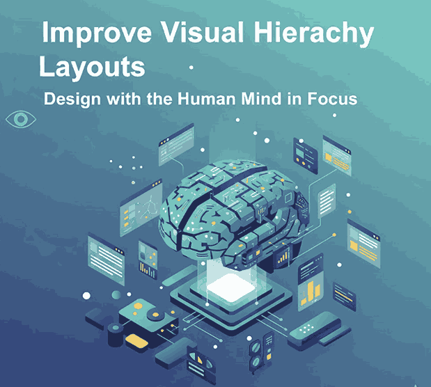
Improve Visual Hierarchy in Layouts: A Complete Guide to More Engaging New Design

Improve Visual Hierarchy Layouts

Table of Contents

  1. Introduction
  2. What Is Visual Hierarchy in Design?
  3. Why Visual Hierarchy Matters
  4. Key Principles of Visual Hierarchy
    • 4.1 Size and Scale
    • 4.2 Color and Contrast
    • 4.3 Typography and Font Choice
    • 4.4 Spacing and Alignment
  5. How to Improve Visual Hierarchy in Layouts
  6. Using Typography to Strengthen Design Hierarchy
  7. Recommended Fonts from CalligraphyFonts.net
  8. Conclusion
  9. References

1. Introduction

Improve Visual Hierarchy Layouts Creating an effective visual layout is more than arranging elements on a page — it’s about guiding the viewer’s eye. In the world of design, visual hierarchy determines what your audience sees first, next, and last.

A well-structured layout can make or break the user experience. Whether you’re designing a website, poster, or digital ad, understanding how to improve visual hierarchy in layouts helps you communicate messages clearly and beautifully.

Improve Visual Hierarchy Layouts

2. What Is Improve Visual Hierarchy Layouts in Design?

Visual hierarchy refers to how design elements are arranged to show their order of importance. It’s a fundamental principle that controls how viewers navigate your content.

Designers use size, color, contrast, spacing, and typography to establish hierarchy — ensuring that key information stands out and secondary details follow naturally.

3. Why Improve Visual Hierarchy Layouts Matters

Without visual hierarchy, even the most creative design can feel confusing. A strong hierarchy ensures that your message is clear and that viewers engage longer with your content.

Here’s why it matters:

  • Clarity: Helps users quickly understand what’s most important.
  • Aesthetics: Creates visual rhythm and flow.
  • Engagement: Encourages viewers to explore more.
  • Usability: Improves how users interact with designs in digital environments.

When hierarchy is properly established, your layout feels organized, intentional, and professional.

4. Key Principles of Improve Visual Hierarchy Layouts

4.1 Size and Scale

Bigger elements attract attention first. Use larger fonts or images to highlight your main message. Scale smaller elements accordingly to guide the viewer’s eye downward through the content.

4.2 Color and Contrast

Contrast draws focus. Bright or dark colors against neutral backgrounds make key elements stand out. Strategic use of color contrast enhances both readability and emotion.

4.3 Typography and Font Choice

Typography plays a powerful role in hierarchy. Headings, subheadings, and body text should have different font weights and styles to establish structure.
Using elegant calligraphy or clean serif fonts can create emotional tone and brand character.

4.4 Spacing and Alignment

White space gives elements room to breathe. Balanced spacing prevents clutter and directs focus naturally. Alignment ensures consistency — whether center-aligned for balance or left-aligned for readability.

5. How to Improve Visual Hierarchy Layouts

Improving hierarchy is about clarity and intention. Here are proven methods to achieve it:

  • Start with structure: Sketch or wireframe your layout before adding details.
  • Highlight the focal point: Use scale, bold color, or a striking font for the most important element.
  • Group related items: Proximity indicates relationship — place related elements closer together.
  • Limit font styles: Too many fonts can break hierarchy; two to three styles are ideal.
  • Use visual rhythm: Alternate heavy and light design areas to create a smooth viewing flow.

By applying these techniques, you’ll guide your audience effortlessly through your design story.

Improve Visual Hierarchy Layouts

6. Using Typography to Strengthen Design Hierarchy

Typography doesn’t just display text — it shapes perception. Fonts have distinct personalities that can elevate the tone and emotion of your design.

For example:

  • A bold modern font grabs attention for headlines.
  • A calligraphy or script font adds elegance and warmth.
  • A minimal serif or sans-serif font ensures readability for long text.

Selecting the right type hierarchy — combining contrasting weights, sizes, and styles — creates a polished, professional appearance.

If you want to achieve balance between beauty and functionality, using premium fonts is the key.

7. Recommended Fonts from CalligraphyFonts.net

At CalligraphyFonts.net, we specialize in handcrafted typefaces designed for creative professionals. Here are some recommended fonts to enhance visual hierarchy in your layouts:

  • Butterlies Font – A stylish modern calligraphy font that works perfectly for bold headlines or hero text sections.
  • Rutinitas Font – Soft and elegant, great for subheadings or secondary content that needs personality without overpowering.
  • Signatory Font – A balanced handwritten font, ideal for captions, taglines, or callouts within visual layouts.
  • Rellative Font – A clean and modern script font that enhances contrast and adds sophistication to any composition.

Each of these fonts helps designers establish contrast, tone, and flow, three pillars of an effective visual hierarchy.

8. Conclusion

Improving visual hierarchy in layouts is about intentional design. By controlling how elements guide the viewer’s eye, you turn complex visuals into engaging, easy-to-read experiences.

Combine layout structure with typographic precision and you’ll achieve designs that not only look great but communicate effectively.

To elevate your typography, explore the handcrafted font collections at CalligraphyFonts.net. Each font is thoughtfully designed to bring balance, clarity, and beauty to your visual hierarchy.

9. References

  1. DinStudio – Visual Hierarchy Principles for Attractive Designs
  2. Canva Design School – Visual Hierarchy in Graphic Design
  3. Envato Tuts+ – Visual Hierarchy for Designers
Posted on

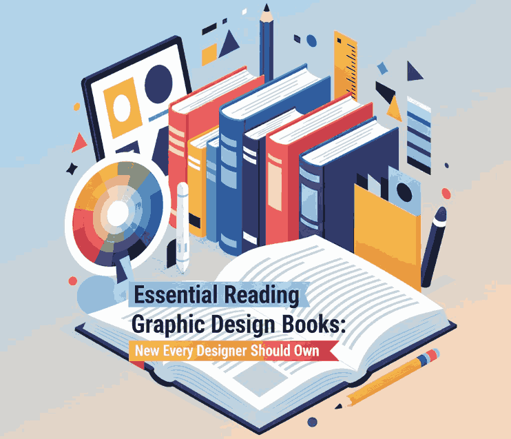
Essential Reading Graphic Design Books: New Every Designer Should Own

Essential Reading Graphic Design

Table of Contents

  1. Introduction
  2. Why Reading Matters for Designers
  3. The Timeless Value of Graphic Design Books
  4. Must-Have Books for Every Designer
    • 4.1 “Thinking with Type” by Ellen Lupton
    • 4.2 “Grid Systems in Graphic Design” by Josef Müller-Brockmann
    • 4.3 “Logo Modernism” by Jens Müller
    • 4.4 “Interaction of Color” by Josef Albers
    • 4.5 “Made You Look” by Stefan Sagmeister
  5. How to Apply Lessons from Design Books in Practice
  6. Typography and Font Choice in Book and Design Projects
  7. Featured Fonts from CalligraphyFonts.net
  8. Conclusion
  9. References

1. Introduction

Essential Reading Graphic Design In the digital age where tutorials and quick videos dominate, books remain one of the most powerful learning tools for designers. Reading helps refine your design thinking, expand creative perspectives, and improve visual literacy.

This article explores the essential graphic design books every designer should read — whether you’re a beginner mastering typography or an experienced creative seeking deeper theory. We’ll also show how professional fonts can complement your projects and make your design work stand out.

Essential Reading Graphic Design

2. Why Matters for Essential Reading Graphic Design

Great design goes beyond aesthetics — it communicates ideas, evokes emotions, and builds connections. Books provide the historical context and theoretical foundations that every designer needs.

Unlike short online content, design books offer structured knowledge, expert perspectives, and timeless inspiration. They help you understand the “why” behind every creative decision — from typography choice to layout balance.

3. The Timeless Value of Essential Reading Graphic Design Books

Graphic design books serve as both inspiration and guidance. They explore the principles of color, typography, grid systems, and branding — subjects that define great design across all eras.

By reading the right books, designers can:

  • Improve their design vocabulary and conceptual depth.
  • Learn how to analyze composition, hierarchy, and visual flow.
  • Gain exposure to historic and modern design movements.
  • Build critical thinking and storytelling through design.

Books are the ultimate teacher for those seeking mastery in graphic communication.

4. Must-Have Books for Every Designer

4.1 “Thinking with Type” by Ellen Lupton

Typography is the heartbeat of design, and Lupton’s classic work is a must-read. It teaches how type interacts with structure and emotion, offering real-world examples for both print and digital media.

4.2 “Grid Systems in Graphic Design” by Josef Müller-Brockmann

A cornerstone of Swiss design philosophy, this book provides timeless lessons on structure, rhythm, and proportion. Every professional designer should understand grid systems before diving into modern layouts.

4.3 “Logo Modernism” by Jens Müller

This visual encyclopedia explores how logos evolved through history. It’s a treasure for brand designers and students learning minimalist design systems.

4.4 “Interaction of Color” by Josef Albers

Color theory can make or break your design. Albers’s work shows how colors interact and influence perception — essential reading for anyone who works with branding, illustration, or UI.

4.5 “Made You Look” by Stefan Sagmeister

Sagmeister’s book dives into creativity and the emotional power of design. It reminds designers that aesthetics should always connect to human experience.

5. How to Apply Lessons from Essential Reading Graphic Design Books in Practice

Reading is only valuable when applied. Start by experimenting with what you learn:

  • Analyze typography: Observe how spacing and type hierarchy influence message clarity.
  • Create grid-based layouts: Apply Müller-Brockmann’s principles in real projects.
  • Experiment with color interaction: Use Albers’s exercises to explore color balance and harmony.
  • Develop storytelling: Integrate Sagmeister’s emotional design ideas into client projects.

When combined with modern tools and resources, these lessons transform your creative process.

6. Typography and Font Choice in Book and Design Projects

Typography is one of the most powerful elements in both graphic and editorial design. A carefully chosen font can amplify tone, readability, and emotional appeal.

For instance:

  • Serif fonts evoke trust and tradition — ideal for print publications.
  • Script fonts bring elegance and creativity — perfect for covers or branding.
  • Sans-serif fonts feel modern and clean — suited for digital reading experiences.

Choosing the right font connects the visual and emotional aspects of a design, making your message resonate stronger.

Essential Reading Graphic Design

7. Featured Fonts from CalligraphyFonts.net

To elevate your next design or book project, here are some stunning fonts available on CalligraphyFonts.net:

  • Neitherly Font – A refined and modern calligraphy typeface perfect for elegant book titles and cover headings.
  • Rutinitas Font – Graceful and flowing, ideal for adding artistic flair to editorial layouts.
  • Signatory Font – Stylish and versatile; works beautifully for author names, chapter titles, or creative taglines.
  • Rellative Font – Clean yet expressive script suitable for design quotes or promotional visuals.

Each of these fonts adds personality and balance to any design, helping you convey emotion and sophistication — just like the best design books teach.

8. Conclusion

Investing time in Essential Reading Graphic Design Books is like sharpening your creative toolkit. They offer wisdom that online tutorials can’t replicate — deep insights into type, form, and visual storytelling.

Pair your learning journey with high-quality fonts from CalligraphyFonts.net to transform ideas into polished, professional visuals.
Because great designers don’t just create — they study, refine, and evolve through the art of continuous learning.

9. References

  1. AIGA Eye on Design – Must-Read Books for Designers
  2. Envato Tuts+ – 20 Essential Graphic Design Books
  3. DinStudio – 6 Must-Have Best Graphic Design Books: A List of Recommendation
Posted on

Creative Surface Background Design Ideas: How to Elevate Your Visual Projects

Surface Background Design Ideas

Table of Contents

  1. Introduction: The Role of Backgrounds in Design
  2. Understanding Surface Background Design
  3. Types of Surface Backgrounds in Modern Design
  4. How to Choose the Right Surface for Your Project
  5. Enhancing Surface Backgrounds with Typography
  6. Font Examples to Pair with Surface Backgrounds
  7. Final Thoughts
  8. References

1. Introduction: The Role of Surface Background Design Ideas

In graphic design, the Surface Background Design Ideas is more than just a backdrop — it’s the foundation that sets the mood, tone, and atmosphere of your visual story. A well-chosen background complements the subject, enhances typography, and creates emotional depth.

Among the many approaches to backgrounds, surface background design stands out for its versatility and tactile appeal. Whether you’re designing posters, packaging, digital ads, or social media content, using surface backgrounds can help you create textures that feel real, inviting, and professional.

Surface Background Design Ideas

2. Understanding Surface Background Design Ideas

Surface background design refers to using textures, patterns, and material-inspired visuals (like wood, marble, paper, or fabric) as the main visual foundation of a design. It brings a sense of realism, helping your audience emotionally connect with your artwork.

Common types of surface backgrounds include:

  • Textured surfaces – concrete, paper grain, sand, or fabric.
  • Natural surfaces – wood, leaves, water ripples, or marble.
  • Industrial surfaces – metal plates, brushed steel, or stone.
  • Minimal surfaces – flat tones, gradients, or subtle shadows.

These backgrounds can be real photographs, digital textures, or vector-based patterns, depending on your project’s style.

3. Types of Modern Surface Background Design Ideas

Surface backgrounds can be classified based on the emotional tone or design goal. Let’s explore a few examples used by professional designers:

a. Organic Surfaces

Organic backgrounds use natural elements like wood, stone, or plants. These are ideal for eco-friendly brands, wellness products, or nature-inspired campaigns.

b. Minimal and Flat Surfaces

These use smooth gradients or single-tone colors, perfect for modern branding or tech industries. Minimal surfaces help the main elements (like logos or text) stand out.

c. Textured & Rough Surfaces

Textures like rough paper, brick, or fabric bring depth and authenticity. Great for handcrafted product branding, coffee shops, or vintage aesthetics.

d. Abstract & Artistic Surfaces

These designs use brush strokes, gradients, or abstract shapes. Ideal for creative studios and art-based promotions, they evoke emotion and movement.

4. How to Choose the Right Surface Background Design Ideas for Your Project

When selecting a surface background, always consider the purpose and audience of your design. Here are a few practical tips:

  • Match your brand tone: Use sleek surfaces for corporate brands and rough textures for artisanal ones.
  • Prioritize readability: Avoid overly busy textures behind important text.
  • Use contrast wisely: Pair dark text with light backgrounds (and vice versa).
  • Stay consistent: Maintain a unified visual theme across all brand materials.
  • Experiment with blending: Use overlays and opacity adjustments to harmonize the surface with your typography or logo.

Remember — your background should support your message, not compete with it.

Surface Background Design Ideas

5. Enhancing Surface Background Design Ideas with Typography

Typography and background are inseparable. A surface background provides the visual context, while typography delivers the message. The right combination turns your design from ordinary to unforgettable.

Here’s how to make typography shine on surface backgrounds:

  • Use contrasting fonts: Bold fonts pop better on textured backgrounds.
  • Add subtle shadows or outlines: Improves readability against uneven surfaces.
  • Choose font tones carefully: Warm tones pair well with organic surfaces, while cooler tones match industrial or modern surfaces.
  • Limit the number of fonts: Stick to 2–3 complementary fonts to maintain harmony.

A powerful design balances texture and text — the surface adds depth, and the typography commands attention.

6. Font Examples to Pair with Surface Background Design Ideas

To bring your surface background designs to life, here are some stunning font mockups from CalligraphyFonts.net that perfectly complement textured or layered visuals:

  • Brafio Font – A stylish serif font designed for clarity and sophistication. Perfect for luxury or editorial designs on subtle backgrounds.
  • Classicly Font – A bold serif display with timeless elegance. Ideal for headlines or poster designs layered over marble or vintage paper textures.
  • Westerners Font – A charming handwritten font that brings warmth and personality, perfect for rustic or organic background designs.
  • Senjalara Calligraphy Font – Elegant, flowing, and expressive — this calligraphy font pairs beautifully with minimal or watercolor-style backgrounds.

When used thoughtfully, fonts like these help establish a visual hierarchy and enhance storytelling within your background design.

7. Final Thoughts

Designing with surface backgrounds is all about texture, tone, and balance. Whether you prefer minimal, natural, or industrial aesthetics, the right background can transform your design from flat to captivating.

Combine it with purposeful typography and the result is a visually cohesive composition that feels authentic and professional.

Explore hundreds of beautifully crafted typefaces at CalligraphyFonts.net to find the perfect match for your next creative project. Each font is designed to complement your background textures and help you express your brand’s personality through typography.

8. References

  1. Smashing Magazine – Principles of Texture in Visual Design
  2. DinStudio – Most Common Background in Graphic Design
  3. Adobe article – Create professional-quality backgrounds for any kind of media
  4. Adobe Express blog – Designing with blue backgrounds for aesthetic appeal
Posted on

Top Infographic Creation Tools Every New Designer Should Know

Infographic Creation Tools

Table of Contents

  1. Introduction: The Power of Infographics in Modern Design
  2. Why Infographics Matter
  3. Key Features of Effective Infographic Tools
  4. Top Infographic Creation Tools to Try
  5. How Fonts Elevate Your Infographic Design
  6. Final Thoughts

1. Introduction: The Power of Infographics in Modern Design

In today’s digital landscape, visuals dominate communication. People prefer to see information rather than read long paragraphs — and that’s where Infographic Creation Tools come in. Infographic Creation Tools turn complex data into visually engaging and easy-to-understand graphics, making them essential for marketers, educators, and content creators alike.

But creating a powerful infographic isn’t just about design; it’s about choosing the right tools. The best infographic creation tools help designers organize ideas, use templates effectively, and save valuable time — all while maintaining aesthetic appeal.

2. Why Infographic Creation Tools Matter

Infographic Creation Tools

Infographics combine Infographic Creation Tools to tell stories visually. Research shows that visuals are processed 60,000 times faster by the human brain than text, and well-designed infographics can boost engagement, shares, and brand credibility.

Here’s why every designer should integrate infographics into their workflow:

  • Simplify complex ideas: Visuals make data easier to digest.
  • Increase engagement: Social media posts with visuals receive significantly higher interactions.
  • Boost SEO: Infographics are highly shareable and attract backlinks, improving search visibility.
  • Strengthen branding: Consistent use of colors, fonts, and layouts reinforces brand identity.

Infographics are more than decoration — they’re communication tools that make information both beautiful and memorable.

3. Key Features of Effective Infographic Creation Tools

Before choosing a platform, it’s important to understand what makes an infographic tool truly effective. Look for these features:

  • User-friendly interface: Drag-and-drop features save time for beginners and professionals.
  • Pre-designed templates: Templates help you start fast and maintain visual consistency.
  • Customizable elements: The ability to adjust colors, shapes, and fonts to match your brand identity.
  • Export flexibility: Options to download in multiple formats (PNG, PDF, SVG) for digital or print use.
  • Collaboration support: Cloud-based tools allow team members to edit and review in real time.

Whether you’re a marketer creating reports or a designer illustrating data stories, the right tool can make the process seamless.

4. Top Infographic Creation Tools to Try

Here are some of the best infographic creation tools that combine simplicity, versatility, and design excellence:

1. Canva

Canva is one of the most popular online design tools for beginners and pros alike. It offers thousands of templates and easy drag-and-drop features. You can create infographics, social media posts, presentations, and more — all from one dashboard.

2. Piktochart

Piktochart focuses on data visualization. It’s ideal for reports, charts, and professional infographics that require accuracy and storytelling combined.

3. Venngage

Venngage offers hundreds of customizable templates with excellent brand integration features. You can upload your logo, choose brand colors, and design consistent visuals quickly.

4. Visme

Visme stands out for its interactive elements — perfect for presentations, dashboards, and infographics that require animation or embedded links.

5. Adobe Express

Adobe Express (formerly Adobe Spark) provides high-quality templates backed by Adobe’s creative technology. It’s excellent for teams needing professional-grade visuals with minimal effort.

Each of these tools empowers designers to focus on creativity while the software handles the technical side of layout and structure.

Infographic Creation Tools

5. How Fonts Elevate Your Infographic Creation Tools

One element that often gets overlooked in infographic design is typography. Fonts do more than display words — they shape your audience’s perception, highlight key points, and define the mood of your infographic.

When designing infographics, it’s essential to use fonts strategically:

  • Use contrasting fonts for hierarchy — bold for headings, simple for body text.
  • Keep readability in mind — choose clear letterforms that remain legible at any size.
  • Match the tone of your topic — playful fonts for lifestyle content, elegant ones for professional infographics.

Here are some font mockups from CalligraphyFonts.net that can enhance your infographic visuals:

  • Holters Font – A modern calligraphy font that adds elegance and sophistication to infographic headlines.
  • Salvations Font – Bold and expressive, perfect for title emphasis or key statistics.
  • Dinernighty Font – Retro-inspired and distinctive, excellent for thematic infographics or branding visuals.
  • Banana Delight Font – Fun and friendly, ideal for lifestyle, education, or social-media-style infographics.

Typography helps establish visual hierarchy, guiding the viewer’s eye from headline to supporting details. The right combination of fonts and layout can make your design both stunning and easy to understand.

6. Final Thoughts

Infographics have become a cornerstone of digital storytelling — a bridge between data and design. Whether you’re showcasing business metrics, health tips, or creative insights, choosing the right infographic creation tools can turn your ideas into captivating visuals.

And remember: a powerful infographic doesn’t rely solely on visuals — it relies on clarity, structure, and emotion.
Pair great design tools with beautiful fonts from CalligraphyFonts.net, and your infographics will not only inform but also inspire.

7. References

  1. Piktochart – Infographic Design Tips for Beginners
  2. Canva – Infographic Design: Everything You Need to Know
  3. Venngage – What Is an Infographic? Examples, Templates & Design Tips
  4. DinStudio – Ready to Create an Infographic Design? Check These Tools Out!
Posted on

The Power of Visual Hierarchy in Design: How to Guide the Viewer’s Eye 2025

Visual Hierarchy in Design

Table of Contents

  1. What Is Visual Hierarchy in Design?
  2. Why Visual Hierarchy Matters
  3. Key Principles of Visual Hierarchy
  4. Practical Tips to Improve Visual Hierarchy
  5. Using Fonts to Enhance Hierarchy
  6. Final Thoughts

1. What Is Visual Hierarchy in Design?

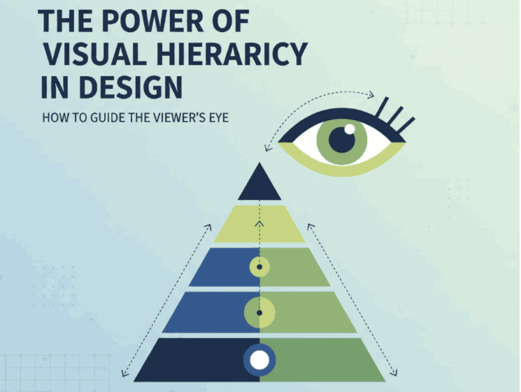
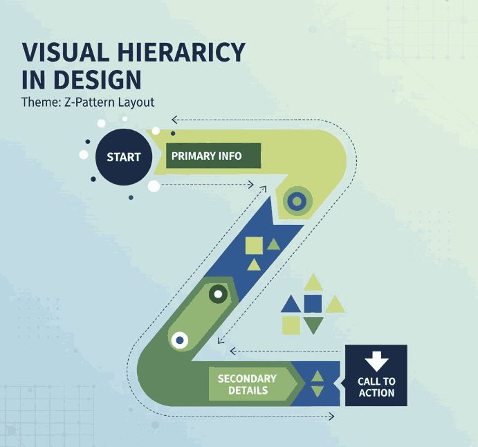
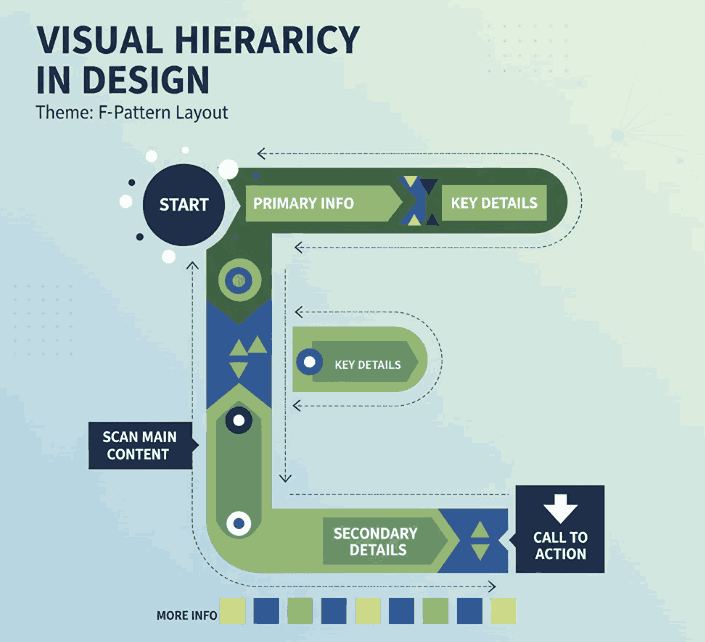
Visual hierarchy in design refers to the strategic arrangement of elements in a way that clearly communicates their order of importance. In simpler terms, it’s how designers guide the viewer’s eye from the most important element to the least.

When used effectively, visual hierarchy helps audiences absorb information naturally and efficiently — whether on a website, poster, logo, or social media post. It’s the foundation that makes a design both aesthetically pleasing and functionally effective.

Visual Hierarchy in Design

2. Why Visual Hierarchy in Design Matters

A well-crafted visual hierarchy is the secret to communicating your message clearly. When hierarchy is missing, your design can appear cluttered or confusing — leaving your audience unsure where to look first.

Here’s why it’s important:

  • Enhances readability and comprehension. Clear hierarchy helps users process content effortlessly.
  • Directs attention strategically. It emphasizes what’s most important — such as a headline, product name, or call-to-action.
  • Creates emotional engagement. Proper balance and contrast create flow, making your design feel dynamic and professional.

When done right, visual hierarchy turns ordinary layouts into captivating compositions that tell a visual story.

3. Key Principles of Visual Hierarchy in Design

There are several foundational principles every designer should understand when applying visual hierarchy:

a. Size and Scale

Larger elements naturally attract more attention. Headings, key images, or call-to-action buttons should be visually dominant compared to supporting text.

b. Color and Contrast

High-contrast colors help highlight important information, while muted tones guide attention elsewhere. Designers often use color psychology to evoke specific emotions.

c. Alignment and Balance

Proper alignment establishes harmony and order. Balanced compositions feel stable and trustworthy, while asymmetrical layouts can create energy and focus.

d. Typography

Font choice dramatically affects perception. Serif fonts convey elegance, sans-serif fonts show modernity, and script or calligraphy fonts express creativity and warmth.

e. White Space

Negative space isn’t “empty” — it’s a powerful tool to separate elements and improve focus. Well-used white space enhances sophistication and clarity.

4. Practical Tips to Improve Visual Hierarchy

To make your designs more visually structured and appealing, consider the following actionable tips:

  • Establish a focal point: Always determine the element you want viewers to notice first.
  • Use consistent typography styles: Keep heading, subheading, and paragraph fonts distinct but cohesive.
  • Play with proximity: Group related items together to indicate relationships.
  • Create rhythm with repetition: Repeating colors, shapes, or lines helps unify your composition.
  • Experiment with grid systems: They help maintain consistent spacing and structure across multiple design formats.
Visual Hierarchy in Design

5. Using Fonts to Enhance Hierarchy

Typography plays a central role in visual hierarchy. The right font choice can immediately set the tone of your design and help guide the viewer’s eye.

Here are some stunning examples from CalligraphyFonts.net that can elevate your design hierarchy:

  • Holters Font – A sophisticated calligraphy typeface that’s perfect for headings and luxury branding.
  • Salvations Font – A bold yet elegant script font that draws immediate attention, ideal for quotes and logo marks.
  • Dinernighty Font – Retro-inspired with strong letterforms, perfect for highlighting focal text or signage.
  • Banana Delight Font – A playful handwritten script that adds warmth and personality to any visual layout.

When combining fonts, maintain contrast and consistency:

  • Use one typeface for titles and another for body text.
  • Pair bold display fonts with simple sans-serif fonts to achieve visual balance.
  • Avoid overusing decorative fonts — one accent typeface is usually enough to stand out.

Good typography hierarchy isn’t just about style; it’s about clarity, flow, and emotion.

6. Final Thoughts

Mastering visual hierarchy in design is one of the most valuable skills for any graphic designer, brand builder, or creative entrepreneur. It ensures your audience sees, feels, and understands your message exactly as intended.

Whether you’re crafting a brand identity, poster, or web layout, remember that hierarchy guides perception.
Experiment with size, color, alignment, contrast, and font choice until your design feels intuitive and balanced.

And if you’re searching for the perfect fonts to elevate your next creative project, explore more exclusive typefaces at
CalligraphyFonts.net — where design meets emotion.

References

  1. DinStudio – 5 Basic Principles of Layout in Graphic Design
  2. Canva Design School – What Is Visual Hierarchy in Design?
  3. Interaction Design Foundation – Visual Hierarchy and Its Role in UX Design
Posted on

Principles of Graphic Design: The Foundation of Visual New Communication

Principles of Graphic Design

Table of Contents

  1. Introduction: Why Graphic Design Principles Matter
  2. The 7 Core Principles of Graphic Design
     • Balance
     • Contrast
     • Alignment
     • Repetition
     • Proximity
     • Hierarchy
     • Space
  3. Applying Design Principles in Branding and Marketing
  4. The Role of Typography in Graphic Design
  5. Recommended Fonts for Creative Projects
  6. Final Thoughts
  7. References

1. Introduction: Why Graphic Design Principles Matter

Principles of Graphic Design is more than just making something look attractive—it’s about communication, clarity, and impact. The Principles of Graphic Design serve as the backbone of every visual creation, ensuring that your message connects effectively with your audience.

Whether you are designing a brand logo, a poster, or a website interface, understanding these principles helps you build visuals that are balanced, intentional, and emotionally engaging. In today’s digital world, where visuals dominate marketing strategies, mastering these fundamentals can set your work apart.

Principles of Graphic Design

2. The 7 Core Principles of Graphic Design

Let’s explore the essential principles that every designer should understand and apply.

Balance

Balance refers to the distribution of visual weight within a design. It can be symmetrical (where both sides mirror each other) or asymmetrical (where visual interest is created through contrast and variation). A balanced layout ensures that no part of the design feels heavier than the other.

Contrast

Contrast highlights differences in color, size, shape, and texture to create emphasis. It helps guide the viewer’s attention to the most important elements, such as headlines or calls to action. High contrast is also essential for readability and accessibility.

Alignment

Alignment ensures that every element on a page visually connects to another. Proper alignment creates structure, order, and a professional appearance. Misalignment, on the other hand, can make a design appear chaotic or unbalanced.

Repetition

Repetition builds consistency by reusing visual elements such as fonts, colors, and shapes. It reinforces branding and helps establish a recognizable identity across different materials like brochures, websites, or social media posts.

Proximity

Proximity groups related items together, making the design easier to navigate. By organizing content logically, proximity helps viewers quickly understand relationships between elements—improving both aesthetics and usability.

Hierarchy

Hierarchy determines the order in which information is presented. Designers use size, weight, and placement to guide viewers from the most important to the least important information. For example, headlines should always stand out compared to body text.

Space

Space, often referred to as “white space,” gives designs room to breathe. It prevents overcrowding and helps highlight important content. Effective use of space contributes to elegance, readability, and a clean layout.

3. Applying Principles of Graphic Design in Branding and Marketing

The principles of graphic design are crucial in building a consistent and memorable brand identity. A logo that follows these rules will communicate professionalism, while a marketing campaign that applies hierarchy and contrast effectively will attract more attention.

For instance, a brand that uses strong visual balance and clear hierarchy across its website and packaging will appear trustworthy and organized. When combined with a cohesive color palette and thoughtful typography, these design principles can create a powerful emotional connection with customers.

4. The Role of Typography in Principles of Graphic Design

Typography is a vital part of design—it influences tone, personality, and readability. Choosing the right font can transform a design from ordinary to extraordinary. Serif fonts convey tradition and authority, sans-serif fonts evoke modernity, and script fonts add a touch of elegance or creativity.

If you’re a designer looking to experiment with stunning typefaces, you can explore premium fonts at Calligraphy Fonts, where artistry meets functionality. The right typography can bring balance and harmony to your overall design composition.

Principles of Graphic Design

5. Recommended Fonts for Creative Projects

Here are some fonts that work perfectly when applying the Principles of Graphic Design to your branding or artwork:

  • Overcame Font – A bold and elegant typeface that captures strength and determination.
  • Ballerinas Font – Perfect for designs that require a graceful and artistic touch.
  • Ameralda Font – A luxurious and stylish font ideal for branding and logo design.
  • Catcalling Font – Great for creative posters and modern minimalist projects.

Each of these fonts exemplifies different principles like contrast, balance, and repetition—helping you achieve a harmonious and engaging design.

6. Final Thoughts

Understanding and applying the principles of graphic design is essential for creating visually compelling work that communicates effectively. Every line, color, font, and space you use contributes to how your audience perceives your design.

By combining these principles with quality typography from CalligraphyFonts.net, you can produce professional and memorable visuals that strengthen brand identity and capture attention in a competitive creative market.

7. References