Posted on

Creative Surface Background Design Ideas: How to Elevate Your Visual Projects

Surface Background Design Ideas

Table of Contents

  1. Introduction: The Role of Backgrounds in Design
  2. Understanding Surface Background Design
  3. Types of Surface Backgrounds in Modern Design
  4. How to Choose the Right Surface for Your Project
  5. Enhancing Surface Backgrounds with Typography
  6. Font Examples to Pair with Surface Backgrounds
  7. Final Thoughts
  8. References

1. Introduction: The Role of Surface Background Design Ideas

In graphic design, the Surface Background Design Ideas is more than just a backdrop — it’s the foundation that sets the mood, tone, and atmosphere of your visual story. A well-chosen background complements the subject, enhances typography, and creates emotional depth.

Among the many approaches to backgrounds, surface background design stands out for its versatility and tactile appeal. Whether you’re designing posters, packaging, digital ads, or social media content, using surface backgrounds can help you create textures that feel real, inviting, and professional.

Surface Background Design Ideas

2. Understanding Surface Background Design Ideas

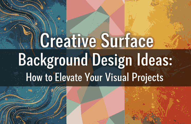
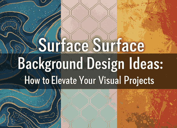
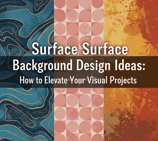
Surface background design refers to using textures, patterns, and material-inspired visuals (like wood, marble, paper, or fabric) as the main visual foundation of a design. It brings a sense of realism, helping your audience emotionally connect with your artwork.

Common types of surface backgrounds include:

  • Textured surfaces – concrete, paper grain, sand, or fabric.
  • Natural surfaces – wood, leaves, water ripples, or marble.
  • Industrial surfaces – metal plates, brushed steel, or stone.
  • Minimal surfaces – flat tones, gradients, or subtle shadows.

These backgrounds can be real photographs, digital textures, or vector-based patterns, depending on your project’s style.

3. Types of Modern Surface Background Design Ideas

Surface backgrounds can be classified based on the emotional tone or design goal. Let’s explore a few examples used by professional designers:

a. Organic Surfaces

Organic backgrounds use natural elements like wood, stone, or plants. These are ideal for eco-friendly brands, wellness products, or nature-inspired campaigns.

b. Minimal and Flat Surfaces

These use smooth gradients or single-tone colors, perfect for modern branding or tech industries. Minimal surfaces help the main elements (like logos or text) stand out.

c. Textured & Rough Surfaces

Textures like rough paper, brick, or fabric bring depth and authenticity. Great for handcrafted product branding, coffee shops, or vintage aesthetics.

d. Abstract & Artistic Surfaces

These designs use brush strokes, gradients, or abstract shapes. Ideal for creative studios and art-based promotions, they evoke emotion and movement.

4. How to Choose the Right Surface Background Design Ideas for Your Project

When selecting a surface background, always consider the purpose and audience of your design. Here are a few practical tips:

  • Match your brand tone: Use sleek surfaces for corporate brands and rough textures for artisanal ones.
  • Prioritize readability: Avoid overly busy textures behind important text.
  • Use contrast wisely: Pair dark text with light backgrounds (and vice versa).
  • Stay consistent: Maintain a unified visual theme across all brand materials.
  • Experiment with blending: Use overlays and opacity adjustments to harmonize the surface with your typography or logo.

Remember — your background should support your message, not compete with it.

Surface Background Design Ideas

5. Enhancing Surface Background Design Ideas with Typography

Typography and background are inseparable. A surface background provides the visual context, while typography delivers the message. The right combination turns your design from ordinary to unforgettable.

Here’s how to make typography shine on surface backgrounds:

  • Use contrasting fonts: Bold fonts pop better on textured backgrounds.
  • Add subtle shadows or outlines: Improves readability against uneven surfaces.
  • Choose font tones carefully: Warm tones pair well with organic surfaces, while cooler tones match industrial or modern surfaces.
  • Limit the number of fonts: Stick to 2–3 complementary fonts to maintain harmony.

A powerful design balances texture and text — the surface adds depth, and the typography commands attention.

6. Font Examples to Pair with Surface Background Design Ideas

To bring your surface background designs to life, here are some stunning font mockups from CalligraphyFonts.net that perfectly complement textured or layered visuals:

  • Brafio Font – A stylish serif font designed for clarity and sophistication. Perfect for luxury or editorial designs on subtle backgrounds.
  • Classicly Font – A bold serif display with timeless elegance. Ideal for headlines or poster designs layered over marble or vintage paper textures.
  • Westerners Font – A charming handwritten font that brings warmth and personality, perfect for rustic or organic background designs.
  • Senjalara Calligraphy Font – Elegant, flowing, and expressive — this calligraphy font pairs beautifully with minimal or watercolor-style backgrounds.

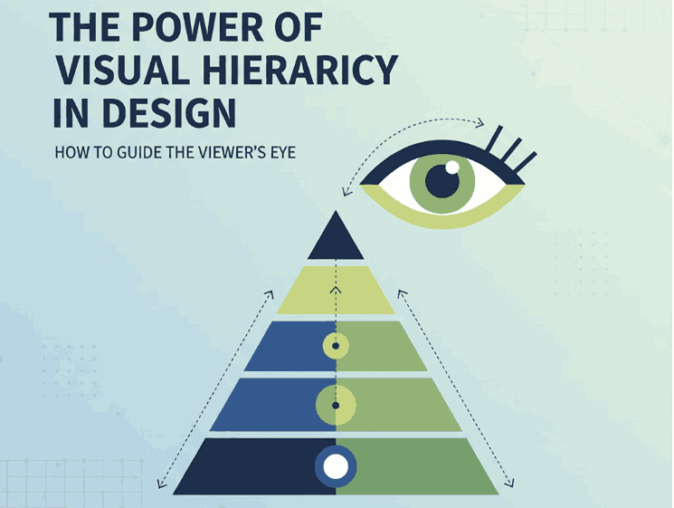
When used thoughtfully, fonts like these help establish a visual hierarchy and enhance storytelling within your background design.

7. Final Thoughts

Designing with surface backgrounds is all about texture, tone, and balance. Whether you prefer minimal, natural, or industrial aesthetics, the right background can transform your design from flat to captivating.

Combine it with purposeful typography and the result is a visually cohesive composition that feels authentic and professional.

Explore hundreds of beautifully crafted typefaces at CalligraphyFonts.net to find the perfect match for your next creative project. Each font is designed to complement your background textures and help you express your brand’s personality through typography.

8. References

  1. Smashing Magazine – Principles of Texture in Visual Design
  2. DinStudio – Most Common Background in Graphic Design
  3. Adobe article – Create professional-quality backgrounds for any kind of media
  4. Adobe Express blog – Designing with blue backgrounds for aesthetic appeal
Posted on

Top Infographic Creation Tools Every New Designer Should Know

Infographic Creation Tools

Table of Contents

  1. Introduction: The Power of Infographics in Modern Design
  2. Why Infographics Matter
  3. Key Features of Effective Infographic Tools
  4. Top Infographic Creation Tools to Try
  5. How Fonts Elevate Your Infographic Design
  6. Final Thoughts

1. Introduction: The Power of Infographics in Modern Design

In today’s digital landscape, visuals dominate communication. People prefer to see information rather than read long paragraphs — and that’s where Infographic Creation Tools come in. Infographic Creation Tools turn complex data into visually engaging and easy-to-understand graphics, making them essential for marketers, educators, and content creators alike.

But creating a powerful infographic isn’t just about design; it’s about choosing the right tools. The best infographic creation tools help designers organize ideas, use templates effectively, and save valuable time — all while maintaining aesthetic appeal.

2. Why Infographic Creation Tools Matter

Infographic Creation Tools

Infographics combine Infographic Creation Tools to tell stories visually. Research shows that visuals are processed 60,000 times faster by the human brain than text, and well-designed infographics can boost engagement, shares, and brand credibility.

Here’s why every designer should integrate infographics into their workflow:

  • Simplify complex ideas: Visuals make data easier to digest.
  • Increase engagement: Social media posts with visuals receive significantly higher interactions.
  • Boost SEO: Infographics are highly shareable and attract backlinks, improving search visibility.
  • Strengthen branding: Consistent use of colors, fonts, and layouts reinforces brand identity.

Infographics are more than decoration — they’re communication tools that make information both beautiful and memorable.

3. Key Features of Effective Infographic Creation Tools

Before choosing a platform, it’s important to understand what makes an infographic tool truly effective. Look for these features:

  • User-friendly interface: Drag-and-drop features save time for beginners and professionals.
  • Pre-designed templates: Templates help you start fast and maintain visual consistency.
  • Customizable elements: The ability to adjust colors, shapes, and fonts to match your brand identity.
  • Export flexibility: Options to download in multiple formats (PNG, PDF, SVG) for digital or print use.
  • Collaboration support: Cloud-based tools allow team members to edit and review in real time.

Whether you’re a marketer creating reports or a designer illustrating data stories, the right tool can make the process seamless.

4. Top Infographic Creation Tools to Try

Here are some of the best infographic creation tools that combine simplicity, versatility, and design excellence:

1. Canva

Canva is one of the most popular online design tools for beginners and pros alike. It offers thousands of templates and easy drag-and-drop features. You can create infographics, social media posts, presentations, and more — all from one dashboard.

2. Piktochart

Piktochart focuses on data visualization. It’s ideal for reports, charts, and professional infographics that require accuracy and storytelling combined.

3. Venngage

Venngage offers hundreds of customizable templates with excellent brand integration features. You can upload your logo, choose brand colors, and design consistent visuals quickly.

4. Visme

Visme stands out for its interactive elements — perfect for presentations, dashboards, and infographics that require animation or embedded links.

5. Adobe Express

Adobe Express (formerly Adobe Spark) provides high-quality templates backed by Adobe’s creative technology. It’s excellent for teams needing professional-grade visuals with minimal effort.

Each of these tools empowers designers to focus on creativity while the software handles the technical side of layout and structure.

Infographic Creation Tools

5. How Fonts Elevate Your Infographic Creation Tools

One element that often gets overlooked in infographic design is typography. Fonts do more than display words — they shape your audience’s perception, highlight key points, and define the mood of your infographic.

When designing infographics, it’s essential to use fonts strategically:

  • Use contrasting fonts for hierarchy — bold for headings, simple for body text.
  • Keep readability in mind — choose clear letterforms that remain legible at any size.
  • Match the tone of your topic — playful fonts for lifestyle content, elegant ones for professional infographics.

Here are some font mockups from CalligraphyFonts.net that can enhance your infographic visuals:

  • Holters Font – A modern calligraphy font that adds elegance and sophistication to infographic headlines.
  • Salvations Font – Bold and expressive, perfect for title emphasis or key statistics.
  • Dinernighty Font – Retro-inspired and distinctive, excellent for thematic infographics or branding visuals.
  • Banana Delight Font – Fun and friendly, ideal for lifestyle, education, or social-media-style infographics.

Typography helps establish visual hierarchy, guiding the viewer’s eye from headline to supporting details. The right combination of fonts and layout can make your design both stunning and easy to understand.

6. Final Thoughts

Infographics have become a cornerstone of digital storytelling — a bridge between data and design. Whether you’re showcasing business metrics, health tips, or creative insights, choosing the right infographic creation tools can turn your ideas into captivating visuals.

And remember: a powerful infographic doesn’t rely solely on visuals — it relies on clarity, structure, and emotion.
Pair great design tools with beautiful fonts from CalligraphyFonts.net, and your infographics will not only inform but also inspire.

7. References

  1. Piktochart – Infographic Design Tips for Beginners
  2. Canva – Infographic Design: Everything You Need to Know
  3. Venngage – What Is an Infographic? Examples, Templates & Design Tips
  4. DinStudio – Ready to Create an Infographic Design? Check These Tools Out!
Posted on

The Power of Visual Hierarchy in Design: How to Guide the Viewer’s Eye 2025

Visual Hierarchy in Design

Table of Contents

  1. What Is Visual Hierarchy in Design?
  2. Why Visual Hierarchy Matters
  3. Key Principles of Visual Hierarchy
  4. Practical Tips to Improve Visual Hierarchy
  5. Using Fonts to Enhance Hierarchy
  6. Final Thoughts

1. What Is Visual Hierarchy in Design?

Visual hierarchy in design refers to the strategic arrangement of elements in a way that clearly communicates their order of importance. In simpler terms, it’s how designers guide the viewer’s eye from the most important element to the least.

When used effectively, visual hierarchy helps audiences absorb information naturally and efficiently — whether on a website, poster, logo, or social media post. It’s the foundation that makes a design both aesthetically pleasing and functionally effective.

Visual Hierarchy in Design

2. Why Visual Hierarchy in Design Matters

A well-crafted visual hierarchy is the secret to communicating your message clearly. When hierarchy is missing, your design can appear cluttered or confusing — leaving your audience unsure where to look first.

Here’s why it’s important:

  • Enhances readability and comprehension. Clear hierarchy helps users process content effortlessly.
  • Directs attention strategically. It emphasizes what’s most important — such as a headline, product name, or call-to-action.
  • Creates emotional engagement. Proper balance and contrast create flow, making your design feel dynamic and professional.

When done right, visual hierarchy turns ordinary layouts into captivating compositions that tell a visual story.

3. Key Principles of Visual Hierarchy in Design

There are several foundational principles every designer should understand when applying visual hierarchy:

a. Size and Scale

Larger elements naturally attract more attention. Headings, key images, or call-to-action buttons should be visually dominant compared to supporting text.

b. Color and Contrast

High-contrast colors help highlight important information, while muted tones guide attention elsewhere. Designers often use color psychology to evoke specific emotions.

c. Alignment and Balance

Proper alignment establishes harmony and order. Balanced compositions feel stable and trustworthy, while asymmetrical layouts can create energy and focus.

d. Typography

Font choice dramatically affects perception. Serif fonts convey elegance, sans-serif fonts show modernity, and script or calligraphy fonts express creativity and warmth.

e. White Space

Negative space isn’t “empty” — it’s a powerful tool to separate elements and improve focus. Well-used white space enhances sophistication and clarity.

4. Practical Tips to Improve Visual Hierarchy

To make your designs more visually structured and appealing, consider the following actionable tips:

  • Establish a focal point: Always determine the element you want viewers to notice first.
  • Use consistent typography styles: Keep heading, subheading, and paragraph fonts distinct but cohesive.
  • Play with proximity: Group related items together to indicate relationships.
  • Create rhythm with repetition: Repeating colors, shapes, or lines helps unify your composition.
  • Experiment with grid systems: They help maintain consistent spacing and structure across multiple design formats.
Visual Hierarchy in Design

5. Using Fonts to Enhance Hierarchy

Typography plays a central role in visual hierarchy. The right font choice can immediately set the tone of your design and help guide the viewer’s eye.

Here are some stunning examples from CalligraphyFonts.net that can elevate your design hierarchy:

  • Holters Font – A sophisticated calligraphy typeface that’s perfect for headings and luxury branding.
  • Salvations Font – A bold yet elegant script font that draws immediate attention, ideal for quotes and logo marks.
  • Dinernighty Font – Retro-inspired with strong letterforms, perfect for highlighting focal text or signage.
  • Banana Delight Font – A playful handwritten script that adds warmth and personality to any visual layout.

When combining fonts, maintain contrast and consistency:

  • Use one typeface for titles and another for body text.
  • Pair bold display fonts with simple sans-serif fonts to achieve visual balance.
  • Avoid overusing decorative fonts — one accent typeface is usually enough to stand out.

Good typography hierarchy isn’t just about style; it’s about clarity, flow, and emotion.

6. Final Thoughts

Mastering visual hierarchy in design is one of the most valuable skills for any graphic designer, brand builder, or creative entrepreneur. It ensures your audience sees, feels, and understands your message exactly as intended.

Whether you’re crafting a brand identity, poster, or web layout, remember that hierarchy guides perception.
Experiment with size, color, alignment, contrast, and font choice until your design feels intuitive and balanced.

And if you’re searching for the perfect fonts to elevate your next creative project, explore more exclusive typefaces at
CalligraphyFonts.net — where design meets emotion.

References

  1. DinStudio – 5 Basic Principles of Layout in Graphic Design
  2. Canva Design School – What Is Visual Hierarchy in Design?
  3. Interaction Design Foundation – Visual Hierarchy and Its Role in UX Design
Posted on

Principles of Graphic Design: The Foundation of Visual New Communication

Principles of Graphic Design

Table of Contents

  1. Introduction: Why Graphic Design Principles Matter
  2. The 7 Core Principles of Graphic Design
     • Balance
     • Contrast
     • Alignment
     • Repetition
     • Proximity
     • Hierarchy
     • Space
  3. Applying Design Principles in Branding and Marketing
  4. The Role of Typography in Graphic Design
  5. Recommended Fonts for Creative Projects
  6. Final Thoughts
  7. References

1. Introduction: Why Graphic Design Principles Matter

Principles of Graphic Design is more than just making something look attractive—it’s about communication, clarity, and impact. The Principles of Graphic Design serve as the backbone of every visual creation, ensuring that your message connects effectively with your audience.

Whether you are designing a brand logo, a poster, or a website interface, understanding these principles helps you build visuals that are balanced, intentional, and emotionally engaging. In today’s digital world, where visuals dominate marketing strategies, mastering these fundamentals can set your work apart.

Principles of Graphic Design

2. The 7 Core Principles of Graphic Design

Let’s explore the essential principles that every designer should understand and apply.

Balance

Balance refers to the distribution of visual weight within a design. It can be symmetrical (where both sides mirror each other) or asymmetrical (where visual interest is created through contrast and variation). A balanced layout ensures that no part of the design feels heavier than the other.

Contrast

Contrast highlights differences in color, size, shape, and texture to create emphasis. It helps guide the viewer’s attention to the most important elements, such as headlines or calls to action. High contrast is also essential for readability and accessibility.

Alignment

Alignment ensures that every element on a page visually connects to another. Proper alignment creates structure, order, and a professional appearance. Misalignment, on the other hand, can make a design appear chaotic or unbalanced.

Repetition

Repetition builds consistency by reusing visual elements such as fonts, colors, and shapes. It reinforces branding and helps establish a recognizable identity across different materials like brochures, websites, or social media posts.

Proximity

Proximity groups related items together, making the design easier to navigate. By organizing content logically, proximity helps viewers quickly understand relationships between elements—improving both aesthetics and usability.

Hierarchy

Hierarchy determines the order in which information is presented. Designers use size, weight, and placement to guide viewers from the most important to the least important information. For example, headlines should always stand out compared to body text.

Space

Space, often referred to as “white space,” gives designs room to breathe. It prevents overcrowding and helps highlight important content. Effective use of space contributes to elegance, readability, and a clean layout.

3. Applying Principles of Graphic Design in Branding and Marketing

The principles of graphic design are crucial in building a consistent and memorable brand identity. A logo that follows these rules will communicate professionalism, while a marketing campaign that applies hierarchy and contrast effectively will attract more attention.

For instance, a brand that uses strong visual balance and clear hierarchy across its website and packaging will appear trustworthy and organized. When combined with a cohesive color palette and thoughtful typography, these design principles can create a powerful emotional connection with customers.

4. The Role of Typography in Principles of Graphic Design

Typography is a vital part of design—it influences tone, personality, and readability. Choosing the right font can transform a design from ordinary to extraordinary. Serif fonts convey tradition and authority, sans-serif fonts evoke modernity, and script fonts add a touch of elegance or creativity.

If you’re a designer looking to experiment with stunning typefaces, you can explore premium fonts at Calligraphy Fonts, where artistry meets functionality. The right typography can bring balance and harmony to your overall design composition.

Principles of Graphic Design

5. Recommended Fonts for Creative Projects

Here are some fonts that work perfectly when applying the Principles of Graphic Design to your branding or artwork:

  • Overcame Font – A bold and elegant typeface that captures strength and determination.
  • Ballerinas Font – Perfect for designs that require a graceful and artistic touch.
  • Ameralda Font – A luxurious and stylish font ideal for branding and logo design.
  • Catcalling Font – Great for creative posters and modern minimalist projects.

Each of these fonts exemplifies different principles like contrast, balance, and repetition—helping you achieve a harmonious and engaging design.

6. Final Thoughts

Understanding and applying the principles of graphic design is essential for creating visually compelling work that communicates effectively. Every line, color, font, and space you use contributes to how your audience perceives your design.

By combining these principles with quality typography from CalligraphyFonts.net, you can produce professional and memorable visuals that strengthen brand identity and capture attention in a competitive creative market.

7. References

Posted on

Boost New Creativity in 2025 with Adobe Illustrator Productivity Plugins

Adobe Illustrator Productivity Plugins

Table of Contents

  1. Introduction
  2. Why Productivity Plugins Matter for Font Designers
  3. Top Illustrator Plugins to Boost Workflow
    • 3.1 Astute Graphics Suite (VectorScribe, VectorFirstAid, etc.)
    • 3.2 Fontself Maker
    • 3.3 Select Menu
    • 3.4 SymmetryWorks
    • 3.5 Magic Exporter & Other Export Helpers
    • 3.6 Bonus: Cleanup / Nudge / Concatenate / ToolShed
  4. How to Use These Plugins in Font Mockups
  5. Tips for Choosing & Managing Plugins
  6. Case Study: Mockups with CalligraphyFonts
  7. Conclusion & Call to Action
  8. References

1. Introduction

In the world of vector design and type design, time is precious. Every minute saved on repetitive or tedious tasks can be reinvested into creativity, refinement, or exploring new ideas. That’s where Adobe Illustrator Productivity Plugins shine.

For font designers, these Adobe Illustrator Productivity Plugins aren’t just nice-to-have—they can streamline glyph cleanup, path editing, batch exports, symmetry generation, and more. In this article, we’ll explore the best productivity plugins for Illustrator, how they help in a font-oriented workflow, and how you can integrate them into your mockups and design process.

2. Why Productivity Plugins Matter for Font Designers

Even though Illustrator is powerful by itself, certain tasks remain friction points—like cleaning up messy vector artwork, splitting paths, aligning anchors, exporting multiple formats, or generating symmetric ornamentation. Plugins extend Illustrator’s native capabilities, allowing you to:

  • Automate repetitive tasks
  • Increase precision in path manipulation
  • Speed up export workflows (especially for marketing / font previews)
  • Add specialty tools not built into Illustrator
  • Reduce manual errors

Din Studio’s article on essential Illustrator plugins highlights how these extensions “improve productivity by providing significantly more efficient tools for some common tasks.”
Also, Ziflow’s list of “19 best Illustrator plugins” includes many productivity and collaboration tools that embed directly into the Illustrator workflow.

Adobe Illustrator Productivity Plugins

3. Top Adobe Illustrator Productivity Plugins to Boost Workflow

Berikut beberapa plugin unggulan yang sering disebut dalam ulasan desain sebagai pengubah produktivitas:

3.1 Astute Graphics Suite (VectorScribe, VectorFirstAid, etc.)

Astute Graphics adalah salah satu pemain besar dalam plugin Illustrator.
Beberapa modul penting:

  • VectorScribe: Smart removal of unnecessary points, dynamic corner tools, path extension, precise measurements.
  • VectorFirstAid: Membersihkan vektor (fix stray anchors, broken paths, text to outlines) yang sering muncul ketika impor desain kompleks.
  • Phantasm: Mengatur warna, efek vektor seperti halftone dan koreksi warna langsung dalam Illustrator.
  • ColliderScribe, ToolShed, Cleanup Tools, Concatenate, Nudge Panel: Beragam utilitas kecil tapi sangat menghemat waktu.

Banyak desainer menyatakan bahwa Astute plugins “shaved time off my workflow and opened new geometric doors.”
Di komunitas Adobe, plugin seperti VectorScribe, InkScribe, dan Reform disebut sebagai “sangat membantu dalam pengeditan path & spline.”

3.2 Fontself Maker

Fontself Maker memungkinkan kamu membuat font (OTF / SVG) langsung dari bentuk vector / lettering di Illustrator.
Fitur utamanya:

  • Drag & drop bentuk glyph
  • Ligatures & alternates
  • Font dengan warna (OpenType-SVG)

Bagi pembuat font, ini menghilangkan kebutuhan berpindah aplikasi (Illustrator → Font software).

3.3 Select Menu

Select Menu memperluas menu Select > Object dengan 18 fungsi tambahan — seperti memilih closed paths, open paths, compound paths, dll.
Plugin ini sederhana, gratis, dan sangat membantu ketika bekerja dengan dokumen kompleks yang berisi ribuan objek.

3.4 SymmetryWorks

Plugin ini membantu membuat pola simetris (mirror, repeat) secara otomatis. Di artikel Din Studio, disebut sebagai plugin yang cocok untuk wallpaper atau desain repeating pattern.
Sangat berguna untuk membuat dekorasi, borders, motif hias dalam tampilan font mockup.

3.5 Magic Exporter & Other Export Helpers

Plugin seperti Magic Exporter memungkinkan kamu memilih objek atau layer tertentu lalu langsung diekspor ke beberapa format (PNG, SVG) dengan otomatis.
Plugin semacam ini sangat berguna ketika kamu memiliki mockups font dalam berbagai variasi ukuran dan format.

3.6 Bonus: Cleanup / Nudge / Concatenate / ToolShed

Plugin-plugin utilitas kecil sering terlupakan tapi sangat berguna:

  • Concatenate: Gabungkan path terpisah secara otomatis jika endpoints dekat.
  • Cleanup Tools: Memperbaiki segment, menyederhanakan anchor, menjaga transisi halus.
  • Nudge Panel: Menggeser objek, dash, pattern fills dengan kontrol lebih halus.
  • ToolShed: Koleksi utilitas seperti offset open paths, duplicate removal, note panel, dan lainnya.

Bersama plugin-plugin utama di atas, kamu bisa sangat mengurangi kerja manual.

4. How to Use These Adobe Illustrator Productivity Plugins in Font Mockups

Untuk font designers, penggunaan plugin bukan hanya di fase perancangan glyph, tetapi juga dalam membuat mockup visual. Berikut beberapa contoh pemakaian:

  • SymmetryWorks → buat border dekoratif ulang tanpa menggambar manual
  • VectorScribe / Cleanup → setelah impor vektor motif atau background, bersihkan path agar lebih ringan
  • Magic Exporter → ekspor mockup font dalam berbagai ukuran (web preview, social media, pp) sekaligus
  • Select Menu → pilih objek tertentu (mis. hanya strokes tanpa fills) untuk di-layering
  • Fontself → jika kamu juga ingin menyajikan font test langsung sebagai glyph dalam mockup

Kamu bisa mencoba memadukan contoh font dari katalogmu:

Dengan plugin di atas, kamu bisa membuat mockup font dalam latar tematik Halloween, vintage, modern, atau motif custom dengan lebih efisien.

Adobe Illustrator Productivity Plugins

5. Tips for Choosing & Managing Adobe Illustrator Productivity Plugins

  • Mulai dari kebutuhan nyata: Identifikasi bagian mana dari workflow yang paling memakan waktu, lalu cari plugin untuk itu.
  • Kompatibilitas & pembaruan: Pastikan plugin kompatibel dengan versi Illustrator kamu. Plugin dari Astute Graphics misalnya rutin update.
  • Gunakan trial dulu: Banyak plugin premium menawarkan uji coba. Coba dulu sebelum beli.
  • Jangan terlalu banyak: Plugin berlebihan bisa membebani memori atau memperlambat startup Illustrator.
  • Organisasi & backup: Simpan plugin eksternal di folder khusus dan backup pengaturan / preset agar tidak hilang saat reinstall.
  • Pantau performa: Jika file jadi lambat, disable plugin tertentu untuk melihat pengaruhnya.

6. Case Study: Mockups with Adobe Illustrator Productivity Plugins CalligraphyFonts

Misalnya kamu ingin membuat mockup font Annandale untuk kampanye Halloween:

  1. Gunakan SymmetryWorks untuk membuat border ornament horor yang berulang.
  2. Impor motif vector eksternal, lalu jalankan VectorFirstAid / Cleanup agar path rapi.
  3. Atur komposisi, lalu ekspor menggunakan Magic Exporter dalam format PNG & SVG sekaligus.
  4. Bila kamu ingin sertakan preview glyph, gunakan Fontself Maker untuk mengubah contoh huruf langsung menjadi font (uji coba).
  5. Gunakan Select Menu untuk memilih elemen dekoratif tertentu dan memodifikasinya secara cepat dalam mockup.

Dengan alur ini, kamu hemat waktu dan hasil mockup tampil profesional serta konsisten.

7. Conclusion & Call to Action Adobe Illustrator Productivity Plugins

Adobe Illustrator Productivity Plugins bukan hanya alat tambahan — mereka menjadi bagian vital dari workflow desain modern, khususnya bagi pembuat font dan mockup visual. Dengan plugin-plugin seperti Astute Graphics suite, Fontself Maker, Select Menu, SymmetryWorks, dan alat ekspor produktif, kamu bisa mempercepat proses, menjaga kualitas, dan menghasilkan mockup yang menarik lebih cepat.

Kalau kamu tertarik, cobalah dulu satu atau dua plugin dalam daftar di atas, lihat seberapa banyak waktu yang bisa kamu hemat. Lalu, langkah berikutnya: integrasikan ke dalam template mockup fontmu, dan pantau konversi dari visual yang lebih halus.

Call to Action: Kalau kamu ingin saya bantu susun template mockup khusus plugin + tema (misalnya Halloween, luxury, vintage) untuk katalog fontmu, tinggal bilang ya — saya siap bantu!

References

  1. Din Studio — “7 Essential Adobe Illustrator Plugins Every Designer Needs”
  2. Ziflow — “19 best Adobe Illustrator plugins for designers and agencies”
  3. 99designs — “5 Best Productivity Plugins for Adobe Illustrator”
  4. Astute Graphics official site — “Astute Graphics plugin suite”
Posted on

Unlock Canva Pro: The Guide to Smarter, Faster Design

Canva Pro Pricing Upgrade

Table of Contents

  1. Introduction
  2. Canva’s Pricing Structure in 2025
  3. Key Features You Get with Canva Pro
  4. Free vs Pro: What You Gain
  5. Why Upgrade? Return on Creative Investment
  6. How Canva Pro Supports Font & Design Entrepreneurs
  7. Showcase Fonts using Canva Pro + Mockups
  8. Final Verdict
  9. References

1. Introduction

If you’re designing, branding, or selling fonts (like us), you may wonder whether upgrading to Canva Pro Pricing Upgrade is a worthwhile decision. The phrase “Canva Pro pricing upgrade” captures this exact dilemma for many creatives. With Canva becoming more feature-rich and AI-driven, the question isn’t simply “Can I afford Pro?” but rather “Will Pro help me scale, save time, or increase revenue?”

In this article, we break down what you actually get with Canva Pro, compare it against the free plan, and argue when the upgrade makes sense—especially for font creators, designers, and small creative businesses.

Canva Pro Pricing Upgrade

2. Canva’s Pricing Structure in 2025

Let’s begin with the numbers. According to Canva’s official pricing page, Canva offers multiple tiers including Free, Pro, Teams, and Enterprise.

External sources confirm that Canva Pro is priced around USD 12.99/month or USD 119.99/year (varies by region).
Moreover, Canva now heavily leans into AI enhancements and generative tools (Magic Studio, etc.), which feed into justification for pricing, especially for business/teams users.

Note: Canva sometimes adjusts regional pricing, and recently its Teams plan faced steep increases owing to AI feature rollouts.

3. Key Features You Get with Canva Pro

Upgrading unlocks a suite of advanced features not present (or only limited) in the free plan. Some of the most compelling ones:

  • Access to Premium Content Library — Over 100 million photos, illustrations, videos, audio assets included without extra cost.
  • Brand Kit & Font Uploads — You can define brand colors, logos, and upload your custom fonts to maintain consistency.
  • Background Remover Tool — One-click or automatic background removal for images, useful for product mockups.
  • Magic Resize / Reformatting Tools — Instantly adapt a design to different dimensions (Instagram, stories, posters).
  • Advanced Export Options — Export in SVG, transparent PNG, animated GIF/MP4 (depending on design).
  • Larger Storage & Folders — Instead of 5 GB (free), you often get 1 TB in Pro.
  • Generative AI Tools — Higher usage quotas of Magic Write, image generation, text-to-image, etc.
  • Better Collaboration & Workflow Features — Shared projects, version history, approval workflows (especially useful if you work in a small agency or team).
  • License Simplicity — Pro users automatically receive “Pro content license” so you don’t have to separately buy usage rights for many design assets.

Together, these features give Pro users a much more capable design workflow.

4. Free vs Pro: What You Gain

Here’s a side-by-side snapshot:

FeatureCanva FreeCanva Pro
Storage~5 GB Unlimited Graphic Design ~1 TB
Templates & AssetsLimited free templates + free elements Premium + full access to 100M+ assets
Brand Kit / FontsBasic color palette, limited branding toolsFull Brand Kit, font uploads, multiple brand kits
Background RemovalNot built in (or very limited)
Unlimited Graphic Design
Full background remover included
Resize / ReformatManual resizing onlyMagic Resize / automatic reformatting Unlimited Graphic Design
Export FormatsPNG, JPG, PDF (basic) SVG, transparent PNG, animation exports
AI & Generative ToolsLimited usageExpanded credits, full access
Collaboration / WorkflowBasic sharing and commentingAdvanced sharing, approval flows, team tools Unlimited Graphic Design

From a functional perspective, the gap is quite wide — for casual users, Free may suffice. But for professionals, Pro offers a productivity boost.

5. Why Upgrade? Return on Creative Investment

When considering a Canva Pro Pricing Upgrade, you want to see returns in either time saved, higher quality output, or increased revenues / sales.

  • Time Efficiency: Tools like Magic Resize, background remover, and template reuse dramatically reduce hours per design.
  • Consistency & Branding: With brand kits and custom font uploading, every design stays on brand, which is essential for brand identity.
  • Better Assets: Access to premium stock, illustrations, and design elements means fewer external purchases or workarounds.
  • Scalability: As your font business or design studio grows, collaboration, workflows, and team features become critical.
  • AI Leverage: Generative tools can speed ideation, mockups, or variations, giving you more creative options in less time.
  • License simplicity: With Pro content licensing, you reduce friction in using assets legally for commercial purposes.
Canva Pro Pricing Upgrade

If a single client project pays more than your monthly Pro cost—or if you reclaim hours weekly—the upgrade can pay for itself many times over.

6. How Canva Pro Pricing Upgrade Supports Font & Design Entrepreneurs

Because your business is centered on fonts and design, here’s how Canva Pro specifically helps:

  • Custom Font Previews & Mockups: Upload your fonts to create direct previews, sample text graphics, and promotional banners.
  • Product Marketing Assets: Use Pro templates + premium assets to create polished flyers, social media ads, and web banners.
  • Better Visual Consistency: Store your brand palette and logos, then apply them across all designs quickly.
  • Faster Iterations: You can generate multiple versions of one design quickly (e.g. size, colors, text) using AI or tools like Magic Resize.
  • Collaboration with Clients: Share editable previews with clients, allow comments, or receive feedback directly in Canva.
  • Mockup Realism: Remove backgrounds, place your fonts on product images or lifestyle photos seamlessly.
  • Reduced Asset Costs: Save on purchasing stock or graphic assets externally since many are bundled.

When selling fonts, first impressions matter.Canva Pro Pricing Upgrade helps you present your typefaces in compelling, high-quality contexts effortlessly.

7. Showcase Fonts using Canva Pro Pricing Upgrade + Mockups

Here are three font examples you can use in your Canva Pro Pricing Upgrade designs or promotional mockups (linking to your products as examples):

Using Canva Pro’s features, you can:

  • Upload each font and build brand templates around them
  • Use background remover + stock photography to mock them in real-world scenes
  • Generate social media banner sets with unique font treatments
  • Use generative AI or mockup tools to present fonts in varied contexts (e.g. packaging, greeting cards, logos)

These mockups, when done well, help potential customers visualize the font in use, increasing sales confidence.

8. Final Verdict Canva Pro Pricing Upgrade

The Canva Pro Pricing Upgrade is not just about paying for extra “nice-to-have” features. For serious creatives, using fonts commercially, or running design ventures, it’s a productivity multiplier and brand automator.

If your design workflows are frequent, your clients demand polish, or your font business needs a strong visual identity, Pro is a strategic investment. For occasional or hobby use, the free plan can still do the basics.

In short: Upgrade when it helps you deliver better results faster, not merely because of added features.

9. References

  1. Canva – Pricing & Plans (official)
  2. Canva — Pro Features (official)
  3. Spendflo — Canva Pricing Guide (2025)
  4. Penji — Canva Free vs Paid (feature comparison)
Posted on

AI Tools for Creating Professional Logo Designs That Stand Out

AI logo design tools

Table of Contents

  1. Introduction
  2. Why Use AI for Logo Design
  3. Key Features to Look for in AI Logo Tools
  4. Top AI Tools for Creating Professional Logo Designs
  5. How to Pair AI Logo Tools with Premium Fonts
  6. Case Studies & Best Practices
  7. Tips for Ensuring Your Logo Feels Unique
  8. Conclusion

1. Introduction to AI Logo Design Tools

AI logo design tools are transforming the way beginners and professionals create unique brand identities. With the help of artificial intelligence, you can design professional logos faster, smarter, and more creatively than ever before. In today’s competitive market, a strong logo is one of the first things customers notice about your brand. But not everyone has the budget of large agencies. Fortunately, AI tools for creating professional logo designs now let small businesses, startups, and creatives craft polished logos quickly and affordably. When combined with well-designed fonts, these tools can help you deliver branding that looks both premium and distinctive. This article explores how to choose and use AI logo tools, how to pair them with excellent fonts (including some from CalligraphyFonts.net), and tips to make your logo stand out.

AI logo design tools

2. Why Businesses Should Use AI Logo Design Tools

  • Speed & Efficiency: AI tools can generate multiple logo variants in minutes, allowing quick iteration.
  • Cost Effective: Avoid high design fees; many AI tools offer free or low-cost tiers.
  • Idea Generation: AI helps overcome creative blocks by offering design ideas, layouts, color combinations.
  • Scalability: You can easily adapt logo designs for different media (social media, business cards, signage) thanks to responsive export options.

3. Key Features of the Best AI Logo Design Tools

When selecting AI logo design tools, especially for delivering professional results, pay attention to:

FeatureWhy It Matters
High-quality vector output (SVG, EPS)Ensures your logo scales cleanly without pixelation.
Font customisation / uploading custom fontsTo use premium or custom fonts (e.g. from CalligraphyFonts.net) for identity consistency.
Color palette suggestions / customizable color schemesHelps in brand consistency and appealing aesthetics.
Logo preview / mockup toolsTo see how your logo looks on real surfaces (bags, t-shirts, signage).
Unique design/style varietySo your logo won’t look like many others; ability to customise shapes, icons.

4. Top AI Logo Design Tools for Professionals

Here are some excellent AI tools you can use. Many have free tiers, but premium features often unlock more customization.

ToolStrengthsConsiderations
LookaAI-driven logo suggestions, brand kits, high-quality mockups.
Provides instant previews & color palette options.
Need to pay for high-res vector exports & full brand assets.
Hatchful by ShopifyEasy & intuitive; good for beginners. Offers many templates.Less control over custom iconic graphics; may require tweaking.
Tailor BrandsStrong branding package, social media kits, font pairing.
Logo mockups across media.
More premium features locked behind subscriptions.
DesignEvoLarge icon library, easy font integration, good free output.Free versions may limit size or include watermarks.
Canva Pro / Canva Logo MakerFull control on layout, shapes, fonts, and ability to upload your own fonts.
Strong mockup and presentation tools.
Branding features better in paid plan; free version still good for basic logos.

5. How to Pair AI Logo Tools with Premium Fonts

Premium fonts can make a big difference in how your logo is perceived. Here’s how to combine them with AI tools:

  • Use Custom Fonts: Upload fonts you own—this ensures unique look. At CalligraphyFonts.net, fonts such as Modern Brush Script or Vintage Elegant Font Pack are perfect for logo headings or wordmarks.
  • Match Font Style & Brand Personality: If your brand is luxurious or elegant, use calligraphic or serif fonts. For modern, techy brands, go sans serif with clean lines.
  • Font Pairing: Combine fonts (for example, a script font for the brand name + sans serif for tagline). Use AI tools that allow two-font pairing.
  • Attention to Spacing & Kerning: Even with AI-generated logo bases, adjust spacing manually for polish. Font weight matters.
  • Mockups with Fonts: Once logo is designed, mock it up on real materials using the fonts to test legibility and presence.

Here are some product suggestions from CalligraphyFonts.net to use in these contexts:

  • Guardsman Font – crafted for designers who want unique, professional logos.
  • Better Sunrise Font – perfect for expressive, hand-lettered logos or stylish wordmarks.
  • Cyranie Zalie Font – works great for pairing with sans serif or script fonts in logos and taglines.
AI logo design tools

6. Case Studies & Best Practices

Case Study 1: Food & Beverage Startup

A café uses Tailor Brands to generate logo mockups (icon + name + tagline). They paired “Modern Brush Script” for the café name and “Classic Serif Display” for the tagline. The result: a friendly but elegant logo, readable on signage and menu cards.

Case Study 2: Tech Startup

A tech brand used Looka to generate minimalist icon ideas, then switched the typography to a clean sans serif + uploaded a custom script font from their font library for accent. The contrast made the logo stand out on both website and app icons.

7. Tips for Ensuring Your Logo Feels Unique

  1. Modify AI Suggestions: Don’t settle for generic icon or layout. Tweak shapes, add custom font, adjust angles or proportions.
  2. Avoid Overused Symbols: Abstract, nature, globe, lightbulb icons are common. Try combining unique elements.
  3. Color Differentiation: Use distinctive color palettes that reflect your brand identity and stand out from competitors.
  4. Test at Small Size: A good logo must be legible even when small (favicon, app icon).
  5. Get Feedback: Show to peers or target audience. Sometimes small tweaks (spacing, font weight) make big differences.

8. Conclusion

AI tools for creating professional logo designs have opened up huge opportunities: speed, affordability, & creativity. But the tools are only half the equation — choosing and pairing the right premium fonts, refining design details, and adding your unique touches makes the difference between “good” and “memorable.” Whether you favor brush scripts, serif display, or elegant classic fonts, the right font from your collection (like those at CalligraphyFonts.net) can lift your logo into something truly exceptional. Start by experimenting with one of the tools above + one of your premium fonts, and iterate until your logo feels just right.

References