Posted on

Color Palette Inspiration Websites: Best New Resources for Creative Color Combinations

Color Palette Inspiration Websites

Table of Contents

  1. Introduction
  2. Why Color Palette Inspiration Matters in Design
  3. What Are Color Palette Inspiration Websites?
  4. Benefits of Using Color Palette Inspiration Websites
  5. Popular Types of Color Palette Inspiration Websites
  6. How Typography Enhances Color Palette Exploration
  7. Font Mockup Examples for Color Palette Inspiration
  8. How to Use Color Palette Websites Effectively
  9. Common Mistakes to Avoid
  10. Final Thoughts
  11. References

1. Introduction Color Palette Inspiration Websites

Color Palette Inspiration Websites is one of the most powerful elements in visual design. The right color combination can communicate emotion, build brand recognition, and improve usability—while the wrong palette can confuse or overwhelm users. That’s why designers rely heavily on Color Palette Inspiration Websites to discover harmonious color combinations quickly and efficiently.

In this article, we’ll explore what color palette inspiration websites are, why they matter, how designers use them, and how pairing color palettes with strong typography can elevate branding, UI, and creative projects.
Color Palette Inspiration Websites

2. Why Color Palette Inspiration Websites Matters in Design

Choosing colors is not just an aesthetic decision—it’s a strategic one. Colors influence:

  • Brand perception
  • Emotional response
  • Readability and accessibility
  • User experience
  • Visual hierarchy

Designers often face creative blocks or time constraints. Color palette inspiration websites help eliminate guesswork by providing curated, tested, and visually pleasing color combinations that work across digital and print media.

3. What Are Color Palette Inspiration Websites?

Color Palette Inspiration Websites are online platforms that offer ready-made color schemes or tools to generate palettes based on:

  • Harmony rules (analogous, complementary, triadic)
  • Images or photos
  • Trends and themes
  • Accessibility standards
  • Industry use cases

These websites are widely used by:

  • Graphic designers
  • UI/UX designers
  • Branding specialists
  • Web designers
  • Illustrators
  • Content creators

They act as both inspiration sources and practical tools.

4. Benefits of Using Color Palette Inspiration Websites

Using color palette inspiration websites offers several advantages:

✔ Save Time

Instead of building palettes from scratch, designers can start with proven combinations.

✔ Improve Consistency

Palettes are usually balanced and harmonious, reducing visual chaos.

✔ Explore New Ideas

Designers can step outside their comfort zone and discover new color directions.

✔ Support Accessibility

Many platforms provide contrast and readability guidance.

✔ Align with Trends

Some websites highlight trending colors used in modern design.

5. Popular Types of Color Palette Inspiration Websites

Color palette websites generally fall into a few categories:

Palette Generator Tools

Automatically generate color schemes based on rules or images.

Curated Palette Galleries

Collections of hand-picked palettes organized by mood, theme, or industry.

Image-Based Color Extractors

Extract dominant colors from uploaded photos or illustrations.

Brand-Focused Palette Platforms

Show how palettes work in real-world branding and UI contexts.

Each type serves a different creative purpose, and designers often combine multiple tools during the design process.

6. How Typography Enhances Color Palette Inspiration Websites Exploration

Color and typography should never be treated separately. Typography:

  • Defines visual tone
  • Adds personality
  • Creates hierarchy
  • Enhances contrast

When experimenting with color palettes, using the right font helps designers visualize how colors perform in real layouts—logos, headlines, UI elements, or packaging.

Premium fonts with strong structure and character allow color palettes to shine without sacrificing readability or professionalism.
Color Palette Inspiration Websites

7. Font Mockup Examples for Color Palette Inspiration Websites

Below are carefully selected fonts from CalligraphyFonts.net that are ideal for showcasing color palette inspiration in mockups and visual examples.

1. Belleriana Font

An elegant calligraphy font that adapts beautifully to a wide range of color palettes.

Best for:

  • Pastel palettes
  • Luxury branding
  • Fashion and beauty visuals

2. Jungle Tribe Font

A bold display font with strong personality, perfect for testing vibrant and earthy palettes.

Best for:

  • Bold and warm palettes
  • Posters and packaging
  • Creative branding

3. Monoscreen Modern Display Font

A clean, futuristic font ideal for digital and UI-focused color palette exploration.

Best for:

  • Tech palettes
  • Monochrome and neon schemes
  • Web and app mockups

4. Anthonyela Calligraphy Font

A graceful handwritten font that works well with soft, romantic, and muted palettes.

Best for:

  • Wedding and lifestyle branding
  • Natural and pastel palettes
  • Logo and packaging previews

8. How to Use Color Palette Inspiration Websites Effectively

To get the most value from color palette inspiration websites:

  • Start with mood and purpose, not random colors
  • Test palettes in real design mockups
  • Combine light, mid, and dark tones
  • Check contrast for accessibility
  • Pair palettes with suitable typography
  • Save and compare multiple options
  • Avoid relying on color alone—use hierarchy and spacing

Using palettes strategically ensures stronger visual communication.

9. Common Mistakes to Avoid

Even with great tools, mistakes can happen. Avoid these common issues:

  • Using too many colors in one design
  • Ignoring contrast and readability
  • Choosing trendy palettes that don’t fit the brand
  • Forgetting accessibility standards
  • Applying palettes without testing typography
  • Copying palettes without adapting them

Effective design balances inspiration with intention.

10. Final Thoughts

Color Palette Inspiration Websites are essential tools for modern designers. They speed up workflows, spark creativity, and help ensure visual harmony across projects. When combined with high-quality typography, color palettes become powerful storytelling tools.

For designers who want to present color inspiration professionally, premium fonts from CalligraphyFonts.net offer the flexibility, readability, and character needed to bring palettes to life.

11. References

Posted on

Monochrome Color Palette Examples: How to Create Stunning One-Color Designs

Monochrome Color Palette Examples

Table of Contents

  1. Introduction
  2. What Is a Monochrome Color Palette?
  3. Monochrome vs Black and White: Key Differences
  4. Why Designers Love Monochrome Color Palettes
  5. Popular Monochrome Color Palette Examples
  6. Typography’s Role in Monochrome Design
  7. Font Mockup Examples for Monochrome Designs
  8. Tips for Creating Effective Monochrome Designs
  9. Common Mistakes to Avoid
  10. Final Thoughts
  11. References

1. Introduction Monochrome Color Palette Examples

Monochrome Color Palette Examples plays a crucial role in visual communication, but sometimes less truly is more. One of the most powerful and timeless approaches in design is the monochrome color palette. Designers across branding, typography, packaging, and digital media rely on monochrome palettes to create visuals that feel clean, intentional, and emotionally focused.

In this article, we explore Monochrome Color Palette Examples, explain how they work, and show how the right typography—especially high-quality fonts—can elevate monochrome designs to a professional level.

Monochrome Color Palette Examples

2. What Is a Monochrome Color Palette Examples?

A monochrome (or monochromatic) color palette is created using one base color and expanding it through:

  • Tints (color + white)
  • Shades (color + black)
  • Tones (color + gray)

This results in a palette that maintains visual consistency while still offering depth and contrast.

For example:

  • A blue monochrome palette may include navy, royal blue, sky blue, and pale blue
  • A green monochrome palette may include forest green, olive, sage, and mint

3. Monochrome vs Black and White: Key Differences

Many people mistakenly think monochrome means only black and white. In reality:

  • Black and white is just one type of monochrome palette
  • Monochrome can be built from any color

This flexibility makes monochrome palettes ideal for modern branding, editorial layouts, and typography-focused designs.

4. Why Designers Love Monochrome Color Palette Examples

Monochrome palettes remain popular because they offer multiple advantages:

✔ Visual Harmony

Using one color ensures consistency across all design elements.

✔ Strong Brand Identity

Brands using monochrome colors often appear more confident and memorable.

✔ Focus on Form and Typography

Without multiple colors competing for attention, typography and layout shine.

✔ Timeless Aesthetic

Monochrome designs age well and adapt easily across mediums.

✔ Easier Color Decisions

Designers can focus more on concept, spacing, and hierarchy.

5. Popular Monochrome Color Palette Examples

Here are some widely used monochrome palettes in modern design:

Monochrome Black & Gray

  • Editorial layouts
  • Luxury branding
  • Minimalist websites

Monochrome Blue

  • Technology and SaaS brands
  • Corporate identity
  • UI and web design

Monochrome Green

  • Eco-friendly brands
  • Organic products
  • Wellness and lifestyle designs

Monochrome Beige / Brown

  • Craft, handmade, and vintage branding
  • Packaging and labels

Monochrome Red

  • Bold posters
  • Entertainment branding
  • Promotional visuals

Each palette works best when combined with strong typography and thoughtful contrast.

6. Typography’s Role in Monochrome Color Palette Examples Design

In monochrome design, typography becomes the primary visual element. The font’s:

  • Stroke weight
  • Curves
  • Contrast
  • Texture

…all determine how engaging the design feels.

High-quality fonts help:

  • Create hierarchy without extra colors
  • Add emotion and personality
  • Improve readability
  • Strengthen brand perception

This is why premium fonts are essential for monochrome layouts.

Monochrome Color Palette Examples

7. Font Mockup for Monochrome Color Palette Examples Designs

Below are carefully selected fonts from CalligraphyFonts.net that work exceptionally well in monochrome color palette examples.

1. Belleriana Font

Elegant calligraphy font perfect for monochrome luxury branding, editorial headlines, and premium packaging.

Best for:

  • Monochrome black, navy, emerald palettes
  • Fashion, beauty, and wedding branding

2. Jungle Tribe Font

A bold display font with strong personality that stands out even with a single color.

Best for:

  • Monochrome earthy tones
  • Posters, packaging, and merchandise

3. Monoscreen Modern Display Font

A futuristic display font ideal for clean, modern monochrome digital designs.

Best for:

  • Monochrome gray or blue palettes
  • Tech branding, UI, and web headers

4. Anthonyela Calligraphy Font

A flowing handwritten font that brings elegance and softness to monochrome compositions.

Best for:

  • Monochrome pastel palettes
  • Beauty brands, personal logos, and packaging

8. Tips for Creating Effective Monochrome Color Palette Examples Designs

To get the most out of monochrome color palettes:

  • Use contrast through light and dark tones
  • Combine bold and thin typography
  • Apply spacing and hierarchy carefully
  • Experiment with texture and opacity
  • Avoid flat designs by adding subtle gradients
  • Test readability across screen and print

Typography and composition are the keys to success.

9. Common Mistakes to Avoid Monochrome Color Palette Examples

Even simple palettes can fail if used incorrectly. Avoid these mistakes:

  • Using too little contrast
  • Choosing weak or poorly designed fonts
  • Relying on color alone without hierarchy
  • Ignoring accessibility and readability
  • Overusing decorative fonts

A strong monochrome design is intentional, not accidental.

10. Final Thoughts Monochrome Color Palette Examples

Exploring Monochrome Color Palette Examples is an excellent way to refine your design skills and strengthen visual storytelling. By focusing on one color and pairing it with high-quality typography, designers can create layouts that are elegant, modern, and impactful.

For professional monochrome typography and branding, premium fonts from CalligraphyFonts.net provide the perfect foundation for stunning design results.

11. References

Posted on

Forbidden Color Combinations: The Essential Guide for Designers 2025

Forbidden Color Combinations

Table of Contents

  1. What Are Forbidden Color Combinations?
  2. Why Some Color Pairings Hurt Your Design
  3. The Most Common Forbidden Color Combinations
  4. How to Identify Bad Color Contrast
  5. How to Fix or Improve Poor Color Pairings
  6. Recommended Fonts for High-Contrast Designs
  7. Final Thoughts
  8. References

1. What Are Forbidden Color Combinations?

In the world of graphic design, color is one of the most powerful communication tools. However, not all colors work well together. “Forbidden color combinations” refer to color pairings that result in poor readability, visual discomfort, or design imbalance. These are combinations that distract the viewer, reduce clarity, or make the message difficult to understand.

The goal of a designer is not only to choose beautiful colors, but also to ensure harmony, contrast, and accessibility. When colors clash, the design suffers—whether it’s a logo, poster, website, or product label.

Forbidden Color Combinations

2. Why Some Forbidden Color Combinations Pairings Hurt Your Design

There are several reasons why certain colors become problematic when paired together:

A. Low Readability Forbidden Color Combinations

Text may blend into the background, making it hard to read.

B. High Visual Vibration

Some bright tones (such as neon pairs) create an unwanted glowing or vibrating effect.

C. Cultural or Emotional Mismatch

Colors may carry conflicting meanings, causing the design to feel confusing.

D. Poor Contrast Forbidden Color Combinations

Contrast affects accessibility and visual hierarchy. When contrast is too low or too extreme, the viewer’s eyes struggle.

E. Color Blindness Issues

Around 8% of men and 0.5% of women experience some form of color blindness (source: National Eye Institute). Certain combinations—such as red/green or green/brown—become impossible to differentiate for affected viewers.

3. The Most Common Forbidden Color Combinations

Here are the color pairings designers should avoid or handle with extreme care:

1. Red & Green

This pair is difficult for color-blind users and often causes blending, making elements look muddy and unclear.

2. Blue & Red

These two create an optical vibration effect, especially when both are bright. Often seen as a “dizzying” combination.

3. Neon Colors Together (Neon Yellow + Neon Green / Neon Pink + Neon Blue)

Neon-on-neon results in intense visual vibration that strains the eyes.

4. Dark Colors on Dark Backgrounds

Examples: navy on black, dark brown on burgundy.
Low contrast = poor readability.

5. Bright Yellow on White

Even though both are positive colors, they blend together and become nearly invisible.

6. Purple & Red

Both are saturated warm colors and create tension or a “messy” visual feel.

7. Green & Orange

Their similar mid-tone values often make them clash and appear unbalanced.

4. How to Identify Bad Forbidden Color Combinations Contrast

To avoid forbidden combinations, designers must evaluate color contrast effectively. Here are practical steps:

☑ Use Contrast-Checker Tools

Tools such as WebAIM Color Contrast Checker or Adobe Color Accessibility can help measure contrast ratios.

☑ Test Multiple Lighting Scenarios

Designs should remain readable in bright daylight, low light, and on various screen types.

☑ Review Your Design in Grayscale

This helps evaluate luminance contrast—the backbone of readability.

☑ Check With Color-Blind Simulations

Use simulators (e.g., Coblis) to ensure colors remain distinguishable.

☑ Follow WCAG 2.1 Guidelines

Text should meet a minimum contrast ratio of 4.5:1 for accessibility (source: W3C Web Content Accessibility Guidelines).

Forbidden Color Combinations

5. How to Fix or Improve Poor Forbidden Color Combinations Pairings

If you must use a risky combination, here’s how to refine it:

1. Adjust Brightness or Saturation

Darken or lighten one of the colors to create contrast.

2. Add Outlines or Shadows

A subtle outline (white or black) helps make text stand out.

3. Use a Neutral Divider

Black, white, gray, or beige can separate conflicting colors.

4. Modify Hue Slightly Forbidden Color Combinations

A small shift (e.g., from pure red to a deeper burgundy) can instantly fix the clash.

5. Simplify the Palette Forbidden Color Combinations

Sometimes less is more. Limiting to 2–3 main colors generally improves harmony.

6. Recommended Fonts for High-Contrast Designs

When dealing with tricky color combinations, typography plays a crucial role. A strong, legible font can compensate for visual limitations and help your message stand out.

Here are premium fonts from CalligraphyFonts.net that work beautifully even in high-contrast or challenging color settings:

1. Workday Font

A modern, bold, handwritten script with excellent clarity.
Perfect for packaging, branding, and product highlights.

2. Blossom Aura Font

Elegant, smooth, and beautifully balanced.
Ideal for labels, wedding branding, and soft color palettes.

3. Popcorn Chips Font

Fun, playful, and easy to read—great for bold color backgrounds.
Suitable for posters, children’s products, and casual branding.

These fonts help maintain visual clarity even when working with intense or difficult color combinations.

7. Final Thoughts Forbidden Color Combinations

Forbidden color combinations are not strict bans—but they are warnings. Understanding how colors interact helps designers produce cleaner, more effective designs while improving accessibility and user experience.

By avoiding problematic pairings—or adjusting them with contrast, saturation, or neutral tones—you can maintain visual harmony and strengthen your brand identity.

Pairing your designs with the right typography further enhances clarity, ensuring that your message remains readable and impactful, even in challenging color environments.

Whether you’re designing a product label, poster, or digital content, mastering color theory will elevate every project you create.

8. References

  • WebAIM – Color Contrast Analysis
  • Din Studio – Forbidden Color Combination
  • Adobe – Why is color accessibility important?
  • W3C / WCAG 2.1 – Color Contrast & Accessibility Guidelines
Posted on

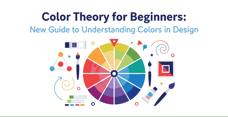
Color Theory for Beginners: New Guide to Understanding Colors in Design

Color Theory for Beginners

Table of Contents

  1. Introduction: Why Color Theory Matters in Design
  2. The Basics of Color Theory
    • The Color Wheel
    • Primary, Secondary, and Tertiary Colors
  3. Understanding Color Harmony
    • Complementary Colors
    • Analogous Colors
    • Triadic and Monochromatic Schemes
  4. The Psychology of Colors
  5. How to Choose the Right Color Palette
  6. Applying Color Theory in Graphic and Font Design
  7. Recommended Fonts for Color-Based Design Projects
  8. Conclusion
  9. References

1. Introduction: Why Color Theory Matters in Design

Color Theory for Beginners is one of the most powerful tools in design. It influences perception, evokes emotion, and helps convey brand identity. For beginners, understanding color theory is the first step to mastering visual communication. Whether you’re designing logos, websites, or typography art, color choices determine how your message resonates with the audience.

Color Theory for Beginners

2. The Basics of Color Theory for Beginners

Color theory is a framework that explains how colors interact with one another. It combines artistic principles and scientific understanding to help designers create visually balanced and appealing compositions.

The Color Wheel

At the heart of color theory lies the color wheel, a circular chart that shows the relationships between colors. It includes primary, secondary, and tertiary colors.

  • Primary colors: Red, Blue, and Yellow — cannot be created by mixing other colors.
  • Secondary colors: Green, Orange, and Purple — formed by mixing two primary colors.
  • Tertiary colors: Created by mixing a primary and a secondary color (e.g., Blue-Green, Red-Orange).

This wheel helps designers easily identify complementary or harmonious color combinations.

3. Understanding Color Theory for Beginners Harmony

Color harmony is the visual balance achieved when colors are combined effectively. It ensures your designs feel cohesive and pleasing to the eye.

Complementary Color Theory for Beginners

Colors that sit opposite each other on the color wheel (e.g., blue and orange). This combination creates strong contrast and high visual energy.

Analogous Color Theory for Beginners

These are colors that sit next to each other (e.g., yellow, yellow-green, and green). They produce a smooth and harmonious effect—perfect for calm and natural designs.

Triadic and Monochromatic Schemes

Triadic schemes use three colors equally spaced around the wheel, while monochromatic schemes use variations of one hue with different values and saturations. Triadic palettes add vibrancy, while monochromatic palettes provide simplicity and elegance.

4. The Psychology of Color Theory for Beginners

Every color carries emotional and psychological associations. Here’s a quick guide to help beginners understand the psychological impact of colors:

  • Red: Passion, energy, and urgency.
  • Blue: Calmness, trust, and professionalism.
  • Yellow: Optimism and creativity.
  • Green: Nature, balance, and growth.
  • Purple: Luxury and sophistication.
  • Black & White: Simplicity and contrast—used to create clarity and focus.

Knowing these meanings helps designers choose colors that align with their brand’s message or design goal.

Color Theory for Beginners

5. How to Choose the Right Color Theory for Beginners

Choosing the perfect color palette can be challenging. Here are some quick tips for beginners:

  1. Start with your brand personality. Identify your brand’s tone—fun, elegant, minimalist, or bold.
  2. Use online tools. Platforms like Adobe Color or Coolors help generate color palettes easily.
  3. Maintain contrast for readability. When designing with fonts or text, ensure high contrast between text and background colors.
  4. Limit your palette. Three to five colors are usually enough for balanced design.

6. Applying Color Theory in Graphic and Font Design

Fonts and colors go hand in hand. The right combination can make your design stand out, while poor pairing can ruin even the best typography.
For example:

  • Warm colors (reds, oranges, yellows) work well with handwritten or bold script fonts, creating energy and excitement.
  • Cool colors (blues, greens) match perfectly with modern sans-serif fonts, giving a calm and professional vibe.

When using calligraphy fonts, balance is key — avoid overly bright combinations that can make the text hard to read.

7. Recommended Fonts for Color-Based Design Projects

Here are some beautiful font recommendations from CalligraphyFonts.net that complement your color-based designs perfectly:

  1. Holters Font – A clean, modern sans-serif perfect for minimalist color palettes and branding.
  2. Rutinitas Font – A casual handwritten style ideal for creative projects and colorful logos.
  3. Leathering Font – Elegant and luxurious, perfect for premium product packaging with soft or neutral tones.
  4. Anthonyela Calligraphy Font – Beautifully flowing calligraphy font that shines in pastel and elegant color schemes.

Try experimenting with these fonts and various color harmonies to see how different tones can transform your typography and overall design aesthetic.

8. Conclusion

Mastering color theory for beginners is not just about memorizing a color wheel — it’s about understanding how color influences perception and emotion. By applying the right combinations, you can elevate your designs, highlight your message, and attract more attention.
Combine your newfound color knowledge with high-quality fonts from CalligraphyFonts.net, and your design projects will instantly feel more cohesive, professional, and visually stunning.

9. References

Posted on

Analogous Colors Definition & How to Use Them in New Design

Analogous Colors Definition

Table of Contents

  1. Introduction
  2. What Is the Analogous Colors Definition?
  3. Why Analogous Schemes Create Visual Harmony
  4. Common Analogous Color Combinations & Examples
  5. Best Practices: Using Analogous Colors in Design
  6. Applying Analogous Palettes in Typography & Mockups
  7. Font Mockup Examples from Your Collection
  8. Tools & Tips to Create & Test Analogous Palettes
  9. Pitfalls to Avoid
  10. Conclusion & Next Steps
  11. References

1. Introduction

Color is one of the foundational building blocks of design. How you pick and combine hues determines mood, readability, cohesion, and emotional impact. Among the many color harmony techniques, Analogous Colors Definition schemes stand out for their subtle beauty and natural feel.

In this article, we’ll explore the Analogous Colors Definition, show you examples, and reveal how to use them effectively—especially in your font mockups, branding visuals, and creative assets.

2. What Is the Analogous Colors Definition?

The analogous colors definition refers to a set of colors that are adjacent to each other on the color wheel. In most applications, an analogous scheme consists of three hues: a base (dominant) color, and one or two supporting (neighbor) colors.

These neighboring hues share similar undertones, which gives analogous palettes a smooth, harmonious, and unified appearance—unlike complementary schemes, which emphasize high contrast.

For example:

  • Blue, blue-green, and green
  • Red, red-orange, and orange
  • Yellow, yellow-green, and green

In digital design, you can tweak saturation, brightness, or tone of these colors to achieve more depth and contrast.

Analogous Colors Definition

3. Why Analogous Schemes Create Visual Harmony

Analogous color schemes are praised for several reasons:

  • Low visual tension: Because the colors are similar in hue, they don’t “fight” each other. This makes them soothing to the eye.
  • Natural occurrences: You often see analogous schemes in nature (sunsets, foliage gradients), which makes them feel organic.
  • Cohesion & unity: They produce a unified look—great for backgrounds, branding, or layouts that shouldn’t feel busy.
  • Flexibility with contrast: Even though they are close in hue, you can achieve contrast by varying brightness, saturation, or applying neutrals (white, gray, black).

Because analogous schemes are more subtle than contrasting ones, they are often chosen when the goal is elegance, calmness, or aesthetic continuity.

4. Common Analogous Color Combinations & Examples

Here are typical triads of analogous hues you can experiment with:

  • Red → Red-Orange → Orange
  • Yellow → Yellow-Green → Green
  • Blue → Blue-Green → Green
  • Blue → Blue-Violet → Violet
  • Purple → Red-Violet → Red

Some designers extend schemes to 4 or 5 hues (neighboring spanning a small arc) as long as they remain adjacent without jumping across the wheel edges.

In interior design, for example, designers often use the 60 / 30 / 10 rule: 60% dominant color, 30% secondary analogous color, and 10% accent (which can be a more muted version).

5. Best Practices: Using Analogous Colors Definition in Design

To make analogous palettes work well, follow these tips:

  • Choose a dominant hue: Use one color for the bulk of your design (backgrounds, large shapes).
  • Support and accent: Use the neighboring colors more sparingly — for accents, buttons, borders, or decorative elements.
  • Vary lightness and saturation: Don’t use pure colors only — lighten or darken, desaturate to create depth.
  • Introduce neutral tones: Gray, off-white, black or very desaturated versions help give rest to the eyes and avoid monotony.
  • Mind contrast for usability: In UI or text design, make sure text is legible across these similar hues — sometimes you’ll need a complementary hue or neutral color to ensure readability.
  • Limit the range: Spread out too far along the wheel and you risk moving away from harmony. Keep the span narrow.

Analogous palettes are ideal when you want aesthetic smoothness rather than stark contrast.

6. Applying Analogous Colors Definition Palettes in Typography & Mockups

For a font/design business, applying analogous schemes can elevate mockups and branding visuals:

  • Use analogous hues for background → secondary shapes → highlight text layer.
  • For text overlays: Use one analogous color for fill, another (slightly darker or lighter) for subtle shadow or outline.
  • In UI or product previews: Use analogous tones in button states, hover effects, or navigation bars for consistency.
  • Combine analogous palettes with neutral typography (black, white) to maintain readability and grounding.

Because fonts and type are the focal point, using analogous color schemes gives them an elegant frame rather than overwhelming them.

Analogous Colors Definition

7. Font Mockup Examples from Your Collection

Here are fonts from your collection and some mockup ideas using analogous color schemes:

  • Classicly Font — Try a calm palette: soft blue, blue-green, and green. Use Classicly for headers and lighter variants for subtext.
  • Creatoria Font — Use warm analogous hues: peach, pink-peach, coral for creative branding visuals.
  • Ballerinas — Elegant pastel analogous colors such as lavender, violet, and blue-violet for feminine or graceful designs.
  • Overcame Font — Use bold analogous palette like orange, red-orange, and red to produce dramatic typographic compositions.

In each mockup, emphasize the dominant hue in backgrounds, the secondary in accents or decorative elements, and the third for smaller highlights. Show how the font remains legible but stylish within the analogous frame.

8. Tools & Tips to Create & Test Analogous Colors Definition Palettes

Here are useful tools and practices:

  • Adobe Color Wheel — switch to “Analogous” mode to generate triads.
  • Coolors.co — lock a hue and get adjacent ones.
  • Paletton — interactive color wheel with analogous scheme support.
  • Contrast checkers — ensure text vs background from your analogous palette remains legible.
  • Preview in context — test your palette on web pages or within your font mockups rather than in isolation.

Trial and iteration are key: you’ll often need to adjust brightness or saturation to make the palette work.

9. Pitfalls to Avoid

While analogous schemes are lovely, there are risks:

  • Too much monotony: All colors too similar can look flat.
  • Poor contrast: Text or UI elements may become unreadable if adjacent hues are too close.
  • Overusing full saturation: Pure colors next to each other can make your design look harsh or garish.
  • Ignoring neutral elements: Without blacks/whites/grays, the scheme may lack grounding.
  • Spanning too wide: If your analogous span covers too many hues, it starts to drift into other schemes and loses harmony.

By anticipating these challenges, you can better manage your palette choices.

10. Conclusion & Next Steps Analogous Colors Definition

The analogous colors definition is simple: hues next to each other on the color wheel, often used in sets of three. What makes them powerful is their ability to deliver harmony, subtlety, and visual cohesion.

For your font and design business, analogous palettes can enliven mockups, showcase your fonts in context, and provide mood without overwhelming contrast. Pair them with good typographic contrast and neutral grounding for the best results.

Next step: Pick a base hue from your branding or a font you want to spotlight. Use a tool to generate its adjacent analogous colors. Create a mockup with those three colors using one of your fonts and see how it feels. Iterate until it feels elegant and readable.

Kalau kamu mau, saya bisa bantu buat preset analogous color palettes (with hex values) khusus untuk font moods (elegant, bold, pastel) + file swatches yang bisa langsung kamu pakai. Mau saya kirim itu?

References

  • Pixflow — “What Is an Analogous Color Scheme? Definition, Examples & Uses”
  • Figma Dictionary — “Analogous Colors Definition & Examples”
  • Art in Context — “What Are Analogous Colors in Color Theory”
  • Creatopy — “What are analogous colors in graphic design”
Posted on

Complementary Colors Definition: New Contrast & Harmony in Design for 2025

Complementary Colors Definition

Table of Contents

  1. Introduction
  2. What Is the Definition of Complementary Colors?
  3. Why Complementary Colors Work — Visual & Psychological Effects
  4. Common Complementary Color Pairs (Examples)
  5. How to Use Complementary Colors in Your Design
  6. Applying Complementary Pairs in Typography & Font Mockups
  7. Font Mockup Ideas with Your Fonts
  8. Tools & Tips to Test Complementary Palettes
  9. Pitfalls to Avoid
  10. Conclusion & Call to Action
  11. References

1. Introduction

Color is one of the most essential tools in Complementary Colors Definition. How you combine colors can make a design feel harmonious or jarring, boring or vibrant. One of the foundational strategies in color theory is complementary colors. Understanding the Complementary Colors Definition—and how to use them skillfully—can instantly elevate your visual designs, including font demonstrations, branding, and marketing visuals.

In this article, we’ll explore the definition of complementary colors, why they are so powerful, practical examples, and how you can apply them in typography mockups and your font portfolio.

2. What Is the Definition of Complementary Colors?

By definition, complementary colors are pairs of colors that sit directly opposite each other on the color wheel.

Because they are opposites, these pairs generate strong contrast when placed side by side. This contrast is key to what makes complementary combinations so visually compelling.

In traditional art (RYB model), some classic complementary pairs are:

  • Red ↔ Green
  • Blue ↔ Orange
  • Yellow ↔ Purple

However, in digital and modern color models (RGB, CMYK), complementary pairs may shift—for example, red ↔ cyan, green ↔ magenta, blue ↔ yellow.

Complementary Colors Definition

3. Why Complementary Colors Definition Work — Visual & Psychological Effects

Visual Contrast & Enhancement

When complementary colors are adjacent, they make each other appear more vivid through a phenomenon known as simultaneous contrast.

In essence, placing two opposite hues together intensifies their brightness and visual presence, which is very useful for highlighting focal elements in a design.

Emotional & Psychological Impact

Complementary colors often combine a warm hue (e.g. red, orange, yellow) with a cool hue (e.g. blue, green, purple). This warm-cool tension resonates with human perception, creating emotional interest.

Used thoughtfully, complementary schemes can convey energy, drama, or clarity—depending on the two hues and their intensities.

4. Common Complementary Color Pairs (Examples)

Here are some widely used complementary pairs that you’ll see across design, branding, art, and media:

  • Red ↔ Green
  • Blue ↔ Orange
  • Yellow ↔ Purple
  • Red-Orange ↔ Blue-Green
  • Yellow-Orange ↔ Blue-Violet
  • Yellow-Green ↔ Purple-Red

A very popular cinematic example is teal and orange—this pair is used in films and movie posters because it delivers strong contrast and skin tones often fall into the orange spectrum.

These pairs are foundational, but what truly matters is how you use tints, shades, and saturation to adapt them for your design.

5. How to Use Complementary Colors Definition in Your Design

Complementary colors are powerful, but they must be handled with care to prevent visual overload. Here are best practices:

1. Use One Dominant, One Accent

Designers often let one color dominate (e.g. 70%) and use the complementary color sparingly for accent or call-to-action elements.

2. Soften One Hue

If two pure complements are too harsh, consider desaturating or lightening one to reduce strain on the eyes.

3. Use Neutrals

Introduce whites, grays, or blacks to buffer the contrast. This helps maintain an overall balanced composition.

4. Apply Contrast for Legibility

Complementary pairs are excellent for readable typography when one color is used for background and the other for text, as long as contrast is sufficient.

5. Use Variations

Don’t stick to pure complements only—use adjacent shades or variations so the pair feels more natural and less rigid.

6. Applying Complementary Colors Definition Pairs in Typography & Font Mockups

When working with fonts, complementary color schemes can help your typeface stand out while looking polished. Here’s how:

  • Headline & background pairing: e.g. use navy blue text on a soft orange background.
  • Accent letterforms or ornaments: Use complementary color for swashes, flourishes, or decorative details.
  • Interactive states: Use the complementary color for hover states, shadow layers, or outlines.
  • Layered typography: Use a faint layer of complementary color behind text (offset shadow) to create a subtle glow or halo effect.

Because your fonts are the hero of your branding, combining them with complementary colors gives visual punch without swamping the type.

7. Font Mockup Ideas with Your Fonts

Here are specific fonts from your collection and ways you can apply complementary color schemes in mockups:

  • Westerners Font — Use a burnt orange ↔ teal pair: Westerners in teal on burnt orange background, with accent details in modified orange tones.
  • Senjalara Calligraphy Font — Pair soft lavender (purple) text with pale green backgrounds, use green for decorative elements.
  • Ameralda Font — Use warm coral for Ameralda text and a muted turquoise as the complementary backdrop or shadows.

Such mockups show clients not just the font shape, but how it performs in real design context using foundational color theory.

8. Tools & Tips to Test Complementary Colors Definition Palettes

To experiment and validate color choices, these tools and tips help:

  • Adobe Color Wheel — Generate complementary pairs instantly.
  • Coolors.co — Lock one hue and see its complement variants.
  • Paletton — Explore complementary harmony modes.
  • Design software preview — Always preview your palette in situ (with text, images) before final use.
  • Contrast checkers — Tools like WebAIM contrast checker ensure your text is legible when using complementary backgrounds.
Complementary Colors Definition

These help you refine, test, and ensure your complementary color use is both bold and usable.

9. Pitfalls to Avoid Complementary Colors Definition

Complementary colors are strong, so avoid these common design missteps:

  • Overusing both colors equally → results in visual tension.
  • Using pure 100% saturation for both → may cause strain or look garish.
  • Poor contrast in text → complementary doesn’t always mean readable.
  • Ignoring color context → lighting, screen calibration, or nearby hues shift perception.
  • Not testing on different mediums → print, web, or mobile may render colors differently.

By being mindful, you can harness the strength of complementarity without tipping into chaos.

10. Conclusion & Call to Action Complementary Colors Definition

The complementary colors definition is simple: hues opposite each other on the color wheel that enhance contrast and vibrancy. But in practice, using them well is an art.

When expertly applied, complementary color pairs offer designers a powerful tool to draw attention, convey emotions, and make typography sing. Pair your page elements and font mockups with complementary palettes to give them visual clarity and dynamic energy.

Call to Action: Jika Anda ingin, saya bisa bantu buat template mockup font + panduan warna complementary (preset palette) khusus untuk koleksi font-mu agar klien tinggal ganti teks dan warna. Mau saya kirim versi itu?

11. References

Posted on

Triadic Color Combinations Examples: New Create Perfect Harmony in Design

Triadic Color Combinations Examples

Table of Contents

  1. Introduction: Why Color Harmony Matters
  2. What Are Triadic Color Combinations?
  3. The Psychology Behind Triadic Colors
  4. Best Triadic Color Combinations Examples
  5. How to Apply Triadic Colors in Graphic Design
  6. Triadic Colors in Branding and Typography
  7. Showcase: Fonts That Complement Triadic Palettes
  8. Useful Tools and Resources
  9. Conclusion

1. Introduction: Why Color Harmony Matters

Triadic Color Combinations Examples is one of the most powerful tools in design—it communicates emotions, defines brand identity, and influences perception. A well-balanced color palette can turn a simple design into a visually stunning masterpiece. Among the most reliable and creative methods for achieving balance is the Triadic Color Combinations Examples.

In this article, we’ll explore practical Triadic Color Combinations Examples, why they work, and how you can use them in your graphic design projects to achieve vibrant, eye-catching results.

2. What Are Triadic Color Combinations?

A triadic color combination consists of three colors that are evenly spaced around the color wheel. This means they are separated by 120 degrees, creating a perfect visual balance between contrast and harmony.

For example:

  • Red – Blue – Yellow
  • Orange – Green – Purple

Unlike complementary color schemes (which use opposite colors), triadic palettes provide a broader range of hues, making your designs more dynamic while maintaining visual coherence.

According to Canva’s Color Theory Guide, triadic schemes are especially effective in modern branding and web design because they are both bold and balanced.

Triadic Color Combinations Examples

3. The Psychology Behind Triadic Colors

Triadic combinations naturally create a sense of equilibrium. They allow each color to stand out without overwhelming the others. This makes them ideal for projects that need energy and vibrancy while still appearing professional.

  • Red evokes excitement and passion.
  • Blue symbolizes trust and calm.
  • Yellow conveys optimism and warmth.

When used together, these colors create visual interest and emotional harmony—perfect for marketing materials, websites, and social media visuals.

4. Best Triadic Color Combinations Examples

Here are some popular triadic color combinations you can use in your design projects:

1. Red – Blue – Yellow

A classic primary triad, perfect for playful, energetic designs like children’s brands or creative agencies.

2. Orange – Green – Purple

A bold and artistic palette, often used in lifestyle or entertainment branding.

3. Pink – Yellow – Cyan

A modern and youthful combination, great for tech startups or trendy product packaging.

4. Teal – Coral – Mustard

A warm yet sophisticated mix often seen in fashion or interior design visuals.

5. Navy – Gold – Crimson

A luxurious and elegant palette suitable for premium brands and editorial designs.

You can experiment with saturation and contrast levels to adjust the mood of your triadic scheme—keeping one color dominant and the others as accents often creates the best visual balance.

5. How to Apply Triadic Color Combinations Examples in Graphic Design

When using triadic palettes, the key is to maintain balance. Here are a few tips:

  • Pick a dominant color for your main elements.
  • Use the second color for highlights or secondary elements.
  • Reserve the third color for accents, buttons, or calls-to-action.

For web design, tools like Adobe Color Wheel or Coolors can help you generate and test triadic palettes effortlessly.

6. Triadic Color Combinations Examples in Branding and Typography

Triadic color harmony doesn’t only apply to images—it also enhances typography. Using fonts that complement your chosen palette can amplify the mood of your design.

For example:

  • Bold sans-serif fonts work well with vibrant, energetic color schemes.
  • Elegant script or calligraphy fonts pair beautifully with pastel triads.

To see how colors and typography combine beautifully, explore these font mockups from Calligraphy Fonts:

  • Rustte Font – Stylish and rustic, perfect for vintage palettes.
  • Classicly Font – Timeless serif that fits minimalist triadic designs.
  • Overcame Font – Modern and bold, ideal for vibrant color harmony.
  • Southlake Font – Natural and calm, perfect for earthy color triads.
Triadic Color Combinations Examples

7. Showcase: Fonts That Complement Triadic Color Combinations Examples

Typography plays a crucial role in color harmony. Pairing fonts with appropriate color combinations can completely transform a design’s tone.

For instance:

  • A triadic mix of navy, gold, and crimson with Classicly Font evokes sophistication.
  • A bright palette of pink, yellow, and cyan paired with Overcame Font creates a fun, tech-forward vibe.
  • A teal, coral, and mustard triad using Southlake Font offers an organic yet modern feel.

By combining these fonts with triadic color schemes, designers can achieve not just visual appeal but also emotional consistency.

8. Useful Tools and References

To help refine your understanding and create better triadic palettes, explore these useful resources:

9. Conclusion Triadic Color Combinations Examples

Triadic color combinations are a designer’s secret weapon for achieving balance, energy, and vibrancy. They give you flexibility to experiment while ensuring your compositions remain visually harmonious.

Whether you’re working on branding, digital graphics, or packaging, understanding how to use triadic color combinations can elevate your work to a new level of professionalism. Pair them with the right typography—like the beautiful selections available at CalligraphyFonts.net—and your designs will truly stand out.

Posted on

Unlock the Psychology of Warm and Cool Colors in Design

Psychology of Warm

Table of Contents

  1. Introduction
  2. What Are Warm and Cool Colors?
  3. The Emotional Impact of Warm Colors
  4. The Calming Effect of Cool Colors
  5. Balancing Warm and Cool Tones in Design
  6. Applying Color Psychology in Branding
  7. Using Fonts and Colors Together
  8. Final Thoughts
  9. References

1. Introduction

In the Psychology of Warm world of graphic design, color is not just a visual choice — it’s a psychological tool. The Psychology of Warm and cool colors plays a key role in how audiences interpret a brand’s message, mood, and emotional tone. Whether it’s the fiery energy of red or the soothing calm of blue, every hue tells a story that connects deeply with viewers.

For example, pairing the right font design with a warm or cool palette can elevate your visual identity. Explore creative font options like Aeromove Font, Kidsway Font, or Glow Curly Font — each has its own emotional “temperature,” perfectly complementing color psychology in design.

Psychology of Warm

2. What Are Psychology of Warm and Cool Colors?

Warm colors include reds, oranges, and yellows, often linked to heat, sunlight, and passion. These hues grab attention and evoke excitement or comfort.
Cool colors — blues, greens, and purples — bring calm, relaxation, and professionalism. They are often used in healthcare, technology, and wellness industries for their soothing effects.

Designers often use a color temperature wheel to balance these tones effectively. Understanding how warm and cool colors interact helps ensure your visuals remain both emotionally resonant and visually balanced.

3. The Emotional Impact of Psychology of Warm Colors

Warm tones are stimulating and energetic. They can make designs feel cozy, passionate, and bold.

  • Red symbolizes excitement, urgency, or love.
  • Orange conveys creativity, enthusiasm, and friendliness.
  • Yellow suggests optimism, clarity, and youthfulness.

These colors are ideal for calls-to-action (CTAs) or promotional visuals that need to grab attention instantly. However, overusing warm hues can lead to overstimulation — balance is key.

4. The Calming Effect of Cool Colors

Cool colors bring harmony, trust, and tranquility.

  • Blue signifies dependability and calm — a favorite among corporate brands.
  • Green represents growth, health, and balance.
  • Purple conveys luxury, creativity, and mystery.

When used in digital design, cool palettes can make websites or brand visuals feel professional, peaceful, and trustworthy — especially when paired with minimalist font styles.

Psychology of Warm

5. Balancing Psychology of Warm and Cool Tones in Design

A visually effective composition uses a strategic mix of warm and cool colors.

  • Use warm tones for emotional highlights (buttons, accents).
  • Use cool tones for stability (backgrounds, text areas).
  • Maintain color contrast for visual hierarchy.

For instance, combining an inviting orange header with a calming blue background helps direct the viewer’s attention while maintaining harmony.

6. Applying Color Psychology of Warm in Branding

Brands consciously use color Psychology of Warm to influence customer behavior:

  • Coca-Cola uses red for passion and energy.
  • Facebook uses blue for trust and connection.
  • Starbucks uses green for freshness and calm.

Your brand’s color scheme should align with its core values and emotional tone. A warm palette suits lifestyle or food brands, while cool colors work for tech, wellness, or finance.

7. Using Fonts and Colors Together

Typography amplifies color Psychology of Warm. Choosing the right font can reinforce or balance a color’s emotional message.
For instance:

  • Warm-toned designs pair beautifully with bold, expressive typefaces like Aeromove Font.
  • Cool color schemes can benefit from smooth, rounded fonts like Glow Curly Font.
  • For playful designs, Kidsway Font adds a friendly and approachable touch.

By blending color temperature and typography psychology, you create cohesive and memorable visuals.

8. Final Thoughts Psychology of Warm

Mastering the Psychology of Warm and cool colors allows designers to craft visuals that don’t just look good — they feel right. Colors influence emotions, actions, and memories, making them a powerful branding asset.

Whether you’re designing logos, packaging, or web layouts, remember: every color has a voice. Use it wisely, pair it with the right font, and let your design speak directly to your audience’s emotions.

9. References

  • Canva — How to use the power of color
  • Adobe — A guide to color meaning
  • 99Designs — Color Psychology and Branding