Table of Contents
- Introduction
- Why Graphic Design Trends Matter
- The Biggest Graphic Design Trends of 2024
3.1 Minimalism with a Modern Twist
3.2 Retro Revival and Nostalgia
3.3 Bold Typography and Experimental Fonts
3.4 3D and Motion Design Integration
3.5 Sustainable and Eco-Friendly Visuals
3.6 AI-Driven Design Tools - How Designers Can Adapt to These Trends
- Recommended Fonts to Match 2024’s Visual Style
- Final Thoughts
- References
1. Introduction
As we step into 2024, the world of graphic design continues to evolve at lightning speed. Technology, culture, and social change all influence how we communicate visually. The Graphic Design Trend Forecast for 2024 reveals a fascinating mix of nostalgia and innovation—where timeless design principles meet futuristic tools and aesthetics.
Whether you’re a brand designer, creative director, or font creator, understanding these upcoming Graphic Design Trend Forecast helps you stay relevant and produce work that resonates with your audience.
2. Why Graphic Design Trend Forecast Matter
Graphic design trends are not just fleeting visual fads; they represent how human behavior and technology merge to shape visual culture. For professionals, following these trends means:
- Staying aligned with audience expectations
- Keeping designs visually fresh and competitive
- Improving brand recognition through modern aesthetics
At CalligraphyFonts.net, where creativity meets craftsmanship, following visual trends also helps you design fonts that fit into the ever-changing digital landscape.
3. The Biggest Graphic Design Trend Forecast of 2024
Here’s a look at the dominant creative directions predicted to shape the industry this year.
3.1 Minimalism with a Modern Twist
Minimalism isn’t going anywhere—but 2024’s version comes with personality. Expect to see clean layouts with subtle gradients, dynamic asymmetry, and bold negative space. The goal? To create elegant simplicity that still feels expressive.
Designers are moving toward “warm minimalism”—using soft color palettes, human-centered imagery, and balanced typography to maintain sophistication without feeling sterile.
3.2 Retro Revival and Nostalgia
The return of the Y2K and ’80s–’90s retro aesthetics continues to dominate. From chrome effects and holographic textures to grainy filters and hand-drawn fonts, nostalgia remains a strong emotional trigger.
This blend of old and new creates familiarity while remaining visually exciting—perfect for social media campaigns, music posters, and brand visuals.
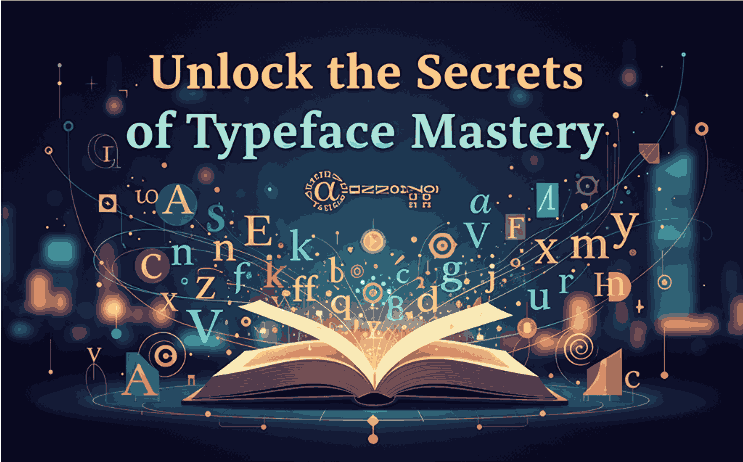
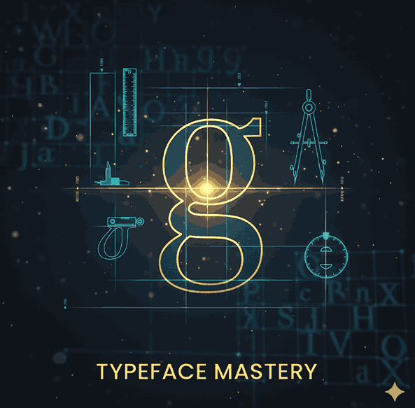
3.3 Bold Typography and Experimental Fonts
Typography takes center stage in 2024. Designers are using custom typefaces, layered textures, and variable fonts to express brand personality.
If you want to incorporate trend-aligned typography, explore these examples:
- Classicly Font — a timeless serif that fits minimalist and editorial aesthetics.
- Jaycee Looks Font — perfect for vibrant, modern-retro compositions.
- Rellative Font — ideal for bold, headline-driven layouts.
- Vineland Font — stylish and sophisticated, great for brand logos or packaging.
These fonts capture the essence of 2024’s design movement: a balance between clarity, expression, and innovation.
3.4 3D and Motion Design Integration
Motion graphics and 3D design continue to merge into mainstream brand identity. Animated typography, immersive visuals, and subtle motion in UI design are becoming essential.
With the rise of AR/VR, designers are exploring interactive storytelling, where static visuals come to life. Tools like Blender and After Effects are now standard for many designers who want to add dimension to their work.
3.5 Sustainable and Eco-Friendly Visuals
As sustainability becomes central to global consciousness, design is reflecting this shift. 2024 brings more earth-inspired tones, natural textures, and organic shapes.
Brands are emphasizing authenticity and ethical design—moving away from over-production toward timeless, minimalist visual systems. Fonts that feel handcrafted or organic fit perfectly into this movement.
3.6 AI-Driven Design Tools
Artificial intelligence has revolutionized how designers brainstorm, create mockups, and explore new visual ideas. AI tools like Adobe Firefly, Midjourney, and ChatGPT are not replacing creativity—they’re amplifying it.
Designers who understand how to collaborate with AI can increase productivity while maintaining artistic integrity. Expect AI-generated art, smart layouts, and predictive color harmonies to play major roles in 2024’s workflows.
4. How Can Adapt to These Graphic Design Trend Forecast
To stay ahead in 2024:
- Stay curious — follow design blogs, attend webinars, and observe top agencies.
- Experiment often — create mockups using the latest design software or new font combinations.
- Refine your typography — test modern fonts and variable weights for flexibility.
- Collaborate with AI tools — use them for idea generation, but always apply your human creativity.
- Build a timeless portfolio — integrate trendy design ideas while preserving your personal style.
By balancing trends with originality, you’ll maintain both relevance and authenticity.
5. Recommended Fonts to Match 2024’s Visual Style
Typography is a major driver of 2024’s aesthetic direction. Here are curated fonts from your collection that complement this year’s design mood:
- Classicly Font – clean and classy, ideal for minimalist branding.
- Jaycee Looks Font – bold and futuristic, great for trend-forward logos.
- Rellative Font – contemporary yet timeless for editorial projects.
- Vineland Font – elegant curves and humanist design perfect for creative campaigns.
These typefaces not only align with the graphic design trend forecast 2024 but also demonstrate the craftsmanship that defines CalligraphyFonts.net.
6. Final Thoughts Graphic Design Trend Forecast
The Graphic Design Trend Forecast for 2024 paints a picture of creativity that merges technology, emotion, and timeless beauty. From AI-powered design tools to nostalgic fonts, this year encourages experimentation and authenticity.
For font creators and graphic designers alike, embracing these shifts means staying not just current—but visionary.
Explore these trends, try new fonts, and let your work inspire the next generation of design innovation.
7. References
- Adobe Creative Cloud — Top 2024 Graphic Design Trends.
- Canva Design School — 2024 Design Forecast.
- Behance Blog — Emerging Graphic Design Trends for 2024.
- Creative Bloq — The Future of Graphic Design in 2024.
- 99Designs — 2024 Graphic Design Trends: What’s Next.