Table of Contents
- Introduction
- Defining Brand Identity
- Why Brand Identity Matters
- Key Elements of a Strong Brand Identity
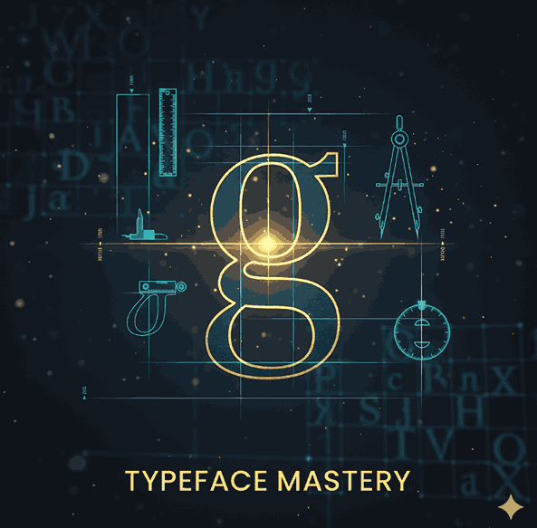
- How Typography & Fonts Shape Brand Identity
- Applying Brand Identity to Your Design — Practical Tips
- Final Thoughts
- References
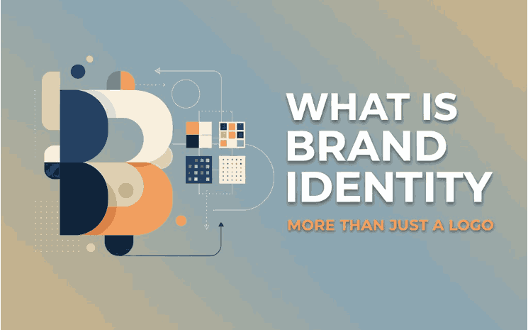
1. Introduction
When people think of branding, the logo often comes to mind—yet brand identity is much more than a single graphic. A well-crafted What is Brand Identity shapes how your business looks, feels, sounds, and behaves. For creative entrepreneurs, designers, and font creators (such as at CalligraphyFonts.net), understanding what brand identity is—and how to use it—is essential to stand out in a crowded marketplace.
2. Defining Brand Identity
According to the American Marketing Association, brand identity is the visual and symbolic elements that represent a brand. American Marketing Association In simpler terms, it’s how your brand wants to be perceived: its mission, values, visuals, voice, and behaviour. One branding journal describes it as “the unique characteristics that influence a brand’s perceived personality, appearance, and behaviour.”
It’s important to distinguish brand identity from brand image:
- Brand identity = what you design and present.
- Brand image = how your audience perceives you.
In other words: you create the identity; the market receives the image.
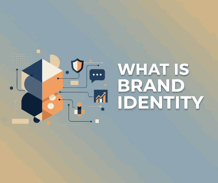
3. Why Brand Identity Matters
A strong brand identity brings several business and creative benefits:
- Recognition & differentiation: It helps your brand stand apart from competitors.
- Consistency & trust: When visual and verbal elements are consistent, people recognise and trust your brand.
- Emotional connection: A clear identity helps your audience feel aligned with your values and story.
- Design efficiency: Once identity guidelines are established, every visual decision becomes easier (fonts, colours, imagery).
For designers and font-makers, brand identity isn’t just a marketing term—it’s the framework within which your products (fonts, graphics, design assets) live.
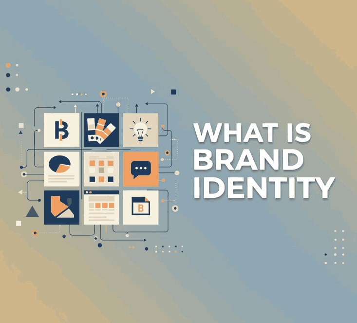
4. Key Elements of a Strong What is Brand Identity
Brand identity is composed of both visual and verbal/experiential elements. Here are major components often cited:
Visual Elements
- Logo and wordmark — the anchor of your brand visuals.
- Colour palette — a set of primary and secondary colours that reflect your brand’s personality.
- Typography / Fonts — the typefaces your brand uses (headings, body text, display) are a vital identity tool.
- Imagery and iconography — how your brand uses photos, illustrations, symbols.
- Graphic style & layout — shapes, patterns, lines that make your visual identity coherent.
Verbal & Experiential Elements
- Brand story & purpose — why your brand exists and what it stands for.
- Tone of voice — how your brand “speaks” in writing and messaging.
- Customer experience & touchpoints — every interaction (website, packaging, social media) reflects identity.
Altogether, these elements form a system: when used consistently, they create a unified brand identity that your audience recognises and trusts.
5. How Typography & Fonts Shape What is Brand Identity
For a website like CalligraphyFonts.net—where you design, make, and sell fonts—typography plays an especially key role in brand identity. The fonts you create are both product and identity asset.
Here are some of your featured fonts that can embed brand identity in visual form:
- Overcame Font — Dynamic, expressive script suited for brands that want energy and movement.
- Creatoria Font — Artistic and refined, ideal for creative agencies or premium products.
- Outrageous Font — Bold and full of life, for brands that wish to make a statement.
- Dreamy Loly Font — Soft, whimsical, perfect for lifestyle or creative branding with personality.
Why these matter for What is Brand Identity:
- Personality: The font choice communicates tone (serious, playful, premium, artisanal).
- Differentiation: A custom or distinctive font helps your brand stand out and feel unique.
- Consistency: Using a font family across headings, body text, and visuals ensures consistent look and feel.
- Level of finish: Quality fonts contribute to perceived professionalism and brand value.
When you incorporate font choices consciously as part of your brand identity (not just as decoration), you strengthen your brand’s visual voice across all touchpoints.
6. Applying What is Brand Identity to Your Design — Practical Tips
Here are practical steps to build, refine and apply brand identity—especially relevant if you’re a designer, creative studio or font business:
- Start with strategy: Define your brand’s purpose, target audience, positioning and values. Without this, identity is shape without meaning.
- Audit what exists: Look at your current logo, fonts, colours, tone. Are they aligned? Are they consistent?
- Select your visual tools:
- Choose a font family for your brand (e.g., your own font or one you sell).
- Define primary and secondary colours.
- Decide on photography or illustration style.
- Develop guidelines: Create a brand-style guide that includes fonts, logo usage, spacing, colours, tone of voice, imagery. This helps anyone working with your brand understand how to apply it.
- Apply across touchpoints: Website, product packaging, font mockups, social media, email templates. Consistency is key.
- Show the fonts in context: When you display your fonts (e.g., Overcame, Creatoria, Outrageous, Dreamy Loly), show how they function in branding scenarios — headlines, logos, signage, etc.
- Review and evolve: Markets change, design trends shift. Review your brand identity periodically to ensure it still reflects who you are and where you’re going.
- Embed identity in your story: Share not just “what” you do (selling fonts) but “why” you do it—why your fonts matter, how they help other brands express themselves. This narrative strengthens identity.
7. Final Thoughts
What is Brand Identity is far more than a logo—it’s the full expression of your brand’s personality, values, and visual voice. For font creators and designers, leveraging typography as a core part of your identity gives you an edge: you’re not simply selling fonts — you’re enabling identity for other brands and building one for your own.
If you craft your identity with intention—strategy, visuals, voice, typography, consistency—you build a brand that resonates, endures, and stands apart.
8. References
- The Branding Journal – “What Is Brand Identity?”
- Investopedia – “Brand Identity: What It Is and How To Build One”
- Bynder – “The Key Elements of Brand Identity”
- Canva – “What is Brand Identity (and how to build one)”
- Marq – “The 7 key elements of brand identity design”
- SendPulse – “What Is Brand Identity? Elements, Examples”