Table of Contents
- Introduction
- What Is Visual Hierarchy in Design?
- Why Visual Hierarchy Matters
- Key Principles of Visual Hierarchy
- 4.1 Size and Scale
- 4.2 Color and Contrast
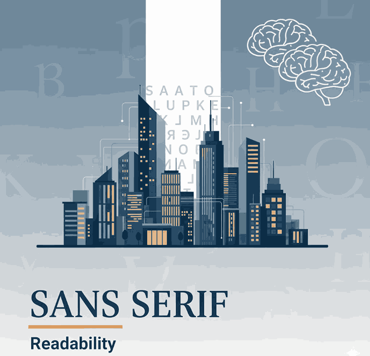
- 4.3 Typography and Font Choice
- 4.4 Spacing and Alignment
- How to Improve Visual Hierarchy in Layouts
- Using Typography to Strengthen Design Hierarchy
- Recommended Fonts from CalligraphyFonts.net
- Conclusion
- References
1. Introduction
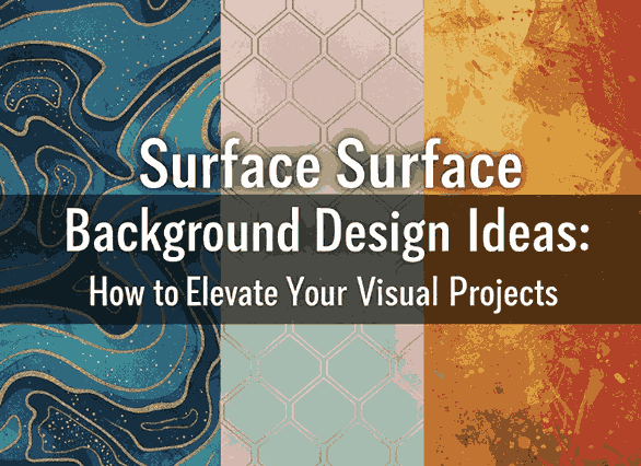
Improve Visual Hierarchy Layouts Creating an effective visual layout is more than arranging elements on a page — it’s about guiding the viewer’s eye. In the world of design, visual hierarchy determines what your audience sees first, next, and last.
A well-structured layout can make or break the user experience. Whether you’re designing a website, poster, or digital ad, understanding how to improve visual hierarchy in layouts helps you communicate messages clearly and beautifully.
2. What Is Improve Visual Hierarchy Layouts in Design?
Visual hierarchy refers to how design elements are arranged to show their order of importance. It’s a fundamental principle that controls how viewers navigate your content.
Designers use size, color, contrast, spacing, and typography to establish hierarchy — ensuring that key information stands out and secondary details follow naturally.
3. Why Improve Visual Hierarchy Layouts Matters
Without visual hierarchy, even the most creative design can feel confusing. A strong hierarchy ensures that your message is clear and that viewers engage longer with your content.
Here’s why it matters:
- Clarity: Helps users quickly understand what’s most important.
- Aesthetics: Creates visual rhythm and flow.
- Engagement: Encourages viewers to explore more.
- Usability: Improves how users interact with designs in digital environments.
When hierarchy is properly established, your layout feels organized, intentional, and professional.
4. Key Principles of Improve Visual Hierarchy Layouts
4.1 Size and Scale
Bigger elements attract attention first. Use larger fonts or images to highlight your main message. Scale smaller elements accordingly to guide the viewer’s eye downward through the content.
4.2 Color and Contrast
Contrast draws focus. Bright or dark colors against neutral backgrounds make key elements stand out. Strategic use of color contrast enhances both readability and emotion.
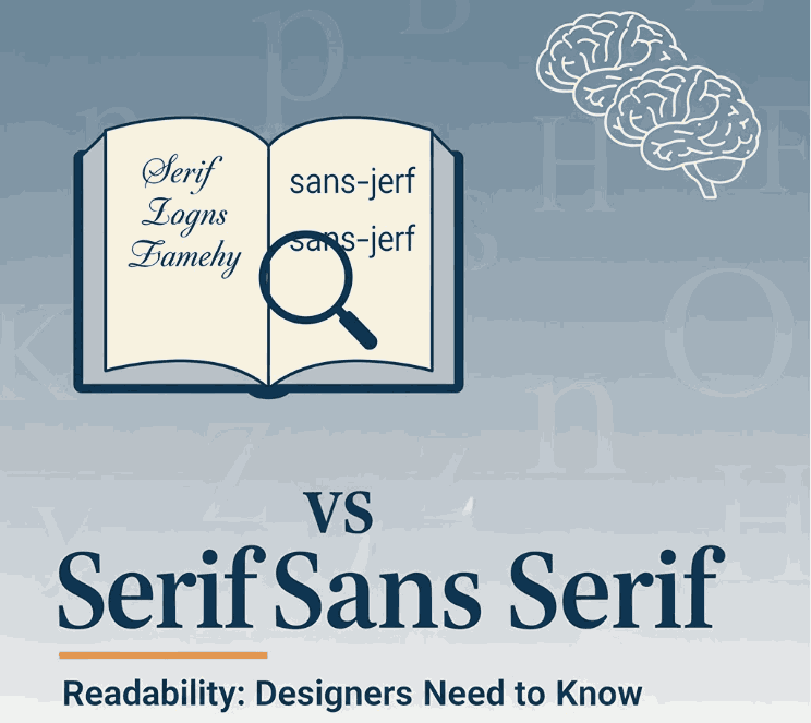
4.3 Typography and Font Choice
Typography plays a powerful role in hierarchy. Headings, subheadings, and body text should have different font weights and styles to establish structure.
Using elegant calligraphy or clean serif fonts can create emotional tone and brand character.
4.4 Spacing and Alignment
White space gives elements room to breathe. Balanced spacing prevents clutter and directs focus naturally. Alignment ensures consistency — whether center-aligned for balance or left-aligned for readability.
5. How to Improve Visual Hierarchy Layouts
Improving hierarchy is about clarity and intention. Here are proven methods to achieve it:
- Start with structure: Sketch or wireframe your layout before adding details.
- Highlight the focal point: Use scale, bold color, or a striking font for the most important element.
- Group related items: Proximity indicates relationship — place related elements closer together.
- Limit font styles: Too many fonts can break hierarchy; two to three styles are ideal.
- Use visual rhythm: Alternate heavy and light design areas to create a smooth viewing flow.
By applying these techniques, you’ll guide your audience effortlessly through your design story.
6. Using Typography to Strengthen Design Hierarchy
Typography doesn’t just display text — it shapes perception. Fonts have distinct personalities that can elevate the tone and emotion of your design.
For example:
- A bold modern font grabs attention for headlines.
- A calligraphy or script font adds elegance and warmth.
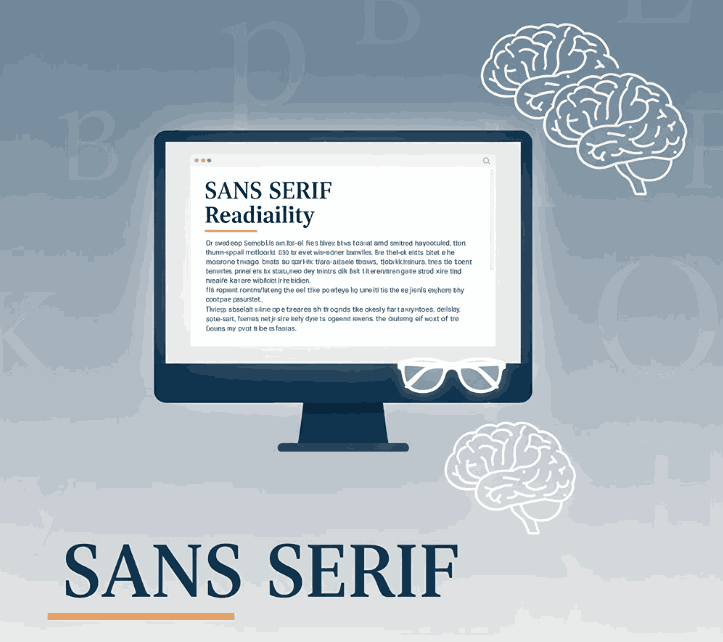
- A minimal serif or sans-serif font ensures readability for long text.
Selecting the right type hierarchy — combining contrasting weights, sizes, and styles — creates a polished, professional appearance.
If you want to achieve balance between beauty and functionality, using premium fonts is the key.
7. Recommended Fonts from CalligraphyFonts.net
At CalligraphyFonts.net, we specialize in handcrafted typefaces designed for creative professionals. Here are some recommended fonts to enhance visual hierarchy in your layouts:
- Butterlies Font – A stylish modern calligraphy font that works perfectly for bold headlines or hero text sections.
- Rutinitas Font – Soft and elegant, great for subheadings or secondary content that needs personality without overpowering.
- Signatory Font – A balanced handwritten font, ideal for captions, taglines, or callouts within visual layouts.
- Rellative Font – A clean and modern script font that enhances contrast and adds sophistication to any composition.
Each of these fonts helps designers establish contrast, tone, and flow, three pillars of an effective visual hierarchy.
8. Conclusion
Improving visual hierarchy in layouts is about intentional design. By controlling how elements guide the viewer’s eye, you turn complex visuals into engaging, easy-to-read experiences.
Combine layout structure with typographic precision and you’ll achieve designs that not only look great but communicate effectively.
To elevate your typography, explore the handcrafted font collections at CalligraphyFonts.net. Each font is thoughtfully designed to bring balance, clarity, and beauty to your visual hierarchy.
9. References
- DinStudio – Visual Hierarchy Principles for Attractive Designs
- Canva Design School – Visual Hierarchy in Graphic Design
- Envato Tuts+ – Visual Hierarchy for Designers