Table of Contents
- Introduction
- What Are Layout Design Principles?
- Why Layout Design Matters in Visual Communication
- Core Layout Design Principles
- 4.1 Balance
- 4.2 Alignment
- 4.3 Contrast
- 4.4 White Space
- 4.5 Hierarchy
- 4.6 Repetition and Consistency
- 4.7 Proximity
- Practical Examples of Layout Design in Action
- Fonts and Typography in Layout Design
- Mockup Inspirations Using Premium Fonts
- Expert Tips for Beginners
- Conclusion
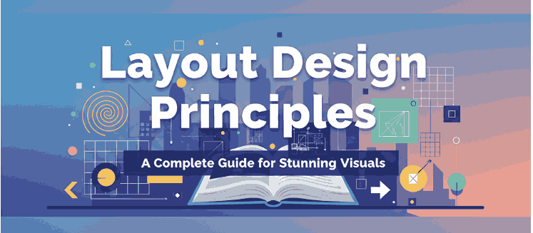
1. Introduction
Great design is not only about creativity but also about structure. Whether you’re working on a website, magazine, poster, or social media graphic, following proven layout design principles ensures your work looks polished, professional, and effective.
In this article, we’ll break down the core principles of layout design in simple terms and provide practical examples you can apply to your projects.
2. What Are Layout design principles
Layout design principles are a set of guidelines that help designers organize visual elements on a page or screen. These rules make sure that text, images, and graphics are visually appealing and easy to understand.
According to the Interaction Design Foundation, layouts are crucial for improving user experience and ensuring smooth communication.
3. Why Layout design principles Matters in Visual Communication
Imagine a poster with messy fonts, random colors, and no clear structure—it immediately feels unprofessional. A good layout ensures that:
- The message is clear.
- The design flows naturally.
- The audience stays engaged.
This is why mastering layout design is essential for graphic designers, marketers, and business owners.
4. Core Layout design principles
4.1 Balance
Balance refers to distributing elements evenly. It can be symmetrical (formal) or asymmetrical (modern and dynamic).
4.2 Alignment
Proper alignment creates order. When text and images are aligned, the design looks neat and professional.
4.3 Contrast
Contrast makes key elements stand out. This can be achieved through color, size, or font choice.
4.4 White Space
Also known as negative space, white space gives breathing room to your design. It prevents clutter and improves readability.
4.5 Hierarchy
Hierarchy shows what’s most important. Larger fonts or bold colors highlight key information first.
4.6 Repetition and Consistency
Using consistent colors, fonts, and styles creates a strong brand identity.
4.7 Proximity
Grouping related elements together helps audiences understand relationships between them.
5. Practical Examples of Layout design principles in Action
- Websites: Clean layouts make content easier to read.
- Magazines: Strong hierarchy guides readers through articles.
- Social Media Posts: Balanced typography keeps designs attractive.
For more in-depth examples, check Smashing Magazine, a trusted resource for design professionals.
6. Fonts and Typography in Layout design principles
Typography plays a massive role in layout design. Choosing the right font ensures readability and strengthens the overall mood of your project. Serif fonts give a classic look, while handwritten or calligraphy fonts add a creative touch.
Explore our premium fonts to bring your layout designs to life:
- Your Own Story Font – Elegant and expressive.
- Granible Fano Font – Stylish, perfect for modern layouts.
- Hashtag Trend Font – Trendy and bold, ideal for attention-grabbing titles.
7. Mockup Inspirations Using Premium Fonts
Imagine using elegant typography on posters, brand identities, or social media campaigns. Mockups with professional fonts elevate the design, making it look more polished. You can experiment with the fonts above to build layouts that resonate with your audience.
8. Expert Tips for Beginners
- Keep it simple: Don’t overcrowd your design.
- Experiment: Try different alignments and contrasts.
- Use a grid system: This helps maintain structure.
- Pair fonts wisely: Use no more than 2–3 fonts in one design.
9. Conclusion
Mastering layout design principles is the foundation of creating visuals that are not only beautiful but also functional. By understanding balance, alignment, hierarchy, and the role of typography, you can take your designs to the next level.
And remember: the right fonts can transform your layouts. Explore our curated collection at CalligraphyFonts.net to find fonts that perfectly match your design vision.