Table of Contents
- Introduction to Negative Space in Design
- What Is Negative Space Design?
- Why Negative Space Matters in Visual Communication
- Types of Negative Space in Design
- Negative Space Design Examples Across Creative Fields
- Typography and Fonts in Negative Space Design
- Font Mockup Examples for Negative Space Design
- Best Practices for Using Negative Space Effectively
- Common Mistakes to Avoid
- Final Thoughts
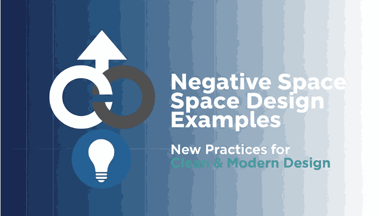
1. Introduction to Negative Space Design Examples
In modern visual communication, negative space design examples are often what separate average designs from truly memorable ones. Negative space—also known as white space—is the area around and between design elements. While it may seem “empty,” it plays a critical role in clarity, balance, and visual storytelling.
From logos and typography to packaging and web design, negative space allows viewers to focus on what truly matters. Designers who master this technique can create layouts that feel clean, premium, and professional.
2. What Is Negative Space Design Examples?
Negative space design refers to the intentional use of empty or unused space to define, emphasize, or enhance visual elements. It is not about leaving areas blank, but about strategic spacing that improves readability and aesthetics.
In many famous negative space design examples, the space itself becomes part of the message—guiding the eye, creating hidden shapes, or improving focus.
3. Why Negative Space Design Examples Matters in Visual Communication
Negative space is essential because it:
- Improves readability and comprehension
- Creates visual hierarchy
- Enhances focus on key elements
- Makes designs feel more modern and professional
- Reduces cognitive overload
Designs without enough negative space often feel cluttered and overwhelming, while well-spaced layouts feel intentional and elegant.
4. Types of Negative Space Design Examples
Understanding the types of negative space helps designers apply it more effectively:
Macro Negative Space
Large areas between major layout elements such as margins, sections, or blocks of content.
Micro Negative Space
Small spacing between letters, lines of text, icons, or buttons. This is especially important in typography.
Active Negative Space
Space deliberately used to guide attention or form visual meaning.
Passive Negative Space
Natural spacing that supports readability without drawing attention.
Successful negative space design examples usually combine multiple types of spacing harmoniously.
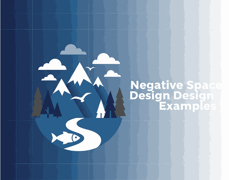
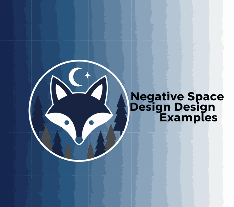
5. Negative Space Design Examples Across Creative Fields
Negative space is widely used across design disciplines:
- Logo Design: Hidden symbols or shapes created by spacing
- Typography: Letter spacing and line height for clarity
- Packaging: Clean layouts that emphasize branding
- Web Design: Improved UX and content scannability
- Editorial Design: Balanced text and imagery
Many iconic brands rely on negative space to communicate sophistication and confidence.
6. Typography and Fonts in Negative Space Design Examples
Typography is one of the most powerful areas where negative space makes a difference. The right font, combined with thoughtful spacing, can transform a simple layout into a refined visual experience.
Fonts that work well for negative space design typically have:
- Clear letterforms
- Balanced stroke weight
- Natural spacing
- High readability
Premium fonts help ensure that negative space enhances the design instead of making it feel empty.
7. Font Mockup Examples for Negative Space Design Examples
Below are professional font examples from CalligraphyFonts.net that work beautifully in negative space design mockups:
Curly Candy Font
A playful and expressive font that benefits from generous spacing, making it ideal for packaging, branding, and creative layouts where negative space highlights personality.
Blossom Aura Font
Elegant and flowing, this font shines when surrounded by white space, making it perfect for beauty, lifestyle, and premium product designs.
Sweet Crumble Font
A romantic calligraphy font that demonstrates how negative space can enhance readability and elegance in logos, invitations, and headlines.
Popcorn Chips Font
Bold and decorative, this font pairs well with strategic negative space to avoid visual overload while maintaining strong visual impact.
These fonts allow designers to clearly demonstrate how spacing and typography work together in effective negative space design examples.
8. Best Practices for Using Negative Space Design Examples Effectively
To master negative space in your designs:
- Start with a clear visual hierarchy
- Avoid filling every empty area
- Use margins and padding intentionally
- Test readability at different sizes
- Let typography breathe
Negative space should feel natural, not forced.
9. Common Mistakes to Avoid
Even experienced designers can misuse negative space. Common mistakes include:
- Treating negative space as wasted space
- Overcrowding typography
- Inconsistent spacing
- Ignoring alignment
- Using decorative fonts without enough breathing room
Avoiding these pitfalls ensures your designs remain clear and professional.
10. Final Thoughts
Negative space is one of the most powerful tools in a designer’s toolkit. The best negative space design examples show that what you leave out is just as important as what you include.
By combining thoughtful spacing with high-quality typography from CalligraphyFonts.net, you can create designs that feel balanced, elegant, and visually compelling—whether for branding, packaging, or digital media.
References
- Din Studio — What is White Space in Design?
- Interaction Design Foundation — Negative Space
- InkbotDesign — Negative Space in Design: Tips and Best Practices
- Canva — 50 mesmerising designs that make the most of negative space