Table of Contents
- Introduction: Why a Good Color Generator Matters
- What Makes a Color Palette Generator “Best”?
- Top Best Color Palette Generator Tools in 2025
- 3.1 Coolors
- 3.2 Adobe Color
- 3.3 Paletton
- 3.4 Colormind
- 3.5 Khroma
- 3.6 ColorSpace / MyColor.Space
- 3.7 ColorMagic / AI generators
- How to Choose the Right Generator for Your Workflow
- Applying Generated Palettes to Fonts & Branding
- Font Mockup Examples from Your Collection
- Tips & Best Practices When Working with Generated Palettes
- Common Pitfalls to Avoid
- Conclusion & Action Steps
- References
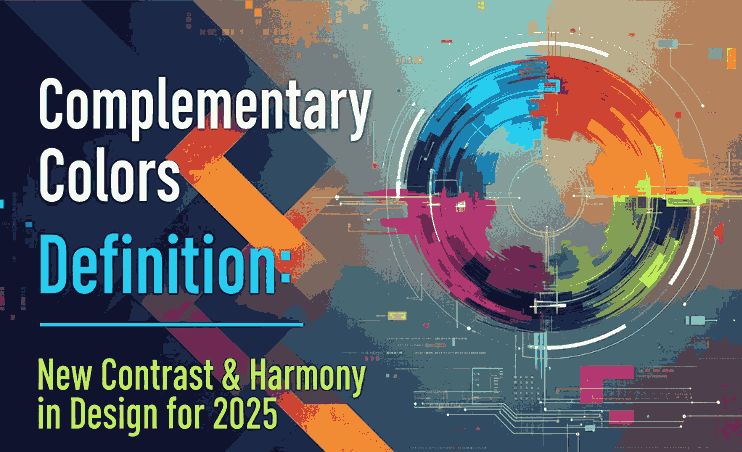
1. Introduction: Why a Good Color Generator Matters
Choosing a Best Color Palette Generator can be one of the most challenging and yet foundational steps in any design project. A strong color palette sets tone, mood, and visual harmony. For font designers and sellers, the palette behind your mockups and branding visuals matters: it influences perception and lets your typefaces shine.
This is where a best color palette generator becomes invaluable. It helps you experiment with harmony, contrast, and visual coherence quickly and reliably. In this article, we’ll explore top tools, how to pick one that suits your workflow, and how to apply those palettes to font mockups and branding.
2. What Makes a Best Color Palette Generator?
Not all color tools are created equal. Here are criteria to judge whether a generator is worth your time:
- Ease of use / UI / UX — simple interface, clear controls
- Color harmony modes — support for analogous, complementary, triadic, tetradic, etc.
- Image upload or extraction — ability to extract palettes from photos or inspirations
- AI / smart suggestions — help with palette variation, learning your preferences
- Export / integration formats — HEX, RGB, CSS, ASE, plugins for design tools
- Preview / context — show palettes in mockups or UI / layout previews
- Performance & reliability — fast, responsive, no heavy lag
A generator that ticks many of these boxes becomes a go-to tool in your design arsenal.
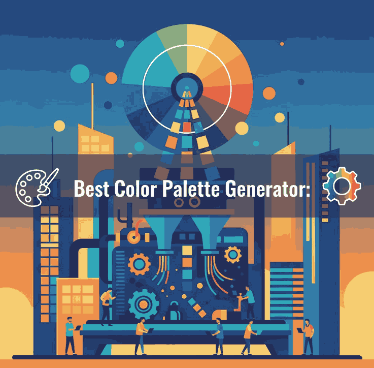
3. Top Best Color Palette Generator Tools in 2025
Here are some of the leading, widely recognized tools used by designers today:
3.1 Coolors
Coolors is praised for speed, simplicity, and versatility. You can lock certain colors and shuffle others, browse trending palettes, and export in many formats.
3.2 Adobe Color
Adobe Color offers multiple harmony rules (analogous, monochrome, triad, etc.) and integrates with Adobe Creative Cloud. You can also upload images and extract color themes.
3.3 Paletton
Paletton is ideal for more experimental palette exploration. It shows previews, scheme variations, and interactive wheel adjustments.
3.4 Colormind
Colormind uses deep learning to suggest palettes based on existing design styles, photos, and popular palettes.
3.5 Khroma
Khroma applies AI to learn your preferred colors and continuously generate palettes aligned with your taste.
3.6 ColorSpace / MyColor.Space
These tools offer palette generation and gradient exploration based on user input or random generation.
3.7 ColorMagic / AI Generators
ColorMagic allows generating palettes from text, images, brand names—with AI backing.
Each of these tools has strengths—some are faster and simpler, others more advanced or AI-powered. You may use multiple depending on your project type.
4. How to Choose the Right Best Color Palette Generator for Your Workflow
Here are guiding questions to help you select the best generator for you:
- Do you prefer creativity or control? (Some tools give you full control, others guide you.)
- Do you need to extract palettes from images / brand assets?
- Do you often work inside Adobe / Figma / design tools and need plugin integration?
- Do you want AI assistance or more manual adjustment?
- Which export formats do you need (CSS, image, ASE, etc.)?
- Do you need preview context (UI mockups, layout previews)?
Choose a generator that fits your typical design flow—whether quick mockups or fine-tuned branding work.
5. Applying Best Color Palette Generator to Fonts & Branding
Once you have a palette, here’s how to apply it in your font business:
- Mockup backgrounds: Use primary or secondary palette colors behind your font samples.
- Accent layers: Use secondary or highlight palette colors on swashes, alternates, curves, ligatures.
- Font pairing visuals: Use different colors in your palette for heading, subheading, body text in your examples.
- Hover / UI states: If you display font previews in a UI or webpage, use accent palette colors for hover overlay or border.
- Brand consistency: Match your brand’s color vocabulary in your marketing, packaging, and interface visuals.
Your palette becomes an extension of brand identity, guiding how fonts are perceived in context.
6. Font Mockup Examples from Your Collection
Here are fonts from your catalog and mockup ideas using generated palettes:
- Holdsmith — place it on a muted, complementary palette background; use a contrasting accent color for decorative strokes or shadows.
- Ameralda Font — present in elegant tones with gentle accent hues to make the script pop.
- Shailendra Font — use bold accent for the name, background in subdued palette tones to let details shine.
- Leathering Font — try textured mockups with color palette-derived earthy tones + one bright accent to highlight edges or texture.
Test multiple generated palettes on the same font mockup to see which palette gives the desired mood or style.
7. Tips & Best Practices When Working with Best Color Palette Generator
- Don’t accept palette blindly—adjust saturation, brightness, contrast as needed.
- Use the 60-30-10 rule: dominant, secondary, and accent colors proportions.
- Always check text contrast – ensure legibility.
- Combine with neutral grays or whites to buffer strong colors.
- Lock colors you like and regenerate the rest to find variations.
- Save your favorite palettes in a swatch library.
- Use palette previews (UI, layout, mockups) before committing.
- Test across devices/screens to avoid color surprises.
8. Common Pitfalls to Avoid
- Accepting a palette without testing it in real use (mockups).
- Ignoring contrast and readability.
- Relying entirely on bright colors or extremes—balance with neutrals.
- Using too many accent colors from generated palettes.
- Forgetting to match your font style / brand tone with the palette mood.
9. Conclusion & Action Steps Best Color Palette Generator
A best color palette generator is not just a tool — it’s a creative partner that helps you explore harmony, contrast, and visual identity. For your font business, using strong, intentional palettes makes your typefaces look more professional, compelling, and cohesive in context.
Action Steps:
- Pick 2–3 generator tools above (e.g. Coolors, Adobe Color, Colormind).
- Generate 5–10 palettes and apply to one of your fonts in mockup visuals.
- Choose the palette(s) that reflect your brand mood, test readability.
- Save hex codes and build a swatch library.
- Use your palette consistently across branding, marketing, mockups.
References
- Paletton — “The Color Scheme Designer”
- Color Designer — “Color Palette Builder & Mixer”
- Wixel — “8 Best Free Color Palette Generator Tools”
- School of Motion — “10 Tools to Help You Design a Color Palette”