Posted on

Graphic Design Movies for Inspiration: 6 Films Every Designer New Should Watch

Graphic Design Movies Inspiration

Table of Contents

  1. Introduction
  2. Why Designers Should Watch Movies
  3. Top 6 Graphic Design Movies for Inspiration
    • 3.1 Helvetica (2007)
    • 3.2 Objectified (2008)
    • 3.3 The Pixar Story (2007)
    • 3.4 Andy Warhol: A Documentary Film (2006)
    • 3.5 Drew: The Man Behind the Poster (2013)
    • 3.6 Typeface (2009)
  4. How These Films Feed Font & Branding Design Ideas
  5. Connecting Movie Inspiration to Your Font Work
  6. Tips for Watching with Purpose
  7. Conclusion
  8. References

1. Introduction

In the world of graphic design, inspiration can come from many sources — a magazine, a street mural, a brand identity— but one of the most under-utilised is film. Movies that explore design, typography, branding, and creative process not only entertain—they expand your visual vocabulary. This article dives into Graphic Design Movies Inspiration, highlighting films that every designer (especially those working on fonts and brand identity) should watch, and showing how you can turn that inspiration into your own font-making and branding work at CalligraphyFonts.net.

Graphic Design Movies Inspiration

2. Why Should Watch Graphic Design Movies Inspiration

Watching design-oriented films gives you three key benefits:

  • Visual mindset: You see how designers think, how they solve problems, how they address constraints.
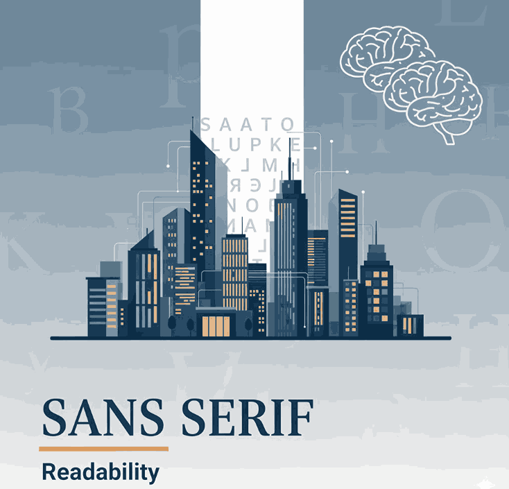
  • Historical context: Understanding how typography, branding and design evolved helps you design more thoughtfully. For example, see the film Helvetica which examines the influence of the typeface of the same name.
  • Creative stimulus: Sometimes when you’re stuck designing a font or brand mark, stepping into a different medium (film) re-energises your creativity and leads to fresh ideas.

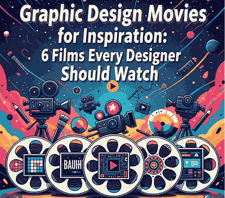
3. Top 6 Graphic Design Movies Inspiration

Here are six carefully selected films that offer great inspiration for font designers and brand creators.

3.1 Helvetica (2007)

A documentary by Gary Hustwit focused on the iconic typeface Helvetica. It explores how this one font has shaped modern visual culture, signage, corporate branding, and how designers reacted to it. this is a must-watch because it raises questions about legibility, style, aesthetics, neutrality, and typography’s role in everyday life.

3.2 Objectified (2008)

Also directed by Hustwit, this film shifts from pure typography into industrial and product design, examining how everyday objects are designed, how form and function meet, and how design influences our environment. While not purely about fonts, the thinking behind design decisions here helps any creative understand how aesthetics, usability and context matter.

3.3 The Pixar Story (2007)

Although this is more about animation and storytelling, it’s rich in design inspiration—character design, colour palettes, branding of a studio, the evolution of a visual identity. Many of the stories in design films point to how visual systems evolve. Watching how a brand like Pixar Animation Studios built its identity from ground up can spark ideas for how to build font families or brand systems.

3.4 Andy Warhol: A Documentary Film (2006)

This film explores the life and works of Andy Warhol—pop-art icon and pioneer of mass-culture visual language. It shows how art, branding and design intersect. the film underlines how visual identity can become cultural identity, how repetition and branding matter, which is powerful when you’re creating fonts that may become part of someone’s brand.

3.5 Drew: The Man Behind the Poster (2013)

Focusing on poster and album-cover designer Drew Struzan (though strictly speaking this film is more film-industry oriented), it’s still relevant because you’ll see how type, layout, colour and composition all come together in a strong visual piece. The insight helps font creators think about how their fonts might live in real usage, not just in isolation.

3.6 Typeface (2009)

A film about the Hamilton Wood Type & Printing Museum, and the craft of wood-type printing, intersecting with modern design and typography. Wikipedia This is especially relevant for your team since you design and sell fonts—seeing the craft and history behind type gives depth to your font-design practice and story.

4. How These Films Feed Font & Branding Design Ideas

When you watch with purpose, you’ll extract ideas like:

  • Understanding how typography influences mood, message, and brand perception (see Helvetica).
  • Thinking about how a font might behave in different contexts—billboards, mobile, web, print (inspired by Objectified).
  • Observing how brands evolve their identity, consistency in usage (seen in The Pixar Story).
  • Considering cultural impact of visual language (from Andy Warhol).
  • Realising that a font may live with imagery, graphics, and context—not just letters (from Drew).
  • Valuing craftsmanship and historic roots of type (from Typeface).

Using these insights, you can create font families that are not only visually appealing, but also conceptually strong—ones that solve design problems, carry meaning, and support brand storytelling.

5. Connecting Graphic Design Movies Inspiration to Your Font Work

At CalligraphyFonts.net, where you design and sell fonts, you can leverage movie-inspired thinking:

  • Create story-driven fonts: Just like Helvetica shows type with a story, you can craft fonts that have a meaningful narrative behind them.
  • Visual context matters: In your product pages, show how fonts work in brand identity, signage, posters, just like in the movies.
  • Use font mockups inspired by cinematic visual style: For example:
  • Show designers how the font could live: Use case studies or mockups showing your fonts in brand movies-style posters or creative visuals.
  • Tell the craft story: Reference the type-making craft as seen in Typeface, to position your fonts as thoughtfully designed, not just quick digital typefaces.
Graphic Design Movies Inspiration

6. Tips for Watching with Purpose Graphic Design Movies Inspiration

  • Take notes: Watch each film with a sketchbook—or digital notes—ready to capture interesting typography, colour palettes, compositions.
  • Pause and analyse: When you see a compelling title sequence, brand logo or typographic detail, pause and break it down: What font (or style) did they use? Why did it work?
  • Apply it: After watching, pick one insight and apply it to your next font-design: e.g., how to build legibility across sizes, how to design for multi-context use.
  • Share with your team: Make watching a design-team activity. Discuss what each film triggered in terms of ideas for your next font collection.
  • Keep a “watch list”: These six are a start; you can add more design-films (documentaries and features) to your list to keep inspiration flowing.

7. Conclusion Graphic Design Movies Inspiration

Inspiration for font designers is everywhere—but films about design bring a unique depth. With the six recommended movies in this article under the theme Graphic Design Movies Inspiration, you’ll gain fresh perspective on typography, brand identity, visual storytelling and design process. At CalligraphyFonts.net, you can channel this inspiration into creating font collections that are not only beautiful, but conceptually rich and brand-ready. Watch with intention, design with passion—and let the visual stories you consume become the fonts you create.

8. References

  • Linearity — “14 must-see graphic design movies you should watch”.
  • Din Studio — “Recommended Graphic Design Movies You Should Watch”.
  • Medium — “A Curated List of Movies and Books For Designers”.
  • Wikipedia Helvetica (film).
  • Wikipedia Typeface (film).
Posted on

Difference Between UI and UX: New Their Roles in Design

Difference Between UI & UX

Table of Contents

  1. Introduction
  2. What Is UI Design?
  3. What Is UX Design?
  4. The Key Difference Between UI and UX
  5. Why UI and UX Must Work Together
  6. The Importance of Fonts in UI/UX Design
  7. Font Recommendations for UI and UX Projects
  8. Conclusion
  9. References

1. Introduction

In the world of digital design, the terms UI (User Interface) and UX (User Experience) are often used interchangeably — yet they represent two distinct but interconnected disciplines. Understanding the Difference Between UI & UX is essential for anyone working in branding, web design, or digital product creation.

Whether you’re designing a mobile app, a website, or even promotional visuals for your font products on CalligraphyFonts.net, mastering UI and UX concepts can make your designs more user-friendly and visually appealing.

2. What Is UI Design?

UI design (User Interface Design) focuses on the look and feel of a digital product. It’s about crafting the interface — the screens, buttons, icons, typography, and color palettes that users interact with.

A UI designer ensures that every visual element aligns with the brand’s identity and supports user goals. They consider details like:

Difference Between UI & UX
  • Typography and font choice for clarity and personality
  • Color harmony and accessibility
  • Consistency in layout, icons, and spacing
  • Interactive feedback, like hover effects or animations

In short, UI design is how the product looks.

Example: The clean buttons and elegant typography of an online store’s checkout page reflect good UI design — visually guiding users to complete their purchase.

3. What Is UX Design?

UX design (User Experience Design), on the other hand, is about how the product works and feels. It focuses on the user journey — ensuring that the interface is intuitive, efficient, and enjoyable.

A UX designer conducts research, builds wireframes, and tests prototypes to answer key questions:

  • Is the navigation logical?
  • Can users find what they need easily?
  • Does the product solve their problem without friction?

UX design is the overall experience, not just the visuals. It’s how easy and satisfying it is for users to interact with your interface.

Example: If a website loads quickly, feels intuitive, and helps users find fonts effortlessly, that’s great UX design in action.

4. The Key Difference Between Difference Between UI & UX

Although UI and UX work closely together, the difference between UI and UX lies in their purpose and approach:

AspectUI DesignUX Design
FocusVisual appearance and styleUser journey and functionality
ToolsFigma, Adobe XD, SketchMiro, Figma, UserTesting, Hotjar
GoalTo create attractive, interactive interfacesTo ensure usability and satisfaction
OutputButtons, menus, color palettes, typographyUser flows, wireframes, experience maps

A simple analogy:

UI is the look and feel of a car; UX is how smoothly it drives.

Without good UX, even a visually stunning UI will fail to engage users. And without good UI, even a well-structured UX may appear unappealing.

5. Why Difference Between UI & UX Must Work Together

Great design happens when UI and UX are perfectly aligned. A product might have a beautiful interface, but if users struggle to navigate it, they’ll leave. Similarly, a functional app without visual appeal won’t keep users engaged.

The best design teams integrate both elements:

  • UX ensures the logic, flow, and function are seamless.
  • UI brings it to life with typography, color, and motion.

For font designers like you, this combination is equally important. When you showcase fonts in mockups or product pages, the UX defines how easily visitors can browse, and the UI defines how beautifully those fonts are presented.

6. The Importance of Fonts in Difference Between UI & UX

Typography plays a massive role in both UI and UX. The right font enhances readability, sets the mood, and strengthens brand identity. Poor font choice, however, can ruin even the best interface.

Here’s why fonts matter:

  • Readability: Fonts should be legible across all screen sizes.
  • Emotion: Different fonts evoke different emotions — serif fonts feel formal, sans-serifs modern, scripts artistic.
  • Hierarchy: Using font weights and styles helps guide user attention.
  • Consistency: A unified font style improves user trust and coherence.

A UI/UX designer should consider fonts not just for beauty, but also for usability and accessibility.

Difference Between UI & UX

7. Font Recommendations for Difference Between UI & UX Projects

Here are some of your fonts from CalligraphyFonts.net that work beautifully in UI/UX contexts:

  • Will Never Be Font – A bold, impactful script perfect for UI headings and creative branding screens.
  • Holters Font – A clean sans-serif that maintains excellent legibility across digital devices.
  • Glow Overload Font – Stylish and futuristic, ideal for landing pages or modern app interfaces.
  • Quillbacks Font – Elegant and versatile, great for hero sections or promotional banners in design mockups.

You can use these fonts in mockups to illustrate how typography enhances both UI aesthetic and UX usability.

8. Conclusion

Understanding the Difference Between UI & UX empowers designers to create experiences that are both beautiful and functional.

  • UI makes a product visually appealing.
  • UX makes it usable, intuitive, and satisfying.

When combined thoughtfully — and paired with strong typography — they result in digital experiences that users love.

For you as a font designer, this knowledge helps you present your fonts more effectively online, improving engagement and conversions. Your fonts don’t just shape visuals — they shape the user experience itself.

9. References

Posted on

Serif vs Sans Serif Readability: New Designers Need to Know

Sans Serif Readability

Table of Contents

  1. Introduction
  2. What Are Serif and Sans-Serif Fonts?
  3. The Readability Debate: Serif vs Sans Serif
  4. Key Factors That Influence Readability
  5. How This Applies to Your Font Design & Mockups
  6. Font Examples for Mockups & Practice
  7. Conclusion
  8. References

1. Introduction

When choosing typefaces for branding, web design, print or packaging, one of the most common questions is: “Should I use a serif or Sans Serif Readability” The short answer: it depends. In this article we’ll explore the nuance of serif vs sans serif readability, examine scientific research, highlight key influencing factors, and show how you can apply this knowledge to your font-design business at CalligraphyFonts.net.

2. What Are Serif and Sans Serif Readability Fonts?

A serif font features small decorative strokes or “feet” at the ends of letterforms. The term “serif” comes from the Dutch word schreef meaning a line or stroke.
A sans-serif font (from French sans meaning “without”) lacks those extra strokes, giving a cleaner and more modern appearance.
From a designer’s perspective:

  • Serif fonts often convey tradition, formality, readability in print.
  • Sans-serif fonts often convey modernity, clarity, minimalism—especially in digital contexts.
Sans Serif Readability

3. The Readability Debate: Serif vs Sans-Serif

For decades, designers and typographers assumed serifs help guide the eye along lines of text (especially in print) and thus improve readability. But what does the research say?

Research Highlights

  • A study published by PMC found that participants read slightly faster and more accurately from sans‐serif typefaces in some digital contexts.
  • Another review notes: “There is no evidence that serif or sans‐serif significantly impacts readability.”
  • A 2023 article in Readable states that the “sans‐serif is easiest” assumption isn’t always true, and that reading speed/comprehension depends on many factors beyond serif presence.
  • A font-readability blog notes: “Serif fonts were slightly more legible for printed text with no anti-aliasing; sans-serif performed best on screen with anti-aliasing.”

What It Means

In practical terms:

  • In print contexts or very small type sizes, serif fonts may offer a slight advantage (though not huge).
  • On digital screens, high resolution and anti-aliasing have reduced the advantage of serifs; many sans-serif fonts perform equally well or better.
  • Ultimately readability depends more on font design quality, x-height, letter spacing, contrast, line length, line spacing, and audience context.

4. Key Factors That Influence Sans Serif Readability

When thinking about serif vs sans-serif readability, keep these factors in mind—they often matter more than the presence or absence of serifs:

  • x-Height & letter proportions: A larger x-height tends to improve legibility.
  • Stroke contrast: High contrast (thin/thick strokes) may reduce readability, especially at small sizes or screen resolution.
  • Spacing (kerning/leading/tracking): Tight spacing can hinder readability; generous spacing helps.
  • Line length & layout: Very long lines of text reduce readability regardless of font style.
  • Medium & resolution: On low-resolution screens, serifs may blur; on print or high-dpi displays, this is less an issue.
  • Audience & context: Readers with visual impairment or dyslexia may respond differently; some studies suggest sans‐serif may have slight advantages for certain groups.

5. How This Applies to Your Font Design & Mockups

As a font-design business (CalligraphyFonts.net) you’re not just choosing fonts—you’re creating them and selling to other designers. Here’s how you can apply the readability insight:

  • Design for context: If a font is intended for body text (print or long reading), then consider serif or well-designed sans with strong x-height and spacing.
  • Mockup your fonts in both display and text usage so customers see readability in context.
  • Use your fonts in relevant digital or print scenarios:
    • For example, a font designed with strong x-height and simplified forms will work well on screen as a sans-serif choice even if it has subtle serifs.
  • Educate your customers: In your product descriptions mention readability context—“ideal for screen use”, “optimized for print body copy”, etc.
  • Pair fonts thoughtfully: When using display fonts (for headlines) vs text fonts (body), the readability requirements differ—display can be more stylised, text needs clarity.
    By aligning font style with readability research (rather than simply relying on “serif for print, sans for web”), you’ll build trust and credibility with your customers.
Sans Serif Readability

6. Font Examples for Mockups & Practice

Here are four fonts from your collection that you can use for readability-focused mockups and display them in contexts (print vs screen) to showcase versatility:

  • Faint Green Font – Try this in body text print mock-up to illustrate serif readability in print context.
  • Clangorous Font – Use in bold headings or web hero to show how sans-serif or hybrid forms perform on screen.
  • Barley Round Font – A friendly rounded sans-serif ideal for digital reading and lifestyle brand usage.
  • Patriotics Font – Vintage-inspired serif display font – good for print use or headings where tone and readability matter.

Show your audience how each font performs in both screen and print contexts, and you’ll not only sell fonts—you’ll educate your market and position your brand as expert.

7. Conclusion Sans Serif Readability

The serif vs Sans Serif Readability discussion doesn’t have a one-size-fits-all answer—but the takeaway is clear: context matters more than dogma. Good font design, appropriate spacing, layout and medium matter more than whether a font has serifs. For your font-design business, that means being deliberate about readability in every mockup, controlling context, and educating your customers. By doing so, you set your fonts apart as thoughtful, usable, and high-quality assets — not just pretty typefaces.

8. References

Posted on

What is Digital Illustration: A New Comprehensive Guide for Creatives

What is Digital Illustration

Table of Contents

  1. Introduction
  2. Defining Digital Illustration
  3. How Digital Illustration Differs from Traditional Illustration
  4. The Tools & Techniques of Digital Illustration
  5. Practical Applications: Where Digital Illustration Meets Typography & Design
  6. Examples of Fonts to Use in Digital Illustration Projects
  7. Conclusion
  8. References

1. Introduction

What is Digital Illustration In today’s visual driven world, illustration has taken a major leap beyond pen and paper. With the rise of tablets, powerful software and digital workflows, understanding What is Digital Illustration has become key for designers, typographers and creative entrepreneurs alike.

For a business like CalligraphyFonts.net — where you design, create and sell a variety of fonts — digital illustration is especially relevant. Whether you’re developing font displays, mock-ups, branding visuals or mixed media pieces, the intersection of font design and digital illustration offers rich creative potential. In this article, we’ll define digital illustration, explore how it differs from traditional methods, dig into tools and techniques, highlight how it relates to typography and font work, and show how you can apply high-quality fonts from your collection to these kinds of projects.

What is Digital Illustration

2. Defining Digital Illustration

At its core, digital illustration is the process of creating images using digital tools and software — from sketches drawn on a tablet to fully realised vector compositions. As one authoritative source states:

“Digital illustration is the creation of a narrative image that tells a story, conveys an emotion or mood, or sells a concept or product.”

Another source defines it simply as:

“Artwork created or enhanced using digital tools or software, rather than purely traditional, physical media.”

So when you ask “what is digital illustration?”, think of:

  • working on a computer or tablet rather than paper
  • using software like Adobe Photoshop, Illustrator, Procreate or Clip Studio Paint
  • creating artwork that may include or combine vector shapes, raster painting, textures, typography and more
  • producing visuals for multiple applications: branding, web, print, motion, packaging

3. How Digital Illustration Differs from Traditional Illustration

While both digital and traditional illustration share the goal of visual storytelling, the key differences lie in tools, workflow and flexibility. Some distinctions:

  • Materials: Traditional uses physical paper, canvas, brushes, inks; digital uses a tablet, stylus, software and screen.
  • Editability: Digital illustrations allow undo, layering, blending, resizing without loss of quality—vastly different from most physical methods.
  • Distribution: Digital work is easily adapted for web, animation, print and scalable formats; traditional may need scanning or digitisation.
  • Hybrid possibilities: Many digital illustrators combine techniques—drawing on paper, scanning, then enhancing digitally. According to one article: “A digital illustration refers to artwork created using digital tools and techniques such as drawing tablets, software programs and computer graphics.”
  • Tools & specialisation: For example, older illustration may emphasise brush strokes and textures; digital adds vector precision, effects, 3-D mimicry and motion.

For designers and font companies, embracing digital illustration means leveraging these advantages: editable mock-ups, scalable art, quick iteration and integration with typography and branding workflows.

4. The Tools & Techniques of What is Digital Illustration

Tools

Typical digital illustration workflows include:

  • A graphics tablet or pen-display (e.g., Wacom, Huion) or tablet device such as iPad + Apple Pencil. One beginner guide notes: “Look for a computer with at least 8 GB RAM … a laptop or desktop with a drawing tablet …”
  • Software like Adobe Photoshop (raster), Adobe Illustrator (vector), Procreate, Clip Studio Paint, or other digital drawing applications.
  • Input devices with pressure sensitivity, layering systems, vector paths, brushes and masks.

Techniques

Some common techniques include:

  • Vector illustration: Using anchor points, curves and fills to create crisp scalable artwork.
  • Digital painting: Mimicking traditional painting using digital brushes, textures and layers.
  • Mixed media / hybrid: Combining scanned textures, hand-drawn elements and digital enhancements.
  • Vector + raster workflows: Many illustrators use both, especially when integrating typography or logos.
  • Motion / interactive illustration: As digital tools evolve, illustration can include animation, interactive elements and more.

Workflow Tips

  • Start with a concept/sketch (digital or paper).
  • Create layers (background, mid-ground, foreground) for easier editing.
  • Use typography and font elements if working with branding or illustration-for-type contexts.
  • Export in appropriate formats (raster for web, vector for logos, high resolution for print).
  • Reuse and adapt for multiple applications (social media, packaging, web banners).

5. Practical Applications: What is Digital Illustration Meets Typography & Design

What is Digital Illustration

Because you run a font-design business, integrating digital illustration with typography offers powerful opportunities:

  • Font display mock-ups: Use digital illustration to create scenes or compositions where your fonts are shown in use—this helps customers visualise them in branding, packaging or editorial.
  • Custom lettering / type design: Illustrators can hand-draw or digitally paint letterforms, then convert or refine them into fonts.
  • Branding & logo work: Digital illustration adds bespoke illustrative elements around text—so a font becomes part of a broader brand visual.
  • Digital product assets: Icons, patterns, backgrounds and textures created via digital illustration enhance packaging, visual identity and font promotional materials.
  • Educational / tutorial content: Share your process of creating a font or illustration via digital tools—this builds authority and engages your audience.

As you review your font range on CalligraphyFonts.net, consider how each font might pair with illustrative backgrounds or compositions. For example:

  • Senjalara Calligraphy Font — perfect for hand-painted digital illustrations or modern calligraphy contexts.
  • Classicly Font — elegant serif that pairs with digital illustration in editorial or branding contexts.
  • Allure Aesthetic Font — stylish script suited for lifestyle illustration backgrounds.
  • Aesthetic Stories Font — ideal for combining with whimsical digital illustration motifs or social-media visuals.

6. Examples of Fonts to Use in What is Digital Illustration Projects

Here are the specific fonts from your collection that integrate beautifully with digital illustration workflows:

  • Senjalara Calligraphy Font – Can be used with hand-drawn brush textures or digital painted flourishes.
  • Classicly Font/ – Pairs well with minimalist digital illustration for packaging or branding.
  • Allure Aesthetic Font/ – Combine with soft digital pastel illustrations for lifestyle/social media design.
  • Aesthetic Stories Font/ – Great for combining illustrated backgrounds, digital collage and type in one visual asset.

With these fonts, you can create mock-ups, promotional visuals or even font bundles aimed at designers who do illustration + type work. It’s a smart way to position your fonts within the digital illustration trend.

7. Conclusion What is Digital Illustration

Understanding What is Digital Illustration is and how it integrates with typography and design empowers you as a font-creator and a visual innovator. The digital illustration process offers remarkable flexibility, scalability and creative control—ideal for modern design and font display.

For your business at CalligraphyFonts.net, leveraging digital illustration means you’re not just selling fonts—you’re providing creative assets that work within rich visual ecosystems. Use illustration to enhance your font offerings, create compelling brand visuals, and connect with a design-savvy audience. The digital canvas is expansive—let your typography and illustration shine.

8. References

Posted on

Graphic Design Trend Forecast 2024: What Will Define New Visual Creativity This Year

Graphic Design Trend Forecast

Table of Contents

  1. Introduction
  2. Why Graphic Design Trends Matter
  3. The Biggest Graphic Design Trends of 2024
     3.1 Minimalism with a Modern Twist
     3.2 Retro Revival and Nostalgia
     3.3 Bold Typography and Experimental Fonts
     3.4 3D and Motion Design Integration
     3.5 Sustainable and Eco-Friendly Visuals
     3.6 AI-Driven Design Tools
  4. How Designers Can Adapt to These Trends
  5. Recommended Fonts to Match 2024’s Visual Style
  6. Final Thoughts
  7. References

1. Introduction

As we step into 2024, the world of graphic design continues to evolve at lightning speed. Technology, culture, and social change all influence how we communicate visually. The Graphic Design Trend Forecast for 2024 reveals a fascinating mix of nostalgia and innovation—where timeless design principles meet futuristic tools and aesthetics.

Whether you’re a brand designer, creative director, or font creator, understanding these upcoming Graphic Design Trend Forecast helps you stay relevant and produce work that resonates with your audience.

Graphic Design Trend Forecast

2. Why Graphic Design Trend Forecast Matter

Graphic design trends are not just fleeting visual fads; they represent how human behavior and technology merge to shape visual culture. For professionals, following these trends means:

  • Staying aligned with audience expectations
  • Keeping designs visually fresh and competitive
  • Improving brand recognition through modern aesthetics

At CalligraphyFonts.net, where creativity meets craftsmanship, following visual trends also helps you design fonts that fit into the ever-changing digital landscape.

3. The Biggest Graphic Design Trend Forecast of 2024

Here’s a look at the dominant creative directions predicted to shape the industry this year.

3.1 Minimalism with a Modern Twist

Minimalism isn’t going anywhere—but 2024’s version comes with personality. Expect to see clean layouts with subtle gradients, dynamic asymmetry, and bold negative space. The goal? To create elegant simplicity that still feels expressive.

Designers are moving toward “warm minimalism”—using soft color palettes, human-centered imagery, and balanced typography to maintain sophistication without feeling sterile.

3.2 Retro Revival and Nostalgia

The return of the Y2K and ’80s–’90s retro aesthetics continues to dominate. From chrome effects and holographic textures to grainy filters and hand-drawn fonts, nostalgia remains a strong emotional trigger.

This blend of old and new creates familiarity while remaining visually exciting—perfect for social media campaigns, music posters, and brand visuals.

3.3 Bold Typography and Experimental Fonts

Typography takes center stage in 2024. Designers are using custom typefaces, layered textures, and variable fonts to express brand personality.
If you want to incorporate trend-aligned typography, explore these examples:

  • Classicly Font — a timeless serif that fits minimalist and editorial aesthetics.
  • Jaycee Looks Font — perfect for vibrant, modern-retro compositions.
  • Rellative Font — ideal for bold, headline-driven layouts.
  • Vineland Font — stylish and sophisticated, great for brand logos or packaging.

These fonts capture the essence of 2024’s design movement: a balance between clarity, expression, and innovation.

3.4 3D and Motion Design Integration

Motion graphics and 3D design continue to merge into mainstream brand identity. Animated typography, immersive visuals, and subtle motion in UI design are becoming essential.
With the rise of AR/VR, designers are exploring interactive storytelling, where static visuals come to life. Tools like Blender and After Effects are now standard for many designers who want to add dimension to their work.

3.5 Sustainable and Eco-Friendly Visuals

As sustainability becomes central to global consciousness, design is reflecting this shift. 2024 brings more earth-inspired tones, natural textures, and organic shapes.
Brands are emphasizing authenticity and ethical design—moving away from over-production toward timeless, minimalist visual systems. Fonts that feel handcrafted or organic fit perfectly into this movement.

3.6 AI-Driven Design Tools

Artificial intelligence has revolutionized how designers brainstorm, create mockups, and explore new visual ideas. AI tools like Adobe Firefly, Midjourney, and ChatGPT are not replacing creativity—they’re amplifying it.
Designers who understand how to collaborate with AI can increase productivity while maintaining artistic integrity. Expect AI-generated art, smart layouts, and predictive color harmonies to play major roles in 2024’s workflows.

4. How Can Adapt to These Graphic Design Trend Forecast

To stay ahead in 2024:

  • Stay curious — follow design blogs, attend webinars, and observe top agencies.
  • Experiment often — create mockups using the latest design software or new font combinations.
  • Refine your typography — test modern fonts and variable weights for flexibility.
  • Collaborate with AI tools — use them for idea generation, but always apply your human creativity.
  • Build a timeless portfolio — integrate trendy design ideas while preserving your personal style.

By balancing trends with originality, you’ll maintain both relevance and authenticity.

Graphic Design Trend Forecast

5. Recommended Fonts to Match 2024’s Visual Style

Typography is a major driver of 2024’s aesthetic direction. Here are curated fonts from your collection that complement this year’s design mood:

  • Classicly Font – clean and classy, ideal for minimalist branding.
  • Jaycee Looks Font – bold and futuristic, great for trend-forward logos.
  • Rellative Font – contemporary yet timeless for editorial projects.
  • Vineland Font – elegant curves and humanist design perfect for creative campaigns.

These typefaces not only align with the graphic design trend forecast 2024 but also demonstrate the craftsmanship that defines CalligraphyFonts.net.

6. Final Thoughts Graphic Design Trend Forecast

The Graphic Design Trend Forecast for 2024 paints a picture of creativity that merges technology, emotion, and timeless beauty. From AI-powered design tools to nostalgic fonts, this year encourages experimentation and authenticity.
For font creators and graphic designers alike, embracing these shifts means staying not just current—but visionary.

Explore these trends, try new fonts, and let your work inspire the next generation of design innovation.

7. References

Posted on

Ways to Sharpen Your Design Skills: A Practical New Guide for Creatives

Improve Design Skills

Table of Contents

  1. Introduction
  2. Why Continual Skill Improvement Matters in Graphic Design
  3. Top 6 Ways to Sharpen Your Design Skills
     3.1 Practice Regularly and Set Design Challenges
     3.2 Study Design Principles and Trends
     3.3 Use & Experiment with Typography and Fonts
     3.4 Learn New Tools, Tutorials & Resources
     3.5 Seek Feedback, Join Communities & Collaborate
     3.6 Build Real-World Projects and a Portfolio
  4. How a Font-Design Business Benefits from Sharpened Skills
  5. Example Fonts for Practice & Creative Use
  6. Conclusion
  7. References

1. Introduction

In the fast-moving world of Improve Design Skills, standing still is not an option. Whether you’re a seasoned creative or just starting out, there is always room to refine your craft. Here, we explore ways to sharpen your Improve Design Skills, focusing on practical, actionable strategies. For a team like yours—designing, creating, and selling fonts at CalligraphyFonts.net—improved design skills aren’t just nice to have; they’re essential to keep your work fresh, your brand relevant, and your products valuable.

Improve Design Skills

2. Why Continual Matters in Graphic Improve Design Skills

Graphic design increasingly demands not just aesthetic sense but also versatility: adapting to new tools, typography trends, branding changes, and market shifts. According to Format, there are “10 Extremely Helpful Free Graphic Design Courses” emphasizing the need to keep learning.
Upgrading your skills helps you:

  • Create more innovative font products and creative design mockups
  • Position your brand (CalligraphyFonts.net) as expert and trend-forward
  • Attract clients/designers who value higher skill and creativity
  • Stay competitive in an evolving marketplace

3. Top 6 Ways to Sharpen Your Improve Design Skills

Here are the most effective ways you and your team can develop and refine your design craft.

3.1 Practice Regularly and Set Design Challenges

Just like mastering a musical instrument, design skills improve through practice. Set mini-challenges: redesign a poster in 30 minutes, experiment with a new font pairing, or create a font mockup in a style you haven’t tried. Consistent sketching or digital experiments keep your creativity active.

3.2 Study Design Principles and Trends

Understanding fundamentals (balance, contrast, hierarchy) allows you to build stronger designs. Also, keeping up with current design trends gives you fresh perspectives. Sites like Shillington’s “48 essential free resources for graphic designers” provide a wealth of material for study and inspiration.

3.3 Use & Experiment with Typography and Fonts

Typography is a core part of design—and for your business it’s central. Experiment with font pairings, custom letterform details, spacing and hierarchy. Practice using fonts in different contexts — branding, packaging, social media. For example:

  • Hashtag Trend Font – try bold headlines and pairing with light body fonts.
  • Shotflick – experiment with playful typography layouts.
  • Holters Font – use for minimalist or tech-inspired design.
  • Richness Font – explore premium and high-end branding applications.
    Such hands-on use deepens your sense of typography, spacing, visual tone—skills that distinguish top designers.

3.4 Learn New Tools, Tutorials & Resources

The landscape of design tools evolves quickly. From UI/UX apps to motion graphics to AI-assisted design, staying current expands your capability. The “Top 26 Graphic Design Resources” article lists excellent resources for inspiration and skill-building.
Register for online tutorials, explore new software, follow design blogs, and build a resource library.

3.5 Seek Feedback, Join Communities & Collaborate

Improvement often comes faster when you expose your work to others. Join design communities (Behance, Dribbble), participate in challenges, share your font design work and ask for critiques. According to Studio Seaside, “joining a creative community… is a great way to sharpen your skills and grow.”
Collaboration—with other designers or via client projects—also forces you to adapt, solve new problems, and raise your standard.

3.6 Build Real-World Projects and a Portfolio

Theory is valuable, but applying design to real projects is where learning gets solid. Build mockup campaigns, take on freelancing jobs, design branding for fictional companies using your own fonts. A strong portfolio demonstrates your skills—and helps you validate how your fonts perform in real usage. Writing case-studies or blog posts around your process also reinforces what you learn.

4. How a Font-Design Business Benefits from Sharpened Improve Design Skills

For your business at CalligraphyFonts.net, sharpening design skills translates to product and branding advantages:

  • You create cleaner, more appealing fonts that address designer needs.
  • Your font product pages become more compelling with strong mockups and layouts.
  • Your brand voice becomes confident—you can share tutorials, case studies, design insights (which also attracts traffic).
  • Better design skills lead to better font pairings, advanced type treatments, and higher perceived value.
  • Your aesthetic stays current and relevant, enabling you to follow trends without losing your identity.

In short: improved design skills strengthen your product line and your brand position.

Improve Design Skills

5. Example Fonts for Practice & Creative Use

Here are selected fonts from your collection that you can use for skill-sharpening and also highlight in your blog:

  • Hashtag Trend Font – great for bold typography experiments.
  • Shotflick – playful and modern, ideal for design explorations.
  • Holters Font – sleek and stylish for minimalist or tech-branding practice.
  • Richness Font – premium look for high-end brand design practise.

Use these in your tutorial content, mock-ups, and experiments to reinforce your design practice and also showcase product value.

6. Conclusion Improve Design Skills

Sharpening your Improve Design Skills isn’t a one-time task—it’s a continuous journey of deliberate practice, study, collaboration, and real-world application. For a font-design business like yours, the payoff is twofold: you become a stronger designer and you develop more impactful, market-relevant products. Dive into the strategies above, make them part of your creative routine, and watch how your work, your fonts, and your brand all benefit.

7. References

  • Format — “10 Extremely Helpful Free Graphic Design Courses.”
  • Shillington Education — “48 Essential Free Resources for Graphic Designers.”
  • Studio Seaside — “5 Resources Every Graphic Designer Should Know About.”
  • Designity — “Top 25 Graphic Design Resources.”
  • EdEx Adobe — “20 Resources to Learn Graphic Design.”
Posted on

Principles of Graphic Design: The Foundation of Visual New Communication

Principles of Graphic Design

Table of Contents

  1. Introduction: Why Graphic Design Principles Matter
  2. The 7 Core Principles of Graphic Design
     • Balance
     • Contrast
     • Alignment
     • Repetition
     • Proximity
     • Hierarchy
     • Space
  3. Applying Design Principles in Branding and Marketing
  4. The Role of Typography in Graphic Design
  5. Recommended Fonts for Creative Projects
  6. Final Thoughts
  7. References

1. Introduction: Why Graphic Design Principles Matter

Principles of Graphic Design is more than just making something look attractive—it’s about communication, clarity, and impact. The Principles of Graphic Design serve as the backbone of every visual creation, ensuring that your message connects effectively with your audience.

Whether you are designing a brand logo, a poster, or a website interface, understanding these principles helps you build visuals that are balanced, intentional, and emotionally engaging. In today’s digital world, where visuals dominate marketing strategies, mastering these fundamentals can set your work apart.

Principles of Graphic Design

2. The 7 Core Principles of Graphic Design

Let’s explore the essential principles that every designer should understand and apply.

Balance

Balance refers to the distribution of visual weight within a design. It can be symmetrical (where both sides mirror each other) or asymmetrical (where visual interest is created through contrast and variation). A balanced layout ensures that no part of the design feels heavier than the other.

Contrast

Contrast highlights differences in color, size, shape, and texture to create emphasis. It helps guide the viewer’s attention to the most important elements, such as headlines or calls to action. High contrast is also essential for readability and accessibility.

Alignment

Alignment ensures that every element on a page visually connects to another. Proper alignment creates structure, order, and a professional appearance. Misalignment, on the other hand, can make a design appear chaotic or unbalanced.

Repetition

Repetition builds consistency by reusing visual elements such as fonts, colors, and shapes. It reinforces branding and helps establish a recognizable identity across different materials like brochures, websites, or social media posts.

Proximity

Proximity groups related items together, making the design easier to navigate. By organizing content logically, proximity helps viewers quickly understand relationships between elements—improving both aesthetics and usability.

Hierarchy

Hierarchy determines the order in which information is presented. Designers use size, weight, and placement to guide viewers from the most important to the least important information. For example, headlines should always stand out compared to body text.

Space

Space, often referred to as “white space,” gives designs room to breathe. It prevents overcrowding and helps highlight important content. Effective use of space contributes to elegance, readability, and a clean layout.

3. Applying Principles of Graphic Design in Branding and Marketing

The principles of graphic design are crucial in building a consistent and memorable brand identity. A logo that follows these rules will communicate professionalism, while a marketing campaign that applies hierarchy and contrast effectively will attract more attention.

For instance, a brand that uses strong visual balance and clear hierarchy across its website and packaging will appear trustworthy and organized. When combined with a cohesive color palette and thoughtful typography, these design principles can create a powerful emotional connection with customers.

4. The Role of Typography in Principles of Graphic Design

Typography is a vital part of design—it influences tone, personality, and readability. Choosing the right font can transform a design from ordinary to extraordinary. Serif fonts convey tradition and authority, sans-serif fonts evoke modernity, and script fonts add a touch of elegance or creativity.

If you’re a designer looking to experiment with stunning typefaces, you can explore premium fonts at Calligraphy Fonts, where artistry meets functionality. The right typography can bring balance and harmony to your overall design composition.

Principles of Graphic Design

5. Recommended Fonts for Creative Projects

Here are some fonts that work perfectly when applying the Principles of Graphic Design to your branding or artwork:

  • Overcame Font – A bold and elegant typeface that captures strength and determination.
  • Ballerinas Font – Perfect for designs that require a graceful and artistic touch.
  • Ameralda Font – A luxurious and stylish font ideal for branding and logo design.
  • Catcalling Font – Great for creative posters and modern minimalist projects.

Each of these fonts exemplifies different principles like contrast, balance, and repetition—helping you achieve a harmonious and engaging design.

6. Final Thoughts

Understanding and applying the principles of graphic design is essential for creating visually compelling work that communicates effectively. Every line, color, font, and space you use contributes to how your audience perceives your design.

By combining these principles with quality typography from CalligraphyFonts.net, you can produce professional and memorable visuals that strengthen brand identity and capture attention in a competitive creative market.

7. References

Posted on

Serif Font Classification: A New Guide to the Major Styles

Serif Font Classification

Table of Contents

  1. Introduction
  2. Why Classifying Serif Fonts Matters
  3. The Four Classic Serif Categories
     3.1 Old Style Serifs
     3.2 Transitional Serifs
     3.3 Modern (Didone) Serifs
     3.4 Slab Serifs
  4. Extended/Additional Serif Classifications
  5. How Font Classification Impacts Your Typography & Branding
  6. How You Can Use Our Fonts in These Categories
  7. Conclusion
  8. References

1. Introduction

When you look at a piece of typography and feel a distinct tone—classic, clean, bold, or vintage—you’re experiencing the power of Serif Font Classification. Understanding what Serif Font Classification means and how the major groups differ helps designers choose the right serif typeface for the task—whether long-form text, elegant branding, or bold headlines. As a font designer and vendor, it’s especially valuable for you at CalligraphyFonts.net to communicate how your fonts align with these classifications, helping your clients pick, pair and apply type with confidence.

2. Why Serif Font Classification Matters

Font classification is more than terminology—it guides design decisions. According to a classification overview by Toptal:

“The first serifs were Old Style. … successors were Transitional, Modern, Slab.”
Similarly, MyFonts notes that serif-styles include Old Style, Transitional, Neoclassical/Didone and Slab among others.
For your business:

  • Helps clients understand your font’s aesthetic heritage
  • Allows you to position fonts more clearly (“this one is a modern serif, this one a slab”)
  • Supports matching fonts to use-cases: readability, display, branding, etc
  • Enhances your authority and education value as a font-seller
Serif Font Classification

3. The Four Serif Font Classification Categories

Below are the major categories of serif fonts, their key features, and design use-cases.

3.1 Old Style Serifs

Old Style (also called Humanist/Old-Roman) emerged during the Renaissance. Key traits: moderate contrast between thick & thin strokes, angled or bracketed serifs, diagonal stress axis.
Use-cases: books, editorial text, design with a classic, elegant tone.
Characteristics at glance:

  • Bracketed serifs (curved connection between serif and stem)
  • Low stroke contrast
  • Slightly diagonal axis of stress
    This classification is ideal when you want a serif that whispers “heritage” not screams “display”.

3.2 Transitional Serifs

Transitional serifs mark the shift between Old Style and Modern. Developed in the 18th century (think Times New Roman/Baskerville family).
Key traits: greater contrast between strokes, more vertical stress, still bracketed serifs but sharper.
Use-cases: where readability is important but you want a hint of modern refinement (premium magazines, branding with subtle sophistication).

3.3 Modern (Didone) Serifs

Also known as Didone, these emerged in the late 18th–early 19th centuries (think Bodoni, Didot).
Traits: dramatic contrast between thick and thin strokes, vertical stress, often unbracketed serifs (flat joins).
Use-cases: display typography, high-end fashion branding, logos where impact and elegance matter.
Caveat: Not always ideal for small-size body text due to thin hairlines.

3.4 Slab Serifs

Slab serifs (aka Egyptian) appeared in the early 19th century to address printing demands.
Traits: heavy, block-like serifs, little or no bracketing, minimal stroke contrast.
Use-cases: advertising, headlines, logos that need sturdy presence, bold statements, retro-industrial look.

4. Extended/Additional Serif Font Classification

Beyond the main four, some classification systems include:

  • Glyphic Serifs: carved-style, inscriptional feel (triangular serifs, minimal contrast)
  • Square Serifs, Clarendons, etc: hybrids that mix slab or glyphic traits.
    Understanding these sub-categories helps you communicate fine differences to your customers and position fonts more precisely.
Serif Font Classification

5. How Font Serif Font Classification Impacts Your Typography & Branding

When designing or shopping for fonts, classification matters for several reasons:

  • Readability: Old Style and Transitional tend to read well in long texts; Modern and Slab are more for display.
  • Tone & Message: A Modern serif says luxury and sophistication; a Slab says strong and bold; an Old Style says traditional and trustworthy.
  • Pairing: Knowing classifications aids in pairing fonts (e.g., mixing a Slab heading with a Sans body) or avoiding conflict.
  • Brand identity: As a font seller, you can highlight a font’s classification as part of its story and suitability—helping your clients make informed decisions.

6. How You Can Use Our Fonts in These Categories

On CalligraphyFonts.net you offer fonts that, while not strictly confined to classic historical classifications, can map into these categories or adopt their influences. Here are some examples and how you might present them:

  • Classicly Font — A typeface with refined serifs, suitable for Classic/Old Style or Transitional usage in text-heavy design or premium branding.
  • Glossy Edition Font — Designed for display, high contrast, elegant feel: aligns with Modern/Didone classification.
  • Trackwalker Classy Font — Robust, with strong serif endings: consider positioning it in the Slab or Hybrid category for headings or branding.
  • Claina Vanie Font — A more decorative serif style, which might map into the Glyphic or special-serif side for unique identity projects.

By tying each font to a classification and use-case, you help your audience choose more confidently—and you enhance your brand as a font expert.

7. Conclusion Serif Font Classification

Understanding Serif Font Classification is a significant skill for any designer—and a powerful differentiator for your font-design business. It enables you to pick fonts with purpose, articulate their roles in branding and publishing, and present your own products more persuasively. At CalligraphyFonts.net, by aligning your fonts with traditional and extended serif classifications, you provide both aesthetic and educational value to your clients. Whether they’re designing a long-form editorial layout, a luxury logo, or a bold heading system, classification becomes their guide—and your fonts become part of the solution.

8. References

  • Toptal – “Types of Fonts: Understanding Typeface Classification”.
  • Design Tuts+ – “The Different Types of Serif Fonts …” .
  • Wikipedia – “Serif classification overview”.
  • Supercharge Design – “Typography Classification: A Guide”.
  • SitePoint – “The Old Style Typeface”.
Posted on

Brand Building Strategy: How to Create, Grow & Sustain Your Brand in 2025

Brand Building Strategy

Table of Contents

  1. Introduction
  2. What is a Brand Building Strategy?
  3. Why Your Font & Design Brand Needs a Strategic Approach
  4. Key Components of an Effective Brand Building Strategy
  5. Font Design & Typography’s Role in Your Brand Strategy
  6. Actionable Steps to Implement Your Brand Building Strategy
  7. Final Thoughts
  8. References

1. Introduction

In a crowded marketplace, defining a brand and then ensuring its existence and relevance over time demands more than a nice logo or a catchy tagline. What you need is a robust Brand Building Strategy—a long-term plan that shapes how your brand is perceived, how it behaves, and how it grows. For a team like yours—designing, creating, and selling fonts at CalligraphyFonts.net—a thoughtful brand building strategy ensures that your fonts are not just visually appealing, but your brand becomes recognizable, trusted and sought-after. In this article, we break down what brand building strategy means, why it matters for a font/design business, essential components, how typography plays a central role, and actionable steps you can take to build your brand deliberately.

Brand Building Strategy

2. What is a Brand Building Strategy?

A brand building strategy is a coordinated set of actions geared toward shaping, communicating and reinforcing your brand’s identity, positioning, and equity over time. As described by Canva, a brand strategy “outlines your business’ unique approach to branding and marketing… it’s the blueprint that helps you stand out, connect and grow.”
Another source adds that building a brand involves integrating art (creativity), science (insights) and craft (execution) to create a meaningful presence.
In short: Brand Building Strategy is less about individual campaigns and more about how you consistently show up, differentiate, and build trust with your audience.

3. Why Your Font & Design Brand Needs a Strategic Approach

For font and design businesses, the market is saturated, the visual standards are high, and differentiation is essential. Here’s why a brand building strategy matters for you:

  • Recognition & memorability: With many font-vendors out there, a strong brand helps designers choose you over others.
  • Trust & credibility: When your brand appears consistent, high quality, and professionally developed, customers trust your fonts and value proposition.
  • Higher perceived value: A well-built brand allows you to charge premium pricing, extend into related products (e.g., font bundles, design assets) and maintain margin.
  • Longevity & adaptability: A strategy helps you evolve with market trends while staying true to core identity, rather than chasing every fleeting design fad.
  • Internal alignment: Your team, creatives and partners need clear direction—brand strategy provides that roadmap so everyone is moving in the same direction.

In essence, your fonts are your product, but your brand is what differentiates and sustains you—and that requires deliberate strategy.

4. Key Components of an Effective Brand Building Strategy

Let’s explore the foundational elements you should include in your brand building strategy:

a. Brand Purpose & Vision

Start with your “why.” Why does your font business exist beyond selling typefaces? What change or value do you bring? Purpose guides your long-term vision and builds emotional connection.

b. Target Audience & Market Positioning

Define who your fonts are for (branding agencies, social-media designers, packaging houses?), what their needs are, and how you’re different from other font providers. Positioning determines how you stand out.

c. Brand Identity & Visual Language

Your brand identity includes your logo, color palette, typography, imagery and tone of voice. For a font business, typography becomes especially central. Visual identity must be consistent and scalable.

d. Messaging & Brand Story

Communicate what your brand stands for, the story behind your fonts, the values and benefits you bring. Strong brands use storytelling to create emotional resonance.

e. Experience & Touchpoints

Every interaction—website, product page, packaging, font mock-ups, customer support—reinforces your brand. Consistency across touchpoints builds recognition and trust.

f. Measurement & Iteration

A strategy isn’t static. You must track brand metrics (awareness, recognition, loyalty), market trends, and iterate accordingly. Effective brand building uses insights + creativity.

Brand Building Strategy

5. Font Design & Typography’s Role in Your Brand Building Strategy

Given your core business of fonts, typography isn’t just a tool—it is part of your brand’s offering and identity. Here’s how you can integrate it into your strategy:

  • Use signature fonts that reflect your brand’s personality and consistently feature them in your branding.
  • Showcase your fonts in real-use contexts so customers visually link your brand to high-quality design outcomes. For example:
    • Butterlies Font — delicate and expressive, suited for creative or feminine branding.
    • Creatoria Font — artistic and refined, ideal for premium design audiences.
    • Oprah Show Font — bold display font for high-impact branding.
    • Aulion Font Duo — versatile font pair that supports brand identity systems.
  • Align your fonts’ aesthetic choices with your brand identity: For example, if you position as modern & minimalist, your fonts should reflect that.
  • In your brand strategy document, include typography guidelines: primary font, secondary font, heading font, usage rules. This makes your brand identity stronger and helps clients understand your expertise.

By doing this, your business becomes not just a font vendor but a brand-builder—fonts are your medium; brands are your mission.

6. Actionable Steps to Implement Your Brand Building Strategy

Here’s a practical 6-step roadmap tailored for your font-design business:

  1. Define or refine your brand strategy document
    • Write your purpose, vision, brand values.
    • Define your target audience and unique positioning.
    • Outline your messaging pillars and brand story.
  2. Audit current brand visuals & touchpoints
    • Website homepage, product pages, social posts, packaging.
    • Are colors, typography, imagery and tone consistent and aligned?
    • Use your signature fonts as brand assets.
  3. Create brand guidelines
    • A clear brand book for internal and external use.
    • Include logo usage, color palette, typography (e.g., Butterlies, Creatoria, etc), imagery style, tone of voice.
  4. Present fonts in brand-focused contexts
    • Mock-ups: Use [Butterlies Font], [Creatoria Font], [Oprah Show Font], [Aulion Font Duo] in branding samples (logo, packaging, social posts).
    • Show clients how choosing your brand’s fonts strengthens their own brand building strategy.
  5. Communicate and market your brand story
    • Blog posts like this, social media posts, design tutorials, case studies.
    • Show your brand strategy implementation: Why you chose certain fonts, how they serve brand building.
    • Partner with design influencers or agencies to showcase your fonts.
  6. Measure and refine
    • Metrics: website traffic, brand-search queries (how many people search your brand name), social media engagement, repeat purchases.
    • Review every 6-12 months: Is your brand still relevant? Are your fonts aligned to evolving trends and audience needs? Adjust where necessary.

By following this roadmap, you’ll not only build a stronger brand for your business but enable your customers (other brands/designers) to build stronger brands—leveraging your fonts as part of their own brand building strategy.

7. Final Thoughts Brand Building Strategy

A deliberate brand building strategy is the foundation of a sustainable and distinctive brand. For a font-design business like your own, formulating and executing a strategy means your fonts become more than products—they become branded experiences and go-to assets for designers and brands seeking strong identities. Remember: brand building isn’t a one-time project—it’s a continuous process of defining who you are, consistently showing up, evolving wisely, and remaining distinct. With the right strategy, your brand—and your fonts—will stand out, resonate, and endure.

8. References

  • Forbes – “The Importance Of A Brand Strategy For Your Business Success.”
  • Frontiers – “Impact of Organizational Brand-Building Strategies on Employee-Based and Organizational Brand Equity.”
  • Canva – “The Brand Strategy Bible: What It Is and How to Build One.”
  • MarTech – “Building a Brand Strategy: Essentials for Long-Term Success.”
  • HubSpot Blog – “Brand Strategy 101: 7 Important Elements of a Company Branding Strategy.”