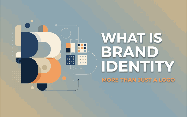
Table of Contents
- Introduction: Why Logo Facts Matter
- What Makes a Logo Truly Iconic
- Five Mind-Blowing Facts from Famous Company Logos
- Hidden Symbols and Negative Space
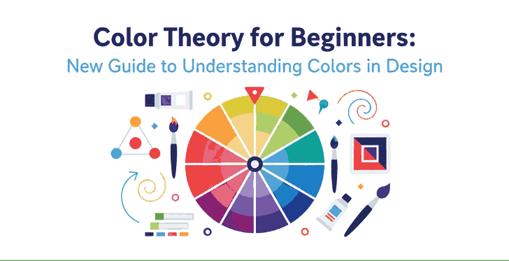
- Color Choices That Tell a Story
- Font, Typography and Custom Lettering
- Evolution Through Time
- Unexpected Origins and Co-incidences
- How These Logo Stories Apply to Your Font & Branding Projects
- Using calligraphic, handwritten or bespoke fonts in branding
- Mockup examples from our font collection
- Bringing It Home: Lessons for Designers and Brand Builders
- Conclusion
- References
1. Introduction: Why Famous Company Logo Facts Matter
Famous Company Logo Facts When we glance at the little “swoosh”, the bite out of an apple, or the smile-arrow stretching from A to Z, we recognise them instantly. Yet behind these famous logos lies more than just a design—they carry stories, psychology, typography choices and even strategic business decisions. Learning the facts behind famous company logos gives designers, brand builders, and font creators a rich source of insight. It helps you appreciate what makes a logo more than a pretty mark—it makes it memorable, meaningful and effective.
2. What Makes a Famous Company Logo Facts Truly Iconic
Based on research and design analyses, iconic logos share some key attributes: simplicity, memorability, versatility, timelessness, and meaningful typography.
Typography plays a critical role: the letter-forms, spacing, weight, and even custom type define how a brand appears in print, web, packaging, signage etc. A well-designed font or lettering treatment contributes to all the attributes above.
3. Five Mind-Blowing from Famous Company Logo Facts
Here are some real-world facts from big brands that you can learn from.
3.1 Hidden Symbols and Negative Space
Many logos embed clever imagery in “empty” parts of the design. For example, the logo for Baskin Robbins hides the number “31” (the number of its flavors at founding) within the “B” and “R”. Another example: FedEx has a hidden arrow between the “E” and “x” to signify speed and precision. Takeaway for you: When designing logos or fonts, consider not just the visible shapes, but how negative space or letter-spacing might carry extra meaning.
3.2 Color Choices That Tell a Story
Color is rarely random in major branding. For instance, the yellow arrow in Amazon’s logo not only forms a smile, but runs from “A” to “Z” to show the full-range offering.
Color also links to emotional triggers: red = energy/passion, blue = trust, green = growth etc.
Your design insight: When applying fonts in brand contexts, the font colour and background must support the same story the logo tells. A beautiful script font used in the wrong colour may lose its power.
3.3 Font, Typography and Custom Lettering
The typography used in a logo is often bespoke. For example: the iconic Nike “Swoosh” logo originally featured the word “NIKE” in Futura Bold, but soon the swoosh alone became the symbol.
Font choices matter: custom lettering, unique curves and weights set a brand apart.
For your font business: This is your sweet spot. When you create or sell fonts (for example our script fonts like Ameralda, Holdsmith or Souther), showing how typography drives brand identity is a compelling story. You might link your fonts as “perfect for logo treatments inspired by big-brand stories”.
3.4 Evolution Through Time
Logos rarely stay fixed forever. Many famous logos evolved to adapt to new media, minimalism trends or global markets. For instance, the first logo of Apple was an intricate depiction of Isaac Newton under a tree—it later evolved into the simple bitten-apple icon.
Design lesson: When designing fonts, think about adaptability — how will the design look at small sizes, on mobile, in print, etc. A script font that only works at large size may limit its utility for branding.
3.5 Unexpected Origins and Co-incidences
Sometimes the logo story is surprising. For example, the Bluetooth logo represents the letters “H” and “B” from King Harald Bluetooth of Denmark—something most people didn’t guess.
Your takeaway: Use surprising trivia or hidden details in your blog or marketing. It draws attention. If you show how a font was inspired by vintage signage or historic scripts, you add depth and credibility.
4. How These Logo Stories Apply to Your Font & Branding Projects
Using calligraphic, handwritten or bespoke fonts in branding
Because many famous logos depend on unique letterforms, your font design business has a direct tie-in. Think of your fonts as tools for brand storytelling:
- A script font conveys elegance, heritage or personal touch.
- A bold sans serif indicates modernity and clarity.
- A custom flourish (swash, alternate glyph) can add hidden meaning or uniqueness just like big brand logos.
Mockup examples from our font collection
To illustrate how typography can elevate a brand-style presentation, check out these real-world font mockups:
- Ameralda Font — script style perfect for premium logos.
- Holdsmith — handwritten signature style, great for boutique branding.
- Souther Font — clean calligraphic style with elegant curves.
Including such mockups helps your audience visualise how fonts influence brand identity.
5. Bringing It Home: Lessons for Designers and Brand Builders
- Start with meaning – A logo (or wordmark) should do more than look good; it should reflect values, story or identity, just like the examples above.
- Typography is brand identity – The font choice is not secondary; it is a core part of logo and brand perception.
- Adapt for scale & medium – From tiny icons on mobile to giant billboards, your design (and font) must work across scales.
- Showcase your fonts in context – As you sell fonts, show them in branding mockups, logos, packaging examples. It positions them as usable for serious brand work.
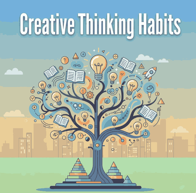
- Leverage storytelling – Using fun facts (like those logo stories) in your blog builds authority and engagement. People remember stories more than just specs.
6. Conclusion Famous Company Logo Facts
The world’s most Famous Company Logo Facts are not simply icons—they carry hidden messages, refined typography, colour strategy and decades of evolution. For font creators and brand designers, these logo facts provide rich inspiration and concrete lessons. By understanding what makes a logo iconic, you can design fonts and projects that carry deeper meaning, higher usability and stronger market appeal.
Explore our font collection at calligraphyfonts.net and imagine how the right typeface can become the next big brand identity.
7. References Famous Company Logo Facts
- Wix Blog — “20 famous logos with 20 fun facts”
- The Branding Journal — “Discover the hidden meanings behind these 40 company logos”
- The Futur — “The Evolution of Famous Logos Over Time”
- Ramotion — “Famous Brand Logos: Stories, Meanings & Traits”
- DinStudio — “Fun Facts About Famous Company Logo You Must Know”
- ArXiv — Academic paper: “Famous Companies Use More Letters in Logo”