Posted on

RGB vs CMYK Difference: New Complete Guide Every Designer Must Know

RGB vs CMYK Difference

Table of Contents

  1. Introduction
  2. What Are Color Modes?
  3. What Is RGB?
  4. What Is CMYK?
  5. Key Differences Between RGB and CMYK
  6. When to Use RGB vs CMYK
  7. Why Colors Look Different in Print
  8. How to Convert RGB to CMYK Properly
  9. Best Practices for Designers
  10. Recommended Fonts for RGB/CMYK Mockups
  11. Final Thoughts
  12. References

1. Introduction RGB vs CMYK Difference

If you work in digital design, printing, branding, or any creative field, you’ve likely encountered the classic debate: RGB vs CMYK. Although both are color modes used in design, they serve very different purposes — which is why choosing the wrong one can lead to washed-out prints, inaccurate hues, or unexpected color shifts.

Understanding the RGB vs CMYK difference is essential to producing consistent, high-quality colors across digital and printed media. Whether you’re designing a logo, social media graphic, poster, or packaging, knowing which color mode to use will save time, resources, and frustration.

This article breaks down the differences between RGB and CMYK, explains when each should be used, and provides best practices for designers — along with font recommendations from CalligraphyFonts.net that work well for mockups in both color modes.

RGB vs CMYK Difference

2. What Are Color Modes RGB vs CMYK Difference?

Color modes are systems used to represent colors in digital and print formats. They define how colors are created, mixed, and displayed. Two of the most important color modes used in design are:

  • RGB (Red, Green, Blue) — used for digital screens
  • CMYK (Cyan, Magenta, Yellow, Key/Black) — used for printing

Choosing the correct color mode ensures accurate reproduction of your design.

3. What Is RGB?

RGB is an additive color model, meaning colors are created by adding light. The more light added, the brighter the color becomes.

RGB is used for:

  • Websites
  • Mobile apps
  • Digital ads
  • Social media graphics
  • UI/UX design
  • Presentations
  • Anything displayed on screens

Why RGB works well for screens:

  • Produces vibrant, glowing colors
  • Supports a wide color gamut
  • Offers more bright neons and saturated tones
  • Perfect for animations and digital visuals

RGB is not intended for print — which is why many designers see dull colors when printing RGB artwork.

4. What Is CMYK?

CMYK is a subtractive color model, meaning colors are created by subtracting light using ink. More ink equals darker results.

CMYK is used for:

  • Brochures
  • Flyers
  • Posters
  • Packaging
  • Business cards
  • Magazines
  • Merchandise printing

Since printers use ink, CMYK is the correct mode for anything that needs to be physically produced.

5. Key Between RGB vs CMYK Difference

1. Color Creation

  • RGB: additive (light-based)
  • CMYK: subtractive (ink-based)

2. Color Range

  • RGB: wider gamut
  • CMYK: limited gamut

Many neon, bright blues, violets, and pinks can’t be reproduced accurately in CMYK.

3. Output Device

  • RGB: screens
  • CMYK: printers

4. Final Appearance

  • RGB is vibrant and glowing
  • CMYK is softer and more matte

5. Purpose

  • RGB = digital
  • CMYK = print

6. When to Use RGB vs CMYK Difference

Use RGB for:

✔ Websites
✔ Social media content
✔ Videos
✔ Animations
✔ Digital ads
✔ UI/UX layouts

Use CMYK for:

✔ Branding materials
✔ Business cards
✔ Posters
✔ Packaging
✔ Print-on-demand merchandise
✔ Large-format printing

Choosing the correct mode at the beginning of the project prevents major color changes later.

RGB vs CMYK Difference

7. Why Colors Look RGB vs CMYK Difference in Print

Designs that look bright on screen often appear dull when printed. This happens because:

  • Screen emits light
  • Paper reflects light
  • RGB colors cannot always be converted perfectly to CMYK
  • Certain saturated tones are outside CMYK’s ink limitations

Printers physically cannot reproduce neon RGB tones.

8. How to Convert RGB vs CMYK Difference Properly

Follow these best practices for accurate conversions:

1. Start designing in the correct color mode

If your project is meant for print, begin in CMYK.

2. Soft-proof your design RGB vs CMYK Difference

Preview how colors will look when printed.

3. Use calibrated color profiles

Such as FOGRA39 or U.S. Web Coated SWOP.

4. Avoid neon or highly saturated tones

These rarely print as expected.

5. Request a physical proof from your printer

This is especially important for brand colors.

9. Best Practices for Designers RGB vs CMYK Difference

  • Always ask clients whether the project is for print or digital
  • Use Pantone for brand consistency
  • Compare printed samples with screen designs
  • Keep brightness lower for print designs
  • Flatten your artwork before exporting for print
  • Export using PDF/X-1a, PDF/X-3, or TIFF for best results

Understanding color mode differences helps maintain professionalism and avoid costly printing mistakes.

10. Recommended Fonts for RGB vs CMYK Difference Mockups

These fonts from CalligraphyFonts.net work beautifully in both digital and printed applications, making them ideal for demonstrating color differences:

1. Pictorial Style Font – Modern Sans Serif

A clean, contemporary sans-serif font perfect for testing color clarity and contrast.

2. Healing Time Font – Elegant Sans Serif

Balanced, sleek, and readable — great for print and digital designs alike.

3. Faint Green Font – Minimal Sans Serif

Strong readability and geometric precision make it excellent for color mode mockups.

4. Overcame Font – Bold Sans Serif

Ideal for posters, headers, and color comparison charts.

These fonts enhance the visual clarity of RGB vs CMYK examples in your article or mockups.

11. Final Thoughts RGB vs CMYK Difference

Understanding RGB vs CMYK difference is one of the most essential skills for modern designers. Whether you’re creating digital artwork or preparing prints, choosing the right color mode can make the difference between a stunning design and a disappointing outcome.

By mastering both color modes and using professional-quality fonts from CalligraphyFonts.net, designers can achieve consistent, beautiful results across digital screens and printed media.

12. References

Posted on

Typography Games Kerning Online: The New Fun Way to Master Spacing

Typography Games Kerning Online

Table of Contents

  1. Introduction
  2. What Are Typography Games?
  3. Why Kerning Matters in Modern Design
  4. How Online Kerning Games Improve Your Skills
  5. Best Typography Games to Train Kerning
  6. Practical Ways to Apply Kerning Skills in Real Projects
  7. Recommended Fonts for Kerning Practice
  8. Final Thoughts
  9. References

1. Introduction Typography Games Kerning Online

Typography Games Kerning Online is more than choosing stylish fonts — it is about ensuring letterforms communicate clearly and beautifully. One of the most important yet often overlooked components of typography is kerning, the adjustment of spacing between individual letter pairs.

As design becomes more digital and competitive, understanding kerning becomes essential for graphic designers, typographers, brand creators, and UI/UX designers. Fortunately, learning kerning doesn’t have to feel like studying math — today, there are fun typography kerning games online that help sharpen your design instincts effortlessly.

This article explores these online games, why kerning is crucial, and how you can improve your spacing skills using interactive tools. We also include mockup font recommendations from CalligraphyFonts.net to inspire your projects.

Typography Games Kerning Online

2. What Are Typography Games Kerning Online?

Typography games are interactive digital games designed to teach visual design skills such as:

  • Kerning (adjusting letter spacing)
  • Tracking
  • Font pairing
  • Color matching
  • Grid alignment
  • Bézier curve manipulation

These games transform complex design principles into fun challenges that help train your visual sensitivity. They are especially helpful for:

  • Beginner designers
  • Students
  • Professional graphic designers wanting regular practice
  • Web/UI designers
  • Typography enthusiasts

The goal is simple: learn typography by playing, not memorizing.

3. Why Typography Games Kerning Online Matters in Modern Design

Kerning directly impacts how a brand or message is perceived. Poor kerning results in:

  • Awkward spacing
  • Misread words
  • Unprofessional visuals
  • Distracting text
  • Weak brand identity

Strong kerning, however, enhances:

  • Readability
  • Balance
  • Aesthetics
  • Brand signature look
  • Viewer trust

From logos to packaging to website headers, kerning determines whether text feels well-crafted or sloppy. This is why kerning games are extremely valuable — they train your eyes to spot spacing issues instantly.

4. How Typography Games Kerning Online Improve Your Skills

Kerning games offer instant skill development because they simulate real-world design challenges.

Benefits of Kerning Games

✔ Improve visual balance
✔ Sharpen spacing sensitivity
✔ Learn faster than reading theory
✔ Provide real-time corrections
✔ Strengthen typographic decision-making
✔ Help develop professional instinct

They also offer scoring systems so you can improve every time you play.

5. Best Typography Games Kerning Online to Train Kerning

Below are some of the top kerning games widely used in design education:

✔ KernType – The Kerning Game

A classic and highly popular kerning game where players adjust spacing between letters to match a typographer’s solution.

✔ ShapeType

Focuses on shaping letters using Bézier curves.

✔ Type War

A simple yet addictive game that sharpens your ability to identify fonts.

✔ Type Connection

A game about pairing fonts that work well together — great for designers doing branding work.

✔ Method of Action Bézier Game

Teaches how to manipulate curves precisely — essential for type designers.

These games make training enjoyable and give valuable muscle memory that improves your design workflow.

6. Practical Ways to Apply Typography Games Kerning Online Skills in Real Projects

Good kerning is essential across nearly all design categories:

Logo Design

Logo text must be perfectly spaced since it represents a brand permanently.

Brand Identity Design

Typography choices such as uppercase headings or handwritten scripts need balanced spacing to maintain consistency.

Web & UI Design

Proper kerning makes interfaces feel clean and professional.

Poster & Print Design

Large typography demands precise spacing to avoid visual imbalance.

Font Design / Custom Lettering

Kerning knowledge helps you understand how letters should interact harmoniously.

Typography Games Kerning Online

7. Recommended Fonts for Typography Games Kerning Online Practice (from CalligraphyFonts.net)

To enhance your typographic projects or create mockups, here are selected fonts from your website that are excellent for kerning exercises due to their clean shapes and consistent structure:

1. Overcame Font – Sans Serif

Perfect for learning kerning because of its bold, modern, and geometric letterforms.

2. Fieldstone Font – Modern Display

Ideal for stylish titles and kerning exploration, especially for uppercase spacing.

3. Faint Green Font – Clean Sans Serif

A minimalistic typeface that makes kerning practice easier and more precise.

4. Healing Time Font – Elegant Sans Serif

Suitable for practicing both subtle and wide kerning adjustments.

Using these fonts in mockups allows readers to visualize kerning improvements in real-world applications.

8. Final Thoughts Typography Games Kerning Online

Typography games are one of the most effective and enjoyable ways to sharpen your design intuition. Kerning might seem like a small detail, but it has a massive impact on branding, readability, and visual harmony.

By incorporating online typography games into your training routine — and practicing with well-designed fonts like Overcame, Fieldstone, Faint Green, and Healing Time — you can grow your design skills significantly faster.

Design is a journey, and kerning is a simple yet powerful step toward mastering it.

9. References

  • Avark — Type Terms
  • Din Studio — Games to Train Your Designing Skills
  • Font Pairings — Check typefaces and font pairings with this interactive tool
  • Method of Action — Method of Action creates tools, toys and games to help you learn design, for free.
Posted on

Golden Ratio Definition & History: New Timeless Blueprint of Perfect Design

Golden Ratio Definition & History

Table of Contents

  1. Introduction
  2. What Is the Golden Ratio?
  3. The Mathematics Behind the Ratio
  4. A Brief History of the Golden Ratio
  5. Why the Golden Ratio Matters in Modern Design
  6. Golden Ratio in Logo Design
  7. Golden Ratio in Typography & Font Selection
  8. Recommended Fonts for Golden Ratio–Inspired Designs
  9. How to Apply the Golden Ratio in Your Creative Projects
  10. Final Thoughts
  11. References

1. Introduction Golden Ratio Definition & History

Golden Ratio Definition & History Designers and artists have long sought a timeless formula that produces visual harmony. The Golden Ratio, often recognized as one of the most powerful composition tools in history, continues to influence architecture, art, branding, and typography today. Whether you’re designing a logo, a website, or a font-centered visual layout, understanding the Golden Ratio helps you create balance, beauty, and natural aesthetics.

This article explores the definition, history, and modern applications of the Golden Ratio—along with carefully selected font mockups from CalligraphyFonts.net to inspire your next design project.

Golden Ratio Definition & History

2. What Is the Golden Ratio Definition & History?

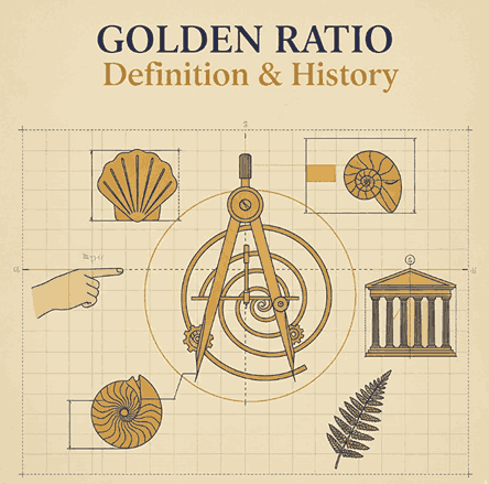
The Golden Ratio, also known as Phi (Φ) and valued approximately at 1.618, is a mathematical proportion found throughout nature, art, and design.

It describes the relationship between two quantities where:

(A + B) / A = A / B = 1.618

This natural proportional pattern is known for producing an ideal sense of harmony and visual balance. You’ll find it in:

  • Nautilus shells
  • Human anatomy
  • Flower petals
  • Galaxy spirals
  • Renaissance paintings
  • Modern brand logos

The universality of the Golden Ratio makes it a foundation of design excellence.

3. The Mathematics Behind the Golden Ratio Definition & History

The Golden Ratio originates from the Fibonacci Sequence, a series of numbers where each number is the sum of the two before it:

1, 1, 2, 3, 5, 8, 13, 21, …

As the sequence progresses, the ratio between successive numbers approaches 1.618, leading to the proportional beauty found in nature and geometry.

Golden rectangles, spirals, and triangles are all derived from this ratio, making it essential in layout design, architecture, and even typography spacing.

4. A Brief of Golden Ratio Definition & History

The Golden Ratio has been studied for thousands of years:

Ancient Greece

Greek mathematicians such as Euclid documented the ratio in “Elements,” linking it to geometry and aesthetics.

Renaissance

Artists including Leonardo da Vinci used the Golden Ratio in works like the Vitruvian Man and the Mona Lisa, elevating it as a standard of beauty.

Modern Times

Architects, graphic designers, and brand specialists continue to use Phi to create balanced compositions, logo grids, and typographic systems.

The Golden Ratio remains a symbol of perfection and artistic craftsmanship.

5. Why the Golden Ratio Definition & History Matters in Modern Design

Modern viewers are subconsciously drawn toward proportionally balanced visuals. Designs using the Golden Ratio tend to feel:

  • Naturally pleasing
  • More professional
  • Better structured
  • Easier to digest visually

It helps designers create layouts with optimal spacing, effective hierarchy, and aesthetically satisfying proportions in:

  • Logos
  • Web layouts
  • Posters
  • Packaging
  • Photography
  • Typography

6. Golden Ratio Definition & History in Logo Design

Many iconic brands incorporate Golden Ratio geometry in their logos, including:

  • Apple
  • Twitter
  • Pepsi
  • Toyota

Using Phi spirals and circular grids helps create logos that feel timeless, balanced, and instantly recognizable.

Designers often start with a Golden Rectangle or spiral, aligning elements—curves, icon shapes, or letterforms—to create cohesive branding.

Golden Ratio Definition & History

7. Golden Ratio Definition & History in Typography Font Selection

Typography plays a crucial role in achieving aesthetic harmony. Fonts that complement Golden Ratio compositions usually embody:

  • Balanced stroke proportions
  • Elegant curves
  • Consistent spacing
  • Strong readability

Choosing the right font amplifies the sense of order and sophistication in Golden Ratio-based layouts.

8. Recommended Fonts for Golden Ratio Definition & History–Inspired Designs

Here are carefully selected fonts from CalligraphyFonts.net that pair beautifully with Golden Ratio compositions:

1. Faint Green Font

A modern handwritten script with graceful curves. Ideal for branding, logos, and editorial layouts.

2. Golden Autumn Font

A luxurious handwritten font with soft strokes, perfect for elegant brand identities.

3. Pictorial Style Font

An artistic script font featuring refined visual rhythm—excellent for posters, book covers, and product packaging.

These fonts offer organic shapes and refined silhouettes that align beautifully with Golden Ratio compositions, helping designers achieve a visually harmonious aesthetic.

9. How to Apply the Golden Ratio Definition & History in Your Creative Projects

Here are practical ways designers integrate Phi into their work:

1. Layout Composition

Divide your canvas using the 1:1.618 proportion to create hierarchy and balance.

2. Typography Scaling

Set headline, subheadline, and body text sizes using Phi increments for harmonious typography.

3. Logo Structure

Use circles and rectangles based on the Golden Ratio to form shapes, curves, and letter marks.

4. Spacing & Margins

Apply the ratio to padding, margins, and leading (line spacing) for cleaner visual flow.

5. Photography & Cropping

Use the Golden Spiral to highlight focal points in images, improving storytelling and visual impact.

10. Final Thoughts

The Golden Ratio is more than a mathematical concept—it’s a universal design principle that inspires harmony, balance, and timeless beauty. From logo grids to typographic scaling, Phi remains an essential tool for designers seeking refinement and professional structure.

By combining Golden Ratio principles with elegant, expressive fonts from CalligraphyFonts.net, you can elevate your branding, layouts, and visual storytelling with powerful aesthetic precision.

11. References

Posted on

Minimalist Negative Space Logos: The Ultimate Guide for Modern Branding

Minimalist Negative Space Logos

Table of Contents

  1. What Are Minimalist Negative Space Logos?
  2. Why Negative Space Logos Are So Effective
  3. Key Principles Behind Minimalist Logo Design
  4. Techniques for Creating Negative Space Logos
  5. Common Mistakes to Avoid
  6. Best Font Recommendations from CalligraphyFonts.net
  7. Final Thoughts
  8. References

1. What Are Minimalist Negative Space Logos?

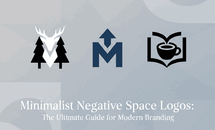
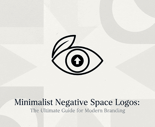
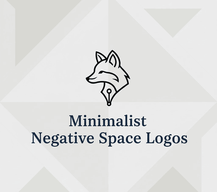
Minimalist Negative Space Logos is a logo design that uses the empty areas between or inside shapes to create a secondary meaning, symbol, or visual message. This design technique creates powerful, clever, and memorable branding while keeping the visual style extremely clean and simple.

Negative space logos gained significant popularity due to their ability to deliver double meaning, strong symbolism, and visual elegance without relying on complex illustrations or decorative elements.

Brands today gravitate toward minimalist logos because:

  • They look modern
  • They scale beautifully on digital and print media
  • They remain timeless and easy to recognize
  • They support simple, universal branding

Negative space design amplifies this minimalism by adding depth and visual intelligence to what seems like a simple logo at first glance.

Minimalist Negative Space Logos

2. Why Minimalist Negative Space Logos Are So Effective

A. They Improve Visual Memory & Brand Recall

The human brain loves solving visual puzzles. When people recognize the “hidden message” inside a negative space logo, it creates a moment of discovery that increases memorability.

According to the Interaction Design Foundation, humans process visuals 60,000x faster than text—making clever design more impactful.

B. They Deliver Simplicity With Depth

A minimalist negative space logo can communicate two ideas simultaneously, helping brands tell a fuller story with fewer graphic elements.

C. They Work Across All Mediums

From business cards to billboards, negative space logos remain sharp and recognizable because they do not rely on color or complex details.

D. They Communicate Professionalism

Minimalist design signals clarity, confidence, and modernity—key qualities for brands in 2025 and beyond.

3. Key Principles Behind Minimalist Negative Space Logos

Before creating a negative space logo, designers must understand the fundamentals of minimalism:

1. Simplicity Over Decoration

A minimalist logo removes anything unnecessary. Each line, shape, and curve must serve a purpose.

2. High Readability Minimalist Negative Space Logos

Even with hidden elements, the main form of the logo must be instantly recognizable.

3. Balanced Composition Minimalist Negative Space Logos

Spacing, alignment, and weight matter more in minimal logos because there are fewer visual cues to stabilize the design.

4. Optimal Use of White Minimalist Negative Space Logos

White space should not feel empty—it should feel intentional and meaningful.

5. Timelessness Minimalist Negative Space Logos

Minimalist logos aim to look relevant for 10–20 years, not just follow trends temporarily.

4. Techniques for Creating Minimalist Negative Space Logos

Below are the most effective methods for designing minimalist negative space logos:

1. Integrated Shapes

Merging two symbols by sharing borders or outlines—allowing one form to naturally create space for another.

2. Hidden Imagery

Placing symbolic shapes within the letters or icons using carved-out negative space.

Example:
An arrow inside the letter “E”, or an animal silhouette inside geometric shapes.

3. Overlapping Elements

Layering shapes in a way that creates subtle inner forms without adding clutter.

4. Letterform Manipulation

Adjusting strokes, spacing, or gaps within typography to reveal a secondary image.

5. Symmetry & Mirroring

Using symmetrical forms makes it easier to insert hidden shapes that feel natural.

6. Subtractive Design

Removing certain parts of a letter or shape to allow the surrounding empty area to become meaningful.

Minimalist Negative Space Logos

5. Common Mistakes to Avoid Minimalist Negative Space Logos

❌ Overcomplicating the Hidden Image

The biggest error is creating a hidden symbol that is too detailed or hard to recognize.

❌ Poor Typography Choices

Complex fonts make negative space logos difficult to read. Clean lines are essential.

❌ Weak Contrast

Negative space only works if the viewer can clearly distinguish the filled and empty areas.

❌ Forcing the Concept

Not every logo needs a hidden image. Only add negative space when it fits naturally.

❌ Ignoring Scalability

Logos must work at all sizes—especially at small resolutions on mobile screens.

6. Best Font Minimalist Negative Space Logos Recommendations from CalligraphyFonts.net

Typography is one of the most important components of negative space logo design. Minimalist logos rely on clarity and shape definition, and choosing the right font will elevate or weaken your entire design.

Below are top recommendations from CalligraphyFonts.net, perfect for minimalist and negative space branding:

1. Ballerinas Font

A clean, modern script with fluid strokes—perfect for elegant minimalist logo concepts that require a balanced flow.

2. Faint Green Font

A simple, readable, and modern sans-serif ideal for clean-cut minimalist logos and geometric compositions.

3. Healing Time Font

Smooth, gentle, and modern—ideal for minimalist logos in beauty, wellness, or lifestyle brands.

4. Pictorial Style Font

A contemporary and clean sans-serif display font perfect for tight spacing and negative space manipulation.

7. Final Thoughts Minimalist Negative Space Logos

Minimalist negative space logos remain one of the most intelligent and visually appealing trends in modern branding. Their ability to combine simplicity with symbolism allows brands to communicate depth while staying clean and timeless.

As designers continue to move toward scalable, digital-first branding, negative space techniques will only grow in demand.

With the right typography—such as curated fonts from CalligraphyFonts.net—you can craft logos that feel elegant, clever, and memorable.

Mastering this technique will elevate your work and help brands stand out with powerful visual storytelling.

8. References Minimalist Negative Space Logos

Posted on

Forbidden Color Combinations: The Essential Guide for Designers 2025

Forbidden Color Combinations

Table of Contents

  1. What Are Forbidden Color Combinations?
  2. Why Some Color Pairings Hurt Your Design
  3. The Most Common Forbidden Color Combinations
  4. How to Identify Bad Color Contrast
  5. How to Fix or Improve Poor Color Pairings
  6. Recommended Fonts for High-Contrast Designs
  7. Final Thoughts
  8. References

1. What Are Forbidden Color Combinations?

In the world of graphic design, color is one of the most powerful communication tools. However, not all colors work well together. “Forbidden color combinations” refer to color pairings that result in poor readability, visual discomfort, or design imbalance. These are combinations that distract the viewer, reduce clarity, or make the message difficult to understand.

The goal of a designer is not only to choose beautiful colors, but also to ensure harmony, contrast, and accessibility. When colors clash, the design suffers—whether it’s a logo, poster, website, or product label.

Forbidden Color Combinations

2. Why Some Forbidden Color Combinations Pairings Hurt Your Design

There are several reasons why certain colors become problematic when paired together:

A. Low Readability Forbidden Color Combinations

Text may blend into the background, making it hard to read.

B. High Visual Vibration

Some bright tones (such as neon pairs) create an unwanted glowing or vibrating effect.

C. Cultural or Emotional Mismatch

Colors may carry conflicting meanings, causing the design to feel confusing.

D. Poor Contrast Forbidden Color Combinations

Contrast affects accessibility and visual hierarchy. When contrast is too low or too extreme, the viewer’s eyes struggle.

E. Color Blindness Issues

Around 8% of men and 0.5% of women experience some form of color blindness (source: National Eye Institute). Certain combinations—such as red/green or green/brown—become impossible to differentiate for affected viewers.

3. The Most Common Forbidden Color Combinations

Here are the color pairings designers should avoid or handle with extreme care:

1. Red & Green

This pair is difficult for color-blind users and often causes blending, making elements look muddy and unclear.

2. Blue & Red

These two create an optical vibration effect, especially when both are bright. Often seen as a “dizzying” combination.

3. Neon Colors Together (Neon Yellow + Neon Green / Neon Pink + Neon Blue)

Neon-on-neon results in intense visual vibration that strains the eyes.

4. Dark Colors on Dark Backgrounds

Examples: navy on black, dark brown on burgundy.
Low contrast = poor readability.

5. Bright Yellow on White

Even though both are positive colors, they blend together and become nearly invisible.

6. Purple & Red

Both are saturated warm colors and create tension or a “messy” visual feel.

7. Green & Orange

Their similar mid-tone values often make them clash and appear unbalanced.

4. How to Identify Bad Forbidden Color Combinations Contrast

To avoid forbidden combinations, designers must evaluate color contrast effectively. Here are practical steps:

☑ Use Contrast-Checker Tools

Tools such as WebAIM Color Contrast Checker or Adobe Color Accessibility can help measure contrast ratios.

☑ Test Multiple Lighting Scenarios

Designs should remain readable in bright daylight, low light, and on various screen types.

☑ Review Your Design in Grayscale

This helps evaluate luminance contrast—the backbone of readability.

☑ Check With Color-Blind Simulations

Use simulators (e.g., Coblis) to ensure colors remain distinguishable.

☑ Follow WCAG 2.1 Guidelines

Text should meet a minimum contrast ratio of 4.5:1 for accessibility (source: W3C Web Content Accessibility Guidelines).

Forbidden Color Combinations

5. How to Fix or Improve Poor Forbidden Color Combinations Pairings

If you must use a risky combination, here’s how to refine it:

1. Adjust Brightness or Saturation

Darken or lighten one of the colors to create contrast.

2. Add Outlines or Shadows

A subtle outline (white or black) helps make text stand out.

3. Use a Neutral Divider

Black, white, gray, or beige can separate conflicting colors.

4. Modify Hue Slightly Forbidden Color Combinations

A small shift (e.g., from pure red to a deeper burgundy) can instantly fix the clash.

5. Simplify the Palette Forbidden Color Combinations

Sometimes less is more. Limiting to 2–3 main colors generally improves harmony.

6. Recommended Fonts for High-Contrast Designs

When dealing with tricky color combinations, typography plays a crucial role. A strong, legible font can compensate for visual limitations and help your message stand out.

Here are premium fonts from CalligraphyFonts.net that work beautifully even in high-contrast or challenging color settings:

1. Workday Font

A modern, bold, handwritten script with excellent clarity.
Perfect for packaging, branding, and product highlights.

2. Blossom Aura Font

Elegant, smooth, and beautifully balanced.
Ideal for labels, wedding branding, and soft color palettes.

3. Popcorn Chips Font

Fun, playful, and easy to read—great for bold color backgrounds.
Suitable for posters, children’s products, and casual branding.

These fonts help maintain visual clarity even when working with intense or difficult color combinations.

7. Final Thoughts Forbidden Color Combinations

Forbidden color combinations are not strict bans—but they are warnings. Understanding how colors interact helps designers produce cleaner, more effective designs while improving accessibility and user experience.

By avoiding problematic pairings—or adjusting them with contrast, saturation, or neutral tones—you can maintain visual harmony and strengthen your brand identity.

Pairing your designs with the right typography further enhances clarity, ensuring that your message remains readable and impactful, even in challenging color environments.

Whether you’re designing a product label, poster, or digital content, mastering color theory will elevate every project you create.

8. References

  • WebAIM – Color Contrast Analysis
  • Din Studio – Forbidden Color Combination
  • Adobe – Why is color accessibility important?
  • W3C / WCAG 2.1 – Color Contrast & Accessibility Guidelines
Posted on

Art Nouveau Style Characteristics: New Elegance of Nature in Design

Art Nouveau Style Characteristics

Table of Contents

  1. Introduction
  2. What Is Art Nouveau?
  3. Key Art Nouveau Style Characteristics
    • Organic & Curvilinear Lines
    • Nature-Inspired Motifs
    • Decorative Typography
    • Asymmetry and Dynamic Movement
    • Handcrafted Aesthetics
    • Use of Soft, Natural Color Palettes
  4. Art Nouveau in Modern Design
  5. Recommended Calligraphy Fonts for Art Nouveau-Inspired Projects
  6. Final Thoughts
  7. References

1. Introduction

Art Nouveau Style Characteristics remains one of the most iconic design movements in history. Known for its fluid lines, botanical elements, and ornamental aesthetics, this artistic era continues to inspire designers across industries—from branding to architecture and digital illustration.

In this article, we will break down the Art Nouveau Style Characteristics, explore why the movement remains timeless, and provide recommended calligraphy fonts from CalligraphyFonts.net that perfectly complement Art Nouveau-themed design works.

Art Nouveau Style Characteristics

2. What Is Art Nouveau Style Characteristics?

Art Nouveau, which translates to “New Art”, emerged in Europe around the late 19th and early 20th centuries. It stood as a rebellion against industrial mass production by bringing back handcrafted artistic expression.

The movement deeply influenced:

  • Architecture
  • Graphic design
  • Posters
  • Typography
  • Interior design
  • Crafts & ornamental arts

Its philosophy emphasized nature, beauty, craftsmanship, and organic forms, making it one of the most recognizable design movements of all time.

3. Key Art Nouveau Style Characteristics

a. Organic & Curvilinear Lines

Perhaps the most defining characteristic of Art Nouveau is its use of curving, flowing lines often described as “whiplash curves.”
These forms evoke:

  • vines
  • stems
  • hair
  • smoke
  • flowing water

Designers use these lines to create a sense of movement, making artworks feel alive and dynamic.

b. Nature-Inspired Motifs

Art Nouveau heavily incorporates elements from the natural world, such as:

  • Flowers (iris, lily, poppy)
  • Leaves & vines
  • Birds
  • Insects (especially butterflies & dragonflies)

These motifs create a visually poetic and harmonious design that feels organic and romantic.

c. Decorative Typography Art Nouveau Style Characteristics

Typography during this era moved away from rigid serif structures and embraced ornamental lettering with fluid strokes and artistic embellishments.

Art Nouveau fonts often feature:

  • extended curves
  • decorative swashes
  • uneven baseline movement
  • handcrafted letterforms

This makes them especially attractive for modern branding, logotypes, packaging, and posters.

d. Asymmetry and Dynamic Movement

Unlike the classical styles that valued symmetry, Art Nouveau embraced asymmetry to emphasize originality and creativity.
This approach created a more natural and spontaneous composition.

e. Handcrafted Aesthetics

Art Nouveau emerged partly as a reaction against machine-made products. Artists and designers prioritized craftsmanship, giving every detail a hand-drawn, artistic feel.

This handcrafted atmosphere can still be seen today in calligraphy and custom lettering styles.

f. Soft, Natural Color Palettes

Typical Art Nouveau colors include:

  • Olive green
  • Dusty blue
  • Gold
  • Beige
  • Terracotta
  • Soft purple

These gentle palettes reflect the movement’s devotion to nature and organic beauty.

4. Art Nouveau Style Characteristics in Modern Design

While Art Nouveau peaked more than a century ago, its influence continues in many modern design fields, such as:

  • branding
  • editorial design
  • illustration
  • luxury packaging
  • wedding invitations
  • interior decor

Designers adapt Art Nouveau’s organic lines and natural themes to create artworks that feel both nostalgic and contemporary.

Art Nouveau Style Characteristics

5. Recommended Calligraphy Fonts for Art Nouveau Style Characteristics-Inspired Projects

To help designers achieve an authentic Art Nouveau aesthetic, here are four carefully selected fonts from CalligraphyFonts.net that embody the movement’s beauty:

1. Creamine Calligraphy Font

A highly decorative calligraphy style with elegant curves and classic ornamentation. Perfect for Art Nouveau poster designs, invitations, and decorative branding.

2. Originale Brush Font

This brush-style font gives a handcrafted, vintage texture reminiscent of early 20th-century artistic posters. Ideal for organic, flowing compositions.

3. Antique Collection Font

A vintage handwriting typeface with historical charm, evoking early European artistic movements. Great for retro packaging and antique-style illustrations.

4. Loveliness Calligraphy Font

A soft, elegant monoline script that captures graceful curves—one of the strongest characteristics of Art Nouveau handwriting styles.

These fonts help bring the spirit of Art Nouveau into modern projects with authenticity and elegance.

6. Final Thoughts Art Nouveau Style Characteristics

The Art Nouveau style stands as one of the most enchanting and influential movements in design history. Its graceful lines, organic motifs, and handcrafted beauty continue to inspire modern designers seeking elegance and visual harmony.

Whether you are working on branding, posters, packaging, or visual storytelling, understanding the Art Nouveau Style Characteristics will give you a powerful foundation for creating sophisticated and expressive artworks.

And with the recommended fonts from CalligraphyFonts.net, you can easily incorporate Art Nouveau’s timeless aesthetics into your next creative project.

7. References

Posted on

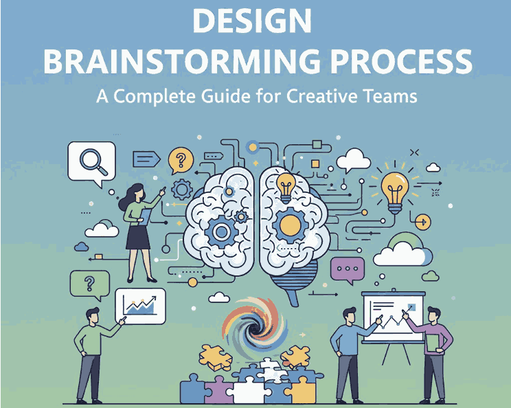
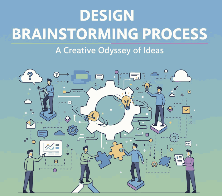
Design Brainstorming Process: A Complete Guide for Creative Teams

Design Brainstorming Process

Table of Contents

  1. Introduction
  2. What Is the Design Brainstorming Process?
  3. Why Brainstorming Matters in Creative Projects
  4. Key Stages of the Design Brainstorming Process
    • 4.1 Preparation
    • 4.2 Idea Generation
    • 4.3 Idea Evaluation
    • 4.4 Refinement & Selection
    • 4.5 Execution
  5. Best Techniques for Effective Design Brainstorming
  6. How Typography Supports the Brainstorming Workflow
  7. Recommended Fonts for Brainstorming Mockups
  8. Tips to Improve Your Brainstorming Sessions
  9. Conclusion
  10. References

1. Introduction

Design Brainstorming Process is an essential step in every creative workflow. Whether you are building a brand identity, designing a website, or crafting digital assets, brainstorming helps teams generate ideas, explore visual directions, and discover solutions that push creativity forward.

This article will guide you through the entire brainstorming process, explain why it is important, share effective brainstorming techniques, and show how typography plays a vital role—complete with recommended fonts from CalligraphyFonts.net.

Design Brainstorming Process

2. What Is the Design Brainstorming Process?

The design brainstorming process is a structured method of generating, evaluating, and refining creative ideas for a design project. It allows designers, teams, or clients to explore concepts freely without judgment, encouraging innovation and unexpected creative outcomes.

Unlike ordinary idea collection, design brainstorming focuses on visual thinking, such as sketching, mood boards, typography experiments, mockups, color exploration, and rapid concept drafts.

3. Why Design Brainstorming Process Matters in Creative Projects

Brainstorming is not just a meeting—it is a strategic tool that improves your design work in several ways:

✔ Encourages Idea Diversity

A structured brainstorm allows participants to share ideas without limitation, resulting in wider creative options.

✔ Solves Problems Faster

Visual ideation helps reveal design issues early and speeds up creative decision-making.

✔ Boosts Creativity & Innovation

Brainstorming breaks mental blocks and encourages designers to think beyond predictable solutions.

✔ Strengthens Team Communication

Collaborative brainstorming aligns vision between designers, marketers, and clients.

✔ Leads to Stronger Visual Identity

Brainstorming helps designers unify typography, layout, color, and brand style in a purposeful way.

4. Key Stages of the Design Brainstorming Process

4.1 Preparation

This is where you define the project scope, design objectives, user needs, and brand direction. Designers gather:

  • brand guidelines
  • color palettes
  • competitor analysis
  • inspirational references
  • target audience insights

4.2 Idea Generation

The fun part. Designers generate as many ideas as possible through:

  • sketching
  • freewriting
  • mood boarding
  • rapid prototyping
  • typography exploration
  • keyword mapping

No judgment—just creativity.

4.3 Idea Evaluation

Next, filter ideas to see which concepts align with project goals. Evaluate based on:

  • brand consistency
  • audience appeal
  • visual clarity
  • originality
  • practicality

4.4 Refinement & Selection

Promising ideas are refined into clearer visual concepts. Designers improve:

  • layout
  • typography choices
  • color combinations
  • iconography
  • illustration style

This stage transforms rough ideas into focused visual directions.

4.5 Execution

The final designs are created based on the refined concepts. This includes:

  • high-fidelity mockups
  • final typography
  • color adjustments
  • asset preparation
  • client-ready presentations
Design Brainstorming Process

5. Best Techniques for Effective Design Brainstorming Process

Use these proven techniques to elevate your brainstorming:

✔ Mind Mapping Design Brainstorming Process

Helps connect ideas visually and explore unexpected directions.

✔ SCAMPER Method Design Brainstorming Process

Substitute, Combine, Adapt, Modify, Put to another use, Eliminate, Reverse.

✔ Mood Boards Design Brainstorming Process

Great for exploring design style, aesthetics, fonts, and imagery.

✔ Sketch Storming Design Brainstorming Process

Rapid sketching pushes visual exploration early.

✔ Brain Writing Design Brainstorming Process

Team members write ideas silently—avoids group pressure.

✔ Typography Experimentation Design Brainstorming Process

Trying different typefaces quickly reveals brand personality.

6. How Typography Supports the Design Brainstorming Process Workflow

Typography is often a key element during the brainstorming stage. The right font can help define:

  • tone and personality
  • visual hierarchy
  • emotional impact
  • brand consistency

Using expressive styles—script, signature, brush, and calligraphy—can make brainstorming mockups feel more alive and inspiring. This is why designers often use premium display fonts early in ideation to visualize strong identity concepts.

7. Recommended Fonts for Design Brainstorming Process Mockups

Here are four font suggestions from CalligraphyFonts.net that work beautifully for design brainstorming presentations, mood boards, and mockups:

1. Rellative Font (Signature Style)

Elegant, modern, and expressive—perfect for branding and concept sketches.

2. Signatory Signature Font

A stylish handwritten font ideal for ideation notes, creative headers, and mood boards.

3. Holters Font

A bold, expressive brush font that brings energy to brainstorming visuals.

4. Anthonyela Calligraphy Font

A sophisticated calligraphy script that adds an artistic and premium feel to presentations.

Using these fonts in your brainstorming mockups instantly upgrades the look and communicates your design direction more effectively.

8. Tips to Improve Your Design Brainstorming Process Sessions

  • Avoid judging ideas too early—creativity thrives on freedom.
  • Set clear objectives so everyone understands the design goal.
  • Use visual tools like sketches, fonts, and mood boards to unlock creativity.
  • Limit sessions to 30–45 minutes to maintain energy and focus.
  • Encourage wild ideas—they often lead to breakthrough concepts.
  • Document everything to revisit sketches and notes later.

9. Conclusion Design Brainstorming Process

The design brainstorming process remains one of the most powerful tools for unlocking creativity and achieving innovative design solutions. Whether you’re working on branding, digital products, or print materials, brainstorming provides structure, clarity, and inspiration. Combined with strong typography choices—such as the fonts from CalligraphyFonts.net—your brainstorming workflow becomes more dynamic and visually engaging.

10. References

(Non-broken authoritative sources)

Posted on

Pantone Color Matching System: New Inspiring Ways to Achieve Color Perfection

Pantone Color Matching System

Table of Contents

  1. Introduction: The Power of Consistent Color
  2. What Is the Pantone Color Matching System?
  3. How Pantone Colors Revolutionized Design
  4. The Importance of Pantone in Branding and Printing
  5. Pantone Colors and Digital Design
  6. Fonts That Pair Perfectly with Pantone Designs
  7. Final Thoughts
  8. References

1. Introduction: The Power of Consistent Color

Pantone Color Matching System is one of the most powerful tools in visual communication. It influences emotions, defines brand identity, and creates visual harmony across mediums. But how do designers and printers ensure that a specific color looks the same on every material — from screen to paper to fabric?

The answer lies in the Pantone Color Matching System (PMS), the world’s most recognized color standard. Whether you’re designing logos, packaging, or marketing materials, understanding Pantone colors can elevate your creative process and ensure color accuracy across every project.

Pantone Color Matching System

2. What Is the Pantone Color Matching System?

The Pantone Color Matching System, often abbreviated as PMS, is a standardized color reproduction system developed by Pantone Inc. in the 1960s. It assigns each color a unique code — known as a Pantone number — to ensure consistency across different design platforms and materials.

For example, Pantone 186 C always refers to the same shade of red, regardless of the printer, monitor, or manufacturer. This allows designers and brands to communicate exact color specifications without confusion or inconsistency.

The PMS system covers thousands of colors, categorized by material type — such as coated (C), uncoated (U), and textile (TPX/TCX) references.

3. How Pantone Color Matching System Revolutionized Design

Before Pantone’s system was developed, designers struggled with inconsistent color results between design proofs and final printed materials. The Pantone system changed everything by creating a universal language for color accuracy.

Key benefits include:

  • Color Consistency: Guarantees the same visual output across print and digital media.
  • Global Communication: Designers, printers, and manufacturers can collaborate seamlessly using shared color codes.
  • Creative Control: Enables precise color matching for logos, branding, and product packaging.
  • Inspiration and Innovation: Pantone’s yearly Color of the Year inspires global design trends across industries like fashion, interior, and digital art.

Today, Pantone is synonymous with design precision — a must-have tool for any professional creator.

4. The Importance of Pantone Color Matching System in Branding and Printing

Brands rely heavily on color psychology and recognition. Think of Coca-Cola’s red (Pantone 484) or Tiffany’s blue (Pantone 1837) — these iconic hues instantly connect consumers to their brands.

Here’s why Pantone colors are essential in branding:

  • Exact Brand Identity: Ensures brand colors look consistent across packaging, advertising, and digital assets.
  • Professional Printing: Pantone spot colors deliver richer, more accurate tones than CMYK blends.
  • Reproducibility: Colors remain the same even after years of reprints or production.

Pantone colors are also essential for product designers, ensuring the final product matches the approved visual concept.

5. Pantone Color Matching System and Digital Design

In digital spaces, designers often work with RGB (screen colors) and HEX (web colors) formats. However, these don’t always align perfectly with printed materials.

Pantone provides digital libraries and tools — such as Pantone Connect — that allow designers to convert between PMS, CMYK, RGB, and HEX values. This helps maintain consistent colors across digital interfaces and print campaigns.

When combining Pantone hues with digital art and typography, designers can create visually balanced designs that resonate both on screen and in print.

Pantone Color Matching System

6. Fonts That Pair Perfectly with Pantone Designs

To achieve harmony between color and typography, font selection plays a crucial role. Certain font styles work beautifully with Pantone-inspired color palettes, adding depth and balance to the overall composition.

Here are some font recommendations from CalligraphyFonts.net that perfectly complement Pantone color schemes:

1. Mode Center Font

A modern and clean display font designed for bold headlines and creative layouts. Its geometric form pairs beautifully with bright Pantone colors like yellow, turquoise, and coral.

2. Fresh Salad Font

Playful and stylish, this display font matches well with vibrant color combinations. Perfect for posters, packaging, or creative branding inspired by Pantone’s dynamic color range.

3. Brafio Font

Elegant yet assertive, this serif display font complements muted or sophisticated Pantone shades like Classic Blue, Serenity, or Viva Magenta. Ideal for luxury branding or editorial design.

When used together, these fonts and Pantone colors can create an unforgettable brand presence — striking, professional, and visually unified.

7. Final Thoughts

The Pantone Color Matching System isn’t just a technical tool — it’s a bridge between creativity and consistency. For designers, it ensures that your creative vision translates flawlessly across every surface.

Understanding and using Pantone colors empowers you to:

  • Maintain brand consistency
  • Collaborate effectively with printers and manufacturers
  • Build stronger emotional connections through color

Whether you’re designing packaging, a logo, or a social media campaign, pairing Pantone precision with the right typography — like Mode Center, Fresh Salad, or Brafio — will help your designs shine across all mediums.

8. References

  • DinStudio — What Are Pantone Colors?
  • Pantone — Pantone Colour Systems ‘Introduction’
  • Oberk — What is the Pantone Color System and How is it used in Packaging?
  • FirstColour — What is the Pantone Matching System (PMS) and why is it important in printing?
Posted on

Master UI/UX Design Systems: A Complete New Beginner’s Guide

UI/UX Design Systems Guide

Table of Contents

  1. Introduction: Why Design Systems Matter in UI/UX
  2. What Is a UI/UX Design System?
  3. Core Components of a Design System
  4. Benefits of Using a UI/UX Design System
  5. How to Build a UI/UX Design System Step by Step
  6. Typography in UI/UX Design Systems
  7. Best Fonts for UI/UX Projects (with Examples)
  8. Common Mistakes to Avoid
  9. Conclusion
  10. References

1. Introduction: Why Matter in UI/UX Design Systems Guide

UI/UX Design Systems Guide Consistency is key in user experience (UX) and user interface (UI) design. As products grow, maintaining design harmony across multiple pages, apps, or devices becomes challenging. That’s where a UI/UX Design System comes in—it ensures consistency, efficiency, and scalability.

Whether you’re designing for a startup or a global brand, understanding how to create and manage a design system helps your team maintain visual identity and improve the overall user experience.

UI/UX Design Systems Guide

2. What Is aUI/UX Design Systems Guide?

A UI/UX design system is a structured collection of design rules, reusable components, patterns, and assets that define how an interface should look and behave. It’s like a “visual language” for your brand—covering everything from color schemes and typography to buttons and icons.

Famous examples include:

  • Google’s Material Design
  • Apple’s Human Interface Guidelines
  • Atlassian Design System

These frameworks ensure that every product built under the same brand feels cohesive and intuitive.

3. Core Components of a UI/UX Design Systems Guide

A well-built design system usually includes several key elements:

  • Design Principles: Core values that guide visual and UX decisions.
  • Color Palette: Defines the primary, secondary, and accent colors.
  • Typography: Sets the tone of the brand with consistent fonts and text hierarchy.
  • UI Components: Buttons, input fields, navigation bars, modals, etc.
  • Spacing and Grid System: Ensures visual balance and alignment.
  • Iconography and Imagery: Consistent visual symbols that support functionality.

Together, these elements form a living document that keeps all design and development work aligned.

4. Benefits of Using a UI/UX Design Systems Guide

Implementing a design system provides multiple long-term advantages:

  • Consistency: Every element across your platform looks and behaves the same.
  • Efficiency: Teams reuse existing assets instead of designing from scratch.
  • Scalability: New pages or apps can be developed faster and easier.
  • Collaboration: Designers and developers work more cohesively with shared resources.
  • Brand Recognition: A consistent aesthetic strengthens brand identity and trust.

In short, design systems make it easier to scale creativity without sacrificing usability.

5. How to Build a UI/UX Design Systems Guide Step by Step

Creating a design system might sound complex, but you can approach it in simple, structured steps:

  1. Audit Existing Designs: Review your current digital assets to find inconsistencies.
  2. Define Your Foundations: Set rules for color, typography, and grid layout.
  3. Create UI Components: Build reusable assets like buttons, modals, and icons.
  4. Document Everything: Use tools like Figma, Notion, or Zeroheight to document guidelines.
  5. Collaborate and Iterate: Involve developers and designers for feedback and continuous improvement.
  6. Maintain and Update: Treat your system as a living product that evolves over time.
UI/UX Design Systems Guide

6. Typography in UI/UX Design Systems Guide

Typography plays a vital role in any design system. The right font can establish hierarchy, readability, and emotional tone. Good UI fonts are:

  • Legible at all sizes (for both desktop and mobile),
  • Versatile (for headings, paragraphs, and buttons),
  • Aligned with your brand’s personality.

Sans-serif fonts are popular in UI design for their clean and modern appearance, while script or calligraphy fonts can be used for accent branding, logos, or special feature screens.

7. Best Fonts for UI/UX Projects (with Examples)

If you want to add personality to your design system, try experimenting with premium fonts that balance readability and style. Here are a few great examples from CalligraphyFonts.net:

  1. Rellative Font – A sleek handwritten signature font perfect for logos, landing pages, or digital branding accents.
  2. Signatory Font – Clean and modern with elegant strokes, ideal for hero sections or creative UI headlines.
  3. Catcalling Font – A stylish calligraphy typeface that adds sophistication and uniqueness to brand-driven UI elements.
  4. Fieldstone Font – A refined serif-style display font that’s perfect for titles and headers in web or mobile layouts.

These fonts demonstrate how typography can enhance digital aesthetics while maintaining usability. When paired with strong color palettes and intuitive components, they elevate your entire UI/UX design.

8. Common Mistakes to Avoid

Even experienced designers can make missteps when building a design system. Avoid these pitfalls:

  • Overcomplicating the system — Keep it simple and scalable.
  • Ignoring documentation — Every component should have usage guidelines.
  • Neglecting accessibility — Always test color contrast and font legibility.
  • Not updating regularly — A stagnant system becomes outdated quickly.

A design system should grow alongside your product and adapt to user needs and design trends.

9. Conclusion

A well-structured UI/UX Design System bridges creativity and consistency. It saves time, improves collaboration, and ensures every user interaction feels intentional and polished.
By integrating thoughtful color choices, readable typography, and reusable UI components, you can create digital experiences that feel both beautiful and functional.

To give your design system a unique touch, explore premium fonts like Rellative, Signatory, Catcalling, and Fieldstone — available now on CalligraphyFonts.net. The right font can transform not just your text, but your entire design identity.

10. References

Posted on

Master Retro 80s Design Elements for a Timeless Look

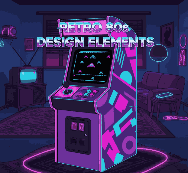
Retro 80s Design Elements

Table of Contents

  1. Introduction: The Magnetic Appeal of the 80s
  2. What Defines the 80s Design Style
  3. Key Retro 80s Design Elements You Can Use Today
  4. The Role of Typography in 80s Design
  5. Modern Ways to Incorporate 80s Style in Your Projects
  6. Best Fonts to Capture the 80s Aesthetic
  7. Conclusion: Bringing Nostalgia Back with Style
  8. References

1. Introduction: The Magnetic Appeal of the Retro 80s Design Elements

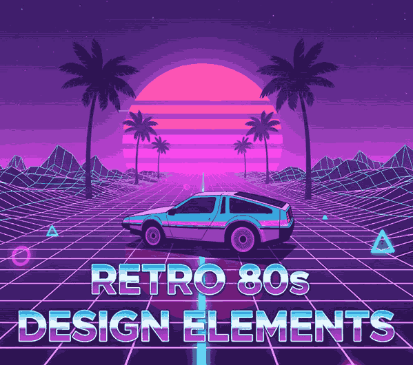
Retro 80s Design Elements The 1980s were a golden era for creativity, characterized by bold colors, flashy graphics, and futuristic yet playful styles. The influence of the retro 80s design elements can still be felt across today’s branding, fashion, and digital art scenes. Designers are once again embracing neon color palettes, geometric shapes, and expressive typography to capture that nostalgic energy.

In this article, we’ll explore how to bring those iconic 80s design elements into your modern projects — and how the right fonts can play a major role in recreating that vintage magic.

Retro 80s Design Elements

2. What Defines the Retro 80s Design Elements

The 80s aesthetic was all about maximalism and vibrancy. It rejected minimalism in favor of eye-catching visuals and fearless experimentation. Here are the defining features of this unforgettable style:

  • Bright Neon Colors: Think hot pink, electric blue, and acid green.
  • Geometric Shapes: Triangles, circles, and grids often overlapped in bold patterns.
  • Gradients and Chrome Effects: Metallic textures and color fades gave designs a futuristic flair.
  • Memphis Design Movement: Abstract shapes with bold outlines and playful asymmetry.
  • Synthwave and Vaporwave Influence: Futuristic elements combined with nostalgic retro tones.

These characteristics together formed a design language that celebrated individuality and excitement.

3. Key Retro 80s Design Elements You Can Use Today

To create authentic 80s-inspired artwork, focus on these timeless design ingredients:

  1. Vibrant Color Palettes – Use strong contrast and high-saturation colors to attract attention.
  2. Dynamic Patterns – Integrate geometric backgrounds or abstract shapes for visual rhythm.
  3. Bold Typography – Mix chunky display fonts with neon glows or metallic gradients.
  4. 3D Graphics and Grids – Add dimension using retro perspective lines.
  5. Lighting Effects – Use glows, reflections, and chrome effects to replicate 80s flair.

These visual tools instantly transform any design into a nostalgic throwback.

4. The Role of Typography in 80s Design

Typography was central to the 80s aesthetic. Designers used bold sans-serif and neon script fonts to communicate energy and innovation.

  • Display fonts were used in headlines to command attention.
  • Script fonts evoked luxury, motion, and glamour.
  • Condensed typefaces delivered futuristic, tech-inspired vibes.

You can recreate this iconic typographic look using high-quality retro fonts that emphasize structure and contrast — exactly what we craft at CalligraphyFonts.net.

5. Modern Ways to Incorporate 80s Style in Your Projects

While retro 80s design is nostalgic, it blends beautifully with modern aesthetics. Here’s how you can balance vintage and contemporary looks:

  • Combine retro color schemes with minimalist layouts.
  • Use retro fonts for headers but keep body text simple and clean.
  • Incorporate gradients as subtle backgrounds or overlays.
  • Add motion graphics with glowing effects to give digital designs an 80s vibe.
  • Create themed brand visuals for product launches or limited-edition campaigns.

The key is to capture the essence of the 80s without overwhelming the viewer.

Retro 80s Design Elements

6. Best Fonts to Capture the 80s Aesthetic

To truly express the retro 80s design elements, typography is your secret weapon. Here are some perfect examples available at CalligraphyFonts.net:

  • Rostia Font – A bold retro display font ideal for posters, album covers, and brand titles.
  • Rowan Julio Font – A vintage serif with a timeless feel, great for combining old-school and modern design.
  • Ocean Zander Font – Dynamic and stylish, this display font captures the vibrant rhythm of the 80s perfectly.

Each of these fonts carries a nostalgic flair that enhances visual hierarchy and makes your designs stand out.

7. Conclusion: Bringing Nostalgia Back with Style

The 1980s were about fearless creativity — and today, those retro 80s design elements are more relevant than ever. Whether you’re designing a poster, brand identity, or social media layout, incorporating bold colors, geometric shapes, and expressive fonts will infuse your work with vintage energy.

If you want to channel the authentic 80s spirit, explore our premium font collections at CalligraphyFonts.net. The right typography can turn any design into a nostalgic masterpiece.

8. References

  • Adobe Creative Cloud — Retro Design Trends
  • ZarmaType — Inside the Style of 80s Graphic Design
  • EnvatoElements — Retro Design Trends: Rewind to the 60s, 70s and 80s
  • DesignBro — 80’s Design Patterns: What Graphic Design Style was Popular in This Decade?