Table of Contents
- Introduction
- Why Image Optimization Matters in Client Deliverables
- Understand Client Use Cases & Output Needs
- Key Techniques to Optimize Images for Delivery
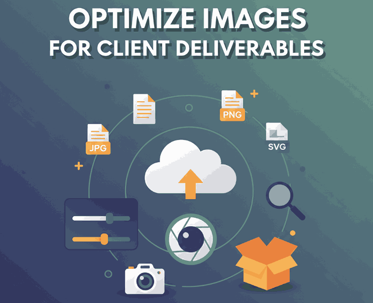
4.1 Choose the Right Format
4.2 Resize & Scale Properly
4.3 Compression: Lossy vs Lossless
4.4 Sharpening, Metadata & Color Profile
4.5 Use Responsive Images & Multiple Versions
4.6 Lazy Loading & Prioritization - Workflow & Tools to Streamline Optimization
- Case Study: Font Mockups & Visual Assets
- Common Pitfalls & How to Avoid Them
- Conclusion
- References
1. Introduction
When working for clients, delivering polished visual assets is more than just aesthetics—it’s about optimize images for client deliverables so that they’re crisp, efficient, and fit for use in multiple contexts (web, print, social). Poorly optimized images can slow websites, look pixelated, or be rejected by clients. In this guide, we’ll walk through best practices, tools, and tips to deliver image files clients will love and use confidently.
2. Why Image Optimize Images For Client Matters in Deliverables
- Performance & Load Speed: Big image files slow websites and apps, hurting user experience and SEO.
- File Size & Bandwidth: Large assets cost more to transfer or host.
- Cross-Platform Use: Clients often repurpose your images—on web, mobile, social media, or print—so flexibility is key.
- Professionalism & Trust: Delivering optimized, ready-to-use assets adds to your credibility as a designer.
Thus, optimizing images is a critical part of the handoff process in design projects.

3. Understand Optimize Images For Client Use Cases & Output Needs
Before you begin, ask the client:
- Where will these images be used? (Web, mobile, print, social)
- What are the target dimensions or resolutions?
- Need transparent backgrounds or color profiles (RGB, CMYK)?
- Will clients need high-res versions later?
Knowing this ensures you deliver the right formats and versions without waste.
4. Key Techniques to Optimize Images for Delivery
4.1 Choose the Right Format
Select formats based on image type:
- JPEG / JPG: Good for photos with many colors and gradients.
- PNG: Best for graphics, icons, and transparency.
- WebP / AVIF: Modern formats offering smaller file sizes with good quality. Use when browser support allows.
- SVG: Ideal for vector graphics, icons, logos. Scalable without quality loss.
4.2 Resize & Scale Properly
Don’t deliver monster-sized images when users will view in small dimensions. Resize images to match their display size. Avoid uploading 4000px wide when it will show at 800px.
4.3 Compression: Lossy vs Lossless
- Lossy compression reduces file size by discarding some details—use carefully to retain visual quality.
- Lossless compression keeps full detail but squeezes out redundancy.
Use tools or plugins to find balance. TinyPNG, ImageOptim, or built-in export features help.
4.4 Sharpening, Metadata & Color Profile
- After resizing, apply mild sharpening to retain crisp edges. Adobe’s guidelines show how sharpening on delivery can improve quality.
- Strip unnecessary metadata (camera info, GPS) to reduce file weight.
- Embed or convert to appropriate color profiles (sRGB for web, CMYK for print) to avoid color shifts.
4.5 Use Responsive Images & Multiple Versions
Deliver multiple image sizes (e.g. small, medium, large) so clients or browsers can load the best fit. Use HTML’s srcset or <picture> tags to let browsers pick the right version.
4.6 Lazy Loading & Prioritization
If images appear lower on the page (below the fold), defer their loading using lazy loading attributes (loading="lazy"). This accelerates the initial load.

5. Workflow & Tools to Streamline Optimize Images For Client
Here’s how to embed optimization into your process:
- Create export presets (e.g. “Web Small,” “Web Large,” “Print High”)
- Use batch tools/plugins (e.g. in Photoshop, Affinity, ImageOptim)
- Automate via build tools or CDNs that support on-the-fly image optimization
- Version control: always keep original high-res masters, deliver optimized variants
- Use image performance testing (e.g. PageSpeed Insights) to verify result quality
6. Case Study: Font Mockups & Visual Assets
When you deliver visual assets that showcase fonts, optimization is crucial so the font details remain crisp. For example:
- Holdsmith Font – if shown as typographic mockups, ensure sharpness and balance between quality & file size.
- Denham Font – deliver web-optimized hero images or poster mockups.
- Souther Font – deliver layered mockups for social media and ensure each layer’s export is optimized.
- Basic Dance Font – decorative or display fonts often show in banners, so optimized large hero images matter.
Creating mockups using these fonts and delivering them in web-friendly formats will impress clients and reduce friction.
7. Common Pitfalls & How to Avoid Them
- Overcompressing → artifacts, blurriness. Always check quality visually.
- Not providing high-res backups → clients may need prints later.
- Ignoring color shift issues → test on multiple devices.
- Delivering only one size → inflexible for responsive use.
- Forgetting alt text and filenames → missed SEO & accessibility opportunity.
8. Conclusion
To optimize images for client deliverables means balancing aesthetics, performance, and usability. By selecting proper formats, resizing smartly, compressing carefully, and delivering multiple versions, you elevate your handoff from ordinary to professional. When your clients receive sharp, ready-to-use assets (especially for font mockups), they’ll appreciate your thoughtfulness and attention to detail.
References
- Uploadcare – How to optimize images for web: Best practice guide.
- RequestMetrics – How to Optimize Website Images: The Complete 2025 Guide.
- Imgix – 8 Best Practices in Image Optimization Used by Top Brands.
- Adobe Experience Manager – Best practices for optimizing the quality of your images.