Table of Contents
- What Are Color Gradients?
- Why Color Gradients Are So Popular
- Types of Popular Color Gradients
- Trending Color Gradient Combinations
- Using Color Gradients in Typography
- Font Mockup Examples with Popular Color Gradients
- Tips for Choosing the Right Gradient for Your Design
- Final Thoughts
1. What Are Popular Color Gradients?
Popular Color Gradients is a gradual transition between two or more colors. Instead of a flat, solid tone, gradients blend hues smoothly to create depth and dimension. Designers use gradients to add realism, motion, and visual interest to digital and print designs.
There are several common gradient types:
- Linear gradients (colors transition in a straight line)
- Radial gradients (colors radiate from a central point)
- Angular gradients (colors rotate around a center)
2. Why Are Popular Color Gradients
Color gradients are popular because they:
- Create visual depth and hierarchy
- Add a modern and dynamic feel
- Evoke emotions and brand personality
- Work well across web, social media, and print
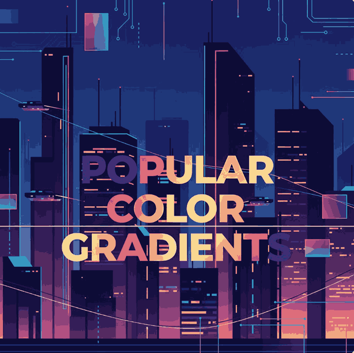
In typography, gradients help text stand out, especially for headlines, logos, posters, and product mockups. When paired with expressive fonts, gradients enhance legibility while adding artistic flair.
3. Types of Popular Color Gradients
Soft Pastel Gradients
These gradients blend gentle hues like pink, lavender, mint, and baby blue. They are widely used in lifestyle branding, beauty products, and minimalist designs.
Vibrant Neon Gradients
Bold combinations such as purple-to-pink, blue-to-cyan, or orange-to-magenta are common in tech branding, music visuals, and creative portfolios.
Dark & Moody Gradients
Deep blues, blacks, purples, and reds create dramatic and luxurious moods. These gradients are perfect for premium branding and high-end typography.
Natural & Earthy Gradients
Inspired by nature, these gradients combine green, brown, sunset orange, and sky blue tones, making them ideal for eco-friendly and organic brands.
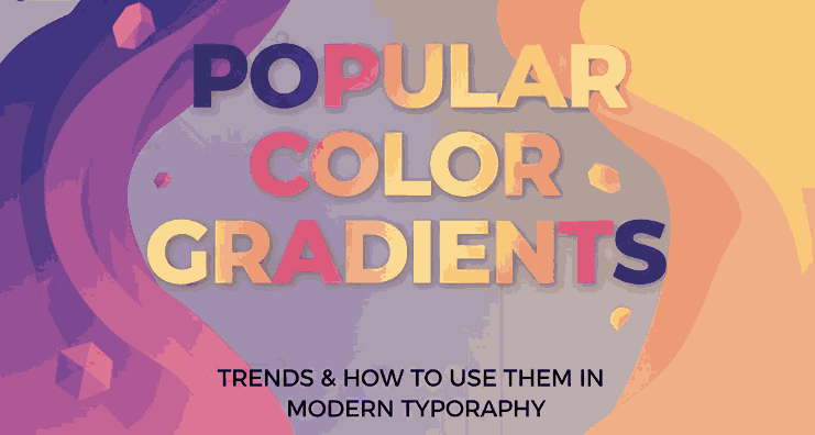
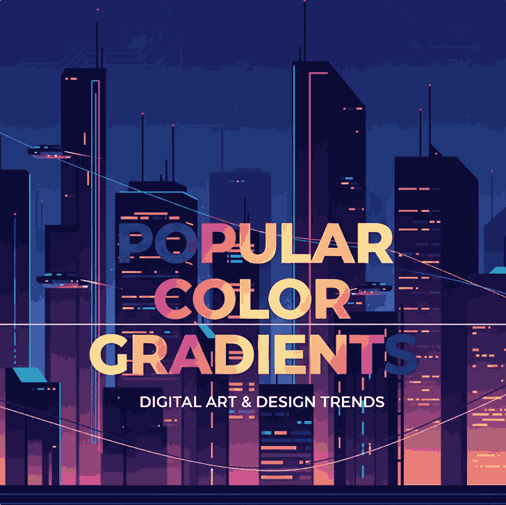
4. Popular Color Gradients Combinations
Some popular color gradient trends dominating modern design include:
- Purple → Pink → Orange (creative & energetic)
- Blue → Teal (clean & professional)
- Gold → Amber → Brown (luxury & elegance)
- Peach → Coral → Rose (friendly & modern)
These combinations work especially well when applied to large typographic elements like logos and hero headlines.
5. Using Popular Color Gradients in Typography
Typography is one of the most effective areas to apply gradients. However, balance is key. Here are some best practices:
- Use gradients mainly on headlines or display text
- Pair gradient text with neutral backgrounds
- Choose fonts with smooth curves or bold strokes
- Avoid overly complex gradients on small text
Script and calligraphy fonts are particularly suitable because their flowing forms allow gradients to transition naturally across letter shapes.
6. Font Mockup Examples with Popular Color Gradients
Here are some excellent font choices from CalligraphyFonts.net that work beautifully with popular color gradients:
Workday Font
A casual and friendly calligraphy font, perfect for pastel or warm gradients in lifestyle branding and social media designs.
Shimmer Gold Font
This elegant script font pairs perfectly with gold, amber, or dark luxury gradients, making it ideal for premium logos and product packaging.
Super Dreamer Font
A bold brush-style script font that shines with vibrant neon or sunset gradients, perfect for creative branding and posters.
Southeasterly Script Font
A dynamic and expressive script font that works well with dramatic and high-contrast gradients for branding and editorial designs.
Using these fonts in gradient-based mockups helps demonstrate how typography and color trends work together in real-world designs.
7. Tips for Choosing the Right Gradient for Your Design
- Match the gradient mood with your brand identity
- Test readability on different screen sizes
- Use subtle gradients for professional designs
- Reserve bold gradients for creative or promotional content
- Always preview your gradient typography in real mockups
A good gradient should enhance your font—not overpower it.
8. Final Thoughts
Popular color gradients continue to shape modern design trends, especially in typography and branding. When used thoughtfully, gradients can elevate fonts, communicate emotion, and create memorable visuals.
By combining trending color gradients with expressive calligraphy fonts from CalligraphyFonts.net, designers can create typography that feels modern, artistic, and impactful. Whether you’re designing logos, posters, packaging, or digital content, gradients remain a powerful creative tool.
References
- Canva – Color meanings and symbolism
- Interaction Design – What is Color Theory?
- Din Studio – Helpful Tips to Create Stunning Color Gradients